Roughly one in five UK homes was built before 1919, and a further wave between 1900 and 1914. Painting them with off-the-shelf brilliant white from a 2020s trade range is the single most common mistake British homeowners make. Historic England, the Georgian Group, the Victorian Society and the Society for the Protection of Ancient Buildings (SPAB) all publish the same warning: modern vinyl emulsions trap moisture in solid masonry walls and the wrong palette flattens the very mouldings, cornices and panelling that give a period home its value.
This 2026 guide sets out the authentic interior colour palettes for Georgian (1714-1830), Regency (1810-1837), Victorian (1837-1901) and Edwardian (1901-1910) properties, with the breathable paint specifications, listed building consent rules and brand references (Farrow & Ball, Little Greene, Edward Bulmer, Earthborn) you need before lifting a brush.
For full pricing, see our complete UK cost guide.
Why heritage palettes matter in pre-1914 homes
Period interiors were designed around candlelight, oil lamps and gas mantles, with daylight filtered through smaller, smaller-paned sashes. The pigments available - earth ochres, lead whites, Prussian blue, vermilion, verdigris, lamp black - produced the deep, slightly chalky tones modern brilliant whites simply cannot replicate. Use a 2026 cool grey on Georgian panelling and the carved bolection moulding will read as flat MDF; use the right Adam green or stone, and 280 years of joinery comes back to life.
There is also a building science argument. Pre-1919 walls are typically solid brick or stone, often lime-rendered or lime-plastered. They rely on vapour-open finishes (distemper, limewash, lime-friendly emulsions) to release moisture. SPAB explicitly recommends soft distemper or lime-friendly mineral paints on walls plastered before 1850, and warns that modern acrylic and vinyl emulsions can cause spalling, salt blooming and damp.
Era-by-era authentic interior palette
Below is a quick-reference table of the four British period eras, with three documented historic colours each, the room they were typically used in, and a current 2026 brand match. All references are taken from Farrow & Ball Heritage, Little Greene National Trust Authentic Colour Range, Edward Bulmer Natural Paint and Dulux Heritage archives.
| Era | Three typical colours | Best room | Brand reference |
|---|---|---|---|
| Georgian (1714-1830) |
Pompeii Red, Adam Green, Stone / Deep Ochre | Drawing room, dining room | F&B Eating Room Red No.43; Little Greene Pleat / Adam Green; Edward Bulmer Pompeian Red |
| Regency (1810-1837) |
Cream, Gilt accents, French Blue | Drawing room, salon | F&B Matchstick No.2013 / Lulworth Blue No.89; Little Greene Regency Cream |
| Victorian (1837-1901) |
Burgundy, Forest Green, Ochre / Plum | Dining room, study, hall | F&B Preference Red / Studio Green; Little Greene Invisible Green; Dulux Heritage Plum |
| Edwardian (1901-1910) |
Soft Sage, Dove Grey, Powder Pink | Drawing room, bedroom | F&B Mizzle / Dimity; Little Greene French Grey Pale; Earthborn Eco Chic Donkey Ride |
Try it on your house
No photo? Try a sample
Georgian (1714-1830): Pompeii red, Adam green, stone
Georgian interiors are architecturally driven. Robert Adam, William Chambers and the pattern books of the 1760s-1810s established a hierarchy: pale stone or "drab" for entrance halls, deeper saturated colour in the principal reception rooms. Pompeii Red (a warm earth red borrowed from the 1748 excavation of Pompeii) became the signature drawing-room colour after 1770; Adam Green (a soft, slightly muddy sage) lined ceilings and panelled libraries; deep ochre defined dining rooms because it flattered mahogany and candlelit silverware.
Joinery was traditionally finished in a broken white (closer to F&B Old White or Slipper Satin than modern brilliant white) in oil eggshell, never in satinwood or gloss vinyl. Ceilings were soft distemper, often a warm off-white or, in grander schemes, picked out in pale blue or pink between the plasterwork.
Upload your room photo and test Georgian, Regency, Victorian or Edwardian palettes in 30 seconds
Regency (1810-1837): cream, gilt, French blue
Regency interiors lightened dramatically. Following the influence of Napoleonic France, creams, off-whites and pale stone dominated the principal walls, set off by gilt mirrors, gilded picture rails and ormolu. The signature accent was French Blue (a clean mid-blue, slightly greener than royal) used on door panels, occasionally an entire dining room, or as a striped wallpaper ground.
Sir John Soane's Museum and the Brighton Pavilion remain the canonical references. Walls were typically flat distemper or oil-bound water paint; woodwork in oil eggshell tinted with raw umber to soften the white. Avoid bright white skirtings - they will date a Regency room instantly.
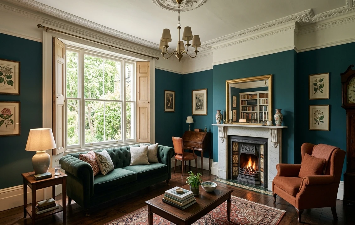
Victorian (1837-1901): saturated jewel tones, high-contrast trim
The Victorian palette is the opposite of minimalism. After the 1856 publication of William Henry Perkin's mauve aniline dye and the 1859 Owen Jones Grammar of Ornament, interiors embraced deep saturated burgundies, forest greens, ochres, plums and Prussian blues. Walls were divided horizontally into dado, fill and frieze, often three different colours or a colour plus embossed Lincrusta and patterned wallpaper above.
Dining rooms went dark - F&B Eating Room Red, Studio Green or Preference Red - because gas mantles and candles bounced warm light back from the deep walls. Halls were oxblood or terracotta with high-gloss skirtings in near-black brown ("invisible green" or "Tanner's Brown"). Trim was always high contrast to the wall, never tone-on-tone.
Edwardian (1901-1910): Arts & Crafts pastels
Edwardian interiors reacted firmly against Victorian heaviness. Influenced by William Morris, C.F.A. Voysey and the Arts & Crafts movement, walls lightened to soft sage, dove grey, powder pink, butter yellow and pale duck-egg. Picture rails were retained but skirtings dropped from 9 inches to 6, and trim moved to off-white or pale stone, much closer in tone to the wall.
This is the era closest to modern taste, which is why Edwardian houses adapt most easily. Stick to the Earthborn Eco Chic range or F&B Mizzle, Dimity, Pavilion Gray for an authentic 1905-1910 feel without looking like a museum.
Listed Building Consent: what you can and cannot do
Roughly 500,000 properties in England, Wales, Scotland and Northern Ireland are listed. The grades determine how much freedom you have:
- Grade I (2.5% of listings): exceptional interest. Almost every interior change - including paint colour on historic joinery - requires Listed Building Consent (LBC) from your Local Planning Authority.
- Grade II* (5.8%): particularly important. LBC needed for changes to historic plaster, panelling, original paint schemes and any non-reversible work.
- Grade II (91.7%): nationally important. Repainting walls in a sympathetic heritage colour is generally permitted, but stripping original paint layers, replacing lime plaster with gypsum, or changing the finish on original joinery (e.g. shellac to gloss) typically requires LBC.
Acting without consent is a criminal offence under section 9 of the Planning (Listed Buildings and Conservation Areas) Act 1990, with unlimited fines and a requirement to reverse the works. Always ask your conservation officer in writing before changing finishes.
Breathable paint: lime-distemper, casein, milk paint
SPAB's technical guidance is unambiguous: walls plastered before 1850 should be finished in soft distemper, limewash or another vapour-open paint. The traditional finishes are:
- Soft distemper: chalk pigment bound in animal glue. Beautifully chalky, must be washed off (not painted over) before redecoration. Authentic for Georgian and Regency ceilings.
- Limewash: slaked lime plus pigment. Highly breathable, mildly antiseptic. Standard finish on lime-plastered walls and external lime render.
- Casein / milk paint: milk protein binder, very low VOC. Suitable for joinery and walls in pre-1850 properties. Edward Bulmer offers a contemporary casein emulsion.
- Lime-friendly mineral emulsions: modern alternatives such as Earthborn Claypaint and Edward Bulmer Natural Paint, both fully vapour-open and free of acrylic binders.
F&B Modern Emulsion vs Estate Emulsion: which on a period wall
A common 2026 confusion. Farrow & Ball offer two main emulsions:
- Estate Emulsion: a flat 2% sheen, water-based, with a relatively high vapour permeability. F&B describe it as suitable for traditional plaster. It is the right choice for solid-wall, lime-plastered period rooms when a fully traditional finish is not required.
- Modern Emulsion: a more durable, washable acrylic with lower vapour permeability. Excellent in kitchens and bathrooms, but not recommended on pre-1850 lime plaster because it can slow moisture release.
For Grade II* and Grade I interiors, neither is a substitute for traditional distemper or limewash, but Estate Emulsion is the closer compromise. Always test on a square metre and wait two weeks before judging.
Heritage brand shortlist for 2026
Six brands cover virtually every authentic UK period scheme:
- Farrow & Ball Heritage: 132 colours, deep archive references, Estate Emulsion finish for lime plaster.
- Little Greene National Trust Authentic Colour Range: 192 colours sampled from National Trust properties, the broadest documented historic palette in Britain.
- Edward Bulmer Natural Paint: plant-based binders, full transparency on ingredients, ideal for pre-1850 lime plaster.
- Earthborn Eco Chic: VOC-free, breathable claypaint and casein primers, strong Edwardian palette.
- Dulux Heritage: more affordable mass-market option, 144 colours referenced to British architectural history.
- Mylands FTT: London-made, signature deep saturated Victorian colours.
Costs and timings for a heritage interior repaint 2026
Indicative UK 2026 figures for a typical 30 sqm period drawing room:
- Materials only (Estate Emulsion + heritage eggshell): £320-£480.
- Materials only (limewash or Edward Bulmer): £480-£720.
- Decorator labour (3 to 4 days, prep included): £900-£1,400.
- Lime plaster repair if required: £55-£90 per sqm.
- Listed Building Consent application: free, 8-week determination.
Five rules for choosing period colours that work in 2026
- Sample on every wall: north-facing rooms can shift a Pompeii Red two steps duller than south-facing.
- Never go pure white on trim - tint your skirtings with raw umber or use F&B Old White / Slipper Satin.
- Match the era to the room function: dark for dining and study, lighter for drawing room and bedrooms.
- Use breathable paint on solid walls - especially below 1m where rising damp risk is highest.
- Test the palette digitally before buying sample pots to narrow 192 National Trust colours to a workable shortlist.
Upload a photo of your Georgian, Regency, Victorian or Edwardian room - heritage palettes preloaded
Frequently asked questions
Do I need Listed Building Consent to repaint a Grade II interior?
Generally not for sympathetic repainting of walls in a heritage colour, but yes for any change to original paint layers on historic joinery, panelling or plaster, and yes for changing finish type (e.g. distemper to vinyl emulsion). Stripping original paint to bare wood almost always requires consent because the paint history is itself a protected feature. Ask your local conservation officer in writing before starting; failure to obtain LBC is a criminal offence under the Planning (Listed Buildings and Conservation Areas) Act 1990.
Can I use Farrow & Ball Modern Emulsion on a pre-1850 lime-plastered wall?
SPAB advises against it. Modern Emulsion is acrylic-based and reduces vapour permeability, which can trap moisture in lime plaster and cause spalling, salt blooming or damp. For pre-1850 walls, choose a vapour-open finish: traditional soft distemper, limewash, casein paint, Edward Bulmer Natural Paint, Earthborn Claypaint, or - as a compromise - F&B Estate Emulsion, which has a flat 2% sheen and higher permeability than Modern Emulsion. Always test a square metre and observe for two weeks before decorating the whole room.
What is the most authentic colour for a Victorian dining room?
A deep saturated red, burgundy or forest green below the picture rail, with a contrasting paler frieze above. F&B Eating Room Red No.43, Preference Red No.297 or Studio Green No.93 are documented Victorian dining room references; Little Greene Invisible Green and Mylands FTT 153 Empire Grey work equally well. Trim should be high-contrast, traditionally finished in oil eggshell tinted with raw umber rather than brilliant white. The deep walls were chosen specifically to flatter candlelight and gas mantles - they remain unmatched under modern dimmable LEDs at 2,200 K.
Is the National Trust Authentic Colour Range only for National Trust properties?
No. The Little Greene National Trust Authentic Colour Range (192 colours) is sampled from National Trust houses but sold to the general public. It is the broadest documented historic UK palette currently available, covering Georgian, Regency, Victorian and Edwardian schemes. You do not need to own a listed house to buy it - the range is widely used in conservation areas, period restorations and pastiche new-builds aiming for authenticity.
A successful period interior repaint starts with the right era palette and the right paint chemistry - never a default brilliant white. Test your shortlist of Georgian, Regency, Victorian or Edwardian colours on a photo of your actual room with our free AI interior colour visualiser, then verify breathability and Listed Building Consent before committing. Sources: Historic England, SPAB, the Georgian Group, the Victorian Society, Farrow & Ball Heritage, Little Greene National Trust Authentic Colour Range, Edward Bulmer Natural Paint, Earthborn.
Trademarks mentioned (Sherwin-Williams, Benjamin Moore, Behr, Caparol, Brillux, Sto, Alpina, Valspar, PPG, Glidden, Dulux, Crown Trade, Sandtex, Farrow & Ball, Johnstone's, Leyland) are property of their respective owners. FacadeColorizer is independent and not affiliated with any of them. Nominative fair use under Lanham Act §1125.