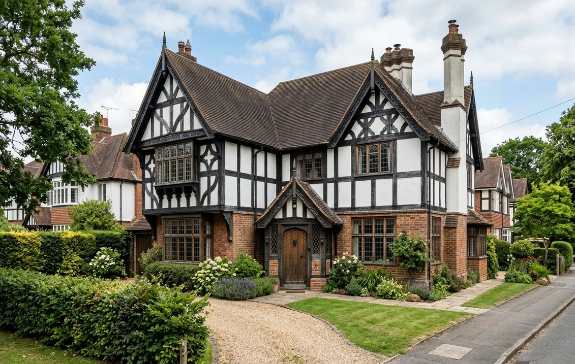

Between 1910 and 1940, more than 800,000 mock Tudor semis were built across suburban Britain, from the Metroland estates of north-west London to the leafy avenues of Surrey, Birmingham and Manchester. With their crisp black timbers over white roughcast, red-tile roofs and leaded bay windows, these Tudorbethan houses are now beloved and yet routinely ruined by modern paint choices, the worst offender being brilliant white render that kills the whole timber effect.
This 2026 guide sets out the correct mock Tudor exterior palette for 1930s British semis, explains the crucial difference between authentic Tudor and Tudorbethan, lists ten tested colour combinations with Farrow & Ball and Little Greene codes, and covers conservation area rules for estates such as Hampstead Garden Suburb and Metroland Pinner.
Mock Tudor vs authentic Tudor: why the distinction matters
The single most common mistake on Britain's suburban semis is treating them as if they were genuine 16th century timber-framed buildings. They are not. A mock Tudor (also called Tudorbethan or Stockbroker Tudor) is a 1910 to 1940 home built in brick or block, then dressed with decorative softwood timbers nailed to a cement or roughcast render. The timbers are cosmetic, not structural.
This matters for colour choice. On an authentic listed Tudor from 1485 to 1625, the timbers were silvered oak or limewashed grey, never jet black originally, and infill panels were hand-floated lime render that mellowed to a warm cream over centuries. On a 1932 Metroland semi, the architects Baillie Scott, Voysey and their imitators deliberately specified deep black-stained softwood against bright white roughcast to reference the romance of old England. So on a mock Tudor, an authentic-looking off-black reads as historically correct, while pure limewash grey would look wrong.
In short: if your house was built after 1900, it is mock Tudor and you should follow the Tudorbethan palette below. If it was built before 1700 and is listed, consult a heritage architect and use the lime-render route described in our listed Tudor guide.
The classic 1930s semi palette: black timber and warm white roughcast
The textbook Tudorbethan semi uses four colours, each with a specific role. Get the balance right and the house immediately looks like it stepped out of a Metroland poster.
- Timber: deep off-black or charcoal, never pure jet black and never dark chocolate brown.
- Roughcast render / pebbledash: warm white or oatmeal, never brilliant white.
- Brick plinth: left as exposed red or orange stock brick, not painted over.
- Joinery (doors, bargeboards, bay windows): either matching the timbers or a heritage accent like bottle green or oxblood red.
The most-used and most-forgiving combination in the UK remains Farrow & Ball Off-Black No.57 on timbers with Wimborne White No.239 on roughcast. It works in sun or cloud, on red tile or slate roofs, and mellows beautifully as the weather softens the render.
Upload a photo of your 1930s semi and test every palette below in under a minute
Ten tested mock Tudor palettes for 2026
Each palette below pairs a timber colour with a roughcast or render colour and a recommended door accent, all matched to Farrow & Ball (F&B) or Little Greene (LG) codes. Use them as your starting point, then test on a photograph of your own property before ordering paint.
| Palette | Timber | Roughcast / render | Door accent | Best for |
|---|---|---|---|---|
| 1. Metroland Classic | F&B Off-Black No.57 | F&B Wimborne White No.239 | F&B Studio Green No.93 | Pinner, Rickmansworth, Ruislip |
| 2. Hampstead Garden | F&B Black Blue No.221 | F&B Slipper Satin No.2004 | F&B Hague Blue No.30 | Hampstead Garden Suburb |
| 3. Surrey Stockbroker | F&B Railings No.31 | F&B Shaded White No.201 | F&B Eating Room Red No.43 | Esher, Weybridge, Virginia Water |
| 4. Warm Oak Semi | F&B Tanner's Brown No.255 | F&B Jitney No.293 | LG Mid Brunswick Green 128 | Birmingham, Solihull suburbs |
| 5. Charcoal & Cream | LG Lamp Black 228 | LG Slaked Lime Mid 150 | LG Tuscan Red 140 | Manchester, Didsbury, Chorlton |
| 6. Chilterns Warm White | F&B Off-Black No.57 | F&B School House White No.291 | F&B Studio Green No.93 | Amersham, Beaconsfield, Chesham |
| 7. Edgware Edwardian | F&B Off-Black No.57 | F&B String No.8 | F&B Inchyra Blue No.289 | Edgware, Stanmore, Harrow |
| 8. Cheshire Black & White | F&B Pitch Black No.256 | F&B James White No.2010 | LG Lamp Black 228 | Wilmslow, Alderley Edge |
| 9. Sussex Sandstone | F&B Off-Black No.57 | F&B Oxford Stone No.264 | F&B Deep Reddish Brown No.W101 | Haywards Heath, Horsham |
| 10. Yorkshire Oatmeal | LG Lamp Black 228 | LG Joanna 130 | LG Invisible Green 46 | Leeds, Harrogate, Ilkley suburbs |
Why brilliant white roughcast kills the mock Tudor effect
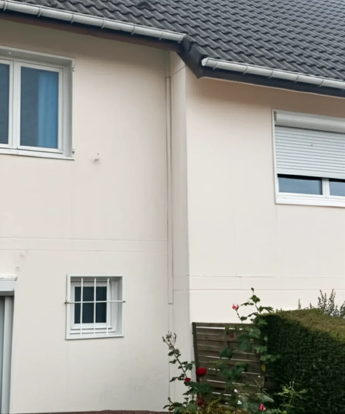
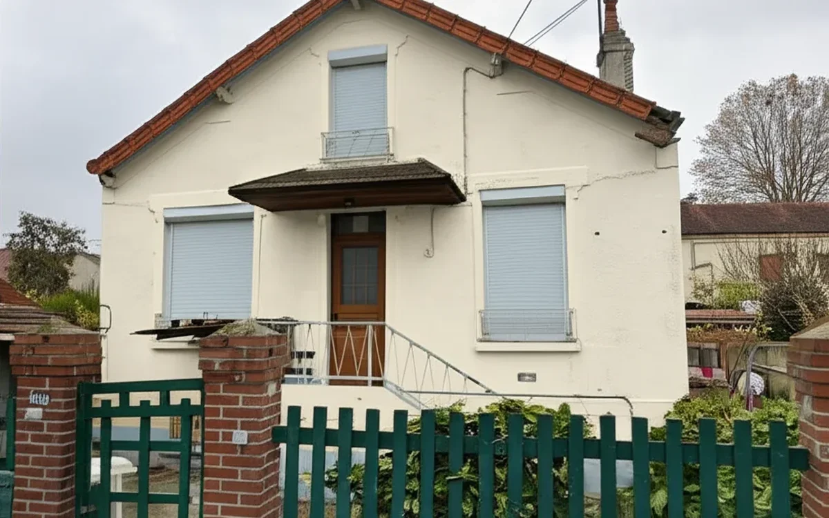
Walk any 1930s suburb today and you will see the same mistake repeated: brilliant white masonry paint, typically Dulux Weathershield Pure Brilliant White or Sandtex Pure Brilliant White, slapped straight onto the pebbledash. The result is a facade that looks cold, chalky and oddly modern, as if a 1990s new-build estate had accidentally grown some black planks overnight.
The reason is simple. Brilliant white contains optical brighteners that reflect UV as a cool blue-white. Next to a genuine deep off-black timber, the contrast is so harsh that the eye reads the wall as a flat backdrop rather than as aged render. Crucially, historic lime render and roughcast never weathered to this tone; they always mellowed to a warm cream or oatmeal within two or three winters. A good Tudorbethan render should read as warm white in shade and pale stone in sun, exactly what Wimborne White, Slipper Satin, School House White, Jitney and James White deliver.
If your render was painted brilliant white by a previous owner and you cannot afford a full repaint, a single coat of Farrow & Ball Exterior Masonry in Wimborne White will knock back the blueness and warm the whole elevation in a single afternoon. Test first on a rear elevation; most homeowners are surprised how much better the timbers read within hours.
Metroland London: the 1930s suburban benchmark
The Metroland estates built by the Metropolitan Railway between 1919 and 1939 across Pinner, Rickmansworth, Ruislip, Wembley Park, Stanmore and Harrow remain the defining examples of British mock Tudor. The original specification from Metropolitan Railway Country Estates Ltd called for Brunswick Black timber stain over lime-and-cement roughcast in a limewash-cream finish, with red Rosemary clay tiles above and bottle-green front doors below.
Modern owners in these streets can replicate the original look with Farrow & Ball Off-Black No.57 on timbers, Wimborne White No.239 on roughcast, and Studio Green No.93 on the front door. The Rosemary tiles are nearly always still original and should be cleaned, never painted. For Hampstead Garden Suburb, where the Hampstead Garden Suburb Trust exercises tight design control, proposals should be submitted in writing with photographic mock-ups before any paint is ordered.
A useful benchmark: on a typical semi-detached Metroland property of around 140 square metres of render and 40 linear metres of timber, expect to use 25 to 30 litres of Exterior Masonry and 8 to 10 litres of Exterior Eggshell, with a materials cost of roughly 550 to 700 pounds at Farrow & Ball retail and a total decorating bill of 3,800 to 5,500 pounds depending on access and condition.
See every Metroland palette on your own semi before you commit a penny
Common colour mistakes on 1930s Tudorbethan semis
These are the errors heritage architects see most often across suburban London, the Midlands and the North, and every one of them is easy to avoid once you know what to look for.
- Brilliant white roughcast. Kills the timber effect. Replace with Wimborne White, Slipper Satin or James White.
- Orange-brown timber stain. Cuprinol Red Cedar or Ronseal Dark Oak make the house look like garden fencing. Use a true off-black instead.
- Cold grey render. A modern light grey turns a Tudorbethan semi into a 2015 new-build. Warm whites always, cool greys never.
- Painting the brick plinth white. Original red or orange stock brick anchors the house. Paint kills the character and traps damp.
- High-gloss timbers. Modern gloss reads as plastic. Use eggshell or satin for the subtle sheen of old oil paint.
- uPVC windows in caramel woodgrain. They always look wrong. If replacement is not possible, paint exposed frames in the same off-black as the timbers.
- Pastel front doors. Baby blue or mint green doors fight the period. Stay with bottle green, oxblood red, Hague blue or black.
Conservation area considerations
Most mock Tudor homes are unlisted because they are too recent for statutory protection. However, many sit inside a designated conservation area or are covered by an Article 4 Direction that removes permitted development rights for painting. Notable examples include Hampstead Garden Suburb, Bedford Park, parts of Pinner and Ruislip, Port Sunlight on the Wirral, Bournville in Birmingham and the Welwyn Garden City Estate.
Where Article 4 applies, you will need planning permission from your local authority to change the colour of your facade, even like-for-like. The application is free and typically determined within eight weeks. Submit a short design and access statement referencing the Historic Area Appraisal for your conservation area, alongside photo evidence of neighbouring properties to show contextual fit. Councils in Barnet, Harrow, Three Rivers and Hertsmere publish their appraisals online and these documents often list the preferred palettes explicitly.
Outside conservation areas, painting a mock Tudor semi is generally permitted development and requires no consent. Even so, covenants in the original 1930s title deeds sometimes restrict external colours; check your deeds or ask your conveyancer before booking a decorator.
Frequently asked questions about mock Tudor exterior colours
What is the correct white for mock Tudor roughcast?
Warm off-whites work best. The three most reliable choices are Farrow & Ball Wimborne White No.239, Slipper Satin No.2004 and James White No.2010. Little Greene Slaked Lime Mid 150 and Joanna 130 are strong alternatives. Avoid any paint marketed as "pure brilliant white" or "trade white", as the optical brighteners read as cold blue-white against black timbers and flatten the whole facade.
Should mock Tudor timbers be pure black or off-black?
Off-black almost always reads better. Farrow & Ball Off-Black No.57 contains a subtle brown undertone that evokes aged oak, while pure jet black (Pitch Black No.256 or trade black) can look harsh and industrial on a suburban facade. The one exception is the very traditional Cheshire black-and-white style, where a pure Pitch Black paired with a crisp James White gives the stronger high-contrast look associated with Wilmslow and Alderley Edge.
Do I need planning permission to repaint my 1930s mock Tudor semi?
Not usually. Painting an unlisted house outside a conservation area is permitted development. However, if your home is inside a conservation area with an Article 4 Direction, such as Hampstead Garden Suburb, Bedford Park or Bournville, you will need free planning permission from your council. Check your local authority's online map before ordering paint, and review your title deeds for any restrictive covenants from the original estate developers.
Test all 10 Tudorbethan palettes on your own semi in under a minute
A good mock Tudor semi can look either like a 1990s rental or like a polished piece of British heritage, and the only difference is the colour choice. Test Off-Black No.57 with Wimborne White No.239, or our nine other Tudorbethan palettes, on a photograph of your actual property using our free AI colour visualiser before booking a decorator. Sources: Historic England Advice Notes, Farrow & Ball Heritage Collection, Little Greene Colour Scales, Hampstead Garden Suburb Trust design guidance.
Trademarks mentioned (Sherwin-Williams, Benjamin Moore, Behr, Caparol, Brillux, Sto, Alpina, Valspar, PPG, Glidden, Dulux, Crown Trade, Sandtex, Farrow & Ball, Johnstone's, Leyland) are property of their respective owners. FacadeColorizer is independent and not affiliated with any of them. Nominative fair use under Lanham Act §1125.