An accent wall is the cheapest design move in interiors. One gallon, one weekend, and a $50 to $90 budget shifts the entire feel of a room. Yet according to Sherwin-Williams consultants and Benjamin Moore 2026 trend data, roughly 4 in 10 DIY accent walls are repainted within 18 months. The reason is almost never the color: it is the wrong wall, the wrong ratio, or the wrong trim relationship.
This guide gives you the 2026 designer playbook: the 5-step wall-pick rule, 60-30-10 ratio, complementary vs analogous theory, drench vs accent, best US paint products, 12 popular combinations, and 8 real-world projects from Brooklyn to Nashville. For full pricing context, see our complete interior painting cost guide.
Upload your room photo and test any accent color in under 30 seconds
The 5-Step Rule: Which Wall Should You Paint?
Picking the wrong wall is the single most common mistake in DIY accent projects. Designers do not pick the biggest wall, the brightest wall, or the wall the homeowner stares at most. They pick the wall that already wants to be a focal point. Run these five checks in order, and stop at the first one that fits.
Step 1: Pick the Smallest Wall for Drama
Counterintuitive but true. A saturated color reads as drama on a small wall and as oppression on a large one. If your room has one wall that is clearly shorter or narrower (often where a window or chimney chase shaves length), that wall is your default candidate. Small walls also use less paint, fail more gracefully, and read as intentional rather than accidental.
Step 2: The Wall Opposite the Entry
When you walk into a room, your eye lands first on the wall directly across from the door. Designers call this the sight-line wall. Painting it pulls the room toward you and makes the space feel deeper. This rule overrides Step 1 if the entry-opposite wall is visually anchored (a fireplace, a built-in, a console).
Step 3: Behind the Focal Furniture
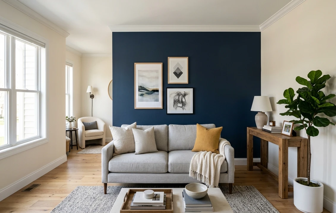
In a living room, that means the sofa wall. In a bedroom, the headboard wall. In a home office, the wall behind the desk. In a kitchen, the range wall. The accent color frames the furniture instead of competing with it. Avoid painting the wall opposite the sofa or bed: it isolates the color and makes the furniture look stranded.
Step 4: Anchor an Architectural Feature
If the room has a fireplace, a niche, a paneled wall, or built-in shelving, paint that surface. The architecture already pulls the eye, and color amplifies the effect. Skip this step if the feature is on the entry wall (Step 2 wins) or if the architecture is fussy enough that color competes with the trim.
Step 5: Skip the Window Wall
Never paint a wall that contains the largest window. Backlight kills saturation, and the human eye reads dark colors against bright glare as a hole. The single exception is when the window wall is also the headboard wall in a bedroom: in that case, drench the whole room (see the drench section below) instead of treating it as an accent.
The 60-30-10 Color Rule
Every successful interior obeys a ratio. The 60-30-10 rule, codified by interior designers since the 1950s, distributes color by visible surface area:
- 60 percent dominant: walls, large rugs, primary upholstery. Usually a neutral or muted tone.
- 30 percent secondary: accent wall, drapes, secondary furniture. The color you noticed when you walked in.
- 10 percent accent: pillows, art, hardware, lampshades. The pop that ties the room together.
An accent wall is your 30 percent player. If you also paint your sofa wall, drench your trim, and add a colored rug, the ratio collapses and the room feels chaotic. Pick one 30 percent move per room and let everything else fall under 60 or 10.
Color Theory: Complementary vs Analogous
Two different relationships govern almost every successful accent wall in 2026. Knowing which one you want before you swatch saves three to five test pots.
Complementary (High Contrast)
Opposite sides of the color wheel: blue and orange, green and red, yellow and purple. Complementary pairings vibrate when used at full saturation, so designers tone one side down. A muted terracotta paired with a deep teal trim is a classic 2026 complementary move. Use complementary pairings when the room feels static and you want energy.
Analogous (Low Contrast)
Three to four colors that sit next to each other on the wheel: blue-green-teal, ochre-terracotta-rust, sage-olive-moss. Analogous schemes feel calm, layered, and expensive. They are the default for bedrooms, primary bathrooms, and any room you want to feel restful. Most 2026 magazine spreads lean analogous because the look photographs as tonal and reads as deliberate.
Drench vs Accent: When to Choose Which
In 2026, color drenching (painting walls, trim, ceiling, and sometimes built-ins all the same color) is challenging the accent wall for designer mindshare. Both are valid moves. Pick by room shape and ceiling height.
- Accent wall: rooms with at least one clear focal point, ceilings 8 ft and up, mixed furniture finishes, lots of natural light.
- Drench: small rooms (powder rooms, dens, libraries, primary bedrooms under 12 by 12), low ceilings under 8 ft, north-facing rooms with cool light, rooms with dated trim you want to disappear.
A drenched 10 by 10 office in Hale Navy reads as a jewel box. The same shade applied as one accent wall in a 14 by 18 great room reads as an arbitrary stripe. Match the technique to the architecture.
Best Paint Products for Accent Walls in 2026
Accent walls show every flaw. Cheap paint shows roller marks under directional light, fades under UV, and reads chalky on saturated tones. Three premium products dominate US designer specs in 2026.
Sherwin-Williams Emerald Designer Edition
SW's top-tier interior line, built for deep saturated colors. Two coats over tinted primer is usually enough, even on burgundy or eggplant. Matte hides drywall flaws and resists burnishing. $90 to $105 per gallon.
Benjamin Moore Aura
BM's flagship and arguably the most consistent saturated-color formulation in the US. Color Lock technology keeps deep blues and greens from going chalky. Matte and Eggshell are the designer go-to sheens. $95 to $110 per gallon.
Farrow & Ball Modern Emulsion
F&B's washable matte, the British import that sets the bar for pigment depth. The 132-color palette is curated rather than exhaustive. Expensive at $130 per gallon, but a single accent wall uses less than one.
Accent Wall Selection Table by Room Type
A quick reference matching the 5-step wall rule to the most common color groups, ideal LRV (Light Reflectance Value) ranges, and 2026 style examples.
| Room Type | Recommended Wall | Color Group | Ideal LRV | Style Examples |
|---|---|---|---|---|
| Living Room | Behind the sofa | Deep blue, forest green, charcoal | 5-15 | Hale Navy, Forest Green, Tricorn Black |
| Bedroom | Behind the headboard | Muted earth tones, dusty pastels | 15-30 | Dusty Rose, Slate Blue, Sage |
| Dining Room | Wall opposite entry | Saturated jewel tones | 8-18 | Burgundy, Deep Teal, Eggplant |
| Home Office | Behind the desk | Focused mid-tones, olive, navy | 10-25 | Olive, Hunter Green, Hale Navy |
| Hallway | End-of-corridor wall | Warm earth, terracotta, charcoal | 10-22 | Burnt Terracotta, Charcoal, Slate Blue |
Try it on your house
No photo? Try a sample
Why LRV matters: Light Reflectance Value runs 0 (pure black) to 100 (pure white). Accent walls in the 5 to 30 range read as color rather than as dark gray. Anything above 35 will look like a slightly different shade of beige under most home lighting and waste the effort.
12 Popular Accent Wall Combinations for 2026
These pairings show up most often in 2026 designer specs. Each one combines an accent color with a trim or adjacent-wall partner that has been tested to keep contrast clean and undertones harmonious.
- Hale Navy + Simply White trim: BM's enduring navy paired with pure crisp white. Works in living rooms, bedrooms, and offices.
- Tricorn Black + Pure White: SW's near-black against bright white. The 2026 modern-minimalist standard.
- Forest Green + Cream: Saturated green with a warm off-white. Library and den favorite.
- Burnt Terracotta + Ivory: Earthy, southwestern, hugely popular in Austin and Phoenix interiors.
- Charcoal + Light Gray: Tonal contemporary look. Pairs well with brass and oak.
- Deep Teal + Bright White: A jewel-tone that photographs blue or green depending on light.
- Dusty Rose + Greige: Soft and grown-up. The 2026 alternative to millennial pink.
- Olive + Linen White: Earthy and warm; outperforms sage when the room has lots of natural wood.
- Burgundy + Cream: Old-money dining room move. Looks expensive in candlelight.
- Hunter Green + Antique White: Traditional, masculine, and ideal for paneled offices.
- Slate Blue + Off-White: Cool and quiet. Bedroom and primary bath favorite.
- Eggplant + Sage: An analogous purple-green pairing that designers in Brooklyn and Seattle have been pushing for two years.
Test any of the 12 combinations above on your actual room photo
Crisp Tape Edges: The FrogTape Trick
A jagged paint line tells the eye the work is amateur, no matter how good the color choice is. Designers and pro painters in the US have effectively standardized on FrogTape Multi-Surface PaintBlock. The tape's PaintBlock polymer reacts with latex paint to seal the edge in seconds, preventing bleed under the line.
Two non-negotiable rules: apply the tape to clean, dry, dust-free trim or ceiling, press the edge firmly with a putty knife, and pull the tape at a 45-degree angle while the second coat is still slightly tacky. Pulling dry tape lifts dried paint with it and leaves the same jagged line you were trying to avoid.
8 Real-World Accent Wall Projects
Eight US homes documented during 2026, ranging from a 700 sq ft apartment to a 3,200 sq ft Craftsman. Each illustrates one or two of the rules above.
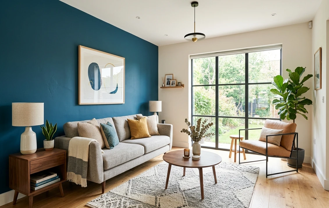
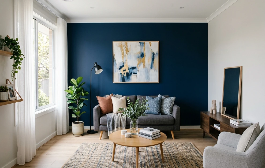
1. Brooklyn, NY: Hale Navy Behind the Sofa
Park Slope brownstone parlor, 11 ft ceilings, original moldings. Sofa wall in BM Hale Navy, trim in Simply White, brass picture lights. Total: $185 in BM Aura, one weekend.
2. Austin, TX: Burnt Terracotta Headboard Wall
East Austin bungalow primary bedroom. SW Cavern Clay on the headboard wall, BM Linen White everywhere else. Pulls oak floors and natural-fiber rug together.
3. Denver, CO: Forest Green Library Drench
10 by 11 home library. Homeowner asked for an accent wall; designer drenched the entire room in F&B Studio Green instead: walls, ceiling, trim, built-ins. Reads twice as large.
4. Charleston, SC: Dusty Rose Behind the Bed
Historic single-house bedroom. SW Rose Tan on the headboard wall, BM Revere Pewter elsewhere. Nods to Charleston's pastel tradition without going saccharine.
5. Seattle, WA: Charcoal Office Wall
North-facing home office with cool light. SW Iron Ore on the desk wall, F&B Cornforth White on the rest. Photographs beautifully on video calls.
6. Phoenix, AZ: Olive Dining Room
Mid-century ranch dining room. BM Tate Olive on the entry-opposite wall, BM White Dove on the rest. Walnut table and brass pendants complete an analogous ochre-olive scheme.
7. Minneapolis, MN: Slate Blue Hallway
Long second-floor hallway with no natural light. Dead-end wall in BM Hale Navy at 50 percent formula, side walls in SW Alabaster. Shortens the visual length.
8. Nashville, TN: Burgundy + Cream Dining Room
East Nashville Craftsman. SW Cocoa Whip on the wall opposite the entry, cream trim, original oak wainscoting clear-finished. Candle-lit photos went mildly viral on Pinterest in February 2026.
Frequently Asked Questions
Should I always pick the wall behind the sofa or bed?
Not always. The rule is to pick the wall that already wants to be a focal point. In most living rooms and bedrooms, that is the wall behind the largest piece of furniture. But if your room has a fireplace, a built-in, or a clear sight-line wall opposite the entry, those override the sofa-wall rule. Never paint the wall containing the largest window: backlight kills saturation.
What is the 60-30-10 rule and how does it apply to an accent wall?
The 60-30-10 rule splits a room into 60 percent dominant color (main walls, large rugs, primary upholstery), 30 percent secondary (your accent wall, drapes, secondary furniture), and 10 percent accent (pillows, art, hardware). Your accent wall is the 30 percent player. If you also drench the trim and add a saturated rug, the ratio collapses and the room feels chaotic. Pick one 30 percent move per room.
When should I drench a room instead of painting just one wall?
Drench when the room is small (under 12 by 12), the ceiling is low (under 8 ft), the light is cool or limited (north-facing), or the trim is dated and you want it to disappear. Powder rooms, libraries, dens, and primary bedrooms in older homes often look better drenched than accented. Stick with an accent wall when ceilings are 9 ft or taller, the room has a clear focal point, and natural light is generous.
What LRV should I look for in an accent wall color?
Aim for an LRV between 5 and 30. LRV (Light Reflectance Value) runs 0 (pure black) to 100 (pure white). Below 5 looks like a hole; above 30 looks like a slightly different beige. Most successful 2026 accent walls land between 8 and 22. SW Hale Navy is LRV 6, SW Tricorn Black is 3, BM Forest Green is 9, and BM Slate Blue is 21.
Is FrogTape really worth it over generic blue painter's tape?
Yes for accent walls specifically. FrogTape Multi-Surface PaintBlock uses a polymer that reacts with latex paint to seal the edge instantly, eliminating bleed under the line. Generic blue tape works for full-room repaints where the bleed line gets covered, but on a feature wall where the line itself is the design, FrogTape's crisper edge is worth the $2 to $3 per roll premium.
Free, no signup, +200 SW and BM colors ready to test on your room photo
A great accent wall is a 90 percent decision and a 10 percent execution problem. Pick the right wall using the 5-step rule, respect 60-30-10, choose a complementary or analogous partner deliberately, and use premium paint. Test your color on the actual room with our free AI interior paint visualizer before you commit to a gallon. Sources: Sherwin-Williams 2026 Colormix Forecast, Benjamin Moore Color Trends 2026, Farrow & Ball technical data sheets.
Trademarks mentioned (Sherwin-Williams, Benjamin Moore, Behr, Caparol, Brillux, Sto, Alpina, Valspar, PPG, Glidden, Dulux, Crown Trade, Sandtex, Farrow & Ball, Johnstone's, Leyland) are property of their respective owners. FacadeColorizer is independent and not affiliated with any of them. Nominative fair use under Lanham Act §1125.