
Painting a cottage in the Cotswolds the same shade you would use in St Ives is one of the quickest ways to upset a conservation officer, and your neighbours. The British countryside is stitched together from regional vernaculars: each valley, moor and coastline has its own palette, shaped by local stone, weather and 300 years of colour tradition. Historic England reports that nearly one in ten listed buildings receives a refusal or enforcement notice after unsympathetic redecoration.
This guide walks through the three most distinctive regional cottage palettes in England, with Farrow & Ball and Dulux Heritage equivalents for each, plus the conservation rules that apply before you lift a brush.
For full pricing, see our complete UK cost guide.
Why regional colour matters on UK cottages
British cottages were originally painted, limewashed or rendered with whatever pigments were available within a day's cart ride. The result is three centuries of strong regional colour identity: honey-toned Cotswold oolite, grey-brown Yorkshire millstone grit, and the salt-washed whites of Cornwall. Choosing a tone that fits the local vernacular is not just aesthetics, it is often a planning requirement under Article 4 directions and conservation area designations.
The National Planning Policy Framework (NPPF) paragraph 203 instructs local authorities to preserve the character and appearance of conservation areas. In practice that means colour choice on external walls, joinery, doors and rainwater goods can be controlled by the council, even on unlisted properties. Before shortlisting swatches, check your address on the Historic England map and your local council's Article 4 register.
There is also a practical reason to follow regional tradition: resale value. Rightmove analysis of period cottage sales in 2025 found properties painted in locally sympathetic heritage colours achieved on average 4 to 7% higher asking prices than comparable cottages painted in modern off-the-shelf shades. Estate agents working in the Cotswolds, Yorkshire Dales and North Cornwall specifically flag poor colour choices as a common reason for price reductions.
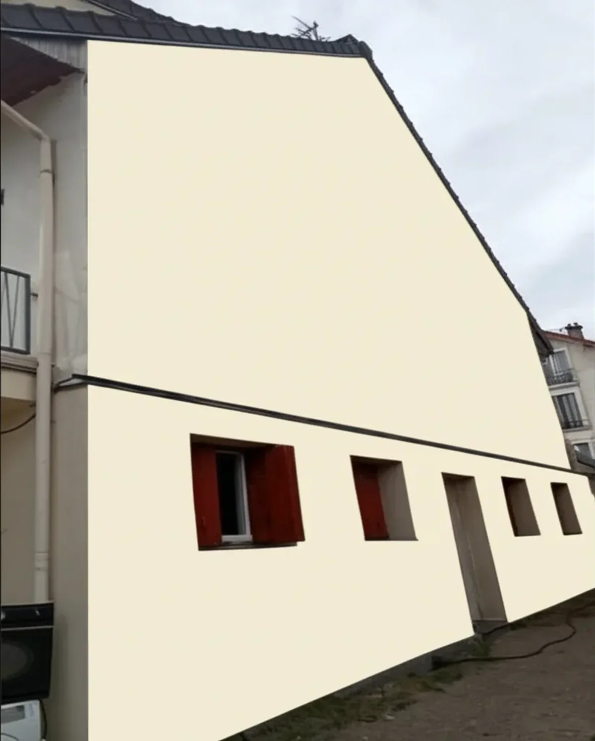
Upload a photo of your cottage and preview heritage colours in 30 seconds
Cotswold cottages: honey, oatmeal and cream
The Cotswolds Area of Outstanding Natural Beauty covers almost 2,000 km² across Gloucestershire, Oxfordshire and Wiltshire, and every listed cottage within it is expected to complement the warm oolitic limestone that defines the region. When exposed stone is repointed or when rendered cottages are repainted, the colours should echo that honey-to-oatmeal spectrum rather than fight it.
Think clotted cream renders, soft buttery limewashes, and joinery in muted sage, bottle green or off-black. Bright white is generally too cold; pure magnolia reads suburban. The Cotswolds Conservation Board publishes design guidance steering homeowners toward mineral pigments and earth tones, and most district councils (Cotswold District, West Oxfordshire) adopt similar guidance.
Cotswold cottage palette
| Tone | Farrow & Ball | Dulux Heritage | Best use |
|---|---|---|---|
| Honey stone | String No.8 | DH Stone Pale | Rendered walls |
| Oatmeal | Matchstick No.2013 | DH Proper Beige | Limewashed cob |
| Clotted cream | New White No.59 | DH Proper Magnolia | North-facing elevations |
| Sage trim | Lichen No.19 | DH Sage Green | Doors, windows |
| Bottle green | Studio Green No.93 | DH Regency Green II | Front doors |
Try it on your house
No photo? Try a sample
Avoid modern brilliant whites and cold grey-beiges on Cotswold elevations. If your cottage is grade II listed, mineral silicate or limewash is almost always preferred over acrylic masonry paint: the stone needs to breathe, and non-breathable coatings trap moisture that damages oolite over a decade.
A practical tip from Cotswold decorators: pair warm wall tones with darker window reveals, typically a soft off-black such as Farrow & Ball Off-Black No.57 or Dulux Heritage Jet Black, to add definition. Cast iron rainwater goods in the same deep tone tie the composition together and age gracefully next to stone. Bright white uPVC is nearly always out of keeping in conservation-designated Cotswold villages and will often be refused consent outright when listed consent is needed.
Yorkshire cottages: slate grey, stone and heather
Yorkshire's vernacular is a world away from the honeyed south. Millstone grit, the dark sedimentary sandstone of the Pennines, weathers to charcoal, soot-black and dusky grey, and the cottages of Haworth, Hebden Bridge and the Dales carry that palette into their paintwork. The North York Moors and Yorkshire Dales National Parks both publish design guidance calling for muted, earth-bound colours that do not "jar" against stone terraces.
Rendered Yorkshire cottages lean into warm stone-greys rather than blue-greys: Portland stone, pebble, flint. Joinery is typically deep: oxblood red, mulberry, blackened green. A touch of heather purple or moorland plum nods to the surrounding landscape and works beautifully on cottage doors seen from a lane or village green.
Yorkshire cottage palette
| Tone | Farrow & Ball | Dulux Heritage | Best use |
|---|---|---|---|
| Slate grey | Down Pipe No.26 | DH Lead Colour | Render, rainwater goods |
| Pennine stone | Mouse's Back No.40 | DH Dusted Heather | Lime render |
| Heather purple | Brinjal No.222 | DH Purple Sage | Front door accent |
| Oxblood | Preference Red No.297 | DH Red Sand | Doors, porches |
| Charcoal | Railings No.31 | DH Cast Iron | Window frames |
In the Dales, avoid bright coastal whites and pastel blues: they look misplaced against gritstone. For exposed Pennine elevations battered by driving rain up to 1,400 mm per year, breathable silicate paints (Keim, Beeck) outperform acrylics and are widely accepted by conservation officers.
Yorkshire terraces often run in continuous rows sharing a party wall, and conservation officers routinely request that colour choices be coordinated with neighbours to preserve the rhythm of the street. If you are in a village such as Grassington, Askrigg or Reeth, it is worth knocking on a few doors before finalising your palette. A single mismatched cottage in a row of twelve is more visually jarring than it sounds, and councils increasingly cite this under Section 72 of the Planning (Listed Buildings and Conservation Areas) Act 1990.
Cornish cottages: whitewash, pebble and pale blue
Along the Cornish coast, traditional cottages were limewashed white to reflect sea glare, seal the granite or cob walls, and act as a navigational marker for fishermen. Villages such as Mousehole, Polperro and Port Isaac are protected conservation areas where the characteristic whites and pale coastal hues are actively enforced. Cornwall Council's design guide identifies lime wash, pebble, shell and pale sky blue as the defining palette.
The trick in Cornwall is avoiding the sterile brilliant white of modern masonry paint, which reads harsh in sea light. Traditional limewash or lime-based silicate gives that soft, chalky, slightly uneven finish that photographs so well at golden hour. Accent joinery ranges from pale duck-egg to inky navy, echoing the fishing boats in the harbour below.
Cornish cottage palette
| Tone | Farrow & Ball | Dulux Heritage | Best use |
|---|---|---|---|
| Lime whitewash | Wimborne White No.239 | DH White Lead | Main walls |
| Pebble | Shaded White No.201 | DH Pebble Shore | Sheltered rendered elevations |
| Shell | Tallow No.203 | DH Natural Hessian | South-facing cottages |
| Duck-egg | Pale Powder No.204 | DH Regatta | Doors, shutters |
| Harbour navy | Hague Blue No.30 | DH Indigo Shade | Front doors, gates |
Cornish salt air is brutal on paintwork. Choose mineral or silicate systems on exposed cottages; acrylic masonry will often blister within three to four winters on a sea-facing gable. Budget for annual washing down of sea-facing elevations to remove salt crystals, and expect a full repaint every five to seven years on headland properties versus ten to twelve in sheltered valleys.
Many Cornish conservation areas (St Ives, Fowey, Padstow) also regulate door colour on painted cottages. Deep traditional pigments, holly green, pillar-box red, oxford blue, work beautifully against limewashed walls, but neon brights and unpainted hardwood doors can be refused under Article 4 controls. The Cornwall Design Guide lists acceptable heritage door colours, typically drawn from National Trust or Farrow & Ball archives, and this is often the quickest path to a no-fuss planning outcome.
Conservation area and listed building rules
Before you paint: the 3 legal checks
- Listed status: If your cottage is grade I, II* or II listed, you will almost certainly need Listed Building Consent to change external colour or material, even by one shade. Applications are free but can take 8 to 12 weeks. Unconsented work is a criminal offence under the Planning (Listed Buildings and Conservation Areas) Act 1990.
- Conservation area: Roughly 10,000 conservation areas exist in England. Many are covered by an Article 4 direction removing permitted development rights, which means painting a previously unpainted wall, or changing colour, needs planning permission.
- Paint type: Historic England strongly recommends breathable mineral or lime-based coatings on traditional solid-wall cottages. Modern plastic masonry paint traps moisture and accelerates stone decay.
Check your status on the Historic England National Heritage List and your local council's planning portal before ordering paint.
Regional palette comparison at a glance
If you are juggling samples across all three regions, perhaps because you own a holiday let in one area and a main home in another, the table below summarises the defining character of each vernacular.
| Region | Wall tone | Joinery accent | Recommended finish |
|---|---|---|---|
| Cotswolds | Honey, oatmeal, cream | Sage, bottle green, off-black | Limewash / mineral silicate |
| Yorkshire | Slate grey, pebble, stone | Oxblood, heather, charcoal | Silicate masonry |
| Cornwall | Whitewash, shell, pale blue | Duck-egg, harbour navy, holly green | Lime wash / marine-grade mineral |
Questions homeowners ask us most
Do I need planning permission to paint my cottage exterior?
In most cases, no, repainting a previously painted surface in a similar colour is permitted development. However, if your cottage is listed you will need Listed Building Consent for any colour change. If you live in a conservation area with an Article 4 direction, even a colour change on an unlisted property may require planning permission. Always check with your local authority's planning department before starting. Fines for unauthorised work on listed buildings can be unlimited in the magistrates' court.
Are Farrow & Ball paints suitable for exterior cottage walls?
Farrow & Ball's Exterior Masonry and Limewash ranges are formulated for traditional buildings and used widely on listed cottages. For pre-1919 solid-wall properties, the Limewash or the Dulux Heritage mineral range will be more breathable than standard acrylic exterior paint. Always specify a breathable coating on lime-rendered, cob or soft-stone cottages to avoid trapping damp.
How do I test a heritage colour before committing?
Order A4 peel-and-stick swatches from Farrow & Ball or Dulux Heritage and pin them to different elevations for at least a week, viewing morning, midday and golden hour. Colours shift dramatically with light. Before ordering physical samples, upload a photo of your cottage to our free AI visualiser to preview the palette in situ, then commission test patches at around 1 m² on each main elevation. Budget at least 10 to 14 days for this process before the decorator starts.
Preview Cotswold honey, Yorkshire slate or Cornish whitewash on your cottage
Choosing a cottage colour that fits its region is the single biggest decision in any exterior repaint. Test your shortlist on a photo of your own home with our free AI colour visualiser, then confirm with A4 swatches and your conservation officer before you order. Sources: Historic England, Farrow & Ball Heritage Archive, Dulux Heritage colour range, Cotswolds Conservation Board, Cornwall Council design guide.
Frequently asked questions
Do I need planning permission to paint my cottage exterior?
Are Farrow and Ball paints suitable for exterior cottage walls?
How do I test a heritage colour before committing?
How many simulations did Hugo Dumoulin analyse for the 2026 White Barometer?
Trademarks mentioned (Sherwin-Williams, Benjamin Moore, Behr, Caparol, Brillux, Sto, Alpina, Valspar, PPG, Glidden, Dulux, Crown Trade, Sandtex, Farrow & Ball, Johnstone's, Leyland) are property of their respective owners. FacadeColorizer is independent and not affiliated with any of them. Nominative fair use under Lanham Act §1125.