
Half-timbered Tudor and mock-Tudor houses remain one of the most romantic silhouettes of the English landscape, from Cheshire black-and-white villages to 1930s suburban semis in Surrey. Yet nothing spoils a Tudor facade faster than the wrong shade of "brilliant white" render or a cold chocolate-brown timber stain. Heritage architects and Historic England agree: the right colour pairing can transform a tired facade into a listed-quality showpiece.
This 2026 guide lists the ten most authentic Tudor exterior palettes, the Farrow & Ball and Little Greene heritage codes that match them, and the conservation rules you must respect on Grade II listed properties.
For full pricing, see our complete UK cost guide.
Why Tudor colour schemes are so unforgiving
Unlike a Georgian townhouse that tolerates a wide palette of stone and pastel shades, a Tudor elevation relies on a strict two- or three-tone contrast: dark structural timber against a pale infill panel, framed by a warm-toned roof. Miss the balance and the house either looks like a Disney cartoon (too white, too black) or a muddy barn (the wrong browns). The effect must read as centuries old, even when the property is a 1932 mock-Tudor.
The good news is that the right heritage colours are well-documented. Farrow & Ball, Little Greene and Edward Bulmer Natural Paint all publish period-correct ranges based on pigment analysis of surviving 16th and 17th century timber-framed buildings. The Society for the Protection of Ancient Buildings (SPAB) also provides free technical advice on traditional finishes suitable for Tudor properties across England and Wales.
Authentic Tudor vs mock-Tudor: know the difference
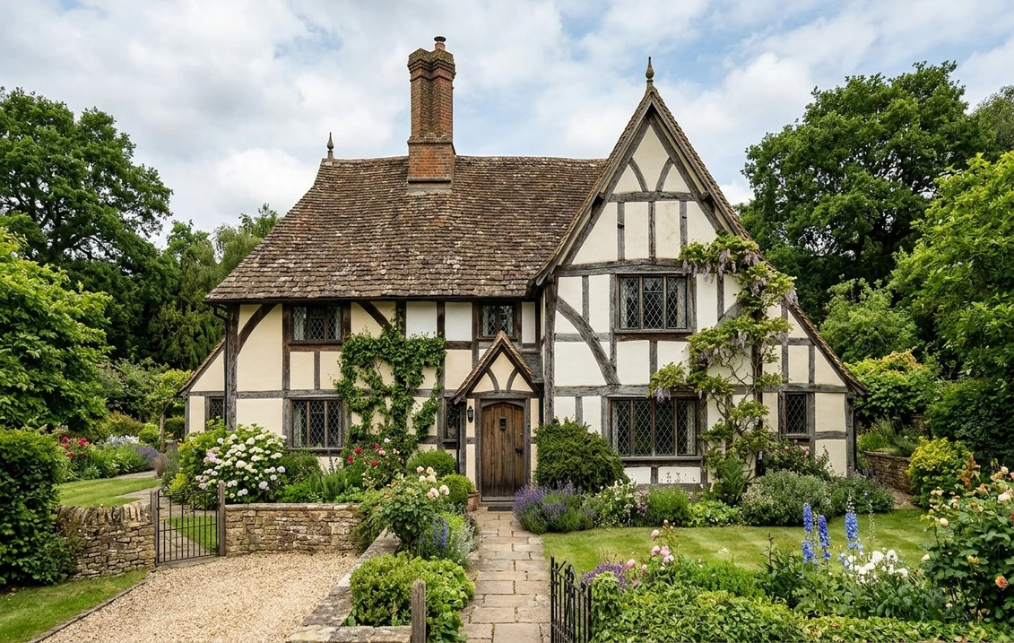
Before picking a colour, identify what you actually own. A genuine Tudor or Jacobean property (1485-1625) has structural oak timbers that support the building, with lime-and-horsehair infill panels between them. A mock-Tudor house (typically 1890-1940) has decorative timbers nailed to a brick or block wall, with cement render between them.
The distinction matters. Authentic Tudor timbers were rarely jet black until the Victorians tarred them; originally they were silvered oak or limewashed grey. Mock-Tudor houses were designed with black-painted timbers, so a deep off-black reads as historically correct on a 1930s semi.
The top 10 authentic Tudor exterior palettes for 2026
Each palette below pairs a timber colour with a render or infill colour, plus a recommended heritage paint code. Use these as your starting point, then test on a photograph of your actual house before committing.
| Palette | Timber colour | Render / infill | Best for |
|---|---|---|---|
| 1. Cheshire Classic | F&B Off-Black No.57 | F&B Jitney No.293 | 1920s-30s mock-Tudor semis |
| 2. Kentish Weald | F&B Tanner's Brown No.255 | F&B Joa's White No.226 | Genuine Tudor, Kent/Sussex |
| 3. Lime-Washed Oak | Little Greene Lamp Black 228 | Little Greene Slaked Lime 105 | Listed Tudor, lime-render |
| 4. Suffolk Oatmeal | F&B Off-Black No.57 | F&B Oxford Stone No.264 | East Anglian farmhouses |
| 5. Warwickshire Dark Oak | F&B Mahogany No.36 | F&B School House White No.291 | Midlands manor houses |
| 6. Surrey Suburbia | F&B Black Blue No.221 | F&B Slipper Satin No.2004 | Inter-war mock-Tudor |
| 7. Devon Longhouse | Little Greene Bronze 247 | Little Greene Stock Day 36 | Cob & thatched Tudor |
| 8. Welsh Marches Grey | F&B Railings No.31 | F&B Shaded White No.201 | Border black-and-white |
| 9. Herefordshire Cream | F&B Off-Black No.57 | F&B String No.8 | Yeoman farmhouses |
| 10. London Mock-Tudor | F&B Off-Black No.57 | F&B Wimborne White No.239 | Metroland 1930s homes |
Try it on your house
No photo? Try a sample
Upload a photo of your Tudor facade and test all 10 palettes in seconds
The Farrow & Ball Off-Black No.57 + Jitney No.293 gold standard
If you take only one recommendation from this guide, make it this pairing. Off-Black No.57 is a softened charcoal that avoids the harsh modern quality of pure black while still reading as unmistakably "Tudor timber". It has a faint brown undertone that flatters oak and weathered elm alike, and it sits comfortably against both warm cream renders and cooler lime-washed finishes.
Paired with Jitney No.293, a warm oatmeal neutral released by Farrow & Ball in 2022, the effect is instantly aged. Jitney avoids the three deadly sins of Tudor render: the greenish cast of cheap trade whites, the yellow chalkiness of magnolia, and the blue-white glare of brilliant white. On south-facing walls it reads cream; on north-facing it reads pale stone. The underlying warmth also hides the small tonal variations inevitable on hand-applied lime or sand-textured render.
Use Farrow & Ball's Exterior Eggshell on timbers for a subtle sheen that matches the waxed quality of old oak, and Exterior Masonry in a dead-flat finish on render. Avoid mixing finishes between walls and timbers: a glossy render next to matt beams will always look wrong.
Lime render and dark oak for listed properties
For a Grade II listed Tudor, modern plastic paints are almost never appropriate. Lime render and limewash are typically mandated because they allow the timber frame to breathe and release moisture. Cement render and vinyl paint trap damp inside the oak, causing rot within a decade.
Little Greene Slaked Lime 105 over traditional lime render, combined with linseed-oil-bound Lamp Black 228 on the timbers, is the closest modern equivalent to a 17th century finish. Expect the lime to mellow and silver over two to three years, which is exactly the character a heritage officer wants to see.
Limewash must be applied in at least three thin coats, never one thick coat, and only in dry conditions between 8 and 25 degrees Celsius. A properly limewashed Tudor wall will last 7 to 10 years before needing a simple refresh coat, without the peeling and cracking that ruins plastic paints on traditional buildings. Budget approximately 18 to 28 pounds per square metre for a hand-applied limewash finish by a heritage-trained decorator.
Heritage rules for Grade II listed Tudor houses
Listed Building Consent is almost always required
Any change of colour, even like-for-like, to a Grade II or Grade II* Tudor property requires Listed Building Consent from your local planning authority. The application is free but unauthorised work is a criminal offence under the Planning (Listed Buildings and Conservation Areas) Act 1990, with unlimited fines and compulsory reinstatement at your cost.
Historic England guidance (HE Advice Note 2, 2017) requires you to justify any paint change with pigment analysis, photographic evidence, or reference to the Heritage Statement for the property. Conservation officers generally refuse modern plastic paints and insist on limewash, distemper or linseed-oil paints.
Conservation area considerations
Even unlisted Tudor-style houses inside a conservation area may fall under an Article 4 Direction that removes permitted development rights for painting. Check your council's local plan before ordering paint. In high-profile areas such as Chester Rows, Lavenham, Shrewsbury, Stratford-upon-Avon and parts of Rye, specific palettes are effectively mandated and deviating will trigger enforcement notices. Expect the council to request a colour sample on a discreet elevation and photographic evidence of existing neighbouring properties before approving your scheme.
Where Article 4 applies, planning permission for painting is free and typically determined within eight weeks. Combine the application with a short design and access statement that references the Historic Area Appraisal for your conservation area; most councils publish these online and they set out which palettes are considered acceptable.
Roof tile harmonies: clay, slate and thatch
Your roof colour is effectively your third palette element and cannot be changed easily. Work with it, not against it.
- Red clay tiles (Kent, Sussex, Surrey): pair with warm creams like Jitney, String or Oxford Stone. Avoid cool greys that fight the roof.
- Welsh or Cornish slate: cool greys and lime-white work beautifully. Try Shaded White or Slaked Lime.
- Thatch (Devon, Dorset, Hampshire): the honey tones of straw demand a warm render. School House White or Stock Day sit perfectly underneath.
- Stone slates (Cotswolds, Yorkshire): mushroom and oatmeal tones echo the roof. Jitney and Joa's White are safe bets.
Casement windows: the often-forgotten fourth colour
Authentic Tudor casements were leaded glass in dark oak or wrought-iron frames. Modern uPVC "woodgrain effect" windows in beige ruin even the best render scheme. If replacement is not possible, paint timber casements in the same off-black as your structural timbers. Avoid painting iron or lead windows in brilliant white, which reads immediately as 1990s suburbia and fights the aged quality of the render.
For timber front doors, authentic Tudor houses favoured studded oak in its natural state or dark green milk paint (Little Greene Mid Brunswick Green 128 is an excellent modern equivalent). On mock-Tudor semis a deep British Racing Green or Farrow & Ball Studio Green No.93 suits the period better than the gloss black typically seen on Georgian townhouses.
Five common mock-Tudor mistakes to avoid
These are the errors heritage architects see most often on 1920s-30s semis across the UK:
- Brilliant white render. PPG Trade Brilliant White kills every Tudor facade. It reads blue-white in daylight and reflects too much sun. Use Jitney, Wimborne White or String instead.
- Wrong brown timber stain. Orange-brown stains (Cuprinol Red Cedar, Ronseal Dark Oak) look like garden fencing. Opt for Off-Black, Railings or Tanner's Brown.
- Grey render with black timber. A cold grey infill makes the whole house look like a multi-storey car park. Tudor render must be warm.
- High-gloss finishes. Modern gloss looks plastic. Use eggshell or dead-flat finishes that read as old oil paint.
- Ignoring brick plinths. Red-brick plinths often read as orange against cold greys. Balance with warm creams above.
Frequently asked questions about Tudor exterior colours
Can I paint my Grade II listed Tudor house a different colour?
Only with Listed Building Consent from your local planning authority. Historic England requires evidence of historical accuracy, typically through pigment analysis or reference to the Heritage Statement. Unauthorised colour changes are a criminal offence under the Planning (Listed Buildings and Conservation Areas) Act 1990, with unlimited fines. Most conservation officers insist on limewash, distemper or linseed-oil paint rather than modern plastic finishes.
Is Farrow & Ball Off-Black No.57 better than pure black for Tudor timbers?
Yes, for almost every Tudor and mock-Tudor property. Off-Black No.57 contains a subtle brown undertone that reads as aged oak rather than modern industrial black. Pure black (Farrow & Ball Pitch Black or trade jet black) looks harsh on timber-framed facades and fights warm creams or lime renders. Off-Black is the default choice for 1920s-30s mock-Tudor and works equally well on genuine Tudor timbers that have been previously painted.
What render colour works best with red clay roof tiles on a mock-Tudor house?
Warm cream and oatmeal shades harmonise with red clay. The top three choices are Farrow & Ball Jitney No.293, Oxford Stone No.264 and Wimborne White No.239. Avoid cool greys, blue-whites and yellow magnolia, all of which clash with the orange-red tone of clay tiles. For Welsh slate roofs, cooler greys like Shaded White or Slaked Lime are preferable.
Test all 10 heritage palettes on your own Tudor facade in under a minute
The difference between a Tudor house that sells for a premium and one that looks tired is almost always colour. Test Off-Black No.57 with Jitney No.293, or our nine other heritage palettes, on a photograph of your actual property using our free AI colour visualiser before booking any decorator. Sources: Historic England Advice Notes, Farrow & Ball Heritage Collection, Little Greene Colour Scales.
Trademarks mentioned (Sherwin-Williams, Benjamin Moore, Behr, Caparol, Brillux, Sto, Alpina, Valspar, PPG, Glidden, Dulux, Crown Trade, Sandtex, Farrow & Ball, Johnstone's, Leyland) are property of their respective owners. FacadeColorizer is independent and not affiliated with any of them. Nominative fair use under Lanham Act §1125.