
According to Farrow & Ball trend reports and House & Garden editors, the dining room is having a renaissance in 2026: high-saturation jewel tones, deep aubergines and oxblood reds are dethroning the safe greys that dominated UK interiors for a decade. The reason is simple, dining rooms are evening rooms, used under candlelight or warm 2700K lighting, where rich colours come alive rather than feeling oppressive.
This guide presents the top 15 dining room paint colours UK 2026, from Farrow & Ball Hague Blue to Edward Bulmer Cuban Brown, with LRV values, drenching tips and period property considerations. Whether you live in a Georgian terrace, Victorian semi or new-build, you will find a sophisticated entertainment palette here.
For full pricing, see our complete UK cost guide.
Why dining rooms suit dramatic, saturated colour
Unlike kitchens or living rooms, dining rooms are typically used after sunset, with the curtains drawn, candles lit and warm pendant lighting overhead. This is the optimal context for low-LRV jewel tones, colours with a Light Reflectance Value below 20 that would feel claustrophobic in a north-facing morning room but become enveloping and theatrical at dinner.
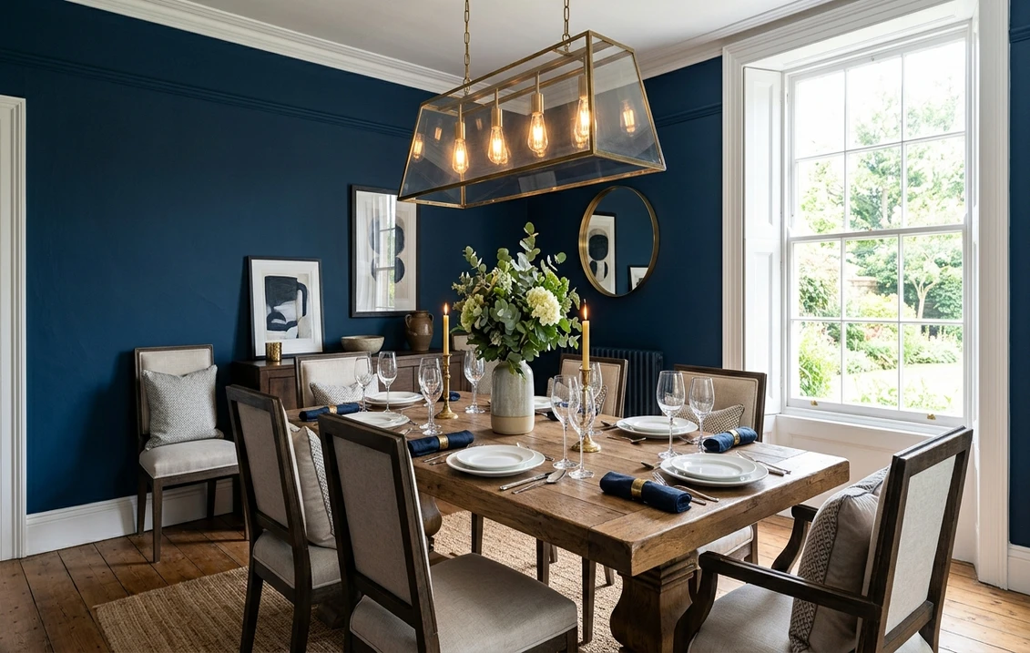
Interior designers call this the candlelight effect: deep blues turn velvety, oxblood reds glow like garnet, and aubergines shift toward black. Add a polished mahogany table, a brass chandelier and white linen, and even a modest semi feels like a private dining club.
The colour drenching trend explained
The dominant 2026 trend is colour drenching: painting walls, ceiling, skirting, cornicing and woodwork in the same hue, often in different finishes (estate emulsion on walls, dead flat on ceiling, eggshell on woodwork). The effect erases architectural boundaries and creates a jewel box.
Drenching works particularly well with Farrow & Ball Hague Blue No. 30, Studio Green No. 93 and Pelt No. 254, where the depth of colour absorbs shadows rather than highlighting them. The technique is favoured by designers like Beata Heuman and Rita Konig, and increasingly seen in House & Garden Top 100 interiors.
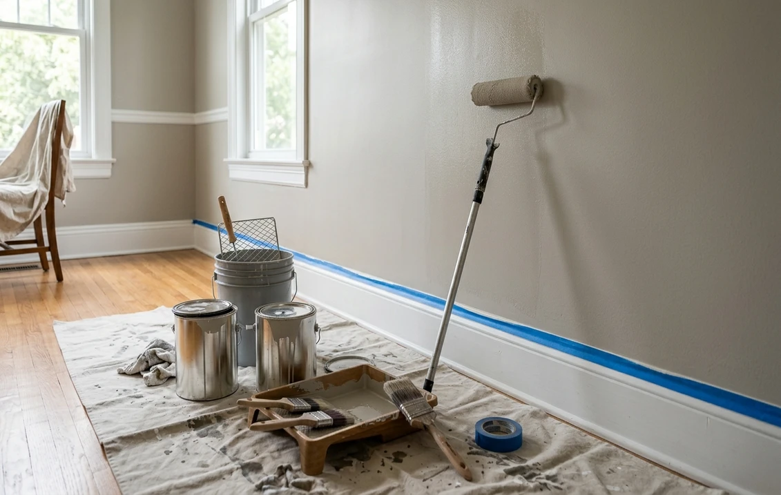
Upload your dining room photo - test 15+ shades in 30 seconds
Top 15 dining room paint colours UK 2026
Below are the fifteen most specified dining room shades for 2026, sourced from Farrow & Ball, Little Greene, Crown, Dulux Heritage, Edward Bulmer and Benjamin Moore. Each entry includes LRV (Light Reflectance Value) and the optimal architectural use.
| Colour | Brand & Code | LRV | Best for |
|---|---|---|---|
| Hague Blue | Farrow & Ball No. 30 | 7 | Walls + ceiling drench |
| Studio Green | Farrow & Ball No. 93 | 5 | Full drench, wainscoting |
| Eating Room Red | Farrow & Ball No. 43 | 8 | Walls (Georgian) |
| Pelt (deep aubergine) | Farrow & Ball No. 254 | 5 | Full drench, candlelit |
| Mid Lead Colour | Little Greene No. 113 | 22 | Wainscoting, woodwork |
| Heath | Little Greene No. 233 | 12 | Walls, accent |
| Stone Mason | Crown Easycare | 35 | Ceiling, wainscoting upper |
| Marrakesh Red | Dulux Heritage | 9 | Walls (terracotta warmth) |
| De Nimes | Farrow & Ball No. 299 | 21 | Wainscoting, lower walls |
| Mizzle (sage) | Farrow & Ball No. 266 | 38 | Walls, ceiling (light dining) |
| Cuban Brown | Edward Bulmer | 11 | Full drench, period homes |
| Caliente AF-290 | Benjamin Moore (specialist) | 10 | Accent wall, fireplace |
| Picture Gallery Red | Farrow & Ball No. 42 | 9 | Walls + ceiling drench |
| Cromarty | Farrow & Ball No. 285 | 62 | Ceiling, woodwork (contrast) |
| Paean Black | Farrow & Ball No. 294 | 7 | Accent wall, dramatic drench |
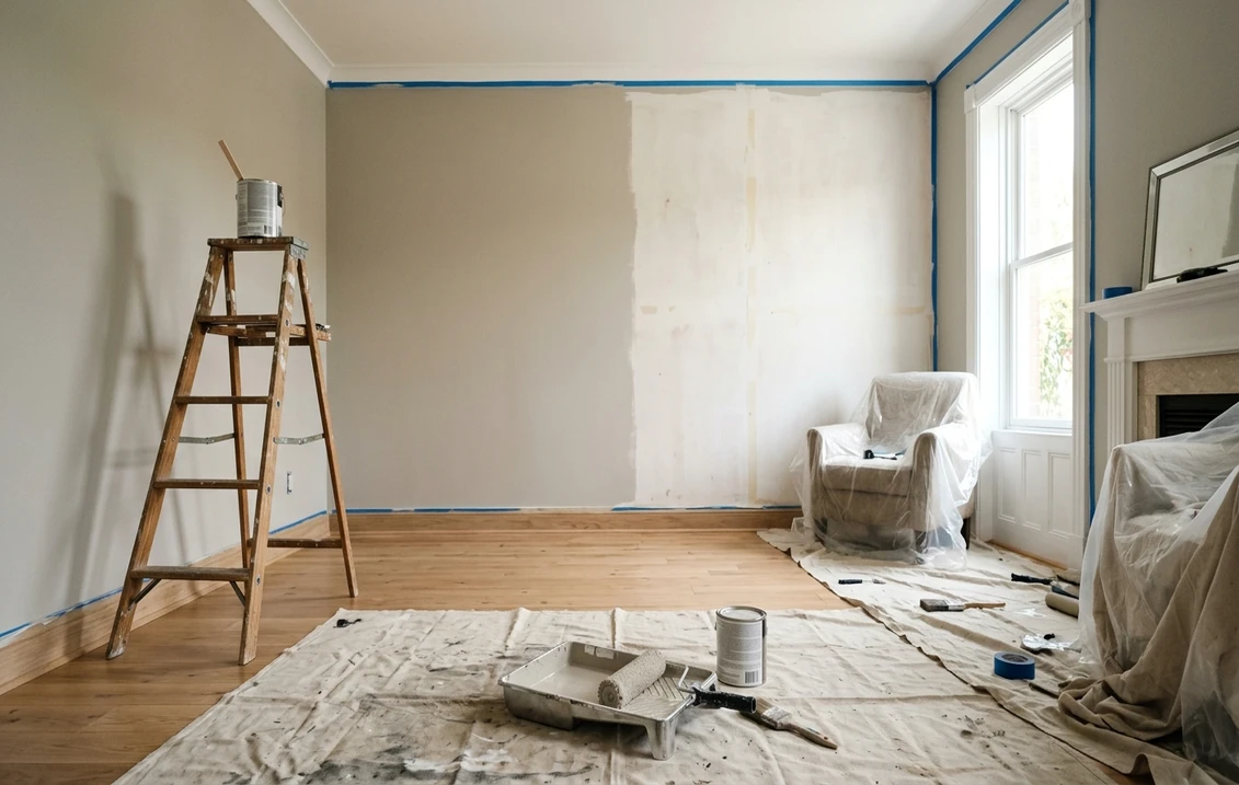
Try it on your house
No photo? Try a sample
Deep dive: the five most specified shades
1. Farrow & Ball Hague Blue No. 30
A deep, ink-toned blue with grey undertones, Hague Blue is the most specified dining room colour of 2026 according to Farrow & Ball trade data. It pairs beautifully with brass, antique mahogany and gilt mirrors, evoking the smoking rooms of Pall Mall clubs.
Drench it from skirting to ceiling for maximum effect. In Georgian properties, leave the cornicing slightly paler in Cromarty No. 285 to highlight period plasterwork. LRV 7, north or east-facing rooms benefit most.
2. Farrow & Ball Studio Green No. 93
Studio Green is one of the deepest greens in the F&B archive, almost black at night and forest-green by day. It is the natural successor to navy in 2026, particularly in Victorian dining rooms with picture rails and panelling.
Use on full wainscoting (lower 110 cm of wall) with a paler chalk-white above for traditional Georgian proportion. Or drench entirely for a saturated, library-like effect. Pairs with terracotta floor tiles and unlacquered brass.
3. Farrow & Ball Eating Room Red No. 43
As the name suggests, this is the archetypal Georgian dining colour, an oxblood red derived from National Trust archives. It was traditionally used because reds were thought to stimulate conversation and complement the patina of old portraits.
In a period property with high ceilings, pair Eating Room Red walls with Stone Mason ceiling and Mid Lead Colour woodwork for a properly historic Georgian half-wall scheme.
4. Farrow & Ball Pelt No. 254
A deep, velvety aubergine-purple with brown undertones, Pelt is the boldest pick on this list and increasingly the favourite of London-based interior designers. It is almost black under tungsten light, but reveals plum richness in daylight.
Best used as a full drench in a small to mid-size dining room (under 18 m²), where the saturation feels intentional rather than accidental. Pair with cream linen, candle sconces and a single oversized abstract painting.
5. Edward Bulmer Cuban Brown
Edward Bulmer Natural Paint specialises in natural-pigment, plant-based emulsions, free from acrylics and microplastics, ideal for listed and period properties where breathability matters. Cuban Brown is a warm, tobacco-toned brown that evokes 1920s gentlemen's clubs.
It works exceptionally well in Georgian and Regency dining rooms because the natural pigment has a depth and complexity synthetic paint cannot replicate. Drench it with eggshell on woodwork for an authentic 18th-century finish.
Wainscoting: the historic Georgian half-wall
If your home is Georgian (1714-1830) or early Victorian (1837-1880), it likely has, or should have, wainscoting: panelling on the lower portion of the wall, traditionally to dado-rail height (approximately 90-110 cm from the floor). Originally fitted to protect plaster from chair backs, it is now a defining feature of historic dining rooms.
The classic Georgian scheme paints wainscoting in a darker shade than the upper wall, anchoring the room visually and grounding the dining table. Period-correct combinations include:
- Mid Lead Colour 113 wainscoting + Stone Mason upper wall
- De Nimes 299 wainscoting + Cromarty 285 upper wall
- Studio Green 93 wainscoting + Mizzle 266 upper wall
- Eating Room Red 43 wainscoting + cream upper wall
If you do not already have wainscoting, modern MDF panelling kits (B&Q, Wickes, or specialist suppliers like The Wood Veneer Hub) can be fitted for £200-£500 per wall and look authentic once painted in eggshell.
Period property considerations
UK period homes have specific requirements that ordinary acrylic emulsions can fail to meet:
Listed buildings and conservation areas
If your property is Grade I or II listed, internal paint colour usually does not require listed building consent, but always check with your local conservation officer for protected interior schemes (rare but possible for stately homes opened to the public). Lime plaster and historic walls require breathable paints, Edward Bulmer Natural Paint, Bauwerk Lime Wash or F&B Limewash are appropriate.
Damp-prone Victorian and Edwardian walls
Older solid-wall properties (1900 and earlier) often suffer from rising or penetrating damp. Sealing them with vinyl emulsion traps moisture and worsens the problem. Use mineral or limewash paints, or breathable acrylics like Crown Easycare in the Stone Mason shade, which permits some vapour transmission while resisting marks.
Original cornicing and ceiling roses
Picking out cornicing in contrast white is a Victorian convention but increasingly considered dated. The 2026 trend, especially in Hague Blue or Pelt drenches, is to paint cornicing the same colour as the walls and ceiling, allowing the relief to read as texture rather than line.
Lighting: the make-or-break factor
Saturated jewel tones only work under appropriate lighting. Cool LED bulbs (4000K+) flatten Hague Blue into mud and turn Eating Room Red orange. The rule for dining rooms is simple:
- 2700K warm white as the standard ceiling and pendant temperature
- 2200K ultra-warm filament bulbs for table lamps and sconces
- Real candles for evening dining, no LED replacement matches the flicker
- Dimmer switches on every light fitting
Test your shortlisted colours in the room at 7pm with the curtains drawn and the intended lighting, not at midday by the window. This is where most dining room paint decisions go wrong.
See Hague Blue, Studio Green, Eating Room Red on your actual walls
Traffic flow and finish durability for dining rooms
A typical UK dining room sees 200 to 600 use-hours per year, considerably less than a hallway or kitchen but with one specific durability requirement: wine and food splash resistance. Specifying a Class 4 matt (low wet-scrub) on a wall behind a dining chair almost guarantees a localised stain at year two when a glass of Malbec finds an opportunity. The decorator's standard 2026 specification is therefore Class 2 washable matt on dining room main walls, even when the rest of the house uses a softer Class 3 to 4 finish. Farrow & Ball Modern Emulsion, Little Greene Intelligent Matt, Crown Easyclean, and Dulux Trade Diamond Matt all meet that specification.
For panelling, wainscoting, and dado rails, eggshell remains the standard. The British Standards reference for wet-scrub testing is BS EN 13300; for substrate preparation under wainscoting (where filler and caulking are heavily used), BS 7079 sets the preparation standard. The BSI British Standards index covers both references plus BS EN 1062 for exterior coatings if your dining room links to an orangery or conservatory addition.
Drenching and lighting interaction
The colour-drenching technique that dominates 2026 dining room specifications only works under correctly-specified lighting. A full Hague Blue or Pelt drench under 4000K cool LED bulbs collapses into a flat, almost greenish mass that bears no resemblance to the Farrow & Ball sample card. The right lighting is 2700K warm-white as the base, ideally with 2200K filament table lamps and real candles for evening dining. Dimmer switches on every fitting are non-negotiable. For the official UK lighting regulatory framework, Approved Document L on gov.uk sets minimum lumens per square metre.
A common 2026 mistake is over-bulb the room. Dining rooms feel best at roughly 100 to 150 lux at table height, comparable to a candlelit restaurant. Bright kitchen-style downlights (300 to 500 lux) destroy the jewel-tone effect that drove the Hague Blue specification in the first place. Brief your electrician to install at least two separate dimmable circuits: a low-wattage ambient overhead and high-CRI accent lighting for the table itself. CIBSE lighting guidance covers Colour Rendering Index (CRI) values that affect pigment depth perception under different bulb temperatures.
Paint finishes UK: matt, eggshell, satin and gloss in the dining room
The table below maps the four UK interior finishes against BS EN 13300 wet-scrub Class and recommends a typical dining room application. Drenching schemes typically use matt on ceiling, washable matt on walls, and eggshell on woodwork to create subtle sheen variation under candlelight.
| Finish | Light reflection | Washability (BS EN 13300) | Dining room use | £ per 2.5L |
|---|---|---|---|---|
| Matt | Less than 10 percent | Class 3 to 4 | Ceiling, cornicing (drench) | £24 to £56 |
| Washable matt | Less than 10 percent | Class 1 to 2 | Main walls (food and wine splash) | £32 to £58 |
| Eggshell | 10 to 25 percent | Class 2 | Wainscoting, skirting, woodwork | £32 to £48 |
| Satin | 25 to 40 percent | Class 1 to 2 | Panelling (occasional, modern schemes) | £36 to £55 |
| Gloss | Over 60 percent | Class 1 | Traditional Georgian dado, radiator | £28 to £42 |
For a plain-English consumer reference on finish selection, Dulux UK's official finish guide covers each category with photographic examples. UK stockists B&Q, Wickes, Homebase, and Screwfix carry the four finishes from Dulux Trade, Crown, Johnstone's, and Leyland. Sandtex remains the trade reference for any exterior bay window or orangery transition.
Frequently asked questions
What is the most popular dining room paint colour in the UK in 2026?
According to Farrow & Ball trade data and House & Garden editorial coverage, Farrow & Ball Hague Blue No. 30 remains the most specified dining room shade in 2026, followed by Studio Green No. 93 and Eating Room Red No. 43. Deep aubergines like Pelt No. 254 are the fastest-rising trend, particularly in London townhouse dining rooms. The common factor is low LRV (5-9), allowing the colour to glow under candlelight rather than feel flat in daylight.
Should I drench my dining room in one colour or use contrasting shades?
Colour drenching (one shade on walls, ceiling, skirting and woodwork) is the dominant 2026 trend and works best in dining rooms used primarily in the evening. It creates an enveloping, jewel-box effect that flatters candles and conversation. Use contrasting wainscoting (darker lower wall, paler upper wall) only if your home is Georgian or early Victorian and already has a dado rail, otherwise the proportions feel forced. Modern open-plan kitchen-diners suit drenching better than dado schemes.
Are dark dining room colours suitable for small rooms?
Yes, contrary to popular belief. Small dining rooms (under 12 m²) often suit deep colours better than large ones, because the saturation feels intentional rather than accidental. The trick is to commit fully: drench the entire room in Pelt 254 or Hague Blue 30, add warm 2700K lighting and a single oversized mirror to bounce light. Trying to "lighten" a small dark room with white skirting and ceiling usually emphasises its smallness; drenching makes the boundaries dissolve.
Is Edward Bulmer paint worth the premium for period homes?
For listed buildings, lime-plastered walls and pre-1919 properties, yes. Edward Bulmer Natural Paint uses plant-based binders and natural pigments, allowing the wall to breathe and preventing damp issues common with vinyl emulsions on solid walls. The colour depth is also unmatched, his Cuban Brown and Invisible Green have a complexity synthetic paints cannot replicate. For modern new-builds, the technical benefit is smaller and Farrow & Ball or Little Greene offer comparable aesthetics at lower cost.
How do I get Benjamin Moore Caliente AF-290 in the UK?
Benjamin Moore is an American brand with limited direct UK distribution. The most reliable route is via specialist retailers such as Shaws of Darwen, Brewers Decorator Centres (selected branches) or online via Decorating Direct. Expect 5-10 day lead times and a 20-30% premium versus Farrow & Ball. As a UK alternative for the same warm oxblood, consider Little Greene Bronze Red 15 or Dulux Heritage Marrakesh Red, both stocked through standard UK trade counters.
The right dining room colour transforms an ordinary room into an evening destination. Test your shortlist on the photo of your actual room with our free AI interior colour visualiser before committing to ten litres of Hague Blue. Sources: Farrow & Ball, Little Greene, House & Garden, Edward Bulmer Natural Paint.
Trademarks mentioned (Sherwin-Williams, Benjamin Moore, Behr, Caparol, Brillux, Sto, Alpina, Valspar, PPG, Glidden, Dulux, Crown Trade, Sandtex, Farrow & Ball, Johnstone's, Leyland) are property of their respective owners. FacadeColorizer is independent and not affiliated with any of them. Nominative fair use under Lanham Act §1125.