
According to the Office for National Statistics, 44 percent of UK workers spent at least part of their week working from home in 2025, and paint merchants report that home office colour enquiries have tripled since 2020. Unlike bedrooms or living rooms, the home office is judged on two fronts at once: how it feels to work in and how it reads on camera during a Zoom or Teams call.
This guide ranks the top 15 home office paint colours for UK homes in 2026, with exact Farrow & Ball, Little Greene and Dulux Heritage codes, productivity-focused advice, Zoom-background considerations, and a cost breakdown of £180 to £450 per small home office. Sources: Farrow & Ball, Little Greene, Dulux Heritage and ONS remote-working data.
For full pricing, see our complete UK cost guide.
The 15 best home office paint colours in the UK for 2026
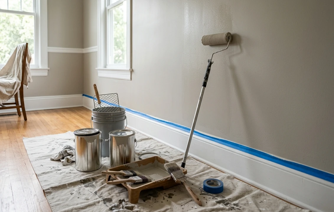
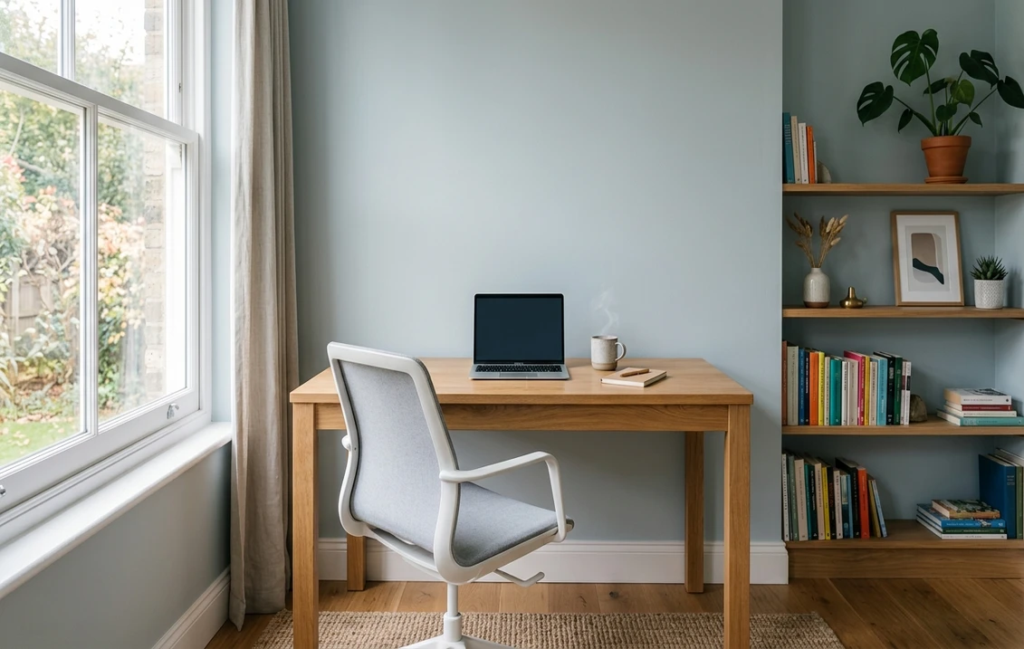
These 15 shades combine 2026 UK trend data, proven focus-friendly undertones and a flattering performance on camera. All recommended in eggshell finish on walls: the UK trade standard for home offices, as it is washable, handles scuff marks near desks and bookshelves, and avoids the harsh reflection of satin or gloss on video calls.
| Colour | Brand & Code | Mood | Best for |
|---|---|---|---|
| De Nimes | Farrow & Ball No.299 | Focused dusty blue | Full room, Zoom-ready |
| Hague Blue | Farrow & Ball No.30 | Deep, serious, library-like | Executive office, book wall |
| Oval Room Blue | Farrow & Ball No.85 | Grey-teal, calm | North-facing home office |
| Treron | Farrow & Ball No.292 | Smoky green-grey | Full room, creative work |
| Card Room Green | Farrow & Ball No.79 | Heritage muted green | Period home study |
| Canvas | Little Greene 171 | Warm biscuit neutral | Small office, north-facing |
| Invisible Green | Little Greene 67 | Near-black bottle green | Book nook, joinery |
| French Grey | Little Greene 113 | Balanced warm grey | Neutral Zoom backdrop |
| Livid | Little Greene 263 | Muted lilac-grey | Creative office, south-facing |
| Normandy Grey | Little Greene 79 | Soft warm taupe | Client-facing studio |
| Mizzle | Farrow & Ball No.266 | Misty grey-green | Long focus sessions |
| Dimpse | Farrow & Ball No.277 | Soft dove grey | Bright Zoom backdrop |
| Bone China Blue | Dulux Heritage | Soft desaturated blue | Small office, loft conversion |
| Indigo Shade | Dulux Heritage | Deep ink blue | Book nook, feature wall |
| Goblin | Dulux Heritage | Earthy deep green | Executive full-room scheme |
Try it on your house
No photo? Try a sample
Productivity-focused palette: why blue and green keep winning
The University of Texas at Austin's often-cited colour and productivity study found that blue and blue-green environments improved sustained attention tasks by up to 15 percent compared with white or red offices. UK decorators have spent 2025-2026 translating that finding into liveable British rooms, and the clear winners are Farrow & Ball De Nimes No.299, Oval Room Blue No.85 and Treron No.292.
- De Nimes No.299: a confident dusty blue that reads as navy in low light and soft denim in daylight. Ideal for four-wall treatment in a full home office where you want the room to feel settled rather than energising.
- Oval Room Blue No.85: more grey-teal than blue, it is Farrow & Ball's top pick for north-facing UK rooms which receive cool light. It holds its depth in overcast British weather without turning flat.
- Treron No.292: the quiet hero of 2026. A smoky green-grey that pairs with oak desks, brass lamps and leather chairs, creating a room that photographs beautifully on Zoom while staying restful over a ten-hour day.
Bright whites and pale greys, by contrast, score poorly for home offices. They look clinical on camera, reflect screen glare straight back at your eyes, and create the kind of visual fatigue that peaks around 3pm. If you must stay light, choose a warm neutral like Little Greene Canvas 171 or Normandy Grey 79 rather than a cool brilliant white.
Upload your office photo, test 15+ F&B and Little Greene shades in 30 seconds
Zoom psychology: how your wall colour is reading on camera
Before committing 5 litres of anything, consider how the colour performs behind your head in a 720p webcam frame. UK recruitment consultants and executive coaches increasingly note that wall colour shapes how authoritative, approachable or creative you appear before you say a word.
- Deep blues (Hague Blue, De Nimes, Indigo Shade): read as authoritative and trustworthy. Favoured by lawyers, consultants and C-suite workers on client calls. Avoid bright white shirts which will flare against them under ring lights.
- Muted greens (Treron, Card Room Green, Invisible Green): read as calm, creative and emotionally intelligent. The go-to palette for coaches, therapists, designers and writers.
- Warm neutrals (Canvas, Normandy Grey, French Grey): read as approachable, professional and non-distracting. The safest choice if you appear on camera with clients from varied sectors.
- Bright pure white: reads washed out, blows highlights on most consumer webcams, and makes skin tones appear pallid. Surprisingly unprofessional on camera despite feeling "safe" in person.
- Saturated reds, oranges and yellows: read as high-energy but aggressive. Reserve for accessories, never four walls.
A quick practical test: record a 30-second test video at your desk at 10am and 3pm, at your chosen paint colour, wearing your usual work top. Watch it back muted. If you look tired, flat or washed out, the colour is wrong no matter how lovely it looks in the tin.
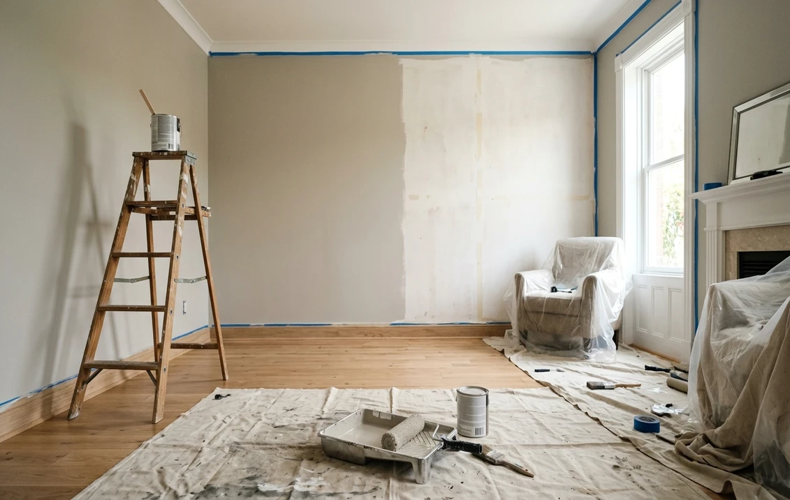
Small home office strategy: boxrooms, landings and alcoves
Most UK home offices are not purpose-built rooms: they are boxrooms under 7 m², landing alcoves, a corner of a guest bedroom, or a re-purposed pantry. Small-space strategy matters more than trend chasing.
Two schools work reliably in small UK offices. The first is light-and-warm: Little Greene Canvas 171, Farrow & Ball Dimpse No.277 or Dulux Heritage Bone China Blue, painted on every wall, ceiling, skirting, architrave and door in the same shade. This eliminates visual break lines and makes a 5 m² boxroom feel 30 percent bigger. It is the UK decorator consensus for small rooms in 2026.
The second, counter-intuitive option is cocoon-dark: Hague Blue No.30, Invisible Green 67 or Indigo Shade on every surface. In a tiny windowless or north-facing office, a dark envelope stops the eye at the walls, creating a library-like focus chamber. Decorators call this the "dark-hug" approach, and it suits introverted deep-work roles (writers, coders, researchers) particularly well.
What rarely works in a UK boxroom: a single bright feature wall with three white walls. It emphasises how small the room is and fragments an already tight space.
Book nook colours: the joinery-and-wall trick
The UK book nook, reading corner or built-in shelving wall is the most-requested home office feature of 2026. The defining move is painting the joinery and the wall behind it in the exact same deep colour, so the shelving reads as a single architectural object rather than a stuck-on unit.
Three deep shades dominate 2026 book nooks:
- Farrow & Ball Hague Blue No.30: the classic, reads like a London club library. Suits Edwardian and Victorian period homes and late-Victorian terraces.
- Little Greene Invisible Green 67: near-black in low light, deep bottle-green in daylight. The favourite of designer-builders in Cotswold and Yorkshire stone cottages.
- Dulux Heritage Indigo Shade: slightly softer than Hague Blue, more accessible on modern new-builds without period architecture.
Paint the shelving unit, the wall behind it, the plinth, and the interior backs of shelves in the same shade and finish. Books become the visual hero; the joinery vanishes. Pair with a brass or antique-bronze picture light on a swivel arm to lift the nook out of the gloom on a dim February afternoon.
Coving, skirting and architrave: the UK 2026 treatment
Period UK home offices almost always have coving, skirting and architrave, and how you paint them changes the whole feel of the room. The 2026 consensus has moved away from the old rule of "brilliant white trim on any wall colour".
- Colour-matched coving and skirting (wall colour, same finish): the dominant 2026 treatment. Creates a seamless envelope, particularly effective with De Nimes, Treron and Hague Blue. Makes low-ceiling Victorian rooms feel taller.
- Slightly darker skirting: for a period-accurate look in Georgian properties, paint skirting in the wall colour at 125 percent intensity (your paint merchant can tint). Grounds the room subtly.
- Warm off-white trim (Slipper Satin, Slaked Lime): avoids the coldness of brilliant white while preserving definition on architrave and doors. The fallback for those not ready to commit to colour-matched coving.
- Brilliant white trim: increasingly dated in UK interiors. Creates harsh contrast lines that visually shrink the room on camera.
On coving specifically, painting it in the wall colour rather than white is one of the highest-impact, lowest-cost moves a decorator can make in a home office. It takes an extra hour and transforms how the room reads on Zoom.
Why eggshell beats matt and satin in a home office
UK decorators almost universally specify eggshell for home office walls and woodwork in 2026. The reasoning is specific to how offices are used:
- Washability: desks, chairs and bookshelves create constant wall scuffs. Eggshell wipes clean; matt shows every mark.
- Low sheen on camera: eggshell reads softly on webcam without the plastic reflection of satin or gloss.
- Hides plaster imperfections: Farrow & Ball Modern Emulsion and Little Greene Intelligent Matt are technically matt-eggshell hybrids (7 percent sheen) that flatter hairline cracks in Victorian and Edwardian plaster.
Use full eggshell on skirting, architrave, doors and built-in desks where wear is heaviest. Avoid gloss: it is dated on UK trim in 2026 and creates bright reflective hotspots on video calls. Avoid dead-flat matt: lovely in showrooms, impossible to clean once coffee splashes onto the wall behind the kettle shelf.
Cost per small home office: £180 to £450 in 2026
Painting a typical UK small home office (boxroom, landing nook or converted alcove, 6 to 10 m²) in 2026 costs between £180 and £450, depending on paint brand, whether you DIY or hire a decorator, and whether joinery is included.
| Office size | Paint only (DIY) | Decorator labour | Total |
|---|---|---|---|
| Boxroom (6 m²) | £80 - £130 | £130 - £220 | £180 - £320 |
| Small office (8 m²) | £100 - £160 | £170 - £260 | £230 - £380 |
| Office + book nook (10 m²) | £130 - £200 | £220 - £330 | £300 - £450 |
Farrow & Ball Modern Emulsion retails around £58 per 2.5L, Little Greene Intelligent Matt around £54 per 2.5L, and Dulux Heritage around £45 per 2.5L. Budget two coats on walls, one coat on ceiling and an eggshell topcoat on joinery: a typical 8 m² office absorbs 2.5L of wall paint, 1L of ceiling paint and 750ml of eggshell trim paint. Deep colours like Hague Blue or Invisible Green often need a tinted primer to achieve full opacity in two coats, adding roughly £15 to £25 to materials.
Light orientation: the UK home office rule book
Home offices in UK homes often occupy the smallest, least-light room in the house, which makes orientation advice more critical than in a south-facing sitting room. Four quick rules:
- North-facing office: warm it up. Canvas, Normandy Grey, De Nimes, Oval Room Blue. Avoid cool greys which compound the blue-grey UK daylight.
- South-facing office: control glare. Treron, Mizzle, Livid, Card Room Green absorb rather than bounce light. Avoid brilliant whites which cause screen reflection fatigue.
- East-facing office: bright mornings, dim afternoons. Mid-tone blues and greens (Oval Room Blue, Treron) shift pleasantly through the day.
- West-facing office: golden late light. Deep colours (Hague Blue, Invisible Green, Goblin) peak at 4pm, which matches late-afternoon focus windows for most desk workers.
Always test sample pots on at least two walls (one behind your monitor, one visible on camera) and view them at 8am, midday and 4pm. For offices used at night, add a 9pm view under your actual desk lamp.
Frequently asked questions on UK home office paint colours
What is the best paint colour for a small UK home office?
For a small UK home office under 7 m², the safest strategy is an enveloping single colour on walls, ceiling, coving and woodwork: Little Greene Canvas 171 or Farrow & Ball Dimpse No.277 for light rooms, or Hague Blue No.30 / Invisible Green 67 for a cocoon-dark focus chamber. Avoid a single bright feature wall in a small office: it fragments the space. Eliminate visual break lines to make the room feel up to 30 percent larger.
Which paint colour looks best on Zoom?
Mid-tone blues and muted greens perform best on webcam in 2026: Farrow & Ball De Nimes No.299, Oval Room Blue No.85 and Treron No.292. They flatter skin tones, read as authoritative without being severe, and avoid the washed-out look of brilliant white walls. Avoid saturated reds and oranges (aggressive on camera) and pure white (blows out highlights on consumer webcams). Test with a 30-second muted video at 10am and 3pm before committing.
Is eggshell or matt better for a home office?
Matt-eggshell hybrids like Farrow & Ball Modern Emulsion or Little Greene Intelligent Matt (around 7 percent sheen) are the UK 2026 standard for home office walls. They wipe clean of desk scuffs, do not reflect webcam lights, and flatter imperfect plaster. Use full eggshell on skirting, architrave, doors and built-in desks where wear is heaviest. Avoid gloss (reflective and dated) and dead-flat matt (impossible to clean behind the kettle shelf).
Should I paint my home office coving white or in the wall colour?
In 2026 the UK decorator consensus is to paint coving in the wall colour, not brilliant white. Colour-matched coving removes the harsh contrast line that visually lowers ceilings and fragments the room on camera. It is especially effective with deep shades like De Nimes, Hague Blue or Treron, where a white coving stripe would dominate the scheme. Reserve brilliant white coving for Georgian restorations where historical accuracy demands it; for every other UK property, match coving and skirting to the wall.
Free - No sign-up - 100+ F&B, Little Greene & Dulux Heritage shades
The right home office colour balances focus, camera-readiness and long-day comfort. Before committing to Hague Blue, De Nimes or Treron, visualise the shade on your own office photo with our free AI interior colour visualiser, then order A4 sample pots and view them at 8am, midday and 4pm. Sources: Farrow & Ball, Little Greene, Dulux Heritage, ONS.
Trademarks mentioned (Sherwin-Williams, Benjamin Moore, Behr, Caparol, Brillux, Sto, Alpina, Valspar, PPG, Glidden, Dulux, Crown Trade, Sandtex, Farrow & Ball, Johnstone's, Leyland) are property of their respective owners. FacadeColorizer is independent and not affiliated with any of them. Nominative fair use under Lanham Act §1125.