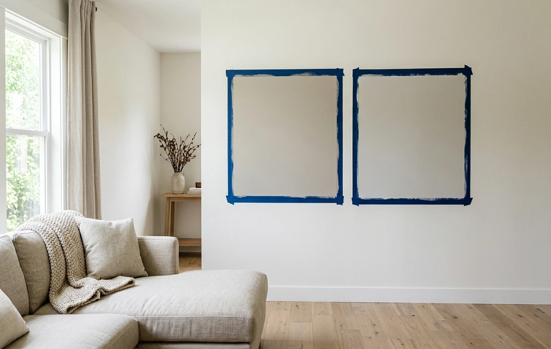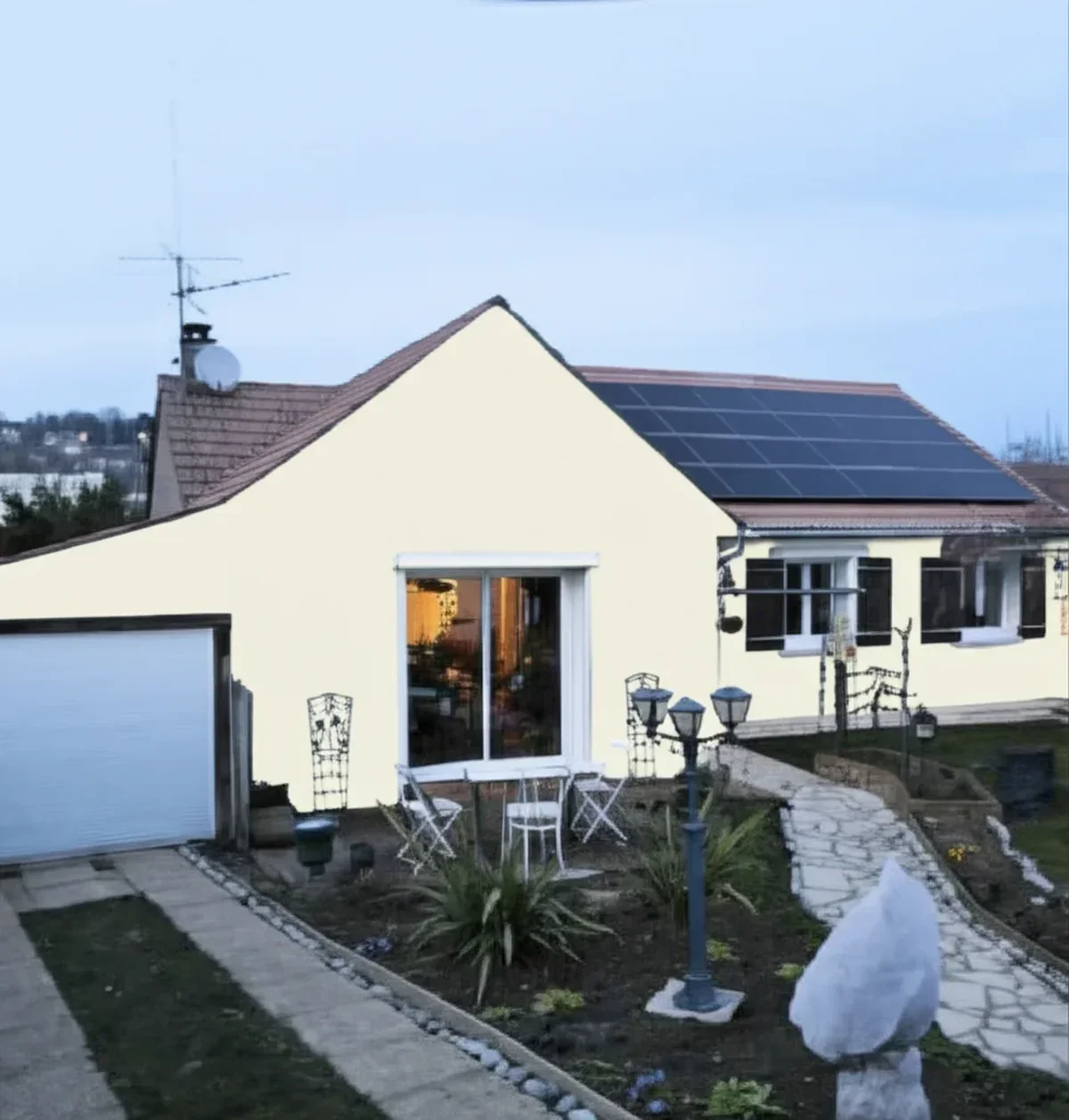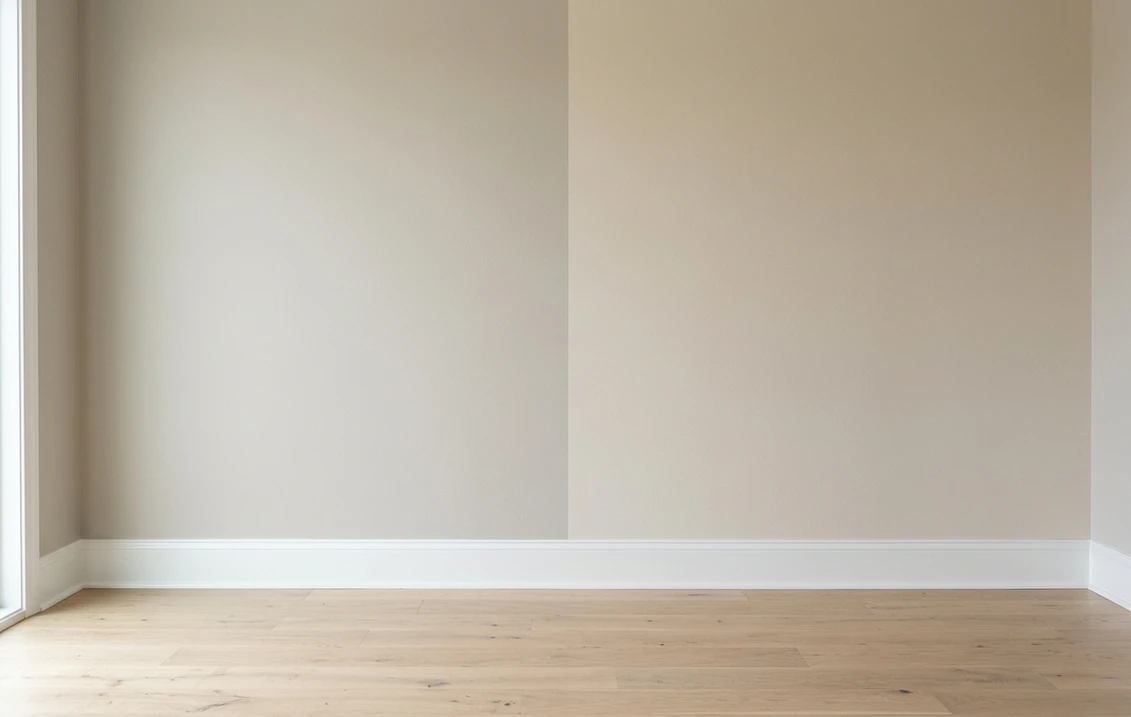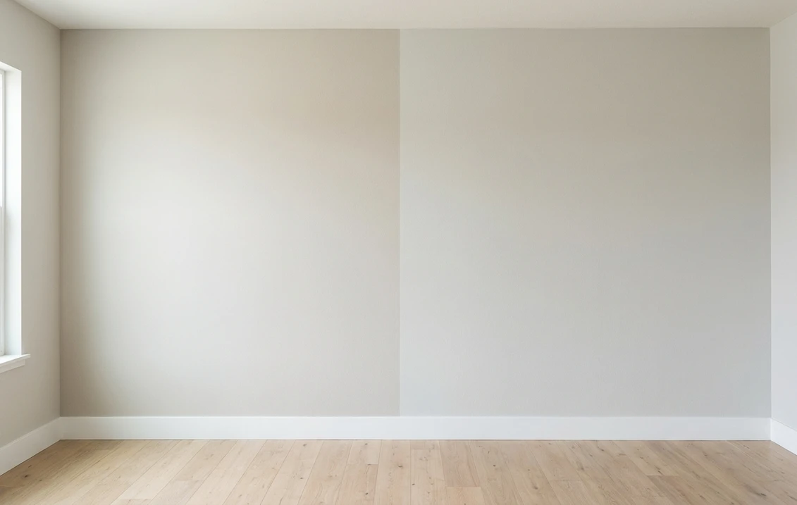
Try it on your house

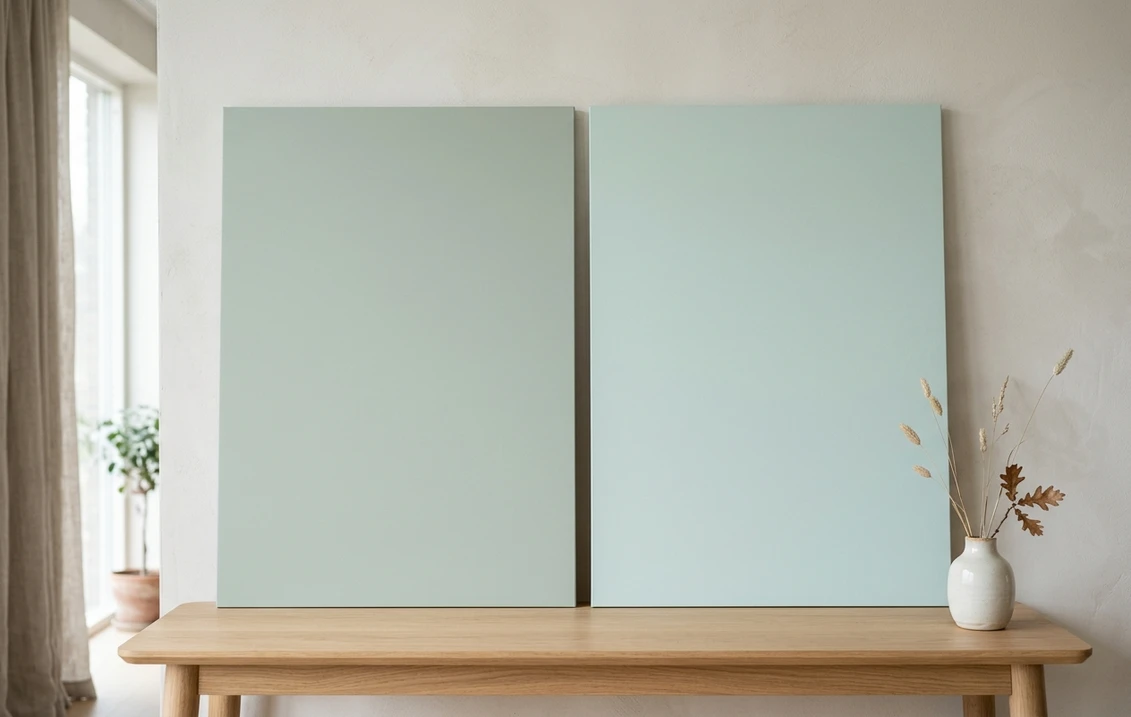
Sea Salt SW 6204 is the greener, airier coastal color, with an LRV of 63 and a green-gray undertone that shifts between green, gray, and blue with the light.
Palladian Blue HC-144 is the bluer, more spa-like coastal color, with an LRV of 61 and a blue-green undertone that appears as a clear, soft aqua.
They are cross-brand (Sherwin-Williams versus Benjamin Moore) and sit at similar depth (63 versus 61). The tiebreaker is whether you want your coastal color to read greener and airier (Sea Salt) or bluer and more present (Palladian Blue). Test both on a photo of your space before you commit.
Sea Salt and Palladian Blue are two coastal paint colors that homeowners cross-shop side by side across both brands. Sea Salt (SW 6204) is Sherwin-Williams' go-to coastal hue, a green-gray that shifts with the light and comes across as breezy and barely-there. Palladian Blue (HC-144) is Benjamin Moore's coastal blue, a soft blue-green that reads as a clear spa-like aqua. This is our side-by-side method for comparing paint colors applied to the two coastal benchmarks.
The numbers side by side
| Attribute | Sea Salt SW 6204 | Palladian Blue HC-144 |
|---|---|---|
| Family | Coastal green-gray, light-shifting | Coastal blue-green, spa-like |
| LRV | 63 | 61 |
| Approximate hex | #CBD1C5 | #C7D6D2 |
| Undertone | Green-gray, shifts green/blue/gray | Blue-green, clear, soft aqua |
| Loves | Kitchens, baths, coastal interiors | Living rooms, master suites, spas |
| Watch out for | Fading toward white in strong sun | Reading too blue in cool north light |
| Overall vibe | Breezy, shifty, green-gray | Soft, clear, blue-green spa |
Try it on your house
No photo? Try a sample
LRV figures are the published values from each brand. Hex values are approximate digital renderings only, and screens vary; the authoritative reference is always a physical paint chip from the retailer.
Upload one photo, get a photorealistic render, then swap to Palladian Blue in one click. Free, no signup.
Room by room, exposure by exposure
| Situation | Usual winner | Why |
|---|---|---|
| North-facing room | Sea Salt | The green-gray stays composed in cool light; Palladian Blue can read chilly blue. |
| Bright south room | Palladian Blue | Strong sun brings out the clear blue-green, making the room feel like a spa. |
| Small bathroom | Sea Salt | The shiftiness of Sea Salt keeps a small bath feeling airy and never flat. |
| Master bedroom | Palladian Blue | The soft blue-green is calming and enveloping, ideal for a serene retreat. |
| Kitchen with white cabinets | Sea Salt | The green-gray pairs beautifully with white cabinets and creates a crisp, clean look. |
| Coastal open plan | Palladian Blue | The clear blue-green holds its character across a larger open space better than the shifty Sea Salt. |
Sea Salt and Palladian Blue are both coastal colors at similar depth, but Sea Salt leans green-gray and shifts, while Palladian Blue leans blue-green and stays clear. For more on Sea Salt, see our Sea Salt vs Rainwashed and October Mist vs Sea Salt guides. If the verdict after seeing both is that neither is green enough, the next step is a true mid sage rather than a coastal wash: our Clary Sage vs Softened Green comparison covers the two closest Sherwin-Williams sages, at LRV 41 and 53 against Sea Salt's 63.
When to choose Sea Salt
- You want a coastal green-gray that shifts with the light and feels airy.
- Your room has mixed or north-facing light where the green-gray stays composed.
- You prefer a coastal color that is more gray-green than blue.
- You are painting a kitchen or bath where a breezy, barely-there color fits.
When to choose Palladian Blue
- You want a clear, spa-like blue-green that reads as a definitive coastal color.
- Your room gets strong south or west light where the blue-green glows.
- You are designing a master bedroom, living room, or retreat where calm is the goal.
- You prefer a coastal color that reads as blue, not green. For related comparisons, see Halcyon Green vs Sea Salt and Evergreen Fog vs Sea Salt.
Same wall, both coastal, your actual light. Free render in about 30 seconds.
Frequently asked questions
What is the difference between Sea Salt and Palladian Blue?
The main difference is undertone. Sea Salt SW 6204 has an LRV of 63 and a green-gray undertone that shifts between green, gray, and blue. Palladian Blue HC-144 has an LRV of 61 and a blue-green undertone that reads as a clear, soft aqua. Sea Salt is greener and airier; Palladian Blue is bluer and more present.
Which is lighter, Sea Salt or Palladian Blue?
Sea Salt is slightly lighter. Its LRV is 63, compared with 61 for Palladian Blue. That 2-point gap is negligible on the wall. The visible difference comes from whether the undertone reads greener (Sea Salt) or bluer (Palladian Blue).
Do Sea Salt and Palladian Blue have the same undertones?
No. Sea Salt has a green-gray undertone that shifts between green, gray, and blue depending on the light. Palladian Blue has a clear blue-green undertone that reads as aqua or spa-blue in most light. Sea Salt is the greener, more neutral option; Palladian Blue is the bluer, more colorful option.
Can I see both colors on my own wall before I buy paint?
Yes. Upload one photo of your room to FacadeColorizer, get a photorealistic render in Sea Salt, then swap to Palladian Blue in one click. You will see the undertone difference on your actual wall. The first HD render and three color variations are free.
1 HD render plus 3 free color variations. Start with Sea Salt, swap to Palladian Blue in one click.
Trademark notice. Benjamin Moore and Palladian Blue are trademarks of Benjamin Moore & Co. Sherwin-Williams and Sea Salt are trademarks of The Sherwin-Williams Company. FacadeColorizer is not affiliated with, endorsed by, or sponsored by these companies. Brand and color names are used descriptively (nominative fair use). Hex and RGB values are approximate digital renderings; the only authoritative reference is a physical paint sample.
Trademarks mentioned (Sherwin-Williams, Benjamin Moore, Behr, Caparol, Brillux, Sto, Alpina, Valspar, PPG, Glidden, Dulux, Crown Trade, Sandtex, Farrow & Ball, Johnstone's, Leyland) are property of their respective owners. FacadeColorizer is independent and not affiliated with any of them. Nominative fair use under Lanham Act §1125.