Try it on your house

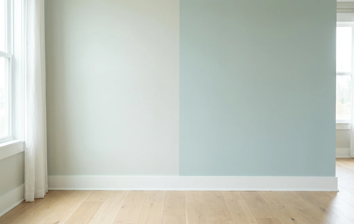
The verdict in three lines. Sea Salt SW 6204 (LRV 63) is the lighter, greener sister: a near-neutral chameleon that drifts between green, gray, and blue as the light changes.
Rainwashed SW 6211 (LRV 59) is the bluer, more saturated sister: it commits to a sea-glass blue-green and holds that character far more steadily through the day.
Pick Sea Salt when you want a whisper of coastal color that behaves like a neutral, Rainwashed when you want the color to still be there at 6 pm. The only real tiebreaker is seeing both on a photo of your own room.
Sherwin-Williams Sea Salt (SW 6204) and Rainwashed (SW 6211) are the most cross-shopped coastal pair in the Sherwin-Williams deck. They sit close together in the fan deck, and on small chips they look nearly identical. On a full wall they behave differently. This head-to-head puts the numbers side by side, walks the duel room by room and exposure by exposure, and tells you exactly when each color wins. For the general method behind any two-color decision, start with our side-by-side method for comparing paint colors.
The numbers side by side
| Attribute | Sea Salt SW 6204 | Rainwashed SW 6211 |
|---|---|---|
| Family | Pale green-gray, coastal near-neutral | Soft blue-green, sea glass |
| LRV | 63 | 59 |
| Approximate hex | #CDD2CA | #C2CDC5 |
| Approximate RGB | 205, 210, 202 | 194, 205, 197 |
| Undertone | Green first, gray in low light, blue flashes in bright cool light | Blue-green, steadier, reads as a real color rather than a neutral |
| Loves | Warm wood, rattan, linen, white shiplap | Crisp white trim, marble, brushed nickel, spa textiles |
| Watch out for | Can go flat gray in dim north light and lose its color | Reads distinctly blue-green; too much color for buyers who wanted "almost white" |
| Overall vibe | Airy, breezy, barely-there coastal | Calm, watery, deliberate spa mood |
Try it on your house
No photo? Try a sample
LRV values are the published Sherwin-Williams figures. Hex and RGB are approximate digital renderings; the authoritative reference is a physical Sherwin-Williams chip or peel-and-stick sample.
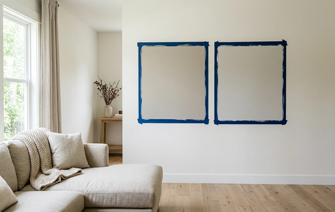
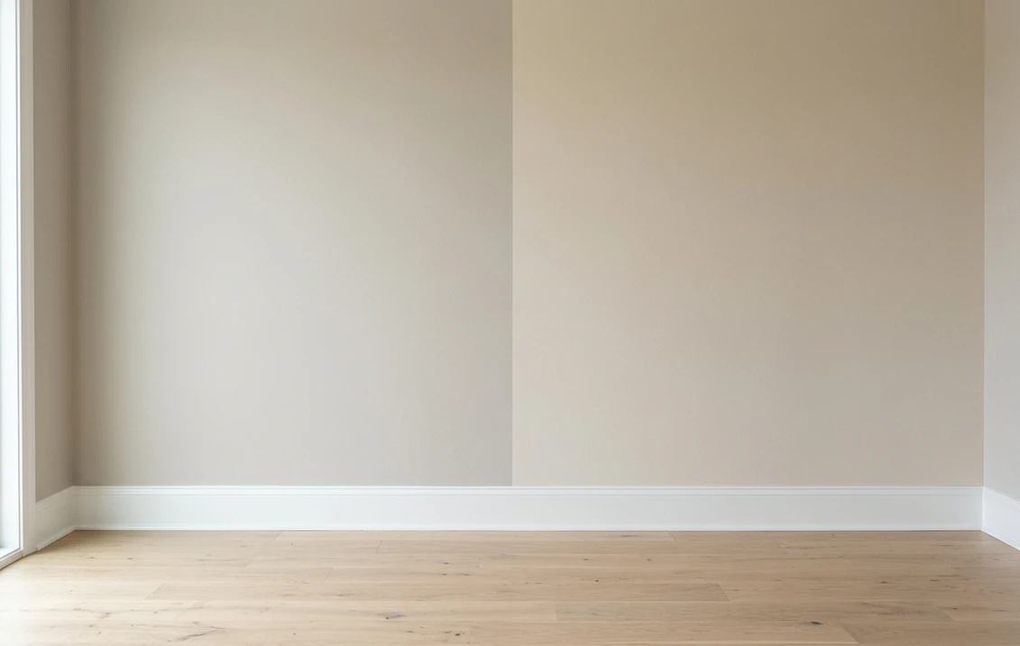
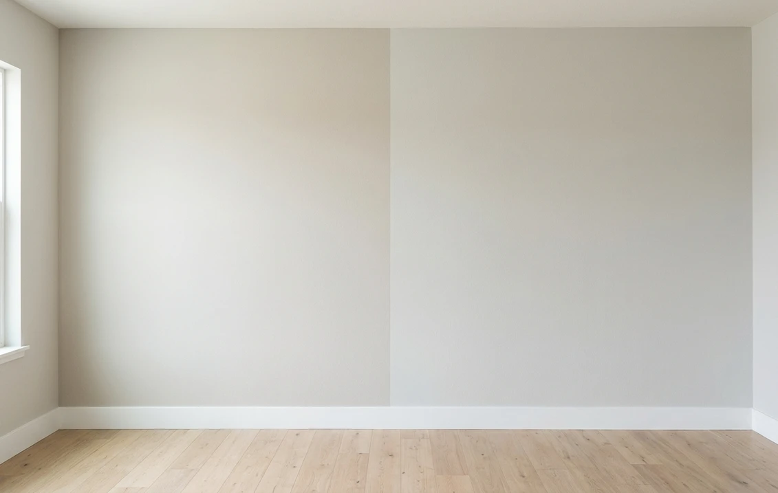
Read that table once and the shape of the duel is clear. The 4-point LRV gap is visible but modest: Sea Salt is the brighter chip, Rainwashed carries a touch more weight. The real decision lives in the undertone row. Sea Salt is the famous shape-shifter: green by a sunny window, gray on an overcast afternoon, faintly blue under cool bulbs. Rainwashed carries more pigment and stays recognizably blue-green in almost every light. Hold each chip against white printer paper and the difference jumps out in seconds: Sea Salt looks like a tinted neutral, Rainwashed looks like a color. That trick, plus the two-coat sample rule, comes from the pillar method linked above.
Upload one photo, get a photorealistic render, then swap to Rainwashed in one click. Free, no signup.
Room by room, exposure by exposure
The same room can crown either sister depending on its light and on how much color you want to live with. Here is how the duel typically plays out.
| Situation | Usual winner | Why |
|---|---|---|
| North-facing living room | Rainwashed | Cool flat light drains Sea Salt toward plain gray; Rainwashed keeps its blue-green alive |
| Bright south-facing bedroom | Sea Salt | Full sun keeps it airy and barely-there; Rainwashed reads noticeably more colorful in the same light |
| Spa-style bathroom | Rainwashed | The steadier sea-glass tone survives mixed vanity and window light without flipping gray |
| Open-plan main floor | Sea Salt | Closer to a neutral, so it hands off politely to adjacent rooms and trim colors |
| Laundry, mudroom, powder room | Rainwashed | A small dose of committed color lifts a windowless utility space more than a shifting neutral |
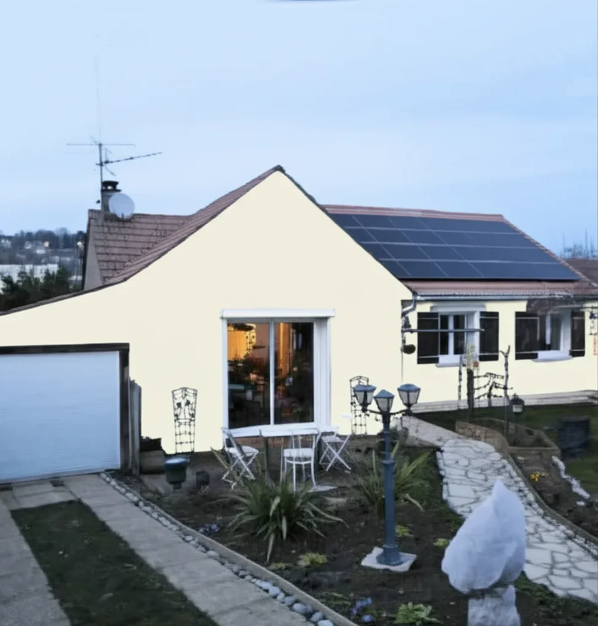
| Exterior siding | Sample outside first | Daylight lightens both by a step; Sea Salt has a dedicated exterior guide linked below |
One nuance worth naming: the two do not share a strip. Sea Salt sits directly above the deeper Comfort Gray SW 6205, the classic answer when Sea Salt feels right but too light on the wall. Rainwashed anchors its own neighboring strip on the bluer side of the family.
When to choose Sea Salt
- You want color that behaves like a neutral. Sea Salt reads "fresh" rather than "green" from across the room, which is why it works on whole main floors where a true blue-green would dominate.
- The room gets generous, changing light. The famous green-gray-blue shift is a feature in bright rooms: the wall feels alive through the day instead of static.
- Your finishes are warm and natural. Oak floors, rattan, jute, and warm white trim pull Sea Salt's green side forward, its best look.
- Resale-safe coastal is the brief. It is the least polarizing chip in the coastal family: buyers see a light, clean wall, not a color statement.
For its full undertone breakdown, best rooms, and trim pairings, see the dedicated Sea Salt undertones and best rooms profile. If the shortlist is for siding rather than walls, the Sea Salt exterior guide covers orientation, trim, and siding materials in full.
When to choose Rainwashed
- You want the color to survive the evening. Where Sea Salt fades to gray at dusk and under warm bulbs, Rainwashed still reads blue-green at 6 pm.
- The mood is spa, not breeze. Bathrooms, bedrooms, and reading nooks that want a deliberate calm-water feeling get it from Rainwashed's steadier saturation.
- Your trim is a crisp cool white. Against bright white casing, Sea Salt can read slightly dingy; Rainwashed reads as an intentional color.
- The room has weak or northern light. With more pigment to spare, Rainwashed keeps its character where its lighter sister goes flat.
The full room-by-room treatment, including its lighting behavior and companion shades, lives in the Rainwashed room-by-room profile. If the shortlist keeps drifting toward green rather than blue, the same light-versus-deep question plays out in the sage family: our Clary Sage vs Dried Thyme duel puts a light silvery sage against a deep olive one, where depth rather than undertone decides.
Neither of these is a whole scheme on its own. A coastal palette built only from pale blue-greens tends to read washed out, and the usual fix is one deep note somewhere the eye lands: a vanity, a set of shelves, a door. Navy is the conventional answer, and the choice inside it is not cosmetic. Naval SW 6244 keeps a faint gray softness that sits quietly next to Sea Salt's own gray side, while In the Navy SW 9178 is cleaner and more saturated and turns the same room into a statement. The Naval vs In the Navy comparison takes that decision apart.
Navy is not the only deep note that works in a coastal room. Charcoal keeps the scheme quieter, and the pick splits on the same axis. Peppercorn SW 7674 runs dead-even RGB channels and stays a clear, readable gray, which extends Sea Salt's own gray side instead of interrupting it; Iron Ore SW 7069 sits at LRV 6 and passes for black from across the room, so a vanity or a door in it becomes the anchor rather than a companion. In our Iron Ore vs Peppercorn duel those four LRV points are worth roughly two thirds more reflected light, which is why the eye registers the gap instantly.
Same wall, both sisters, your actual light. Free render in about 30 seconds.
Frequently asked questions
Are Sea Salt and Rainwashed the same color?
No, they are sisters, not twins. Both are soft coastal green-blues from Sherwin-Williams, but Sea Salt SW 6204 (LRV 63) is lighter and leans green-gray, while Rainwashed SW 6211 (LRV 59) is a touch deeper and leans clearly blue. On a small chip they look interchangeable; on a full wall Rainwashed reads as a real color and Sea Salt reads as a tinted neutral.
Is Sea Salt lighter than Rainwashed?
Yes. Sea Salt sits at LRV 63 versus LRV 59 for Rainwashed, a 4-point gap that reads as roughly half a shade on the wall. The bigger practical difference is behavior: Sea Salt shifts between green, gray, and blue with the light, while Rainwashed holds a steadier blue-green from morning to evening.
Which is better for a bathroom, Sea Salt or Rainwashed?
Both are classic bathroom picks, so it comes down to intent. Rainwashed usually wins the spa brief because its sea-glass tone stays visible under mixed vanity and window light. Sea Salt wins when you want the room to feel light and almost white, with just a suggestion of green. Sample both under your actual vanity bulbs before deciding.
Can I use Sea Salt and Rainwashed together in the same house?
Yes, and they share undertones well, but keep them in separate zones. Side by side on connected walls the 4-point gap is close enough to look like a paint-batch mistake rather than a deliberate contrast. The cleaner plan is Sea Salt on the open main areas and Rainwashed in a closed room such as a bathroom, bedroom, or laundry.
Settle it on your photo
Chips lie, screens lie, and a sample patch on someone else's shiplap tells you nothing about your light. The fastest honest answer to Sea Salt vs Rainwashed is to test both on a photo of your actual room and let your trim, floor, and windows pick the winner. If the duel widens into a whole-house scheme, the coastal paint color palette guide maps the rest of the beach-house deck.
1 HD render plus 3 free color variations. Start with Rainwashed, swap to Sea Salt in one click.
Trademark notice. Sherwin-Williams®, Sea Salt®, Rainwashed®, Comfort Gray® and Silvermist® are trademarks of The Sherwin-Williams Company. FacadeColorizer is not affiliated with, endorsed by, or sponsored by The Sherwin-Williams Company. Brand and color names are used for descriptive and editorial purposes only, consistent with nominative fair use. Hex and RGB values are approximate digital renderings; the only authoritative reference is a physical Sherwin-Williams color sample.
Trademarks mentioned (Sherwin-Williams, Benjamin Moore, Behr, Caparol, Brillux, Sto, Alpina, Valspar, PPG, Glidden, Dulux, Crown Trade, Sandtex, Farrow & Ball, Johnstone's, Leyland) are property of their respective owners. FacadeColorizer is independent and not affiliated with any of them. Nominative fair use under Lanham Act §1125.