You sample Sherwin-Williams Sea Salt (SW 6204) on the bathroom wall, come back an hour later, and could swear someone swapped the can. Morning, a calm spa green. Late afternoon, almost blue. By lamplight, a quiet gray. That is not your eyes. Sea Salt is the most famous color-shifting neutral in the Sherwin-Williams lineup, a blue-green-gray hybrid that refuses to commit to one hue, which is exactly why people love it and why it catches them off guard.
This profile is for the homeowner who has already fallen for Sea Salt: how its three undertones trade places, the published LRV, the rooms it suits, and the trim and decor that keep it fresh instead of murky. It is one of the soft hues in our wider Sherwin-Williams interior paint colors guide, and you can see where it ranks in our best interior paint colors for 2026 roundup.
Upload one photo and preview SW Sea Salt under your room's actual light in about 30 seconds, free.
The numbers behind Sea Salt SW 6204
Start with the published data; these figures predict the wall better than any fan-deck chip. They come from the Sherwin-Williams color tools:
| Spec | Value |
|---|---|
| SW code | SW 6204 Sea Salt |
| HEX (screen approximation) | #CBD1C5 |
| RGB approximation | 203, 209, 197 |
| LRV (Light Reflectance Value) | 63 |
| Hue family | Blue-green-gray hybrid, soft spa sage with a cool cast |
| Closest SW cousins | Rainwashed (SW 6211), Comfort Gray (SW 6205), Tradewind (SW 6218) |
Try it on your house
No photo? Try a sample
Sources: Sherwin-Williams SW 6204 Sea Salt color data, retrieved 2026; The Spruce paint undertone references.
The LRV of 63 is the part most people overlook. That is a light mid-tone: bright enough to keep a small bathroom from feeling closed in, but with enough body to read as a real color rather than a tinted white. It is far lighter than a true sage like SW Evergreen Fog (LRV 30), which is why Sea Salt feels airy where deeper greens feel cozy. For that moodier direction, our SW Evergreen Fog profile shows how a low-LRV green reshapes the same rooms.
Three undertones taking turns
Most neutrals have one dominant undertone and a secondary whisper. Sea Salt is unusual: it carries three pigment directions at close to equal weight, a green, a blue, and a soft gray. Which one you see is decided by the room's light at that moment.
- The green read. Under warm light (direct sun or a 2700K bulb), the warmth cancels the blue and the green steps forward as a soft, restful sage. The version most people picture.
- The blue read. Under cool, indirect light (overcast sky, a north window, a 5000K daylight LED), the warm side drains away and the blue surfaces as a pale seafoam or spa blue. The version that surprises people expecting green.
- The gray read. In low or balanced light (dawn, dusk, a dim hallway), green and blue cancel and the soft gray base takes over, closer to a green-gray than a color.
None of these is the "wrong" Sea Salt; they are all the same paint behaving as designed. The skill is deciding which read you want to dominate, then steering the light toward it. Because the undertones are so finely balanced, the direction a room faces moves Sea Salt more than it moves a committed beige or gray, as the interior color families guide explains. Typical behavior across the four Northern Hemisphere orientations:
| Room orientation | Daylight character | How Sea Salt reads |
|---|---|---|
| South-facing | Warm, abundant midday light | Greenest version, a soft warm sage, very calming |
| West-facing | Cool by day, very warm at sunset | Blue-leaning by day, glowing green-sage late afternoon |
| East-facing | Warm early sun, neutral later | Green in the morning, settling to gray-green by afternoon |
| North-facing | Cool, indirect, no direct sun | Bluest and coolest version, leans seafoam or spa blue |
Sources: American Institute of Architects daylight reference; Sherwin-Williams SW 6204 color data; designer field notes on color-shifting neutrals.
Want the sage you fell for? Put Sea Salt in a south or east room and lean warm with your bulbs. Want the spa-blue feel? A north-facing bathroom with daylight bulbs delivers it; a north room is where the green you expected most often turns blue. For a neutral that holds far steadier across orientations, our profile of SW Repose Gray is the predictable counterpoint.
The rooms Sea Salt was made for
Sea Salt earns its reputation in rooms where calm is the point. Its soft, watery quality reads as relaxing rather than energizing, which steers it toward a clear set of spaces:
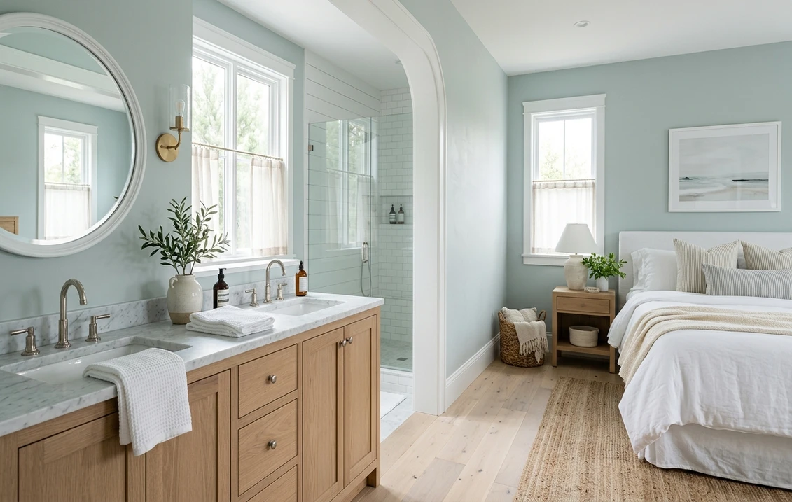
- Bathrooms and powder rooms: the signature use. The spa-blue side reads clean against white tile, marble, and chrome or brushed-nickel fixtures, while the green side keeps it from feeling cold.
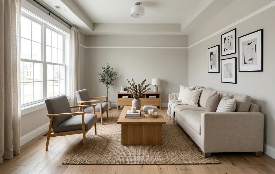
- Bedrooms: the low-saturation hue is genuinely restful. It layers easily under white, cream, or natural-linen bedding and loves light oak.
- Laundry and mudrooms: it adds life to small utility spaces without shouting, and hides smudges better than a flat white.
- Kitchens, on cabinets: increasingly popular on lower cabinets or an island, where the soft green-blue reads custom and coastal against white uppers and warm wood counters. For the cabinetry call, our Sherwin-Williams vs Benjamin Moore interior comparison covers how the two brands' finishes wear.
Where to be careful: a windowless bathroom under warm builder bulbs can drain its freshness to a flat gray-green, and a big open great room can feel like a lot of cool color, where many designers use it as an accent wall instead of wall to wall. Our interior house painting cost guide covers what the repaint should run.
Free AI visualizer: test Sea Salt in a bathroom, bedroom, or on cabinets before you buy a sample.
Trim, ceiling, and decor that keep it fresh
Because Sea Salt is a soft color rather than a true neutral, the white beside it decides whether it reads spa-fresh or dingy. Crisp, clean whites win:
- Best all-around trim: Sherwin-Williams Pure White (SW 7005, LRV 84). Bright and only faintly warm, it frames Sea Salt cleanly and keeps the color fresh without going icy. The default designer pairing.
- For a warmer scheme: SW Alabaster (SW 7008, LRV 82). A creamy white that nudges Sea Salt toward its greener, cozier side, good in a bedroom or warm-light bath.
- Ceiling: a flat white keeps the room open. Avoid Sea Salt overhead in a low room; the cool color can feel heavy.
- Deeper coordinating tones: for an accent, a built-in, or a vanity, SW Comfort Gray (SW 6205) or a navy like SW Naval (SW 6244) reads as a natural in-family step down.
- Decor and finishes: white oak and light woods, natural linen and rattan, polished or brushed nickel, and brass all flatter it. Cool gray-washed floors and heavy cool grays drag it toward murky.
To ground a Sea Salt scheme with a warm neutral in adjoining rooms, the obvious partners are the greiges; our profiles of SW Accessible Beige and SW Agreeable Gray both flow naturally beside a soft blue-green.
Sea Salt vs the colors people cross-shop
Sea Salt has a few near-twins shoppers line up against it, and knowing the difference saves a wrong sample:
- vs SW Rainwashed (SW 6211): the closest sibling, a touch more clearly blue and a hair brighter. Rainwashed leans spa-blue more often; Sea Salt holds its green side longer and is the steadier of the two. For a room-by-room verdict, see Sea Salt vs Rainwashed: the side-by-side duel.
- vs SW Comfort Gray (SW 6205): the deeper, grayer member of the same family. The cozier, more muted option for a moodier bath or bedroom, where Sea Salt stays light and fresh. We break down when each one wins in Sea Salt vs Comfort Gray: which coastal green-gray to pick.
- vs BM Palladian Blue (HC-144): the most common Benjamin Moore cross-shop. Palladian Blue reads more uniformly soft sky-blue and shifts less across the day, where Sea Salt swings further between green, blue, and gray. Choose Sea Salt for color movement, Palladian Blue for a more predictable single read.
Worth flagging: Benjamin Moore also sells a color named Sea Salt (HC-141), a completely different warm green-beige with no blue side. If a designer says "Sea Salt," confirm whether they mean SW 6204 or the BM color. We untangle the brand differences in formula, coverage, and finish in the full Sherwin-Williams vs Benjamin Moore interior comparison.
Indoors versus on the facade
Sea Salt leads a double life: a top coastal exterior pick as well as an interior favorite, and the two are not the same project. This page owns Sea Salt indoors, on bathroom and bedroom walls, on cabinets, under your bulbs, framed by your trim. Sea Salt on siding, shingle, and stucco, with door colors, HOA notes, and coastal fits, lives in our companion SW Sea Salt 6204 exterior guide. Complementary, not duplicates: this one for the rooms, that one for the curb.
How to test Sea Salt before you commit
Sea Salt is the textbook color where a 3-inch fan-deck chip will mislead you. Viewed under store light near 4000K, the chip lands on a balanced sage-blue that may be none of the three reads you get at home. The reliable method is a large peel-and-stick sample (Sherwin-Williams sells one) taped to at least two walls and checked mid-morning, mid-afternoon, and after dark under your normal bulbs; the dim-light gray is the version you live with at night. The faster, no-paint first pass is a digital visualizer: upload a photo of the room and apply Sea Salt beside a bluer alternative (Rainwashed) and a grayer one (Comfort Gray) to see which way your light pulls it, ruling out the colors that were never going to work.
Preview Sea Salt beside a bluer and a grayer alternative under your real light, free.
Frequently asked questions
Is Sea Salt green, blue, or gray?
All three, depending on the light. Sea Salt (SW 6204) is a blue-green-gray hybrid that carries those undertones at close to equal weight. Warm light pulls out the green (the soft sage read most people expect), cool or north light pulls out the blue (a pale spa-blue), and dim or balanced light lets the gray base take over. It is the same paint in every case; the light decides which side you see.
What is the LRV of SW Sea Salt?
Sea Salt has a Light Reflectance Value of 63, a light mid-tone. That is bright enough to keep a small bathroom feeling open but has enough depth to read as a real soft color rather than a tinted white. It is far lighter than a true sage like Evergreen Fog (LRV 30), which is why Sea Salt feels airy and spa-like instead of cozy and enveloping.
What trim color goes with Sea Salt?
Sherwin-Williams Pure White (SW 7005, LRV 84) is the most reliable trim pairing. It is bright and only faintly warm, so it frames Sea Salt crisply and keeps the color reading fresh rather than dingy. For a softer, warmer scheme that nudges Sea Salt toward its green side, use SW Alabaster (SW 7008). A flat white ceiling keeps the room feeling open.
Is SW Sea Salt the same as Benjamin Moore Sea Salt?
No. They share a name but are different colors. SW Sea Salt (SW 6204) is a light blue-green-gray hybrid with a clear cool side. Benjamin Moore Sea Salt (HC-141) is a warm green-beige sage with no blue in it at all. The closest Benjamin Moore match to the SW color is Palladian Blue HC-144, not BM Sea Salt; confirm the brand and code before sampling.
See SW Sea Salt under your real light, beside a bluer and a grayer alternative, before you buy.
Disclaimer: Sherwin-Williams and SW 6204 Sea Salt are trademarks of The Sherwin-Williams Company. Benjamin Moore and Behr are trademarks of their respective owners. FacadeColorizer is an independent paint visualization service and is not affiliated with, endorsed by, or sponsored by Sherwin-Williams, Benjamin Moore, or Behr. Screen color approximates the manufacturer's sample; always confirm with a physical sample before purchase. Sources: Sherwin-Williams SW 6204 Sea Salt color data 2026, Sherwin-Williams Pure White SW 7005 and Alabaster SW 7008 color data, Benjamin Moore Palladian Blue HC-144 and Sea Salt HC-141 color data, The Spruce paint undertone references, and designer field notes on color-shifting neutrals.
Trademarks mentioned (Sherwin-Williams, Benjamin Moore, Behr, Caparol, Brillux, Sto, Alpina, Valspar, PPG, Glidden, Dulux, Crown Trade, Sandtex, Farrow & Ball, Johnstone's, Leyland) are property of their respective owners. FacadeColorizer is independent and not affiliated with any of them. Nominative fair use under Lanham Act §1125.