On the fan deck, Snowbound looks like a plain white. Nothing about that little chip warns you. Then it goes up on a whole bedroom wall and the surface warms, softens, and picks up the faintest blush of pink-warm rose a true white never shows. That gap between the 3-inch chip and the finished wall is the whole story of Snowbound (SW 7004), and it is why this Sherwin-Williams off-white is either the most flattering paint in the house or the one that reads dusty on a gray afternoon. The siding rules are different, so this guide stays indoors: undertones on interior walls, the rooms where it sings, how your bulbs change it, and the pairings that keep the warmth honest.
This is one satellite under our Sherwin-Williams interior paint colors 2026 hub. Weighing several soft whites? Our best interior paint colors 2026 roundup and the interior paint color families guide set Snowbound against creams, greiges and true whites.
Upload a photo of your actual room and preview SW Snowbound on the walls in about 30 seconds, free. No sample pot required.
Snowbound at a glance (the numbers that matter indoors)
Before the room talk, the published specs every store, designer and color app works from:
- SW code: SW 7004 Snowbound.
- LRV (Light Reflectance Value): 83. High enough to read white and bounce light around a room, but a few points below a builder white, which keeps it soft rather than stark.
- HEX (screen approximation): #E7E3DE, RGB roughly 231, 227, 222.
- Undertone: a soft pink-warm rose, steadied by a gray softener and a whisper of warm beige. Not a yellow-cream, not a cool gray-white.
That LRV of 83 is the practical headline: it returns plenty of light without the glare of an LRV-90 white, so ceilings feel taller and corners feel less boxed in, while the walls still read soft. Think of Snowbound as a white that has exhaled.
The undertone, decoded for interior walls
The defining trait of Snowbound is a barely-there pink-warm rose under the surface. On a chip it is invisible; on a full wall it reads as a gentle warmth the eye registers as "clean but cozy" rather than cold. The gray softener stops that pink from going pastel or nursery-sweet, so the color stays grown-up. The catch: the rose is sub-perceptual on a chip and only blooms past roughly 40 square feet, so a whole room is where you meet the real color, and where cool light can tip it toward mauve.
If you have wrestled with a warm white going flat in cool light, you will recognize the pattern from our Alabaster north-facing undertones guide: Alabaster loses its yellow and drifts greige, Snowbound loses its warmth and drifts mauve. Same mechanism, different residue.
Upload your real photo to see how the pink-warm undertone reads in your space before you buy a single sample.
Best rooms for Snowbound
Snowbound earns its place anywhere you want light and calm without the sterility of a stark white. A few rooms suit it best.
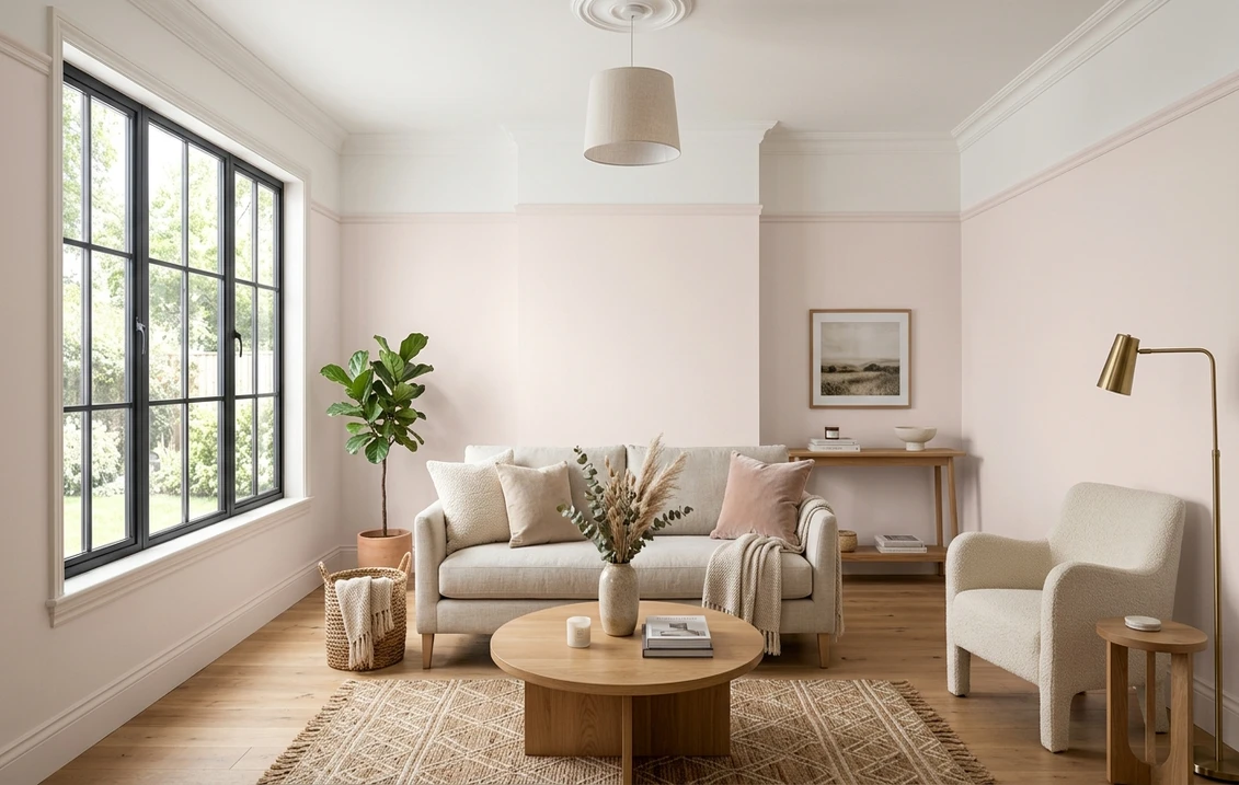
Bedrooms and primary suites
Snowbound's home turf. The pink-warm whisper makes bedrooms feel restful and flattering, and the high LRV keeps a smaller room from closing in. Give it a little direct sun and it sings. Strictly north-facing? Then load the room with warm wood, brass and linen, and that reflected warmth will hold the undertone steady.
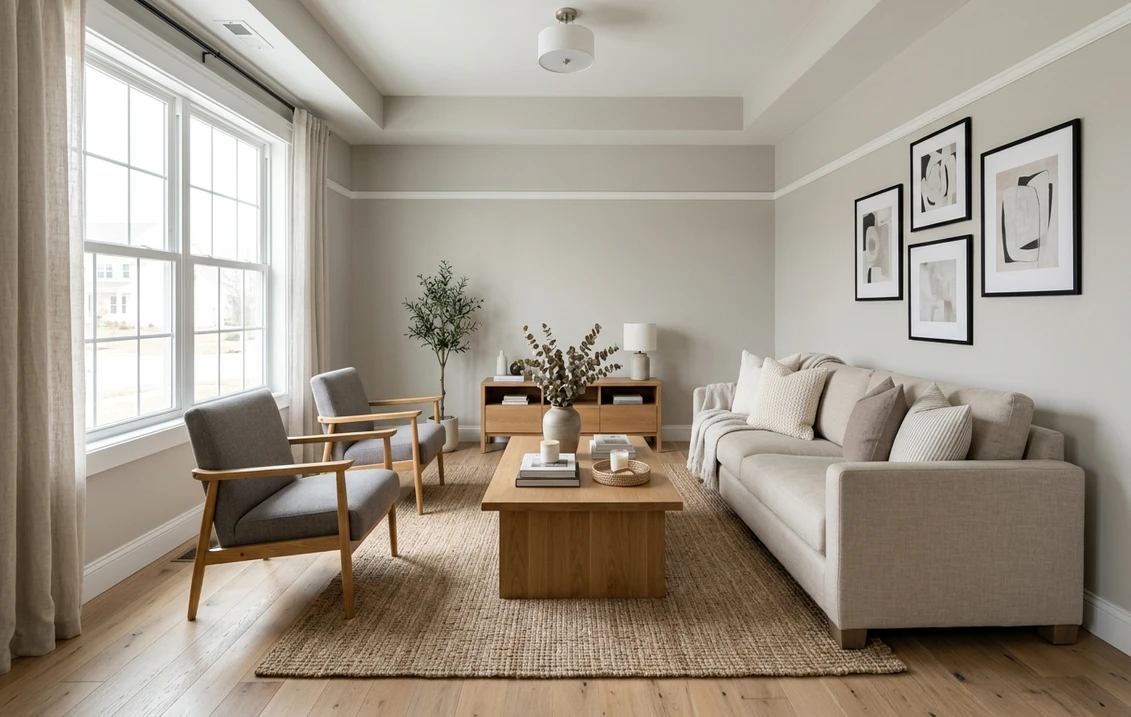
Living rooms and open-plan main floors
On a sunlit main floor, Snowbound is a soft, welcoming backdrop that lets wood tones, art and textiles carry the color. It is a favorite for transitional and modern-farmhouse-light interiors where a yellow-cream feels dated and a true white feels hard.
Kitchens and cabinetry
Cabinet makers reach for Snowbound for one reason: it is soft. It paints up as a refined, slightly warm white that flatters brass and matte-black hardware, butcher block and warm stone. Pair it with a marginally cooler wall so the cabinets stay the warmer element in the room. Budgeting a repaint? Our interior house painting cost guide breaks down ranges by room.
Bathrooms and powder rooms
In a bright, south-facing bath, Snowbound is a softer alternative to a glaring white. Watch the windowless powder room, though. On cool LED, the rose can read pink when you least expect it, so warm the bulbs to 2700K or test before you commit.
Where to think twice
Dark north-facing rooms and home offices on daylight-balanced bulbs are the toughest assignment, because that cool light is what surfaces the mauve. There, a more neutral pick may serve better: our Repose Gray undertones guide and Accessible Beige undertones guide cover two steadier alternatives.
How interior lighting changes Snowbound
Indoor light is two sources stacked, daylight through the window and whatever bulbs you flip on, and both rewrite this color:
- South and west window light: warm, direct sun lifts the pink-warm base; Snowbound glows as a soft off-white with a faint blush at golden hour. Its best daytime light.
- East window light: crisp in the morning, gently warm in the afternoon. A balanced, easy read.
- North window light: cool and indirect; the warmth thins and the rose can surface as soft mauve on overcast days, especially in northern latitudes and winter.
- Warm bulbs (2700K to 3000K): the most flattering nighttime light; the walls turn creamy and candle-lit.
- Cool or daylight bulbs (4000K and up): these mimic cool sky light and push Snowbound toward gray-pink, so test under them if you use them.
Trim, ceiling and cabinet pairings
On interior walls, the colors next to Snowbound either protect its warmth or drag it toward the dingy edge. Aim for gentle contrast. Pair it with whites close in value, and steer clear of a bright cool white, which makes Snowbound look gray by comparison.
- Trim, the safe layered look: Sherwin-Williams Pure White (SW 7005, LRV 84) is about a point brighter but reads cooler-neutral, giving a soft white-on-white separation that keeps the walls warm and the woodwork crisp.
- Trim, for crisp definition: Extra White (SW 7006, LRV 86) sharpens the woodwork, but its coolness can make Snowbound read a hair pinker, so sample the pairing together.
- Ceiling: match the trim white, or run Snowbound onto the ceiling for a soft, enveloping bedroom look. A bright white ceiling in a cool room exaggerates the mauve shift.
- Cabinetry and built-ins: with Snowbound on the walls, keep cabinets within a few LRV points; a marginally warmer or cooler off-white reads intentional, a high-contrast white reads like a mismatch.
- Wood and metals: warm white oak, walnut and honey floors feed reflected warmth onto the walls, and brass, bronze and matte black all sit beautifully against it; cool gray-washed floors amplify any cool drift.
Want to lean into the warmth? Reach for oatmeal linens, terracotta, dusty rose, soft sage and rattan. Want to pull against it instead? Cool blues and charcoal accents bring the crisp contrast.
See Snowbound on the walls with your real trim, cabinets and flooring in a single preview, free.
Snowbound vs the off-whites people cross-shop
Most homeowners weigh Snowbound against the other warm and soft off-whites on the wall. Here is how they separate indoors:
| Color | LRV | Undertone | Reads as |
|---|---|---|---|
| SW Snowbound (7004) | 83 | Slight pink-warm with gray softener | Soft, warm-without-yellow off-white |
| SW Alabaster (7008) | 82 | Warm yellow-cream | Creamy, buttery warm white |
| SW Pure White (7005) | 84 | Cool-neutral, very slight gray | Clean, crisp true white |
| BM Cloud White (OC-130) | 85 | Warm yellow with a hint of pink | Soft creamy white |
Try it on your house
No photo? Try a sample
Sources: Sherwin-Williams SW 7004, 7005 and 7008 technical data sheets, retrieved May 2026; Benjamin Moore OC-130 technical data sheet, retrieved May 2026. Trademarks of their respective owners.
In one line: Snowbound for soft warmth without yellow, Alabaster for full creamy warmth, Pure White for a clean true white. Torn between brands? Our Sherwin-Williams vs Benjamin Moore interior comparison maps the closest matches, and if your taste leans warmer-neutral than a white, the Agreeable Gray undertones guide covers the most popular greige in the lineup.
Snowbound inside vs Snowbound on the facade
This page is the indoor half of Snowbound: walls, rooms, undertones in interior light, and trim, ceiling and cabinet pairings. The color also has a life outside on siding, where the same pink-warm whisper flatters heritage brick, weathered cedar and curb appeal at house-scale; for that side, see our companion SW Snowbound 7004 exterior guide. The two are complementary: this one decides your walls, that one decides your facade.
How to test Snowbound before you commit
Because the undertone only shows at full-wall scale, the 3-inch fan deck is the worst way to judge Snowbound, and it is behind almost every "where did the pink come from" surprise. Two better routes:
- Sample at scale. Use a 12-inch peel-and-stick sample (the Sherwin-Williams ColorSnap Express swatch) on at least two different walls, and view it morning, midday and night under your normal bulbs; the warm-light read and the cloudy-morning read can be two different colors.
- Preview it digitally first. Before buying any sample, upload a photo of the room into our free paint visualizer and apply Snowbound (and a couple of alternatives) to your real walls. It does not replace a physical swatch for sign-off, but it narrows five colors to one or two in minutes.
Upload your room photo and compare Snowbound with Alabaster and Pure White side by side, free.
Frequently asked questions
Is Snowbound a warm or cool white?
Snowbound (SW 7004) is a soft, warm off-white. The undertone is a slight pink-warm rose balanced by a gray softener, warmer than a true white but never yellow like a cream. Under warm bulbs and sunny windows it reads creamy; in cool, indirect north light it can drift toward soft mauve.
What is the LRV of SW Snowbound?
Snowbound has a Light Reflectance Value of 83 on the Sherwin-Williams technical data sheet, in the soft off-white range: bright enough to bounce light around a room, but a few points below a builder white like Extra White (SW 7006, LRV 86), which keeps it soft rather than stark.
Why does Snowbound look pink or mauve in my room?
The pink-warm rose undertone is invisible on a small chip and only blooms on a full wall over about 40 square feet. In cool light (a north room, an overcast day, or daylight LED bulbs) the warm wavelengths thin out and the rose surfaces as soft mauve. Warm 2700K to 3000K bulbs plus warm wood and brass usually pull it back to a creamy off-white.
What trim color goes with Snowbound walls?
Sherwin-Williams Pure White (SW 7005, LRV 84) is the safest interior trim pairing: a point brighter than Snowbound but cooler-neutral, for a soft white-on-white separation without making the walls look dingy. Extra White (SW 7006) adds crisper contrast, but its coolness can make Snowbound read a touch pinker, so sample the two together first.
Snowbound or Alabaster for interior walls?
Both are warm Sherwin-Williams off-whites at nearly the same LRV (Snowbound 83, Alabaster 82), but Snowbound leans pink-warm and reads soft without yellow, while Alabaster leans yellow-cream and reads fully creamy. Choose Snowbound for cleaner warmth with cool grays, brass and dusty-rose decor; choose Alabaster for classic cozy cream. Test whichever you favor in your own light.
See SW Snowbound on your actual walls, with trim and cabinet pairings, before you buy a single sample pot.
Disclaimer: Sherwin-Williams, Snowbound, Alabaster, Pure White and Extra White are trademarks of The Sherwin-Williams Company; Benjamin Moore and Cloud White are trademarks of Benjamin Moore & Co. FacadeColorizer is an independent paint visualization service, not affiliated with or endorsed by these companies. LRV, HEX and RGB values are screen approximations of the published technical data sheet; the painted finish varies by sheen, substrate, lot and lighting, so confirm with a manufacturer sample at full wall scale before purchase. Sources: Sherwin-Williams SW 7004, SW 7005 and SW 7008 technical data sheets 2026, Benjamin Moore OC-130 Cloud White technical data sheet 2026, The Spruce off-white paint editorial 2025, and professional designer undertone references.
Trademarks mentioned (Sherwin-Williams, Benjamin Moore, Behr, Caparol, Brillux, Sto, Alpina, Valspar, PPG, Glidden, Dulux, Crown Trade, Sandtex, Farrow & Ball, Johnstone's, Leyland) are property of their respective owners. FacadeColorizer is independent and not affiliated with any of them. Nominative fair use under Lanham Act §1125.