You held up the Sherwin-Williams chip and it looked like the perfect soft beige: warm, calm, not yellow, not gray. Then you painted a wall and started second-guessing. In the morning it glows like oatmeal; by dusk it goes quiet and a little gray-green. That is Natural Linen (SW 9109) doing what a light warm beige does, and once you understand why, it becomes one of the easiest whole-home neutrals to live with. Stagers lean on it for exactly that reason, when greige feels too gray and cream feels too yellow.
This is a single-color profile for the homeowner who has already shortlisted Natural Linen and wants the specifics before committing a whole floor to it: what the undertones really do, the published LRV, the rooms it flatters, how it shifts from dawn to lamplight, and the trim whites and finishes that make it sing. It is one of the soft warm neutrals in our wider Sherwin-Williams interior paint colors guide, and our roundup of the best interior paint colors for 2026 sets it against the field.
Preview SW Natural Linen under your room's actual light in about 30 seconds, free.
Where Natural Linen sits: the SW 9109 numbers
The published specifications come from the Sherwin-Williams color data, and they predict the wall better than the chip does:
- SW code: 9109, a soft warm neutral in the Sherwin-Williams palette rather than one of the deep beiges.
- LRV (Light Reflectance Value): 66. That is the key figure. It is a light beige, brighter and airier than a true greige, but it is not a white. It keeps walls feeling open while still reading as a soft color.
- Hue family: warm beige with a soft tan-yellow base and a whisper of gray-green. The gray keeps it from going gold; the warmth keeps it from going flat.
- HEX / RGB approximation: roughly #D8CDBA, about RGB 216, 205, 186. A useful screen reference only, never a substitute for a real sample.
- Closest relatives: SW Accessible Beige (7036, LRV 58) is the darker, grayer cousin; SW Alabaster (7008, LRV 82) is the off-white step up. Natural Linen sits in the gap between them, lighter and softer than a greige but with clearly more color than a white.
That LRV of 66 is why people describe Natural Linen as "barely there but warm." It bounces enough light to keep a room from feeling closed in, yet has enough pigment that it never reads as builder white. It behaves like a softer, lighter alternative to the mid-tone greiges, which is exactly why it suits open floor plans and whole-home schemes.
What the undertones actually do
Natural Linen is often sold as a "no-undertone beige," which oversells it. The warm tan base does most of the talking, but a low-key gray-green sits underneath and surfaces in specific conditions. Watch for it three ways:
- In warm or generous light, the tan-yellow base steps forward and Natural Linen reads as a soft, creamy oatmeal beige. This is the version people fall for in listing photos and showrooms.
- In cool or dim light, the gray-green becomes visible and the color reads quieter, closer to a pale greige. North-facing rooms and overcast afternoons pull it this way.
- Next to a strong color, contrast decides the read. Beside crisp white trim it looks unmistakably beige; beside a warm tan sofa or honey oak, it can look almost gray.
The one undertone to test for is that faint green. It is subtle and most people never see it, but it can appear in a north-facing room running cool 5000K daylight bulbs, or against a lot of greenery seen through the windows. The fix is almost always the bulbs and the trim, not the wall color, as the pairings section below covers. If you want the warmth of Natural Linen but more depth and gray for a moodier room, compare our profile of SW Accessible Beige, the mid-tone greige that sits one clear step darker.
How light through the day changes the read
Because Natural Linen is a light beige with a quiet green underneath, it shifts more across the day than a darker, saturated color would. Nothing unstable about that. The color is simply responsive, and here is how each exposure treats it:
- South-facing rooms: the warmest, most flattering version. Abundant midday sun pushes the tan base forward and the walls glow soft and creamy. Natural Linen at its best.
- West-facing rooms: cool and balanced in the morning, then a warm honey glow at sunset. Lovely in a living room used in the evening.
- East-facing rooms: warm and bright early, settling to a neutral soft beige by afternoon. Forgiving and easy.
- North-facing rooms: the test case. With cool indirect light and no direct sun, the gray-green can surface and the color reads paler and quieter. Warm 2700K bulbs and a warm-white trim keep it reading beige rather than drifting gray.
Sources: Sherwin-Williams SW 9109 color data; The Spruce paint undertone references; designer field notes on warm-beige behavior by light.
So here is what it comes down to. That creamy beige you loved in a photo came from a bright, warm room. Drop the same paint into a north-facing study and it reads paler and grayer. Plan for the dimmest moment, not the brightest.
Free AI visualizer: test the color in any room before you buy a sample.
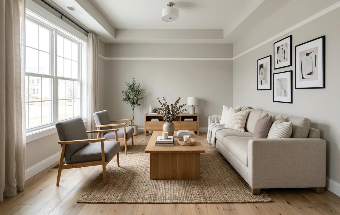
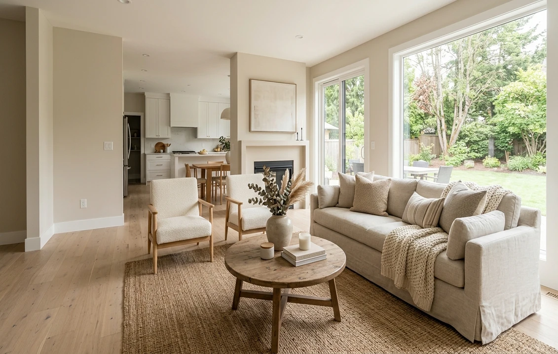
Best rooms for Natural Linen
Natural Linen is light, warm, and low on drama, so it flatters most of the house. A few rooms are where it truly earns its keep:
- Open-concept living and dining: its strongest use. The soft beige flows wall to wall and over the kitchen without fighting cabinets or furniture, which is why it is a go-to whole-home color. The interior color families guide explains how warm neutrals anchor an open plan.
- Bedrooms: warm enough to feel restful, light enough to keep a small room airy, and a calm backdrop for any bedding. It pairs especially well with white oak, rattan, and warm linens.
- Kitchens with white or wood cabinets: it reads warm against white cabinetry and soft against stained wood, bridging the two without taking over, and the higher LRV keeps the room bright.
- Bathrooms and powder rooms with daylight: a spa-like softness that beats a stark white, provided there is some natural or warm light. Skip it in a windowless, cool-LED bathroom where the green can creep in.
Where to be cautious: against cool gray flooring or blue-gray tile it can look slightly muddy, so sample those rooms first. If your space leans cooler and more modern, a true warm gray is the route worth weighing against this beige in our SW Agreeable Gray profile.
Trim whites and decor that pair best
The trim white is where a Natural Linen room reads crisp or muddy. Because the wall is a soft warm beige, a clean but not icy white gives the freshest contrast without making the walls look dingy or pushing them green:
- Best all-around trim: Sherwin-Williams Pure White (SW 7005, LRV 84). Bright with a hint of warmth, it frames Natural Linen cleanly and keeps it reading beige rather than gray. This is the safe default in most stager schemes.
- For a soft, blended look: SW Alabaster (SW 7008, LRV 82). A warm creamy white that lets trim melt gently into the wall for a calm, low-contrast, cohesive feel. For how Alabaster itself behaves in cooler rooms, see our Alabaster north-facing undertones guide.
- Use with care: SW Extra White (SW 7006, LRV 86) or any bright cool white. The crisp contrast can pull Natural Linen grayer and make the white look slightly blue beside it, especially in north light.
- Coordinating darker tone: a deeper warm greige or a soft bronze on an accent wall, island, or built-ins reads as a natural in-family step down without clashing.
- Decor and finishes: warm metals (brass, aged bronze), natural linen, jute and rattan, white oak and walnut, and matte black for definition. Cool chrome, gray-washed oak, and cool gray textiles fight the warmth and can surface the green.
The single best green-prevention move is warm bulbs. Run 2700K to 3000K throughout and the tan base stays in charge; switch to 5000K daylight bulbs and you invite the gray-green forward. Bulb temperature shifts this color as much as the trim does.
Natural Linen vs the colors people confuse it with
Shoppers almost always cross-shop Natural Linen against a few neighbors. The quick map:
| Color | LRV | How it differs from Natural Linen |
|---|---|---|
| Natural Linen (SW 9109) | 66 | Light warm beige, soft tan base, faint green hint |
| SW Accessible Beige (7036) | 58 | Clearly darker and grayer, a true mid-tone greige |
| SW Alabaster (7008) | 82 | Reads as a warm off-white, much less beige color |
| BM Manchester Tan (HC-81) | 64 | A truer, more yellow tan with less gray and more warmth |
Try it on your house
No photo? Try a sample
Pick by what you want more of. Reach for Accessible Beige when you need depth and gray, Alabaster when you want something closer to a soft white, and Manchester Tan when you are after frank yellow warmth. Natural Linen is the light, balanced middle of that set. If that first matchup is your real hesitation, our Natural Linen vs Accessible Beige duel settles it room by room. If you are weighing the two big brands before locking a color, our Sherwin-Williams vs Benjamin Moore interior comparison covers formula, coverage, and price.
How to test it before you commit
A fan-deck chip reads roughly 25 to 35 percent lighter than a rolled wall and cannot show the warm-versus-green swing that defines this color. The reliable method is a large peel-and-stick sample (Sherwin-Williams sells one) on two walls, checked mid-morning, mid-afternoon, and after dark under your normal bulbs. Whether the green shows in the dimmest moment is the version you live with at night.
The faster, no-paint first pass is a digital visualizer: upload a room photo and apply Natural Linen beside a grayer and a warmer alternative to see which way your light pulls it. Once the color is locked, our interior house painting cost guide covers the repaint budget.
Preview Natural Linen beside a warmer and a grayer alternative, free.
Frequently asked questions
Is Natural Linen warm or cool?
Natural Linen (SW 9109) is a warm light beige. The dominant undertone is a soft tan-yellow that reads creamy in most light, with a low-key gray-green underneath that keeps it from going gold. In cool or dim light, especially a north-facing room with cool bulbs, that green can surface and the color reads quieter and a touch grayer, but overall it sits firmly on the warm side of neutral.
What is the LRV of SW Natural Linen?
Natural Linen has a Light Reflectance Value of 66, which makes it a light beige: bright enough to keep a room feeling open, yet with enough pigment to read as a real soft color rather than an off-white. It is noticeably lighter than mid-tone greiges like Accessible Beige (LRV 58) and a clear step deeper than a warm off-white like Alabaster (LRV 82).
Does Natural Linen look green?
It can, in the wrong conditions, but it usually does not. Natural Linen carries a faint gray-green under its warm tan base. That green can surface in a north-facing room running cool 5000K daylight bulbs, or when a lot of greenery is visible through the windows. Warm 2700K to 3000K bulbs and a warm-white trim keep the tan base in charge so the wall reads beige, not green.
What trim color goes with Natural Linen?
Sherwin-Williams Pure White (SW 7005, LRV 84) is the most reliable trim pairing. Bright with a touch of warmth, it frames Natural Linen cleanly and keeps it reading beige rather than gray. For a softer, low-contrast look, use SW Alabaster (SW 7008). Avoid bright cool whites like Extra White (SW 7006) if you do not want the walls to look grayer and the trim slightly blue by contrast.
See SW Natural Linen under your real light, with warmer and grayer alternatives, before buying.
Disclaimer: Sherwin-Williams and SW 9109 Natural Linen are trademarks of The Sherwin-Williams Company. Benjamin Moore and Behr are trademarks of their respective owners. FacadeColorizer is an independent paint visualization service and is not affiliated with, endorsed by, or sponsored by Sherwin-Williams, Benjamin Moore, or Behr. Screen color approximates the manufacturer's sample; always confirm with a physical sample before purchase. Sources: Sherwin-Williams SW 9109 Natural Linen color data 2026, Sherwin-Williams Pure White SW 7005 and Alabaster SW 7008 color data, The Spruce paint undertone references, and designer field notes on warm-beige behavior by light.
Trademarks mentioned (Sherwin-Williams, Benjamin Moore, Behr, Caparol, Brillux, Sto, Alpina, Valspar, PPG, Glidden, Dulux, Crown Trade, Sandtex, Farrow & Ball, Johnstone's, Leyland) are property of their respective owners. FacadeColorizer is independent and not affiliated with any of them. Nominative fair use under Lanham Act §1125.