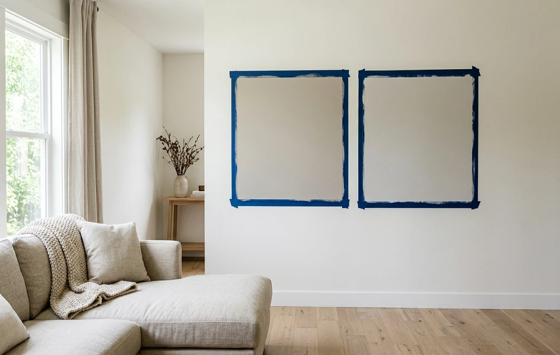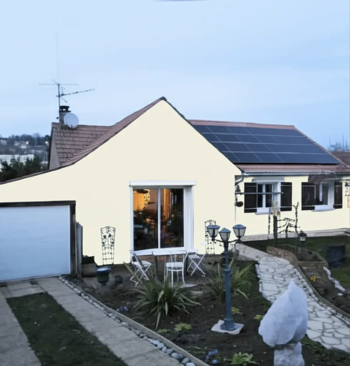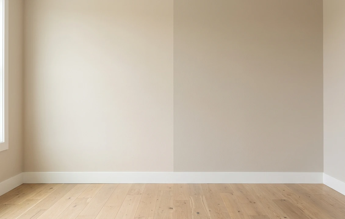
Try it on your house

The verdict in three lines. Natural Linen SW 9109 (LRV 66) is the lighter, creamier beige: it keeps small and dim rooms airy and blends softly into white trim.
Accessible Beige SW 7036 (LRV 58) is the deeper, grayer beige: it anchors big open rooms, defines walls against white trim, and bridges gray and beige finishes.
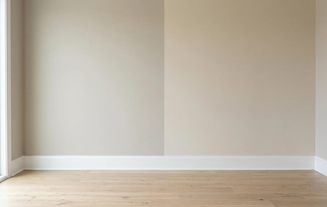
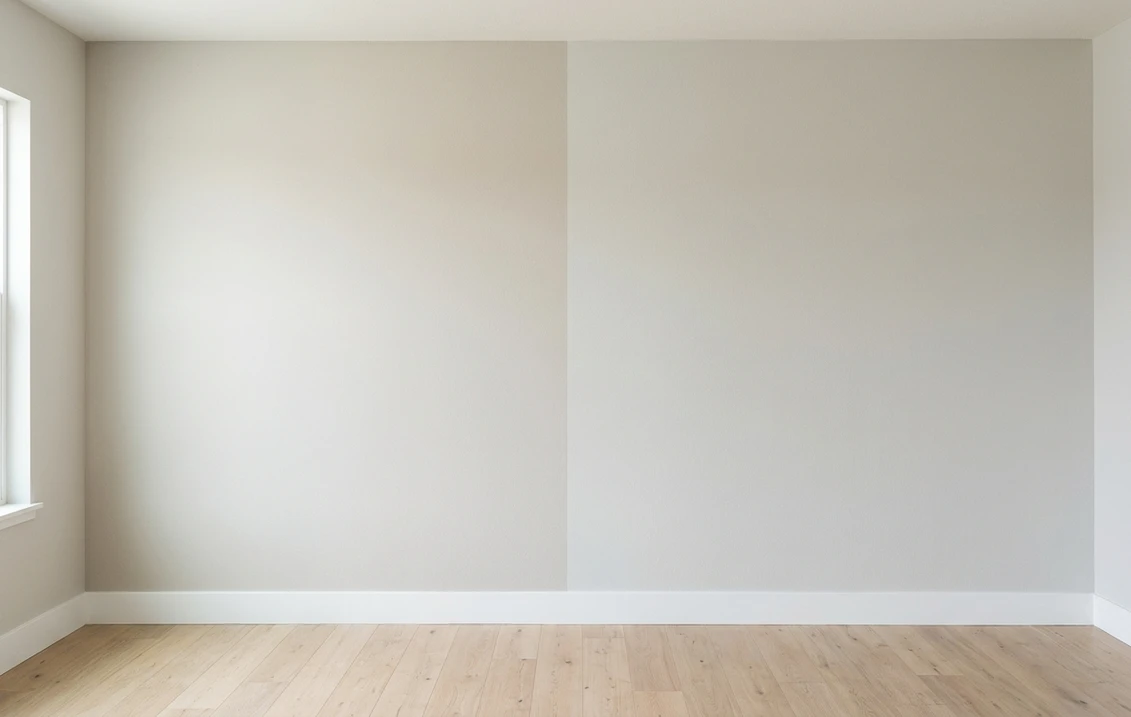
Unlike most beige duels, the 8-point LRV gap here is clearly visible on a wall. Depth decides this one first, undertone second, and your own photo settles both.
Sherwin-Williams Natural Linen (SW 9109) and Accessible Beige (SW 7036) sit on the same shopping list for anyone who wants warm walls without committing to yellow-leaning builder beige. On chips they look like near-twins. On a full wall they behave like two different strategies: one lightens the room, the other grounds it. This head-to-head puts the numbers side by side, plays out the duel room by room and exposure by exposure, and tells you exactly when each color wins. For the general method behind any two-color decision, start with our side-by-side method for comparing paint colors.
The numbers side by side
| Attribute | Natural Linen SW 9109 | Accessible Beige SW 7036 |
|---|---|---|
| Family | Light creamy beige | Greige-leaning beige |
| LRV | 66 | 58 |
| Approximate hex | #DFD3C3 | #D1C7B8 |
| Approximate RGB | 223, 211, 195 | 209, 199, 184 |
| Undertone | Soft creamy warmth, stays gentle rather than yellow | Beige steadied by gray, calmer and less sunny than classic beige |
| Loves | White trim, light oak, linen and boucle textiles, airy bedrooms | Open floor plans, white trim contrast, mixed gray and beige finishes |
| Watch out for | Can wash toward off-white in strong sun | Can read flat or muddy in dim, low-light corners |
| Overall vibe | Airy, soft, barely-there warmth | Grounded, cozy, deliberate |
Try it on your house
No photo? Try a sample
LRV values are the published Sherwin-Williams figures. Hex and RGB are approximate digital renderings; the authoritative reference is a physical Sherwin-Williams chip or peel-and-stick sample.
Read that table once and you can see why this duel plays differently from the classic greige match-ups. In a pairing like the Agreeable Gray vs Accessible Beige match-up, depth is nearly a tie and undertone does all the work. Here the depth row is the headline: 66 versus 58 is a gap you notice from the doorway. Natural Linen reads like a warm off-white with body; Accessible Beige reads like a true wall color with weight. Undertone still matters as the tiebreaker: Natural Linen carries a creamy softness, while Accessible Beige keeps a gray backbone that stops it from ever looking sunny or yellow.
Upload one photo, get a photorealistic render, then swap to Accessible Beige in one click. Free, no signup.
Room by room, exposure by exposure
Because the depth gap is real, the deciding question in each room is simple: does this space need more light, or more definition? Here is how the duel typically plays out.
| Situation | Usual winner | Why |
|---|---|---|
| Small or dim bedroom | Natural Linen | The higher LRV keeps the room airy where a deeper beige would close it in |
| Open-plan main floor | Accessible Beige | Enough body to define long walls and read intentional next to white trim |
| North-facing living room | Natural Linen | Cool, flat light drops every color a step; Natural Linen stays soft while Accessible Beige can go flat |
| Bright south-facing room | Accessible Beige | Strong sun can wash Natural Linen toward off-white; Accessible Beige keeps its presence |
| Kitchen with white cabinets | Accessible Beige | The deeper wall gives white cabinetry visible definition instead of melting into it |
| Whole-house interior-exterior continuity | Accessible Beige | It is a proven exterior body color as well, so the palette can run through the front door |
That last row deserves a note. If your shortlist extends to siding and stucco, Accessible Beige has a dedicated playbook for orientation, trim, and materials in the Accessible Beige exterior guide. Natural Linen is overwhelmingly specified as an interior color, which is exactly where its light, creamy character earns its keep.
An Accessible Beige exterior almost always needs a dark for shutters, the front door, or a garage band, and that second choice carries a constraint the wall color does not: heat. A near-black such as Wrought Iron 2124-10 (LRV 6) reads sharp on a door or a pair of shutters but absorbs more heat across a large surface, so a warm charcoal such as Kendall Charcoal HC-166 (LRV about 12) is the safer call on vinyl or engineered siding. Benjamin Moore Wrought Iron vs Kendall Charcoal works through that trade-off surface by surface.
When to choose Natural Linen
- You want warmth without weight. Natural Linen delivers a beige feeling at nearly off-white brightness, so rooms stay open and calm.
- The room is small, dim, or north-facing. At LRV 66 it bounces meaningfully more light back than Accessible Beige, which matters most where light is scarce.
- Your palette is soft and layered. Light oak floors, white trim, linen and wool textures: Natural Linen joins that family without adding contrast.
- You were about to pick white but the samples felt cold. Natural Linen is the classic landing spot one notch warmer and one notch deeper than a warm white.
For its full undertone breakdown, best rooms, and trim pairings, see the dedicated Natural Linen undertones and best rooms profile.
When to choose Accessible Beige
- You need one anchor color for a big, connected space. Accessible Beige has the depth to hold long sightlines and open plans together without going dark.
- Your finishes mix gray and beige. Its gray backbone is the classic bridge between beige stone or carpet and gray furniture or tile.
- The room is bright. In generous daylight Accessible Beige stays composed while lighter beiges drift toward white.
- You want visible contrast with white trim and cabinets. The 58 LRV creates a clear, crisp trim line that a near-off-white cannot.
The full room-by-room treatment, including lighting behavior and companion shades, lives in the Accessible Beige room-by-room profile. And if you find yourself wanting even more depth than SW 7036, the Accessible Beige vs Balanced Beige duel compares it against the next step down.
Same wall, both beiges, your actual light. Free render in about 30 seconds.
Frequently asked questions
What is the real difference between Natural Linen and Accessible Beige?
Depth first, undertone second. Natural Linen SW 9109 has an LRV of 66 and reads like a creamy near-off-white, while Accessible Beige SW 7036 sits at LRV 58 and reads like a true wall color with visible body. The 8-point gap shows clearly on a full wall. Undertone is the tiebreaker: Natural Linen is softer and creamier, Accessible Beige carries more gray.
Is Natural Linen lighter than Accessible Beige?
Yes, and noticeably so. At LRV 66 versus 58, Natural Linen reflects meaningfully more light than Accessible Beige, so it reads a clear step lighter and airier on the wall. If you sample both side by side, nobody will confuse which is which, even though the chips look similar at the store.
Which is better for a small or dark room, Natural Linen or Accessible Beige?
Natural Linen, in most homes. Low-light rooms make every paint color look a step darker, and Natural Linen has brightness in reserve while Accessible Beige can turn flat or heavy in dim corners. The exception is a small room you deliberately want to feel cocooned and cozy; there, Accessible Beige's extra depth becomes a feature. Sample on the darkest wall before deciding.
Can I use Natural Linen and Accessible Beige together in the same house?
Yes, and this pairing works better than most beige-on-beige combinations because the depth gap is big enough to read as intentional. A common plan is Natural Linen in bedrooms, hallways, and low-light rooms, with Accessible Beige anchoring the main living areas. Keep the trim color identical throughout so the two beiges read as one family.
Settle it on your photo
Chips lie, screens lie, and a sample patch on someone else's wall tells you about their light, not yours. The fastest honest answer to Natural Linen vs Accessible Beige is to test both colors on a photo of your actual room and let your own trim, floor, and windows pick the winner. You will see the depth gap immediately, and the undertone question will answer itself.
1 HD render plus 3 free color variations. Start with Natural Linen, swap to Accessible Beige in one click.
Trademark notice. Sherwin-Williams®, Natural Linen®, Accessible Beige®, Balanced Beige® and Shoji White® are trademarks of The Sherwin-Williams Company. FacadeColorizer is not affiliated with, endorsed by, or sponsored by The Sherwin-Williams Company. Brand and color names are used for descriptive and editorial purposes only, consistent with nominative fair use. Hex and RGB values are approximate digital renderings; the only authoritative reference is a physical Sherwin-Williams color sample.
Trademarks mentioned (Sherwin-Williams, Benjamin Moore, Behr, Caparol, Brillux, Sto, Alpina, Valspar, PPG, Glidden, Dulux, Crown Trade, Sandtex, Farrow & Ball, Johnstone's, Leyland) are property of their respective owners. FacadeColorizer is independent and not affiliated with any of them. Nominative fair use under Lanham Act §1125.