The name says white. The wall, more often than not, says otherwise. Sherwin-Williams Shoji White (SW 7042) is not really a white at all. Its Light Reflectance Value of 74 lands below the off-white threshold designers usually draw near LRV 80, and the undertone underneath is a quiet greige with a whisper of taupe. So it photographs as "white" in a bright, sunny listing photo, then turns into a soft, complex putty on the wall of a normal lived-in room. Reach for it when a true white feels cold but a beige feels too yellow.
Already shortlisted Shoji White? Then you need the specifics, not the sales pitch: what its undertone does, the published numbers, the rooms it flatters, how it moves under different light, and the trim and decor that make it sing. This is one of the warm neutrals we break down in our wider Sherwin-Williams interior paint colors guide, and you can see how it stacks up against the rest of the field in our roundup of the best interior paint colors for 2026.
Preview SW Shoji White under your room's actual light in about 30 seconds, free.
White or greige? The published numbers behind SW 7042
The honest answer to "is it a white or a greige" is both. Against a stark builder white it reads warm and tinted, clearly not white; against a true tan it reads pale and crisp, clearly not beige. Most designers treat it as the lightest member of the greige family rather than the darkest member of the white family. Skip the marketing copy and look at the actual Sherwin-Williams color data. These are the numbers that predict how it behaves on a wall:
- SW code: 7042, in the Sherwin-Williams white and off-white family.
- LRV (Light Reflectance Value): 74. Light and open, but a full 6 to 8 points below the popular "soft white" group (Alabaster 82, Greek Villa 84). That gap is why Shoji White holds more visible color on the wall.
- Hue family: warm off-white leaning greige, a pale base with a balanced gray-and-taupe undertone and a faint green-gray side in cool light.
- HEX / RGB approximation: roughly #DFD9CD, about RGB 223, 217, 205. A screen reference only, never a stand-in for a real sample.
- Closest relatives: SW Natural Linen (7531), a touch warmer; Alabaster (7008), warmer, creamier, and noticeably lighter.
If you remember one figure, make it the LRV of 74. Bright enough that Shoji White never feels dark, low enough that it reads as a real soft neutral instead of vanishing into "white." A sun-flooded south room lifts it toward a clean warm white; a dim or north room settles it into a calm greige. That single swing, from off-white to greige, is the behavior every owner needs to plan around.
What the undertone actually does
Call Shoji White a "no-fuss neutral" and you sell its undertone short, because that undertone works hard. The base is a balanced greige (warm taupe-gray with a hint of yellow). Behind it sits a quieter green-gray side that only surfaces in specific conditions:
- In warm, abundant light, the taupe base softens and it reads as a creamy, gently warm off-white, the version that wins in staged listing photos.
- In cool or low light, the gray steps forward into a true pale greige, sometimes brushing a soft green-gray. North rooms and overcast days pull it this way.
- Next to a bright white, the contrast exposes its warmth and it looks clearly tinted, more putty than white. Beside a tan or oak floor, the gray side surfaces and it reads cooler.
The one undertone to test for is that green-gray cast. It is subtle, but in a north-facing room running cool 5000K daylight LED bulbs, Shoji White can pick up a faint green-gray that reads a touch dull, so sample first and look at the wall after dark. For how undertones get classified across whites, grays, and greiges, our interior color families guide maps where a soft greige like this one sits.
How room orientation tips it
Room orientation tips Shoji White noticeably one way or the other. If you fell for the bright, almost-white version in a photo, that was a sunny south or west room; the same paint in a north-facing study reads as a soft greige instead. The table maps the typical read across the four orientations in the Northern Hemisphere:
| Room orientation | Daylight character | How Shoji White reads |
|---|---|---|
| South-facing | Warm, abundant midday light | Lifts to a clean, soft warm white, its lightest version |
| West-facing | Cool mornings, very warm late-day sun | Greige by day, glowing warm putty at sunset |
| East-facing | Warm early sun, neutral by afternoon | Soft warm off-white in the morning, settles to greige later |
| North-facing | Cool, indirect, no direct sun | Reads as a calm pale greige, can hint green-gray |
Try it on your house
No photo? Try a sample
Sources: Sherwin-Williams SW 7042 color data; The Spruce paint undertone references; designer field notes on greige and off-white behavior by orientation.
Pin down which version your light delivers and you save yourself a repaint. Want a warmer, creamier white under cool north light instead? Our SW Alabaster on north-facing walls profile is the companion read.
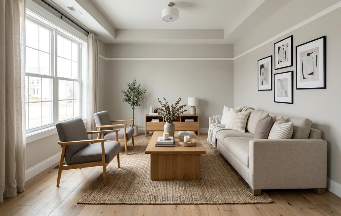
The rooms Shoji White flatters most
That chameleon quality is exactly what makes Shoji White a strong whole-home neutral. Still, it earns its keep best in the spots where its soft warmth has room to breathe:
- Open-concept living and dining: its sweet spot. Light enough to keep the floor plan airy, warm enough to feel cohesive wall to wall, neutral enough not to fight the kitchen or furniture. A favorite for transitional and Japandi interiors built on wood and linen.
- Bedrooms: the soft greige warmth reads calm and restful without the chill of a true white, and layers under almost any bedding alongside white oak, rattan, and warm metals.
- Kitchens and cabinetry: light enough to use on cabinets, where its subtle greige gives more depth than a stark white and bridges white and stained-wood elements.
Where to be careful: in a small windowless north-facing bathroom or a cool-lit basement, Shoji White can read flat and slightly green-gray, so sample first. Weighing it against a cooler, grayer option? Compare our profile of SW Repose Gray.
Free AI visualizer: test the color in any room before you buy a sample.
Trim, ceiling, and decor pairings
Because the wall itself is so light, the trim question flips compared with a mid-tone color: you want a trim white that is clearly brighter, so the wall reads as the gentle warm neutral it is rather than as dirty trim.
- Best crisp trim: Sherwin-Williams Pure White (SW 7005, LRV 84) or Extra White (SW 7006, LRV 86). Both are brighter than Shoji White and frame it cleanly. Pure White is the safer pick because its slight warmth keeps the pairing from feeling cold.
- For a soft, low-contrast look: use Shoji White on the trim too, or pair it with a creamy white like SW Alabaster (SW 7008). This blends rather than frames, ideal for calm, tonal rooms. Keep the ceiling a bright flat white to hold the room open.
- Coordinating walls: for accent walls, Shoji White nests beautifully under deeper greiges and warm grays like SW Anew Gray or Mega Greige, or a soft sage such as Evergreen Fog.
- Decor and finishes: it loves warm materials. White oak, rattan, jute, linen, aged brass, and matte black for definition all play to its warmth. Cool chrome, blue-gray tile, and gray-washed oak pull against it.
Want the same soft warmth but more visible color on the wall? The natural step up is a true greige; our profile of SW Accessible Beige covers the mid-tone version of this same warm-neutral idea.
Shoji White vs the colors people cross-shop
Shoppers almost always weigh Shoji White against three other SW neutrals:
- vs SW Alabaster (7008): Alabaster is lighter (LRV 82), creamier, and unmistakably a warm white; Shoji White is deeper, greiger, and more complex. Choose Alabaster for a soft true-white feel, Shoji White for a hint of color and a more grounded look. For the full room-by-room breakdown, see our Shoji White vs Alabaster side-by-side verdict.
- vs SW Agreeable Gray (7029): deeper (LRV 60) and more clearly a warm gray-greige, where Shoji White is lighter and leans whiter. Want light and airy? Shoji White. Want a more present greige? See our Agreeable Gray profile.
- vs SW Sea Salt (6204): not a true rival, but fans of Shoji White's softness sometimes consider Sea Salt for a green-blue version of the same calm. For a quiet spa feel, see our Sea Salt profile.
Still deciding between the two big US brands before locking a color? Our Sherwin-Williams vs Benjamin Moore interior comparison covers formula, coverage, and price differences that matter once the shade is chosen.
How to test Shoji White before you commit
A fan-deck chip is the worst way to judge this color: it reads roughly 25 to 35 percent lighter than a rolled wall. The reliable method is a large peel-and-stick sample on two different walls, checked mid-morning, mid-afternoon, and after dark under your normal bulbs. How far it slides toward greige in the dimmest light is the version you live with at night.
The faster, no-paint first pass is a digital visualizer: upload a room photo and apply Shoji White beside a lighter white and a deeper greige. Once the color is locked, our interior house painting cost guide covers what the repaint should run.
Preview Shoji White beside a brighter white and a deeper greige, free.
Frequently asked questions
Is Shoji White a warm or cool color?
Shoji White (SW 7042) is a warm off-white that leans greige. Its base is a balanced taupe-gray with a hint of yellow, so in most light it reads warm and soft. In cool or dim light, especially north-facing rooms, the gray side surfaces and it can brush a faint green-gray. Overall it sits on the warm side of neutral, just gently rather than strongly.
What is the LRV of Shoji White SW 7042?
Shoji White has a Light Reflectance Value of 74. That is light and airy but clearly below the true off-white group (Alabaster sits at 82, Greek Villa at 84). The lower LRV is why Shoji White holds more visible color on the wall and reads as a soft neutral rather than a clean white.
Is Shoji White actually a white or a greige?
It is on the line, which is its whole appeal. Most designers treat Shoji White as the lightest member of the greige family rather than a true white. Next to a stark white it looks clearly warm and tinted; next to a tan it looks pale and crisp. In a bright sunny room it lifts toward off-white, and in a dim or north room it settles into a soft greige.
What trim color goes with Shoji White?
For crisp contrast, use a brighter white than the wall: Sherwin-Williams Pure White (SW 7005, LRV 84) is the safest pick, with Extra White (SW 7006) for an even sharper frame. For a soft, low-contrast tonal look, paint the trim Shoji White too, or pair it with a creamy white like Alabaster (SW 7008). Avoid pairing it with a much grayer cool white if you do not want the walls to look dingy.
What is the difference between Shoji White and Alabaster?
Alabaster (SW 7008, LRV 82) is lighter, creamier, and reads as a soft warm white. Shoji White (SW 7042, LRV 74) is deeper and greiger, with more visible color and a more modern, grounded feel. Choose Alabaster when you want a true off-white; choose Shoji White when you want a hint of warmth and complexity without going to a full beige.
See SW Shoji White under your real light, beside a brighter white and a deeper greige, before buying.
Disclaimer: Sherwin-Williams and SW 7042 Shoji White are trademarks of The Sherwin-Williams Company. Benjamin Moore and Behr are trademarks of their respective owners. FacadeColorizer is an independent paint visualization service and is not affiliated with, endorsed by, or sponsored by Sherwin-Williams, Benjamin Moore, or Behr. Screen color approximates the manufacturer's sample; always confirm with a physical sample before purchase. Sources: Sherwin-Williams SW 7042 Shoji White color data 2026, Sherwin-Williams Pure White SW 7005, Extra White SW 7006, and Alabaster SW 7008 color data, The Spruce paint undertone references, and designer field notes on greige and off-white behavior by orientation.
Trademarks mentioned (Sherwin-Williams, Benjamin Moore, Behr, Caparol, Brillux, Sto, Alpina, Valspar, PPG, Glidden, Dulux, Crown Trade, Sandtex, Farrow & Ball, Johnstone's, Leyland) are property of their respective owners. FacadeColorizer is independent and not affiliated with any of them. Nominative fair use under Lanham Act §1125.