You picked a white that looked like milky cream on the chip, painted the room, and at noon the south wall glows like soft butter. That is Sherwin-Williams Creamy (SW 7012) doing exactly what it is built to do. It is not a crisp builder white and not a true off-white that hides its hand. It is a frankly warm cream, a white with a real yellow base you can see, and that single trait decides every room it belongs in and every room where it will fight you.
This is a single-color profile for the homeowner who has already shortlisted Creamy and now wants the specifics: what the undertone does, the published LRV, the rooms where its warmth reads cozy rather than yellow, and the trim and finishes that pair with it. Creamy is one of the warm whites featured in our wider Sherwin-Williams interior paint colors guide, and our roundup of the best interior paint colors for 2026 sets it against the cooler whites and greiges it competes with.
Preview SW Creamy under your room's actual light in about 30 seconds, free.
Creamy SW 7012 by the numbers
Start with the numbers. They tell you most of what the paint will do on a wall before you ever open a can. Here is the Sherwin-Williams color data for SW 7012:
- SW code: 7012, in the Sherwin-Williams white and pastel family.
- LRV (Light Reflectance Value): 81. High enough to read as a white and keep a room bright, but a few points below a builder white like Extra White (SW 7006, LRV 86), which is why it feels softer and never glares.
- Hue family: warm off-white with a clear yellow base and a faint green-gray that keeps it from going fully gold. The yellow is the dominant note.
- HEX / RGB approximation: roughly #EFE9D4, about RGB 239, 233, 212. A useful screen reference only, never a substitute for a physical sample.
- Closest relatives: SW Alabaster (7008, LRV 82) is its quieter, more balanced sibling; SW Greek Villa (7551, LRV 84) is brighter with a peachier lean; Benjamin Moore White Dove (OC-17, LRV 85) is the cross-brand cousin that reads creamy but more neutral.
The LRV of 81 is the number to hold onto. It is bright enough to bounce light around a dim room, where Creamy earns its keep, but the warm base means it never reads as a clinical white.
What the undertone actually does
Creamy is one of the more honest warm whites Sherwin-Williams sells: it does not hide its undertone. Where Alabaster whispers a hint of warmth, Creamy says it out loud. That yellow base behaves in three predictable ways:
- In warm or low light, the yellow reads as soft cream, the cozy, candle-lit warmth most people want from this color. North-facing rooms, hallways, and evenings under 2700K bulbs flatter it.
- In bright, direct sun, the same yellow intensifies. A south or west wall at midday can push Creamy toward a true buttery yellow, sometimes more saturated than the chip suggested.
- Next to a brighter white, the warmth is unmissable. Beside a crisp trim white it reads as a soft cream rather than a white; beside an old-builder beige it can look almost white.
The faint green-gray buried under the yellow keeps Creamy from turning gold or peach the way a pure-yellow-based white can. It is the same restraining undertone that gives Alabaster its softness. For how that quieter warm white handles cool light, where it can fall flat, see our SW Alabaster north-facing undertones guide.
How room orientation changes the read
Because Creamy carries a strong warm base, light direction does not change whether it looks warm, only how warm. The table maps its typical behavior by orientation in the Northern Hemisphere:
| Room orientation | Daylight character | How Creamy reads |
|---|---|---|
| North-facing | Cool, indirect, no direct sun | Its best look: a soft, balanced cream that warms the room |
| East-facing | Warm early sun, neutral by afternoon | Glowing cream at breakfast, calm warm white later |
| South-facing | Warm, abundant midday light | Buttery and bright; watch for a yellow tip at noon |
| West-facing | Cool mornings, very warm late-day sun | Quiet by day, deep golden yellow at sunset |
Try it on your house
No photo? Try a sample
Sources: Sherwin-Williams SW 7012 color data; The Spruce paint undertone references; designer field notes on warm-white behavior by orientation.
Here is where Creamy breaks the usual rule. Most warm whites go flat in cool north light and come alive in the sun. Creamy does the reverse. It looks its best in north and east rooms, where the cooler light tames the yellow into a perfect cream. Save your caution for the bright south and west rooms, where the warmth can run hot. And if a cooler white ever left your north-facing room looking flat or gray, this is often the fix.
Best rooms for Creamy
Creamy is a mood color first and a neutral second. It works hardest in rooms the light would otherwise leave cold:
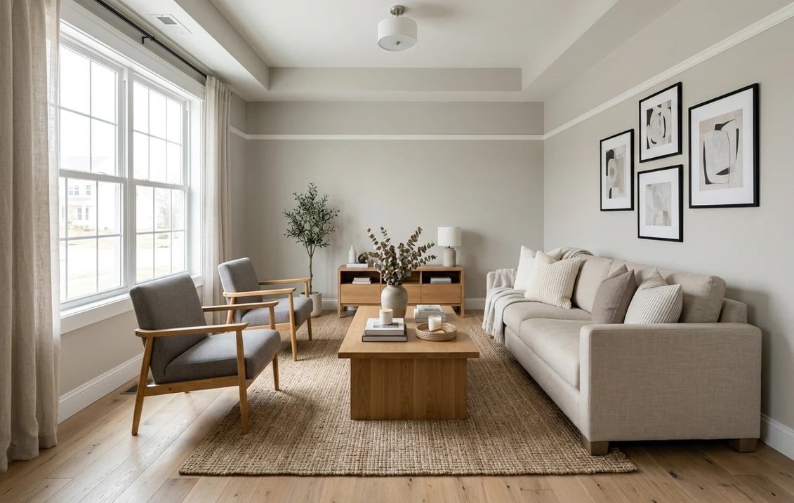
- North-facing bedrooms and nurseries: its single best use. The warm base counteracts cool, flat north light and gives a soft, restful glow a true white cannot.
- Hallways, entries, and stairwells: these low-light transitions go gray under most whites. Creamy keeps them warm and lived-in, while the LRV of 81 still bounces enough light to stop them feeling dark.
- Kitchens with cream or wood cabinets: a natural partner for warm white shaker cabinetry, butcher block, and brass hardware, building a soft farmhouse feel rather than a stark modern one.
- Trim and millwork in warm schemes: beyond walls, Creamy is a popular soft-white trim and cabinet color when a bright white would feel too clinical against warm wall colors.
Where to be cautious: a bright, modern, south-facing space with cool gray flooring and chrome fixtures is the wrong home for Creamy, where the warmth fights everything. For a cooler, contemporary scheme, our profile of SW Accessible Beige covers the warm-greige route, and SW Sea Salt shows where a soft cool-toned color fits the same rooms.
Free AI visualizer: test the color in any room before you buy a sample.
Trim whites and decor that pair best
Trim makes or breaks a Creamy room. The wall is already a warm cream, so the trim wants to go brighter and cleaner. Just steer clear of an icy blue-based white, or the contrast will leave the walls looking dingy:
- Best all-around trim: Sherwin-Williams Pure White (SW 7005, LRV 84). Bright and very slightly warm, it frames Creamy walls crisply without making them look yellow or grimy. The safe default.
- For a soft, low-contrast look: keep trim and walls in Creamy with a sheen change (satin trim, matte walls) for a calm, tonal feel.
- Use with care: SW Extra White (SW 7006, LRV 86) or any bright cool white. The blue-white contrast can make Creamy look more yellow and slightly dirty, especially in strong light. Test it first.
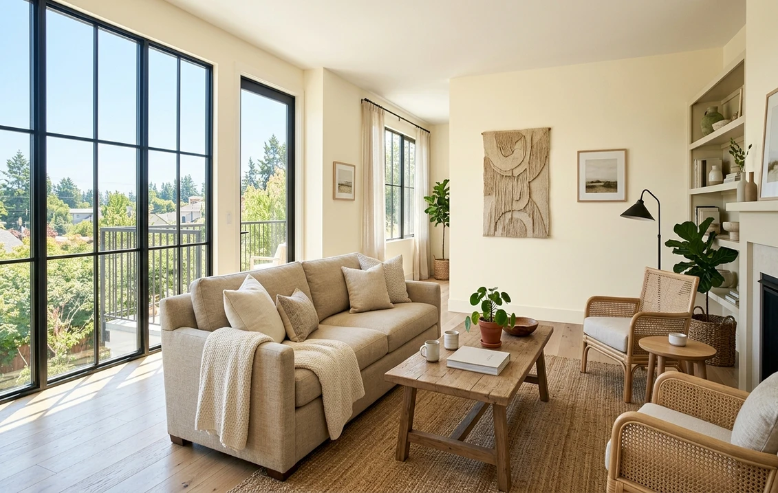
- Decor and finishes: warm metals (brass, bronze, gold), white oak, walnut, rattan, linen, and jute all sing with Creamy; black accents add definition. Cool chrome, gray-washed oak, and blue-gray tile fight the undertone and read muddy.
- Coordinating wall color: a warm greige or soft sage in an adjacent room flows naturally with Creamy; a cool gray next door makes the Creamy room look yellow through the doorway.
To see how warm whites sit alongside greiges, true grays, and cool whites when you build a whole-home palette, the interior color families guide is the place to start.
Creamy vs the whites people confuse it with
Creamy is almost always cross-shopped against other warm whites. The differences are small on the chip and obvious on the wall:
| Color | LRV | How it differs from Creamy |
|---|---|---|
| SW Creamy (7012) | 81 | The warmest of the group; openly yellow-cream |
| SW Alabaster (7008) | 82 | More balanced and subtle; warmth is quieter, can read gray in cool light |
| SW Greek Villa (7551) | 84 | Brighter and crisper, with a slight peach lean instead of pure yellow |
| BM White Dove (OC-17) | 85 | Brighter, creamier-neutral; the safe "barely warm" white |
Really, it comes down to one question: how much warmth are you willing to commit to? Go with Creamy when you want the warmth obvious and the room cozy. Alabaster is the warm-but-neutral pick, as long as you can live with a gray cast sneaking in under north light. Greek Villa and White Dove split the difference, a touch brighter and a touch safer. If you are weighing the two brands more broadly before locking a color, our Sherwin-Williams vs Benjamin Moore interior comparison covers the formula, coverage, and price differences that matter once the shade is chosen.
How to test Creamy before you commit
A fan-deck chip is the worst way to judge Creamy. It reads roughly 25 to 35 percent lighter than a rolled wall and cannot show how the yellow intensifies in your light. The reliable method is a large peel-and-stick sample on two walls, checked mid-morning, mid-afternoon, and after dark under your normal bulbs. The midday reading on your brightest wall tells you whether the warmth tips into yellow; the evening reading tells you how cozy it gets under lamplight.
The faster, no-paint first pass is a digital visualizer: upload a room photo and apply Creamy beside a brighter white to read your light. Once the color is locked, our interior house painting cost guide covers what the repaint should run.
Preview Creamy beside a brighter white to see which way your light pulls it, free.
Frequently asked questions
Is Sherwin-Williams Creamy too yellow?
It depends entirely on the light. Creamy (SW 7012) has a real yellow undertone, so in bright, direct south or west sun at midday it can read as a true butter yellow rather than a soft cream. In cool north light, east light, or under warm evening bulbs, that same yellow settles into a flattering cream. It is not "too yellow" for the right room; it is too yellow for a sun-flooded modern space with cool finishes. Always sample it in your brightest light before committing.
What is the LRV of SW Creamy?
Creamy has a Light Reflectance Value of 81. That keeps it firmly in white territory, bright enough to lighten a dim room, but a few points below a true builder white like Extra White (SW 7006, LRV 86), which is why it feels softer and warmer rather than stark. The high LRV is part of why it works so well to warm up low-light hallways and north-facing rooms without making them feel dark.
What is the difference between Creamy and Alabaster?
Both are warm Sherwin-Williams off-whites at almost the same brightness (Creamy LRV 81, Alabaster LRV 82), but Creamy is noticeably warmer and more openly yellow, while Alabaster is more balanced and subtle. Creamy commits to warmth; Alabaster stays neutral until cool light pulls a soft gray out of it. Choose Creamy when you want obvious coziness, especially in north light. Choose Alabaster when you want warm but neutral and the room gets decent warm light.
What trim white goes with Creamy?
Sherwin-Williams Pure White (SW 7005, LRV 84) is the most reliable trim pairing. It is bright and very slightly warm, so it frames Creamy walls crisply without going icy and making them look yellow or dingy. For a softer, tonal look, keep the trim in the same warm-white family and rely on a sheen difference for definition. Avoid pairing Creamy with stark cool whites like Extra White unless you have tested the contrast, because the blue-white can make the walls look dirtier and more yellow.
See SW Creamy under your real light, with a brighter white alongside, before buying a single sample.
Disclaimer: Sherwin-Williams and SW 7012 Creamy are trademarks of The Sherwin-Williams Company. Benjamin Moore and Behr are trademarks of their respective owners. FacadeColorizer is an independent paint visualization service and is not affiliated with, endorsed by, or sponsored by Sherwin-Williams, Benjamin Moore, or Behr. Screen color approximates the manufacturer's sample; always confirm with a physical sample before purchase. Sources: Sherwin-Williams SW 7012 Creamy color data 2026, Sherwin-Williams Pure White SW 7005 and Alabaster SW 7008 color data, Benjamin Moore OC-17 White Dove color data, The Spruce paint undertone references, and designer field notes on warm-white behavior by orientation.
Trademarks mentioned (Sherwin-Williams, Benjamin Moore, Behr, Caparol, Brillux, Sto, Alpina, Valspar, PPG, Glidden, Dulux, Crown Trade, Sandtex, Farrow & Ball, Johnstone's, Leyland) are property of their respective owners. FacadeColorizer is independent and not affiliated with any of them. Nominative fair use under Lanham Act §1125.