That freshly painted American home you just toured? Odds are the walls came out of a Sherwin-Williams can. The brand publishes more than 1,700 interior shades, yet a couple of dozen colors do most of the actual work. A short list of warm grays, soft whites, quiet beiges, and a handful of muted greens keeps showing up across real estate listings, model homes, and designer reels. This page is the map to that short list, organized by color family, with the exact SW code, the published Light Reflectance Value (LRV), the undertone to watch for, and the rooms each one actually suits.
Think of this as the hub. Each color family below links out to a deeper profile when you need to go further (undertone shifts by light direction, trim pairings, brand-for-brand comparisons). If you would rather skip the chips entirely, you can preview any of these SW colors on a photo of your own room in about 30 seconds, free, before you commit to a single sample pot.
Upload one photo and compare Agreeable Gray, Alabaster, Accessible Beige and more under your actual light.
How to read this guide (and why LRV matters)
Two numbers decide most of what a paint color does indoors. The first is the SW code, the unique identifier that guarantees the store tints the exact formula and not a look-alike. The second is the LRV, a 0 to 100 scale published by Sherwin-Williams for how much visible light a color bounces back. A higher LRV reads brighter and makes a room feel larger; a lower LRV reads moodier and absorbs light. As a rough field guide:
- LRV 80 and up: reads as white or near-white. Great for ceilings, trim, and small or north-facing rooms that need every photon.
- LRV 55 to 75: the "greige" and soft-neutral zone where most popular SW wall colors live. Bright enough to feel light, warm enough to feel cozy.
- LRV 35 to 55: midtones with real presence. Think muted greens, putty, and warm taupes for accent walls and cabinetry.
- LRV under 25: deep, dramatic colors (Naval, Iron Ore, Urbane Bronze) for moody rooms, islands, and front doors.
Undertone is the third lever, and the one that surprises people. A "gray" with a green base behaves nothing like a "gray" with a violet base once your room's light gets involved. We flag the undertone for every color below, but a chip can only hint at it. The honest test is to see it on your own wall.
The warm grays and greiges (where SW dominates)
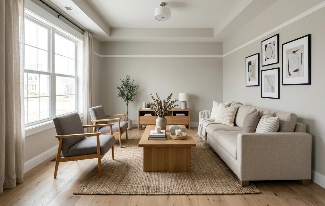
If Sherwin-Williams is famous for one thing indoors, it is the warm gray. These are the colors that built the "modern farmhouse" decade and still anchor most neutral interiors. They sit in the comfortable LRV 55 to 75 band and lean greige (gray plus beige) rather than cool concrete gray.
- Agreeable Gray (SW 7029), LRV 60: the most-painted SW neutral of the decade. A true greige with a soft warm base and a faint green-gray edge in low light. It reads warm in most rooms and pairs with nearly any wood tone. Best for living rooms, hallways, and open-plan main floors. Full breakdown in our Agreeable Gray undertones and best rooms guide.
- Repose Gray (SW 7015), LRV 58: a half-step cooler and grayer than Agreeable Gray, with a subtle purple-taupe undertone that can show up under cool light. The go-to when Agreeable Gray photographs "too beige." Great for bedrooms and bathrooms. See the Repose Gray undertones guide.
- Mindful Gray (SW 7016), LRV 48: the deeper cousin of Repose Gray, a true mid-gray greige with quiet warmth. Reads more "gray" than "beige" and grounds a room without going dark. Strong on accent walls and cabinetry.
- Worldly Gray (SW 7043), LRV 57: warmer and a touch more taupe than Agreeable Gray, with a soft green undertone. A favorite for west-facing and sunlit rooms where you want warmth without yellow.
These four cover most "I just want a warm neutral" requests. The trap is choosing between them from a fan deck, where they look nearly identical. In a real room they diverge fast: light direction, floor color, and trim all push the undertone one way or the other. For the full family logic (warm vs cool, how greige differs from true gray), see our interior paint color families guide.
See Agreeable Gray, Repose Gray and Worldly Gray side by side on your actual room, free.
The whites and off-whites
White is the hardest color to buy from a chip, because the undertone only shows once it is on a wall and surrounded by light. Sherwin-Williams off-whites split cleanly into warm (cream-leaning) and clean (crisp, near-neutral). Pick by the mood of the room, not by which chip looks "whitest" in the store.
- Alabaster (SW 7008), LRV 82: the 2016 Color of the Year and still a top-selling warm white. A soft creamy base that photographs inviting on south and west walls, but can drift greige or mauve in cool north light. Read our Alabaster on north-facing walls guide before you commit in a cool room.
- Pure White (SW 7005), LRV 84: the workhorse "just barely warm" white. Clean enough to read as white, soft enough to avoid the clinical look. The default SW trim color and a safe whole-house white.
- Snowbound (SW 7004), LRV 83: a soft white with a barely-there gray-pink undertone. Slightly cooler and more neutral than Alabaster, popular for cabinetry and trim when the walls are greige.
- Extra White (SW 7006), LRV 86: the cool, crisp white. A blue-gray undertone gives it a clean, modern edge. Excellent for contemporary spaces and as a bright trim against deep wall colors; too cool for cozy farmhouse looks.
For a competing favorite homeowners often cross-shop against Alabaster, see the Benjamin Moore White Dove (OC-17) review. And if your shortlist is "any brand, just the best white," our best interior paint colors of 2026 roundup compares across SW, BM, and Behr.
The beiges, taupes and "new neutrals"
Beige never left; it got better. The 2020s version is warmer, more sophisticated, and less yellow than the builder beige of two decades ago. Sherwin-Williams leads this category indoors, and these are the colors quietly replacing cool gray in homes that want to feel warmer.
- Accessible Beige (SW 7036), LRV 58: the flagship "new beige." A warm greige-beige with a gray base that keeps it modern, not dated. It plays beautifully with both warm woods and white trim. Deep dive in our Accessible Beige undertones and best rooms guide.
- Kilim Beige (SW 6106), LRV 57: warmer and more golden than Accessible Beige, with a soft pink-tan undertone. Cozy in low-light rooms and Tuscan-leaning interiors.
- Balanced Beige (SW 7037), LRV 47: a deeper greige-taupe, one step down from Accessible Beige. Reads warm and grounding; strong for accent walls, dens, and bedrooms.
- Natural Tan (SW 7567), LRV 65: a clean, light true tan with minimal pink. Brighter than Accessible Beige and Kilim Beige, it gives you warmth without the gray of a greige, and it keeps a room feeling open rather than grounded.
Accessible Beige is the natural starting point if you loved Agreeable Gray but found it too cool. The two are close cousins, and homeowners frequently sample both before deciding which direction their light pushes. The other classic in this lane is a Benjamin Moore color worth knowing: the Revere Pewter (HC-172) review covers BM's most famous greige, a useful benchmark when you compare across brands.
The greens and moody darks
After a decade of gray, color came back, and it came back muted. Sherwin-Williams greens in particular have become the default for kitchen islands, built-ins, and accent walls. These are richer, so the LRV runs lower; sample them generously because deep colors shift hard with light.
- Evergreen Fog (SW 9130), LRV 30: the 2022 Color of the Year and arguably the green that started the trend. A gray-green sage with a soft, earthy quality. Outstanding on cabinets, accent walls, and bedrooms.
- Sea Salt (SW 6204), LRV 63: a pale, calming green-gray that flickers between green and blue depending on light. A spa favorite for bathrooms and bedrooms, and far more forgiving than the darker greens.
- Pewter Green (SW 6208), LRV 12: a deep, sophisticated forest-gray-green. A top pick for kitchen islands and statement cabinetry where you want drama without going full black.
- Naval (SW 6244), LRV 4: not a green, but the navy that belongs in this conversation. A rich, classic blue for islands, libraries, and front doors. Deep enough to read nearly black at night.
- Urbane Bronze (SW 7048), LRV 8: the 2021 Color of the Year, a warm charcoal-brown. The brand's signature "moody warm dark" for accent walls, exteriors, and cozy dens.
These darks earn their keep most often in the kitchen, where a deep island against light perimeter cabinets has become the defining look of the era. If that is your project, our complete kitchen cabinet color guide and the trending cabinet paint colors for 2026 both go deeper on pairings and finishes.
Preview Evergreen Fog, Pewter Green or Naval on your real kitchen before you order, free.
Quick-reference table: popular SW interior colors
| Color | SW code | LRV | Family / undertone | Best rooms |
|---|---|---|---|---|
| Agreeable Gray | 7029 | 60 | Warm greige | Living room, hallway, open plan |
| Repose Gray | 7015 | 58 | Cooler greige (violet) | Bedroom, bathroom |
| Accessible Beige | 7036 | 58 | Warm greige-beige | Living room, dining, whole house |
| Alabaster | 7008 | 82 | Warm white | Trim, walls, sunlit rooms |
| Pure White | 7005 | 84 | Soft clean white | Trim, ceilings, whole house |
| Sea Salt | 6204 | 63 | Green-blue-gray | Bathroom, bedroom, spa spaces |
| Evergreen Fog | 9130 | 30 | Gray-green sage | Cabinets, accent walls, bedroom |
| Pewter Green | 6208 | 12 | Deep forest gray-green | Islands, statement cabinetry |
| Naval | 6244 | 4 | Rich navy blue | Islands, libraries, front doors |
| Urbane Bronze | 7048 | 8 | Warm charcoal-brown | Accent walls, dens, exteriors |
Try it on your house
No photo? Try a sample
Sources: Sherwin-Williams official color pages and technical data sheets (LRV values), 2026; Sherwin-Williams Color of the Year archive; The Spruce paint color references.
How to choose between near-identical SW colors
The honest problem with Sherwin-Williams indoors is not finding a good color, it is telling apart the five good colors that look the same on the chip. A repeatable method beats guessing:
- Start from the room's light, not the chip. North-facing rooms cool every color down, so lean warmer (Accessible Beige over Repose Gray). South and west rooms add warmth, so a cooler greige stays balanced.
- Narrow to two, never six. Pick the family first (greige, warm white, green), then the two closest candidates. Agreeable Gray vs Accessible Beige, or Alabaster vs Pure White, are the classic finalists.
- Test at three times of day. Morning, midday, and under your evening artificial lights. Undertones swing most at the edges of the day.
- Check it against your fixed elements. Floor, countertop, and large furniture decide more than the wall. A color that fights your floor undertone will always look "off."
- Preview before you sample. A digital visualizer narrows six chips to two in minutes, so you only buy the one or two sample pots that actually matter.
That last step is where FacadeColorizer earns its place. Upload a photo of the real room, drop real SW colors onto the walls, and watch undertone and brightness behave in context before a dime goes to samples. For room-by-room inspiration once you have a family in mind, browse our paint color ideas by room, the top 15 living room paint colors, and the calming master bedroom colors roundup.
Sherwin-Williams vs the other big brands
Most homeowners do not shop one brand in a vacuum; they cross-shop SW against Benjamin Moore and Behr. Each has a personality. Sherwin-Williams owns the warm-greige conversation and has the widest store network. Benjamin Moore is the designer default for whites and rich historical colors. Behr is the value play at Home Depot with surprisingly strong neutrals.
- SW vs Benjamin Moore: the closest rivalry on greige and white. Our Sherwin-Williams vs Benjamin Moore interior comparison lines up the matches color for color.
- SW vs Behr: price and availability vs library depth. See the Behr vs Sherwin-Williams interior comparison for the equivalents and where Behr saves you money.
- Going Behr or BM instead? Browse the parallel hubs: Behr interior paint colors 2026 and Benjamin Moore interior paint colors 2026.
A quick warning about "Swiss Coffee." That famous warm white is not one color. Several brands sell their own formula under the same name, and they do not match. If it is on your list, our Swiss Coffee comparison (Behr vs Benjamin Moore OC-45) sorts out the differences.
Indoors vs outdoors: this is the interior side
Several of these colors live a double life. Alabaster, Repose Gray, Accessible Beige, Naval, and Urbane Bronze are all popular on siding, trim, and front doors too, but they behave very differently outdoors, where harsh direct sun, sky reflection, and scale change how an undertone reads. This page is the interior reference: walls, rooms, undertones under indoor light, and trim pairings inside the house. For the same brand on the building envelope (best exterior lines, the 174 SW exterior shades tested, and how each color reads on a full facade), see our companion Sherwin-Williams exterior paint guide. The two are complementary: pick your interior palette here, and take the exterior color decision over there.
Budgeting the project is the other half of the decision. Color choice and labor scope drive the bill more than the brand of paint does. Our interior house painting cost guide breaks down what a repaint actually runs per room and per square foot in 2026.
Upload one photo, apply real SW colors to the walls, and compare brightness and undertone in context, free.
Frequently asked questions
What is the most popular Sherwin-Williams interior color?
Agreeable Gray (SW 7029) has been the single most-painted Sherwin-Williams interior neutral of the past decade. It is a warm greige with an LRV of 60, which keeps it bright enough to feel light and warm enough to feel cozy in most rooms. Accessible Beige (SW 7036) and Alabaster (SW 7008) are the next most common, covering the warm-beige and warm-white lanes respectively.
What is the difference between Agreeable Gray and Accessible Beige?
Close cousins. Their LRV is nearly identical (60 vs 58). The split is in the lean: Agreeable Gray runs slightly cooler and grayer, Accessible Beige a touch warmer and more beige. Put them in a north-facing or cool room and Accessible Beige tends to hold its warmth better; in a bright, sunny room, Agreeable Gray stays more balanced. Most homeowners sample both and let the room's light cast the deciding vote.
Which Sherwin-Williams white is best for trim?
For most jobs, reach for Pure White (SW 7005, LRV 84). It is soft enough to dodge that clinical look, yet clean enough to still read as white. Want a crisper, cooler edge against colored walls? Extra White (SW 7006, LRV 86) does the job. One rule with warm or greige walls: keep the trim within a few LRV points, or step up to a clean white, so the contrast looks intentional rather than mismatched.
Can I use the same SW color inside and outside my house?
Yes, the same color comes in both interior and exterior formulas. No, it will not look the same in each. Outdoors, direct sun, sky reflection, and the sheer scale of a facade push undertones lighter and often cooler than they read on an interior wall. So test it in both contexts. This guide covers the interior behavior; our Sherwin-Williams exterior paint guide covers how these shades read on siding and trim outside.
Skip the guesswork: see your shortlist of Sherwin-Williams colors on your actual room before buying a single sample pot.
Disclaimer: Sherwin-Williams and the SW color names and codes referenced here are trademarks of The Sherwin-Williams Company. Benjamin Moore and Behr are trademarks of their respective owners. FacadeColorizer is an independent paint visualization service and is not affiliated with, endorsed by, or sponsored by Sherwin-Williams, Benjamin Moore, or Behr. Color reproduction on screens approximates the manufacturer's chip; always confirm with a manufacturer sample before purchase. Sources: Sherwin-Williams official color pages and technical data sheets (LRV values) 2026, Sherwin-Williams Color of the Year archive, The Spruce paint color references.
Trademarks mentioned (Sherwin-Williams, Benjamin Moore, Behr, Caparol, Brillux, Sto, Alpina, Valspar, PPG, Glidden, Dulux, Crown Trade, Sandtex, Farrow & Ball, Johnstone's, Leyland) are property of their respective owners. FacadeColorizer is independent and not affiliated with any of them. Nominative fair use under Lanham Act §1125.