
The first time I rolled Sherwin-Williams Iron Ore (SW 7069) on a client's interior doors, the homeowner paused and said "wait, that is not black?" That reaction is the whole point. Iron Ore reads as black across a room, but step close in warm lamplight and you catch the brown-gray warmth underneath. It is the softest of the popular near-blacks, the one designers reach for when a true black like Tricorn feels too hard. Two questions keep coming up: is iron ore actually black or gray, and where does it look its best indoors?
One quick note on naming so you land on the right guide. This page is the indoor profile for SW 7069, and it owns the bare term iron ore indoors: walls, doors, cabinets, accent walls, undertones, and pairings. The color's outdoor life on siding and front doors (sun load, fade, vinyl warranties) lives in our SW Iron Ore exterior complete guide, which owns the outdoor search. This profile is one stop in our Sherwin-Williams interior paint colors guide.
Upload a photo and preview SW Iron Ore (plus a true black for comparison) under your actual light in about 30 seconds, free.
Iron Ore SW 7069 at a glance: the numbers that matter
Before opinions, the verifiable specs from the Sherwin-Williams color library, the values you can take to the paint counter:
- SW number: 7069.
- LRV (Light Reflectance Value): approximately 6. For context, a true black like Tricorn sits near 3 and a builder white near 90. At LRV 6 Iron Ore absorbs almost all light, so it reads black from across the room while staying a hair softer than a dead-flat black.
- Hex / RGB: approximately #45494B / 69, 73, 75. The channels sit close, but blue and green edge just above red: the quiet signature of a cool-leaning warm-soft black, not a pure neutral.
- Color family: warm soft near-black, a deep charcoal with a brown-gray heart.
- Undertone: warm brown-gray primary, with a faint cool charcoal edge that surfaces in bright daylight.
- Tint base: ultra-deep (extra-deep) base only. A lighter base never reaches LRV 6, so a miscanned Iron Ore comes out a muddy mid-gray. Expect a second coat and a tinted gray primer under it.
The takeaway: Iron Ore is not a true black, and not a gray either. It lives in the narrow band between, near-black enough to make a statement, soft enough that it never feels harsh. That is why it has become the default iron ore paint pick for millwork and doors.
Is Iron Ore black or gray? The undertone, decoded
Call it "just gray" and you are looking at a small chip in a bright store; call it "basically black" and you are seeing it rolled out on a wall. Both are half right, because Iron Ore sits on the line between the two.
The warm brown-gray heart is dominant in most interior light, which keeps Iron Ore from feeling cold. Under warm 2700K bulbs it reads almost espresso, soft and grounded. But it also carries a faint cool charcoal edge: in bright daylight or under cooler 4000K LEDs, that cool side steps forward and Iron Ore reads crisper, grayer, closer to a true charcoal. It never flashes blue the way some cool blacks do, but the warm-to-cool swing across a day is real, and it is the thing to test for.
One quirk to watch: sheen changes Iron Ore more than hue does. At LRV 6 the wall has almost nothing to reflect, so what you mostly see is the finish. Flat or matte reads as a deep, light-swallowing near-black; satin or semi-gloss catches window reflections and feels a half-shade lighter. On doors and cabinets, where you want durability, that satin lift is a feature, not a flaw.
- South or west-facing (warm): its most flattering read, a warm soft near-black where the brown comes through and the late-day sun pulls it toward espresso.
- East-facing: rich in the morning, then a crisper charcoal by afternoon.
- North-facing (cool, indirect): cooler and grayer; the charcoal edge surfaces and it reads nearer to true black.
- Artificial light: warm 2700K bulbs read cozy and almost espresso; cool 4000K reads grayer and sharper.
Sources: Sherwin-Williams SW 7069 color data 2026; designer field reports compiled by FacadeColorizer.
Free AI visualizer. Test Iron Ore on your real walls before buying a single sample pot.
Best rooms (and surfaces) for Iron Ore indoors
Iron Ore is a confidence color, not a fill color. The goal is rarely to paint the whole room but to anchor a space or make one feature read deliberate and expensive. Where it earns its keep, from most forgiving to boldest:
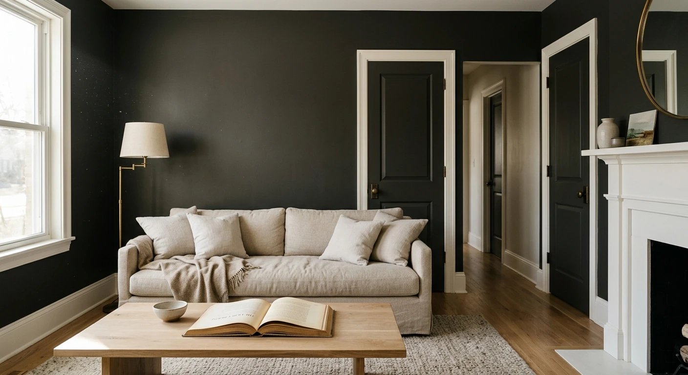
Interior doors and trim (the safest big win)
This is Iron Ore's home turf. Painting interior doors (or a window sash) while keeping walls light is the highest-style, lowest-commitment move in the book. Black doors with black hardware against off-white walls have been one of the most-saved looks for years, and Iron Ore softens it just enough to feel warm rather than severe. Cut in carefully around the casing, lay off for a furniture-grade finish, and use satin so fingerprints wipe clean.
Cabinets, islands, and built-ins
Iron Ore on doors and cabinets is where the color truly shines, a staple for a kitchen island base, lower cabinets under lighter uppers, a butler's pantry, and library shelving. Against white or marble counters and warm wood, Iron Ore lowers read grounded and high-end, never heavy. Specify satin or semi-gloss for a durable, wipeable surface, and prime with a tinted gray primer so two coats fully cover.
Accent walls in offices, dens, and bedrooms
A single Iron Ore accent wall behind a desk or a bed reads focused and cocooning, and it makes brass, walnut, and framed art pop without the flat severity of a true black. Because it is softer than Tricorn, it is the more forgiving choice in a smaller or darker room, where dead black tips into cave territory. For the broader strategy, see our guide to black interior walls.
Where to think twice
A small, windowless room wrapped entirely in Iron Ore under cool LED light is where it falls flat and reads as a dull mid-charcoal: the warmth has nothing to feed it. There, commit to warm 2700K bulbs, or step up to true black like Tricorn if you want full drama. And if near-black on every wall feels like too much, a warmer brown-gray a few shades lighter, like Urbane Bronze, gives depth without the edge.
Free visualizer. Upload your room photo and test Iron Ore on cabinets or one wall before you commit a can.
Trim, wall, and decor pairings
A near-black lives or dies on what sits next to it. Iron Ore is warm, so it flatters warm whites and natural materials best. A few pairings are reliably worth specifying by name:
- Warm companion white (most harmonious): SW Alabaster (SW 7008, LRV 82). Its soft cream bias echoes Iron Ore's warmth, so doors and walls feel like one collected scheme rather than a hard black-and-white contrast.
- Crisper contrast white: SW Pure White (SW 7005, LRV 84). A cleaner edge that makes Iron Ore doors read sharper and pushes it toward its cool charcoal side. Best for modern, black-window homes.
- Greige envelope: Iron Ore built-ins or doors against Agreeable Gray walls give a layered, warm neutral scheme, softer and more livable than black-and-white alone.
- Avoid: a stark blue-white like SW Extra White right beside Iron Ore. The cool contrast exaggerates the charcoal edge and leaves the warmth looking muddy.
- Floors and decor: warm oak, walnut, rattan, and natural linen bring out the brown. Brass and aged-gold hardware are the classic counterpoints; matte-black hardware doubles down.
If you want the same near-black drama with zero warmth and zero drift, that is the job of a true neutral black: our SW Tricorn Black profile covers when to pick that instead.
Iron Ore vs the near-blacks people confuse it with
"Just pick a dark color" is a trap; the near-blacks read very differently on a real wall. Here is how Iron Ore stacks up against the deep tones people cross-shop indoors:
| Color | LRV | Undertone indoors | Best when you want |
|---|---|---|---|
| SW Iron Ore 7069 | ~6 | Warm brown-gray, soft near-black | A softer almost-black that reads warm, never stark |
| SW Tricorn Black 6258 | 3 | None (true neutral) | True black that stays black in every light |
| SW Urbane Bronze 7048 | ~8 | Warm brown-gray | Depth and warmth a few steps lighter |
| SW Peppercorn 7674 | ~8 | Cool charcoal-gray | A dark gray that stays cool, reads as gray |
| BM Wrought Iron 2124-52 | ~6 | Cool, blue-charcoal | A soft black-gray that leans cool |
LRV and undertone values per Sherwin-Williams and Benjamin Moore color data 2026; undertone notes reflect designer consensus. Values are approximate and shift with finish and light.
So here is the call in one breath. Reach for Iron Ore when you want a warm, soft near-black that grounds doors and cabinets without going harsh. Switch to Tricorn when you want true, undertone-free black that never drifts. Drop to Urbane Bronze when near-black is one step too far and you still want warmth and depth.
How to test Iron Ore before you commit
Sampling a near-black is trickier than sampling a white. The differences between deep tones are subtle, and bad lighting flattens them in seconds. Four rules keep the test honest:
- Never judge from a fan-deck chip, and test your real sheen. A 1-inch chip ringed by white paper looks lighter and grayer than a rolled wall, and Iron Ore in flat versus satin looks like two different colors. Use a 12-inch peel-and-stick sample in the finish you will actually use (usually satin on doors and cabinets).
- View it morning, midday, and night, next to the trim and floor. The warm-to-cool swing is biggest between daylight and lamplight, so check it around 9 a.m., 2 p.m., and under your evening bulbs, taped beside your real white trim and a board near the floor.
The fastest no-paint option is digital: upload a real photo and apply Iron Ore (plus Tricorn Black for the true-black comparison) to your doors or one wall, judging it against your own trim and light first. Pricing context is in our interior house painting cost guide for 2026, which explains why a saturated near-black costs more than an off-white repaint.
Compare a warm near-black and a true black on your actual surface, free.
Frequently asked questions
Is Iron Ore black or gray?
Iron Ore (SW 7069) is a soft near-black with a warm brown-gray base, so the honest answer is both. On a small chip in a bright store it can read as a dark gray, but rolled out on a wall or door it reads as black across the room. Up close in warm lamplight the brown-gray warmth shows, which keeps it from feeling as hard as a true black.
What is the LRV of Iron Ore?
Iron Ore has a Light Reflectance Value of about 6 on the Sherwin-Williams color data, with a hex approximation near #45494B (RGB about 69, 73, 75). That puts it just above a true black like Tricorn (LRV 3) and well below a dark gray, which is why it reads as a warm soft near-black rather than a flat black.
Is Iron Ore good on doors and cabinets?
Yes, doors and cabinets are where Iron Ore is most loved. On interior doors with black hardware against light walls, and on islands, lower cabinets, and built-ins against white counters and warm wood, it reads grounded and high-end without the severity of a true black. Use satin or semi-gloss for durability, and prime with a tinted gray primer so two coats cover.
What trim color goes with Iron Ore?
SW Alabaster (SW 7008) is the most harmonious companion because its soft cream bias echoes Iron Ore's warmth. SW Pure White (SW 7005) is the crisper, cooler option that makes Iron Ore doors read sharper and more modern. Avoid a stark blue-white like Extra White next to it, which can exaggerate the cool charcoal edge and make the warmth look muddy.
Iron Ore or Tricorn Black for an interior accent wall?
Choose Iron Ore (LRV about 6) when full black feels too hard and you want a warm, soft almost-black that is more forgiving in smaller or darker rooms. Choose Tricorn Black (LRV 3) when you want a genuine, uncompromising black that stays black in every light. Sampling both on the actual wall, side by side, is the only way to be sure.
Preview SW Iron Ore on your doors and walls under your own light before buying a sample.
Disclaimer: Sherwin-Williams, Iron Ore (SW 7069), Tricorn Black (SW 6258), Urbane Bronze (SW 7048), Peppercorn (SW 7674), Agreeable Gray (SW 7029), Alabaster (SW 7008), Pure White (SW 7005), and Extra White are trademarks of The Sherwin-Williams Company. Benjamin Moore and Wrought Iron (2124-52) are trademarks of Benjamin Moore & Co. FacadeColorizer is an independent paint visualization service, not affiliated with, endorsed by, or sponsored by Sherwin-Williams or Benjamin Moore. Color on screens approximates the manufacturer's chip; always confirm with a manufacturer sample under your own light before purchase. Sources: Sherwin-Williams SW 7069, SW 6258, and SW 7048 color data 2026, Benjamin Moore published color data 2026, designer field reports compiled by FacadeColorizer.
Trademarks mentioned (Sherwin-Williams, Benjamin Moore, Behr, Caparol, Brillux, Sto, Alpina, Valspar, PPG, Glidden, Dulux, Crown Trade, Sandtex, Farrow & Ball, Johnstone's, Leyland) are property of their respective owners. FacadeColorizer is independent and not affiliated with any of them. Nominative fair use under Lanham Act §1125.


