
The first time a client showed me a board with Sherwin-Williams Gauntlet Gray (SW 7019) swatched next to white oak and brass, I knew exactly where it was headed: a moody kitchen island, a built-in wall, maybe a charcoal exterior she had seen on a coastal build. This dark warm gray has quietly become the go-to when "I want gray but with some weight" walks through the door. The question that follows, every single time, is whether it leans blue, green, or brown, and which rooms can actually carry something this deep. The honest answer rides almost entirely on your light. Here is how it behaves indoors.
Quick orientation before the deep dive. Gauntlet Gray has a published LRV of about 17 and a hex approximation of #5C574F (RGB 92, 87, 79). That is a deep, warm gray (a charcoal with a brown-taupe core), not a cold slate. It is dark enough to read dramatic, warm enough to feel grounded instead of icy, and that single trait is what saves it in rooms where a blue-gray charcoal would feel cold and corporate. This profile is one stop in our wider Sherwin-Williams interior paint colors guide, and it pairs naturally with our guide to gray paint colors and their interior shades if you are still deciding how dark to go.
Upload a photo of your actual room and preview SW Gauntlet Gray under your own light in about 30 seconds, free.
Gauntlet Gray at a glance: the numbers that matter
Before opinions, here are the verifiable specs straight from the Sherwin-Williams color library. These are the values you can take to a paint counter:
- SW number: 7019.
- LRV (Light Reflectance Value): approximately 17. Dark enough to read as a true charcoal-gray, but a notch lighter and softer than near-black neighbors like Iron Ore (LRV around 6).
- Hex / RGB: approximately #5C574F / 92, 87, 79. The red channel sits highest and blue lowest, which is the mathematical signature of a warm, brown-leaning gray.
- Color family: deep warm gray (a charcoal with a taupe-brown core), often filed under "greige gone dark."
- Undertones: warm brown-taupe primary, with a faint green-gray that only surfaces in cool, shaded light. No blue, no violet.
- Tint base: mixed in a deep or ultra-deep base. A standard light base cannot hold this depth and will read chalky.
The takeaway from those numbers: Gauntlet Gray is a warm charcoal, not a slate. At LRV 17 with a brown-taupe core, it lands in the upper-middle of the dark-gray range, deep enough to anchor a feature wall, light enough to still show a hint of color rather than reading flat black. Sitting in that spot, neither true black nor wishy-washy mid-gray, is exactly what lets it work on cabinets, islands, and full walls without swallowing a room whole.
Is Gauntlet Gray warm or cool? The undertone, decoded
Gauntlet Gray is a warm color. People who call it cool are usually reacting to one of two things: a north-facing room or a bright blue-white trim sitting right next to it. Here is what is happening underneath.
The brown-taupe base is dominant in most light. But Gauntlet Gray also carries a whisper of green-gray, the same muting pigment you find in many designer charcoals. In warm or balanced light that green-gray stays buried and the wall reads as a rich, warm charcoal with a faint taupe glow. In cool, indirect light (a north room, an overcast Tuesday, deep shade), the warm wavelengths get subtracted and the residual green-gray steps forward. That is when Gauntlet Gray can look a touch flatter or greener than the chip promised. Critically, it does not turn blue or lavender the way many cooler charcoals do, which is exactly why painters reach for it when they want depth without a cold cast.
Watch out for one quirk. Gauntlet Gray photographs cooler and grayer than it lives, especially on glossy cabinets under camera flash. So if you are choosing from Pinterest photos alone, assume the real wall will land a half-step warmer and browner than the image suggests. Cut in a small patch and look at it next to a true blue-gray to see the warmth jump out.
| Indoor light | How Gauntlet Gray reads |
|---|---|
| South-facing (bright, warm) | Rich warm charcoal with a clear taupe glow, its most flattering read |
| West-facing (warm afternoon) | Leans warmest and brownest in late-day sun, almost espresso at golden hour |
| East-facing (cool after noon) | Warm and grounded in the morning, a flatter neutral charcoal by afternoon |
| North-facing (cool, indirect) | Cooler and flatter; the faint green-gray can surface and depth can feel heavier |
| Artificial light at night | Warm 2700K bulbs read cozy and taupe-brown; cool 4000K bulbs read grayer and more slate-like |
Sources: Sherwin-Williams SW 7019 color data 2026; The Spruce dark-paint undertone coverage; designer field reports compiled by FacadeColorizer.
Free AI visualizer. Test Gauntlet Gray on your real walls before buying a single sample pot.
Best rooms for Gauntlet Gray
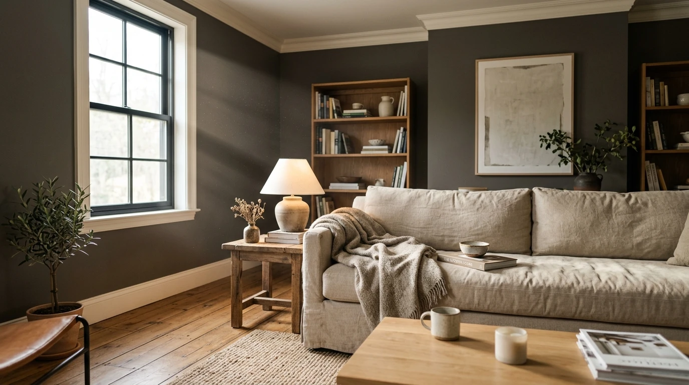
Deep, warm, and confident, Gauntlet Gray is a color you reach for on purpose, not a safe whole-home neutral. It rewards rooms that can take some drama and have enough light or contrast to keep that LRV 17 from feeling like a cave. Here are the spaces where it consistently earns its keep:
Kitchen islands and cabinetry
This is Gauntlet Gray's most popular job. On a base of cabinets or a single island it reads as a grounded, warm anchor that flatters white oak, brass hardware, and white perimeter uppers without the cold edge a blue-charcoal brings. It is timeless rather than trendy, which is why it shows up on so many two-tone kitchens. For where it sits among the year's most-requested cabinet tones, see our complete kitchen cabinet colors guide.
Accent and feature walls
On a single plane behind a bed, a fireplace, or a media unit, Gauntlet Gray gives instant weight and lets art, wood, and metal pop against it. The warmth keeps it from feeling like a slab of slate. If a feature wall is your project, our guide to accent wall color strategy for 2026 shows how to balance a dark anchor against lighter surrounding walls.
Studies, libraries, and powder rooms
A small, low-traffic room is the one place you can safely wrap Gauntlet Gray on all four walls. Studies and powder rooms turn into jewel-box spaces, the kind that feel intentional and a little luxe under warm light. Lean into it with a 2700K bulb and warm metals. For more whole-room moody schemes, our room-by-room paint color ideas maps where deep tones land best.
Where to think twice
Small, dim, north-facing rooms with no warm light source and no contrast are where Gauntlet Gray can feel heavy and closed-in. At LRV 17 it absorbs a lot of light, so a windowless space under cool LEDs reads cave-like and pushes the green-gray forward. There, a lighter warm gray, a single accent wall instead of all four, or a warmer 2700K bulb rescues it. To compare it against its deep-gray neighbors first, our colors that go with gray interiors roundup is a useful map.
Trim, ceiling, and decor pairings
A dark body color lives or dies on the contrast around it. Get the trim right and Gauntlet Gray looks architectural and intentional; get it wrong and the warmth can read muddy, or the wrong white can make it look cold by comparison.
- Warm trim (most harmonious): SW Alabaster (SW 7008, LRV 82) is the designer default. Its soft cream bias echoes Gauntlet Gray's warmth and gives high, clean contrast without going icy. This is the safe, cohesive pick for traditional and transitional rooms.
- Crisp trim (cleaner, cooler): SW Pure White (SW 7005, LRV 84) gives a brighter, more current edge and emphasizes the charcoal side. Best for modern, high-contrast spaces and black-window homes.
- Tonal trim (moody, low contrast): SW Repose Gray or SW Agreeable Gray on the trim keeps the scheme soft and enveloping rather than crisp, ideal in a study you want to feel like a den.
- Ceilings: a clean warm white keeps a Gauntlet Gray room from closing in. Going dark on the ceiling too is gorgeous but only in a room with real light to spare.
- Floors and decor: white oak, walnut, brass, aged bronze, and natural linen reflect warmth back onto the walls and bring out the taupe. Cool chrome and gray-washed floors fight the warmth and can leave it looking flat.
For built-ins and trim drama in the same family, a true near-black such as SW Iron Ore reads as a richer, deeper version of the same warm story and layers beautifully with Gauntlet Gray. If you want the full breakdown of that near-black, see our SW Iron Ore undertones and best rooms guide.
See walls, trim, and floor together in one preview, free.
Gauntlet Gray vs the colors people confuse it with
Almost every Gauntlet Gray search ends in a comparison. The three that matter most indoors:
| Color | LRV (approx) | Undertone | Pick it when |
|---|---|---|---|
| Gauntlet Gray (SW 7019) | 17 | Warm brown-taupe | You want a deep, warm charcoal with weight but not full black |
| Iron Ore (SW 7069) | 6 | Warm near-black | You want it to read essentially black, still soft and warm |
| Dovetail (SW 7018) | 26 | Warm greige-gray | Gauntlet feels too dark; you want a mid-depth warm gray |
| Peppercorn (SW 7674) | 10 | Neutral-cool charcoal | You want a crisper, slightly cooler dark gray |
- vs SW Iron Ore (SW 7069): Iron Ore is the near-black big brother in the same warm family, much deeper at LRV 6. Choose Gauntlet Gray when you still want to read color and softness, choose Iron Ore when you want a warm stand-in for black.
- vs SW Dovetail (SW 7018): Dovetail is the lighter step up the same paint strip, a warm mid-tone gray at LRV 26. Pick Dovetail when Gauntlet feels too heavy for the room, Gauntlet when you want the extra drama.
- vs SW Peppercorn (SW 7674): Peppercorn is a crisper, more neutral-to-cool charcoal. Gauntlet Gray is warmer and browner; Peppercorn reads cleaner and more modern, with a slight slate edge.
Spelling note: gauntlet grey, color gauntlet gray, and gauntlet gray sherwin williams all point to this same SW 7019.
How to test Gauntlet Gray before you commit
A 3-inch fan-deck chip is the number-one reason people pick a dark gray that disappoints: it reads cooler and grayer than a rolled wall and cannot show how heavy LRV 17 feels across a full room. With a color this deep, the second coat also shifts it noticeably, so a chip undersells it twice. Two better methods:
- Paint a large swatch: roll a 12-by-12-inch sample (or a peel-and-stick sample) with a full second coat on two different walls and check it mid-morning, mid-afternoon, and at night under your normal bulbs. Watch for that cool-light flatness in any dim corner and notice how much light the room loses.
- Preview it digitally first: upload a real photo of your room and apply Gauntlet Gray (plus a lighter and a near-black alternative) before you buy any samples, narrowing three contenders to one worth painting. Pricing context for the full repaint is in our interior house painting cost guide for 2026.
Preview Gauntlet Gray against a lighter and a near-black option, side by side, free.
Frequently asked questions
Is Gauntlet Gray warm or cool?
Gauntlet Gray (SW 7019) is a warm color. It is a deep charcoal gray with a dominant brown-taupe undertone and only a faint green-gray that surfaces in cool, indirect light. In most rooms it reads as a rich warm charcoal; in a north-facing or dimly lit space it can look flatter or greener, but it never turns blue or lavender the way many cooler charcoals do.
What is the LRV of Gauntlet Gray?
Gauntlet Gray has a Light Reflectance Value of about 17 on the Sherwin-Williams color data, with a hex approximation of #5C574F (RGB 92, 87, 79). That makes it a deep warm gray: dark enough to anchor a wall or island, but a step lighter and softer than near-black neighbors such as Iron Ore at LRV 6.
What are the best rooms for Gauntlet Gray?
Kitchen islands and cabinetry, accent or feature walls, and small jewel-box spaces like studies and powder rooms are where Gauntlet Gray shines, because its warmth keeps a deep color from feeling cold. It is least reliable in small, windowless, or north-facing rooms with only cool light; a lighter warm gray, a single accent wall, or a 2700K bulb helps there.
What trim color goes with Gauntlet Gray?
SW Alabaster (SW 7008) is the most harmonious trim because its soft cream bias echoes Gauntlet Gray's warmth and gives clean, high contrast. SW Pure White (SW 7005) is the crisper, cooler option for modern rooms. For a moody, low-contrast look, a tonal gray such as Repose Gray on the trim keeps the scheme soft and enveloping.
Is Gauntlet Gray the same as gauntlet grey?
Yes. "Gauntlet grey," "color gauntlet gray," and "gauntlet gray sherwin williams" all refer to the same color, Sherwin-Williams SW 7019. There is no separate British-spelling formula. The same color is also widely used as an exterior siding and trim shade.
Preview SW Gauntlet Gray on your actual walls under your own light before buying a single sample.
Disclaimer: Sherwin-Williams, Gauntlet Gray (SW 7019), Iron Ore (SW 7069), Dovetail (SW 7018), Peppercorn (SW 7674), Alabaster (SW 7008), Pure White (SW 7005), Repose Gray (SW 7015), and Agreeable Gray (SW 7029) are trademarks of The Sherwin-Williams Company. FacadeColorizer is an independent paint visualization service and is not affiliated with, endorsed by, or sponsored by Sherwin-Williams. Color reproduction on screens approximates the manufacturer's chip; always confirm with a manufacturer sample under your own light before purchase. Sources: Sherwin-Williams SW 7019 Gauntlet Gray color data 2026, Sherwin-Williams SW 7069 Iron Ore and SW 7018 Dovetail color data 2026, The Spruce dark-paint undertone coverage, designer field reports compiled by FacadeColorizer.
Trademarks mentioned (Sherwin-Williams, Benjamin Moore, Behr, Caparol, Brillux, Sto, Alpina, Valspar, PPG, Glidden, Dulux, Crown Trade, Sandtex, Farrow & Ball, Johnstone's, Leyland) are property of their respective owners. FacadeColorizer is independent and not affiliated with any of them. Nominative fair use under Lanham Act §1125.


