
I cut in the first corner of a north-facing study with Sherwin-Williams Mindful Gray (SW 7016) on a gray January morning and, for a minute, thought I had the wrong can. In the shade the wall looked almost green-taupe. By the time the second coat went on under afternoon light, it had settled into the warm, grounded greige the homeowner fell for on the chip. That swing is the whole story of this color, and it is why people keep asking the same thing: is Mindful Gray warm or cool, how dark is it really, and which rooms suit it? The answer rides almost entirely on your light. Here is how it behaves indoors.
Quick orientation before the deep dive. Mindful Gray has a published LRV of around 48 and a hex approximation of #BCB6AC (RGB 188, 182, 172). That is a medium, warm greige (gray plus beige) carrying a soft taupe undertone. It is not a light gray and not a true gray: it sits a clear step deeper than the popular light greiges, which is precisely why it reads so cozy and architectural. This profile is one stop in our wider Sherwin-Williams interior paint colors guide, and it is the indoor companion to our SW Mindful Gray 7016 exterior guide: that one covers the color on siding and facades, while this one stays on interior walls, rooms, undertones, and pairings. They are complementary, not duplicates.
Upload a photo of your actual room and preview SW Mindful Gray under your own light in about 30 seconds, free.
Mindful Gray at a glance: the numbers that matter
Before opinions, here are the verifiable specs straight from the Sherwin-Williams color library. These are the values you can take to a paint counter:
- SW number: 7016.
- LRV (Light Reflectance Value): approximately 48. That is the headline. At 48 it is a true medium tone: noticeably deeper than light greiges in the high 50s and 60s, so it holds shadow and feels grounded rather than airy.
- Hex / RGB: approximately #BCB6AC / 188, 182, 172. The red channel sits highest and blue lowest, which is the mathematical signature of a warm neutral.
- Color family: medium warm greige (gray plus beige), with a quiet taupe lean.
- Undertones: warm taupe-beige primary, with a faint green-gray that surfaces in cool, shaded light.
- Tint base: mixed in a light or medium base. Spec it correctly so the wall lands at LRV 48 and does not muddy.
The takeaway from those numbers: Mindful Gray is a warm color under a gray-sounding name. At LRV 48 with a taupe undertone, it is the deeper, moodier cousin of the lighter greiges. It belongs in the family of interior gray paint shades, but do not expect a pale silvery gray. It commits to warmth and depth, and that is its whole appeal.
Is Mindful Gray warm or cool? The undertone, decoded
Mindful Gray is a warm color. People who call it cool are usually reacting to one of two things: a north-facing room or a stark white trim sitting right next to it. Here is what is happening underneath.
The taupe-beige base is dominant in most light. But Mindful Gray also carries a whisper of green-gray, the same softening pigment found in many designer greiges. In warm or balanced light that green-gray stays quiet and the wall reads as a soft warm taupe-gray. In cool, indirect light (a north room, an overcast Tuesday, deep shade), the warm wavelengths get subtracted and the residual green-gray steps forward. That is the green-taupe flash I saw on that first corner. It does not turn blue or lavender the way some grays do, but at LRV 48 the shift is more visible than on a lighter color, simply because there is more pigment on the wall.
Watch out for one quirk. Mindful Gray photographs lighter and a touch grayer than it lives. So if you are choosing from Pinterest photos alone, assume the real wall will land a half-step warmer and a clear step deeper than the image suggests, and budget for a solid second coat because the depth shows every thin spot.
| Indoor light | How Mindful Gray reads |
|---|---|
| South-facing (bright, warm) | Soft warm taupe-gray, its most flattering and inviting read |
| West-facing (warm afternoon) | Leans clearly toward warm taupe in late-day sun |
| East-facing (cool after noon) | Warm and earthy in the morning, balanced and a touch cooler by afternoon |
| North-facing (cool, indirect) | Deeper and cooler; the faint green-gray can surface, can read green-taupe in shade |
| Artificial light at night | Warm 2700K bulbs read cozy and earthy; cool 4000K bulbs read grayer, flatter, and crisper |
Sources: Sherwin-Williams SW 7016 color data 2026; The Spruce neutral-paint undertone coverage; designer field reports compiled by FacadeColorizer.
Free AI visualizer. Test Mindful Gray on your real walls before buying a single sample pot.
Best rooms for Mindful Gray
Because it sits at a medium LRV, Mindful Gray is a color that wants enough light to keep it from going heavy, and rewards you with real depth and a hugging warmth when it gets it. These are the spaces where it consistently earns its keep:
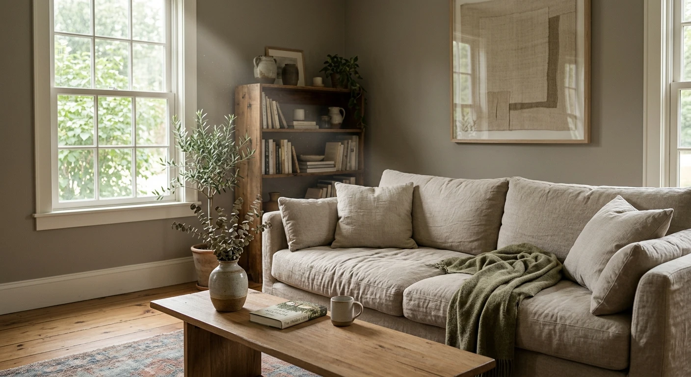
Living rooms with good natural light
In a bright south or west living room, Mindful Gray reads as a warm, enveloping backdrop with more presence than a pale greige. It makes white trim pop and lets wood tones glow without going builder-bland. The depth is the point: it feels finished. For more whole-room schemes built around warm neutrals, see our top living room paint colors for 2026.
Primary bedrooms and moody retreats
This is where the LRV 48 depth shines. Mindful Gray makes a restful, grown-up bedroom because the taupe warmth keeps it cocooning under lamp light while the gray side keeps it from tipping into beige. It is the natural pick if you want a bedroom that feels calm and a shade dramatic rather than bright and open. If a bedroom is your project, our guide to calming master bedroom paint colors shows how it sits next to other restful neutrals.
Studies, dens, and accent walls
A home office or den is a perfect match for Mindful Gray's grounded warmth: enough depth to feel focused, enough warmth to feel comfortable for long stretches. It also makes a strong single accent wall in a room otherwise kept light, giving you the moody-greige hit without committing the whole space to a medium tone.
Where to think twice
Small, dim, north-facing rooms with no warm light source are where Mindful Gray can get heavy and tip toward green-taupe. A windowless powder room or a dark hallway under cool LEDs mutes its warmth, and at LRV 48 that reads gloomy rather than cozy. A warmer bulb (2700K) helps, but the lighter, cooler Repose Gray is often the smarter call for a dim, tight space.
Trim, ceiling, and decor pairings
A medium greige body color lives or dies on what sits next to it. Get the trim right and Mindful Gray looks intentional and architectural; get it wrong and it can look muddy or, paired with the wrong white, suddenly cold.
- Crisp trim (best contrast): SW Pure White (SW 7005, LRV 84) is the go-to. The clean contrast against a medium greige is what makes Mindful Gray read intentional and current, with bright millwork framing the deeper walls.
- Soft trim (more blended): SW Alabaster (SW 7008, LRV 82) gives a warmer, lower-contrast, traditional feel. The walls and trim relate more closely, which reads calm and old-money rather than crisp and modern.
- Avoid: a stark blue-white like SW Extra White can make the medium walls read green-gray and slightly dirty by comparison; the cooler the white, the more it exposes the green undertone.
- Ceilings: a clean warm white keeps the room from feeling closed in over a medium-LRV wall. Skip a heavy cool-white ceiling, which amplifies the cool-light flatness.
- Floors and decor: warm oak, white oak, walnut, brass, rattan, and natural linen reflect warmth back and bring out the taupe. Cool gray-washed floors do the opposite and can leave the room feeling flat and heavy.
For millwork drama, a warm near-black such as SW Iron Ore or SW Tricorn Black on doors and built-ins reads genuinely sophisticated against the medium greige, since both share that warm, grounded character. If you want the airier alternative for the same family, our lighter Agreeable Gray profile covers the LRV 60 option for rooms that need more bounce-back light.
See walls, trim, and floor together in one preview, free.
Mindful Gray vs the colors people confuse it with
Almost every Mindful Gray search ends in a comparison, usually with its own lighter relatives. Here is the spec sheet that settles most of them:
| Color | LRV | Undertone | When to choose it |
|---|---|---|---|
| Mindful Gray (SW 7016) | ~48 | Warm taupe, faint green-gray | You want medium depth and a grounded, cozy warmth |
| Repose Gray (SW 7015) | ~58 | Cooler, quiet violet-brown | You want a lighter, more true-gray neutral for dim rooms |
| Agreeable Gray (SW 7029) | ~60 | Warm cream-beige | You want a light, airy greige with maximum bounce-back light |
| Dorian Gray (SW 7017) | ~39 | Cooler, more true gray | You want Mindful's deeper neighbor with less warmth |
The short version: Repose Gray and Agreeable Gray are the lighter, more forgiving picks for whole-home use, while Mindful Gray trades some of that ease for genuine depth and warmth. Dorian Gray (its direct neighbor on the SW strip) goes deeper and cooler still. For a broader map of the whole category, our interior gray paint shades guide places all of these side by side.
Spelling note: mindful grey, color mindful gray, and mindful gray sherwin williams all point to this same SW 7016.
How to test Mindful Gray before you commit
A 3-inch fan-deck chip is the number-one reason people pick a medium greige that disappoints: it reads lighter and grayer than a rolled wall and cannot show the green-taupe shift across a day. At LRV 48 the stakes are higher, since the color carries real weight on a full wall. Two better methods:
- Paint a large swatch: roll a 12-by-12-inch sample (or a peel-and-stick sample) on two different walls, ideally one near a window and one in a shadier corner, and check it mid-morning, mid-afternoon, and at night under your normal bulbs. Watch for that green-taupe flatness in any dim corner.
- Preview it digitally first: upload a real photo of your room and apply Mindful Gray (plus a lighter and a cooler alternative such as Agreeable Gray and Repose Gray) before you buy any samples, narrowing three contenders to one worth painting. Pricing context for the full repaint is in our interior house painting cost guide for 2026.
Preview Mindful Gray against a lighter and a cooler neutral, side by side, free.
Frequently asked questions
Is Mindful Gray warm or cool?
Mindful Gray (SW 7016) is a warm color. It is a medium greige with a dominant taupe-beige undertone and only a faint green-gray that surfaces in cool, indirect light. In most rooms it reads as a soft warm taupe-gray; in a north-facing or dimly lit space it can look deeper and tip toward green-taupe, but it never turns blue or lavender the way some true grays do.
What is the LRV of Mindful Gray?
Mindful Gray has a Light Reflectance Value of around 48 on the Sherwin-Williams color data, with a hex approximation of #BCB6AC (RGB 188, 182, 172). That makes it a medium warm greige: a clear step deeper than light greiges in the high 50s and 60s, so it holds shadow and feels grounded rather than airy.
What are the best rooms for Mindful Gray?
Living rooms with good natural light, primary bedrooms, studies, and accent walls are where Mindful Gray shines, because its medium depth and warmth feel cozy and architectural. It is least reliable in small, windowless, or north-facing rooms with only cool light, where it can go heavy and green-taupe; a warmer bulb or a lighter greige helps there.
What trim color goes with Mindful Gray?
SW Pure White (SW 7005) is the go-to trim because its crisp contrast against a medium greige reads intentional and current. SW Alabaster (SW 7008) is the warmer, lower-contrast option for a more blended, traditional look. Avoid a stark blue-white like Extra White next to it, which can make the walls read green-gray and dingy by contrast.
What is the difference between Mindful Gray and Repose Gray?
Repose Gray (SW 7015) is lighter, around LRV 58, and cooler, with a quiet violet-brown undertone that keeps a true-gray identity. Mindful Gray (SW 7016) is deeper, around LRV 48, and clearly warmer, with a taupe lean. Choose Mindful for cozy depth in a well-lit room, choose Repose for a lighter, more forgiving neutral in dimmer or smaller spaces.
Preview SW Mindful Gray on your actual walls under your own light before buying a single sample.
Disclaimer: Sherwin-Williams, Mindful Gray (SW 7016), Repose Gray (SW 7015), Agreeable Gray (SW 7029), Dorian Gray (SW 7017), Alabaster (SW 7008), Pure White (SW 7005), Extra White, Iron Ore, and Tricorn Black are trademarks of The Sherwin-Williams Company. FacadeColorizer is an independent paint visualization service and is not affiliated with, endorsed by, or sponsored by Sherwin-Williams. Color reproduction on screens approximates the manufacturer's chip; always confirm with a manufacturer sample under your own light before purchase. Sources: Sherwin-Williams SW 7016 Mindful Gray color data 2026, Sherwin-Williams SW 7015 Repose Gray and SW 7029 Agreeable Gray color data 2026, The Spruce neutral-paint undertone coverage, designer field reports compiled by FacadeColorizer.
Trademarks mentioned (Sherwin-Williams, Benjamin Moore, Behr, Caparol, Brillux, Sto, Alpina, Valspar, PPG, Glidden, Dulux, Crown Trade, Sandtex, Farrow & Ball, Johnstone's, Leyland) are property of their respective owners. FacadeColorizer is independent and not affiliated with any of them. Nominative fair use under Lanham Act §1125.


