
The first time I cut in a corner with Sherwin-Williams Peppercorn (SW 7674), the homeowner stood in the doorway and said, "wait, is that black?" It is not. Peppercorn is a deep charcoal gray, and that one degree of separation from true black is the whole reason designers keep reaching for it. It gives you the drama of a dark wall without the flat, light-swallowing heaviness that real black can bring to a bedroom or a dining room. The question I get most, spelled a dozen ways, is whether Peppercorn paint reads warm or cool, and which rooms actually suit it. The honest answer rides on your light. Here is how it behaves indoors.
Quick orientation before the deep dive. Peppercorn SW 7674 has a published LRV of about 10 and a hex approximation of #4D4A47 (RGB 77, 74, 71). That is a dark, soft charcoal gray: deep enough to feel moody and architectural, but a clear step lighter and more nuanced than a flat black at LRV 5 or below. The Peppercorn undertones are mostly neutral with a faint cool lean, which is exactly what lets it pass for "almost black" in low light while keeping a gray identity in good light. This profile is one stop in our wider Sherwin-Williams interior paint colors guide, and it sits one shade family over from SW Iron Ore, the warmer soft near-black most people cross-shop it against.
Upload a photo of your actual room and preview SW Peppercorn under your own light in about 30 seconds, free.
Peppercorn at a glance: the numbers that matter
Before opinions, here are the approximate published specs from the Sherwin-Williams color library. These are the values you can take to a paint counter:
- SW number: 7674.
- LRV (Light Reflectance Value): about 10. Dark enough to read as a moody charcoal, but not the near-zero LRV of a pure black, so it keeps a hint of dimension instead of going dead flat.
- Hex / RGB: approximately #4D4A47 / 77, 74, 71. The three channels sit very close together, which is the signature of a near-neutral gray rather than a strongly tinted one.
- Color family: dark charcoal gray, in the "almost black" tier alongside Iron Ore, Urbane Bronze, and Cyberspace.
- Undertones: mostly neutral, with a faint cool (slightly blue-gray) lean that can surface in north light and a quiet softness that keeps it from feeling harsh.
- Recommended sheen: matte or eggshell on walls hides surface flaws on a dark color; satin or semi-gloss on trim and doors gives a richer, more durable finish.
The takeaway from those numbers: Peppercorn is a charcoal, not a black. At LRV 10 with near-neutral channels and a faint cool lean, it lands deeper and cooler than warm near-blacks like Iron Ore, yet noticeably softer and grayer than a true black such as Tricorn Black. That middle position, dark and dramatic but never quite black, is exactly what makes it so usable on accent walls, doors, and cabinetry.
Is Peppercorn warm or cool? The undertone, decoded
Peppercorn is a near-neutral charcoal that leans very slightly cool. It is not a warm gray and it is not an icy blue-gray either: it sits close to dead center, which is rare and useful in a dark color. Here is what is happening underneath.
Because the red, green, and blue channels are so close, Peppercorn has very little color cast to fight with. The faint cool lean only steps forward in cool, indirect light. In warm or bright light the wall simply reads as a deep, sophisticated charcoal. In cool north light or under crisp LED bulbs, that quiet blue-gray surfaces and Peppercorn can look a touch flintier, almost slate. It will not flip to brown or green the way some "black" paints do, and that predictability is the reason it earns trust. Compared with Iron Ore, which carries an obvious warm brown-gray undertone, Peppercorn reads cleaner and a little harder.
Watch out for one quirk every dark color shares. Peppercorn photographs darker and flatter than it lives, so a phone shot of an accent wall can look almost solid black while the real wall still shows depth and brush texture up close. If you are judging it from Pinterest alone, assume the real wall will read a half-step lighter and a touch grayer than the image suggests, especially anywhere daylight hits it.
| Indoor light | How Peppercorn reads |
|---|---|
| South-facing (bright, warm) | Rich, deep charcoal with visible dimension, its most flattering read |
| West-facing (warm afternoon) | Warms slightly in late-day sun, reads softer and almost graphite |
| East-facing (cool after noon) | Crisp charcoal in the morning, settles to a moody neutral by afternoon |
| North-facing (cool, indirect) | Reads cooler and flintier; the faint blue-gray lean surfaces, can look near-black |
| Artificial light at night | Warm 2700K bulbs read cozy and graphite; cool 4000K bulbs read harder and slatey |
Sources: Sherwin-Williams SW 7674 color data 2026; The Spruce dark-paint undertone coverage; designer field reports compiled by FacadeColorizer.
Free AI visualizer. Test Peppercorn on your real walls before buying a single sample pot.
Best rooms for Peppercorn
Dark, near-neutral, and just shy of black, Peppercorn is a contrast color first. It is at its best where you want depth and definition rather than an all-over light wash. These are the spaces where it consistently earns its keep:
Accent walls and feature walls
This is Peppercorn's home turf. On a single wall behind a bed, a sofa, or a fireplace, it anchors the room and makes lighter furnishings pop without the heaviness of a fully black wall. For where it fits among the year's strongest feature-wall picks and how to keep one wall from overwhelming the room, see our accent wall color strategy for 2026.
Dining rooms and moody studies
A dining room is one of the few spaces you mostly use after dark, which makes it a natural home for a dramatic charcoal. Peppercorn on all four walls, lit by warm bulbs and a few candles, reads intimate and expensive rather than cave-like. Home offices and libraries get the same treatment: the depth helps you focus and makes brass, wood, and books glow. For more enveloping schemes built around darker tones, our top dining room paint colors for 2026 is a useful map.
Doors, trim, and cabinetry
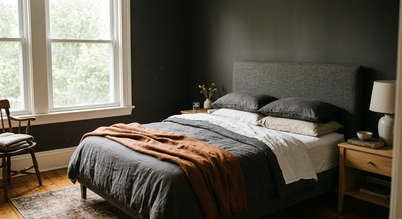
Peppercorn is a favorite for interior doors, window sashes, built-ins, and kitchen or bathroom cabinets. As a charcoal it reads softer and more livable than black on a large cabinet run, and it pairs cleanly with brass, matte black, and stainless hardware alike. It also makes a striking bedroom accent: see how dark tones behave in a restful room in our guide to calming master bedroom paint colors.
Where to think twice
Small, dim, north-facing rooms with no real daylight are where Peppercorn can close in and read as a flat near-black, losing the dimension that makes it interesting. A windowless powder room can pull this off as a deliberate jewel box, but a low-ceiling bedroom with one small north window usually cannot. If you want the drama without committing every wall, treat Peppercorn as an accent and keep the rest light. To see how it sits among other charcoals and grays before you decide, our interior gray paint color shades guide lines up the full range.
Trim, ceiling, and decor pairings
A dark charcoal lives or dies on its contrast partner. Get the trim and the whites right and Peppercorn looks intentional and gallery-grade; get them wrong and the wall can read as a muddy void.
- Crisp white trim (highest contrast): SW Pure White (SW 7005, LRV 84) or SW Extra White give a sharp, modern, graphic edge against Peppercorn. This is the go-to for an accent wall in a contemporary room.
- Soft white trim (gentler): SW Alabaster (SW 7008, LRV 82) warms the contrast slightly and keeps the look from feeling cold, a better fit for transitional and traditional spaces.
- Tonal trim (most enveloping): painting trim, walls, and doors all in Peppercorn (a "color drench") makes a small room feel deliberate and cocooning. Vary the sheen so the trim reads as trim.
- Ceilings: a clean white ceiling keeps a Peppercorn room from feeling like a box. Drenching the ceiling too only works in a small jewel-box space with good lighting.
- Floors and decor: warm white oak, walnut, brass, leather, and natural linen reflect light back and keep Peppercorn from feeling severe. Brushed brass hardware in particular looks superb against it.
For a body wall to pair with Peppercorn doors and built-ins, a light warm greige like SW Agreeable Gray gives the room somewhere to breathe while the charcoal carries the drama. If you are weighing a charcoal against a flat black for the same job, our guide to black interior wall paint shades shows exactly where the near-blacks stop and true black begins.
See walls, trim, and floor together in one preview, free.
Peppercorn vs the colors people confuse it with
Almost every Peppercorn search ends in a comparison against the other dark Sherwin-Williams neutrals. The three that matter most indoors:
- vs SW Iron Ore (SW 7069): Iron Ore is a warmer soft near-black with an obvious brown-gray undertone and a slightly lower LRV. Choose Peppercorn when you want a cleaner, cooler charcoal that still reads as gray; choose Iron Ore when you want warmth and a deeper, almost-black finish.
- vs SW Tricorn Black (SW 6258): Tricorn is a true neutral black at a much lower LRV. Peppercorn is clearly a charcoal gray by comparison, softer and a touch cooler. Pick Tricorn when you genuinely want black; pick Peppercorn when "almost black" with visible dimension is the goal.
- vs SW Gauntlet Gray (SW 7019): Gauntlet is a medium-dark gray that sits a couple of steps lighter than Peppercorn, reading clearly as gray rather than near-black. Use Gauntlet when you want depth without the charcoal-drama commitment.
Spelling note: peppercorn grey, SW peppercorn, and peppercorn paint sherwin williams all point to this same SW 7674.
How to test Peppercorn before you commit
A small fan-deck chip is the number-one reason people pick a dark color that disappoints: at chip size every charcoal looks like the same flat black, and the chip cannot show how the wall opens up (or closes in) across a day. Two better methods:
- Paint a large swatch and prime well: roll a 12-by-12-inch sample on two different walls over a tinted primer, since a dark color over white usually needs a second coat to cover evenly. Check it mid-morning, mid-afternoon, and at night under your normal bulbs, and watch how flat it goes in your dimmest corner.
- Preview it digitally first: upload a real photo of your room and apply Peppercorn (plus a warmer near-black and a true black) before you buy any samples, narrowing three contenders to one worth painting. Pricing context for a dark-color repaint, which often needs extra coats, is in our interior house painting cost guide for 2026.
Preview Peppercorn against a warmer near-black and a true black, side by side, free.
Frequently asked questions
Is Peppercorn warm or cool?
Peppercorn (SW 7674) is a near-neutral charcoal gray that leans very slightly cool. Its red, green, and blue channels sit close together, so it has little color cast. In bright or warm light it reads as a deep, sophisticated charcoal; in cool north light or under crisp LEDs a faint blue-gray (almost slate) lean steps forward. It does not flip to brown or green the way some dark paints do.
What is the LRV of Peppercorn SW 7674?
Peppercorn has a Light Reflectance Value of about 10 on the Sherwin-Williams color data, with a hex approximation of #4D4A47 (RGB 77, 74, 71). That makes it a dark charcoal: deep and moody, but a clear step lighter and more dimensional than a true black at LRV 5 or below, which is why it can read as charcoal in good light and near-black in dim light.
What are the best rooms for Peppercorn?
Peppercorn shines on accent and feature walls, in dining rooms and studies used mostly after dark, and on doors, trim, and cabinetry where its charcoal depth reads softer than black. It is least reliable as an all-over color in small, dim, north-facing rooms with no daylight, where it can flatten into a near-black void; there it works best as an accent or in a deliberate jewel-box powder room.
What is the difference between Peppercorn and Iron Ore?
Iron Ore (SW 7069) is a warmer soft near-black with an obvious brown-gray undertone and a slightly lower LRV, while Peppercorn (SW 7674) is a cleaner, cooler charcoal gray that still reads as gray. Choose Peppercorn for a crisper, more neutral charcoal; choose Iron Ore when you want warmth and a deeper, almost-black finish on doors or cabinets.
What trim color goes with Peppercorn?
Crisp whites like SW Pure White (SW 7005) or Extra White give the sharpest, most modern contrast against Peppercorn, while SW Alabaster (SW 7008) warms the contrast for traditional rooms. For a cocooning look, drench the trim in Peppercorn too and vary the sheen. Brass hardware and warm wood floors keep the charcoal from feeling severe.
Preview SW Peppercorn on your actual walls under your own light before buying a single sample.
Disclaimer: Sherwin-Williams, Peppercorn (SW 7674), Iron Ore (SW 7069), Tricorn Black (SW 6258), Gauntlet Gray (SW 7019), Urbane Bronze (SW 7048), Cyberspace, Agreeable Gray (SW 7029), Alabaster (SW 7008), Pure White (SW 7005), and Extra White are trademarks of The Sherwin-Williams Company. FacadeColorizer is an independent paint visualization service and is not affiliated with, endorsed by, or sponsored by Sherwin-Williams. The values above are approximate published figures; color reproduction on screens approximates the manufacturer's chip, so always confirm with a manufacturer sample under your own light before purchase. Sources: Sherwin-Williams SW 7674 Peppercorn color data 2026, Sherwin-Williams SW 7069 Iron Ore and SW 6258 Tricorn Black color data 2026, The Spruce dark-paint undertone coverage, designer field reports compiled by FacadeColorizer.
Trademarks mentioned (Sherwin-Williams, Benjamin Moore, Behr, Caparol, Brillux, Sto, Alpina, Valspar, PPG, Glidden, Dulux, Crown Trade, Sandtex, Farrow & Ball, Johnstone's, Leyland) are property of their respective owners. FacadeColorizer is independent and not affiliated with any of them. Nominative fair use under Lanham Act §1125.


