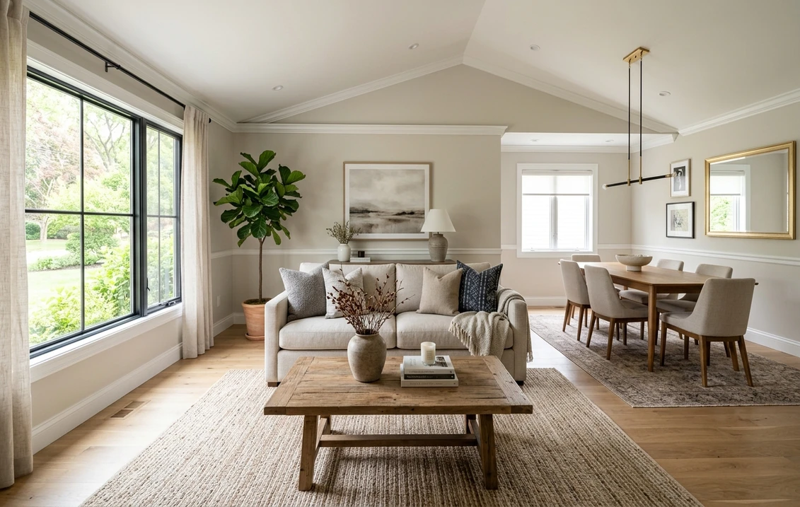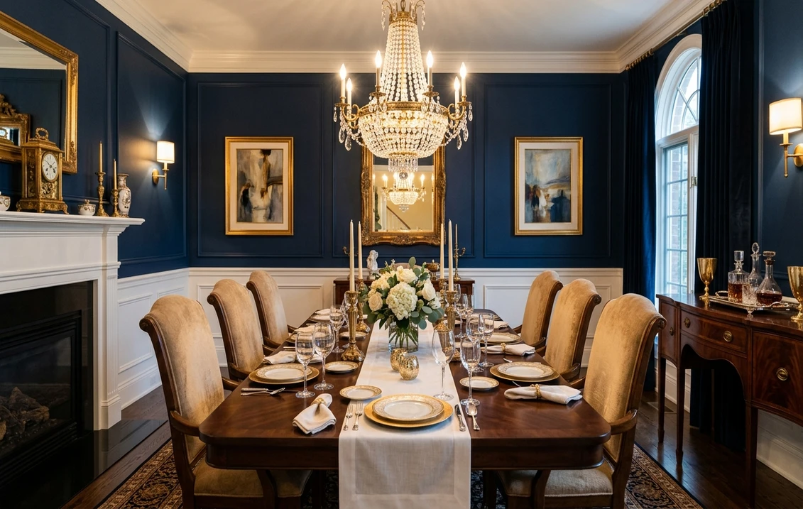
Hotel-restaurant dining is the single most copied interior trend of 2026. According to the American Institute of Architects 2026 Home Design Survey and the Sherwin-Williams Colormix Forecast, sophisticated dining rooms now favor saturated jewel tones, deep neutrals, and historic greens applied via the color-drenching method, walls, ceiling, trim, and built-ins all painted the same hue for a cocooning, candle-lit effect.
This guide curates the 15 most elegant dining room paint colors for 2026, drawn from Benjamin Moore, Sherwin-Williams, and Farrow & Ball palettes, with exact codes, LRV values, and the precise role each shade plays: walls, ceiling, wainscoting, or accent. Whether you host candle-lit Saturday dinners or sun-bright Sunday brunches, these are the colors that make a dining room feel curated rather than decorated. For full pricing context, see our complete interior painting cost guide.
Why Color Drenching Defines Elegant Dining in 2026
Color drenching, the technique of painting walls, ceiling, crown molding, and trim in a single saturated hue, originated in London hotel suites and high-end Parisian bistros. The effect dissolves the architectural seams that fragment traditional dining rooms, creating a soft monochromatic envelope that flatters skin tones under candlelight and reads as instantly intentional.
Saturated jewel tones, navy, oxblood, forest green, deep aubergine, perform best in dining rooms because they absorb light rather than reflecting it. At dinner, the room shrinks visually around the table; the chandelier and candle flames become the brightest points; conversation feels closer. By morning, the same drenched walls catch raking sun and shift to a softer, almost velvet appearance, which is why LRV (Light Reflectance Value) matters: pick LRV 5-15 for evening drama, LRV 25-50 for day-bright morning rooms.
Upload your dining room photo - test all 15 colors in 30 seconds
The 15 Most Elegant Dining Room Paint Colors for 2026
Each color below is paired with its ideal application: full color-drenching, ceiling-only treatment, wainscoting (lower half), or accent wall behind the buffet or hutch.
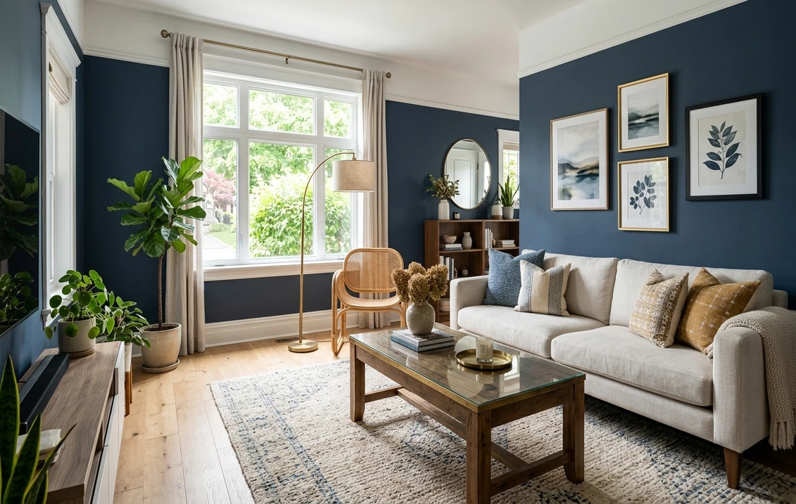
1. Benjamin Moore Hale Navy HC-154 (LRV 6.3)
The most-specified hospitality navy of 2026. Hale Navy reads black-blue under daylight, soft midnight under candle flame. Best for full color-drenching in north-facing dining rooms where you want a quiet, library-style mood. Pair with brushed-brass sconces and unlacquered hardware.
2. Benjamin Moore Caliente AF-290 (LRV 8.65)
A warm, deep red with a barely-perceptible terracotta undertone. Restaurant designers favor Caliente because it stimulates appetite without tipping into Christmas-red. Best for accent walls behind the buffet, or full-drenched in small, windowless dining alcoves. Stunning under amber candlelight.
3. Sherwin-Williams Naval SW 6244 (LRV 4)
SW's deepest navy, almost black, with a cooler base than Hale Navy. Best for color-drenched ceilings with crown molding intact, the molding reads as soft architectural relief rather than contrasting trim. Pair with white oak floors to keep the room from feeling closed.
4. Farrow & Ball Studio Green No.93 (LRV 7)
A historic deep green developed for English country libraries. Its softened black-green reads completely different in morning sun versus evening candle. Best for full drenching with high crown molding, the molding becomes sculptural shadow. Specify Modern Emulsion finish for washability around the table.
5. Benjamin Moore Cushing Green HC-125 (LRV 24.66)
A warmer, more olive historic green that performs beautifully in south-facing rooms with afternoon light. Best for wainscoting half-walls paired with a cream upper wall and white ceiling, the most classic American formal-dining configuration. Carries a Historical Collection pedigree that resale appraisers recognize.
6. Sherwin-Williams Cyberspace SW 7964 (LRV 5)
A near-black with a subtle blue-green undertone, the SW answer to the moody hospitality palette. Best for full color-drenching when you want maximum drama and minimum warmth. Looks particularly striking with a single oversized statement chandelier and brass-rimmed mirrors.
7. Farrow & Ball De Nimes No.299 (LRV 33)
A dusty, slightly-faded denim blue inspired by 18th-century French workwear. Higher LRV than the navies, so it works in day-bright breakfast-dining hybrids where you still host the occasional dinner party. Pair with linen slipcovered chairs and unstained oak.
8. Benjamin Moore Forest Green 2047-10 (LRV 4.65)
The deepest, truest forest green BM offers, the saturated emerald of vintage hotel bars. Best for accent walls or color-drenched powder-style dining nooks. Pair with antique brass and burgundy upholstery for a steakhouse-elegant feel without going theme-restaurant.
9. Benjamin Moore Hawthorne Yellow HC-4 (LRV 64.59)
The exception that proves the moody-dining rule. A historic mustard yellow with high LRV that bathes morning rooms in golden light. Best for sun-bright dining rooms that double as breakfast spaces. Wainscoting in a contrasting deep green (Cushing Green or Studio Green) elevates the formal feel.
10. Farrow & Ball Pelt No.254 (LRV 5)
A deep, muscular aubergine that reads almost black at night, soft plum at noon. The most adventurous pick on this list, and the most photographed in 2026 hospitality magazines. Best for full color-drenching in formal dining rooms with high ceilings, low LRV demands at least 9-foot ceilings to avoid feeling oppressive.
11. Benjamin Moore Rosepine 2006-30 (LRV 14.7)
A complex, dusty rose-mauve with grey undertones, BM's answer to the warm-neutral plum trend. Best for accent walls behind a buffet, or wainscoting paired with a soft white upper wall. Particularly flattering to skin tones, an underrated criterion for any dining room.
12. Sherwin-Williams Kestrel White SW 7516 (LRV 64)
A warm, slightly-pinked off-white that reads as luxurious neutral rather than cold contractor-white. Best for ceilings paired with deep drenched walls, or for upper-wall pairings above wainscoting in Cushing Green or Pelt. The warm undertone keeps it from looking gray under chandelier light.
13. Farrow & Ball Mizzle No.266 (LRV 41)
A soft, sage-grey-green with notable serenity. Best for color-drenched morning-bright dining rooms, or as the upper wall above a deeper green wainscoting. Mizzle is the most-specified F&B color in American hospitality projects in 2026.
14. Benjamin Moore Black Knight 2127-20 (LRV 5.27)
A blue-leaning charcoal that performs as black under candlelight and as deep slate by day. Best for wainscoting beneath a Hawthorne Yellow or Kestrel White upper wall, the highest-resale formal-dining combination of the year per Realtor.com 2026 paint-color resale data.
15. Sherwin-Williams Tricorn Black SW 6258 (LRV 3)
A pure, undertone-free black, no blue, no brown, no green. Best for crown molding accent against a deep-drenched wall, or for full color-drenching in dining rooms with abundant natural light from at least two exposures. Tricorn Black on the ceiling alone, with white walls, is the modern hospitality classic.
Color Reference Table: All 15 Elegant Dining Colors
A quick-reference table with paint codes, LRV values, and the application that best showcases each shade.
| Color Name | Brand Code | LRV | Best For |
|---|---|---|---|
| Hale Navy | BM HC-154 | 6.3 | Walls + ceiling drench |
| Caliente | BM AF-290 | 8.65 | Accent wall (buffet) |
| Naval | SW 6244 | 4 | Ceiling drench |
| Studio Green | F&B No.93 | 7 | Walls + ceiling drench |
| Cushing Green | BM HC-125 | 24.66 | Wainscoting |
| Cyberspace | SW 7964 | 5 | Walls + ceiling drench |
| De Nimes | F&B No.299 | 33 | Walls (day-bright) |
| Forest Green | BM 2047-10 | 4.65 | Accent wall |
| Hawthorne Yellow | BM HC-4 | 64.59 | Walls (morning room) |
| Pelt | F&B No.254 | 5 | Walls + ceiling drench |
| Rosepine | BM 2006-30 | 14.7 | Wainscoting / accent |
| Kestrel White | SW 7516 | 64 | Ceiling / upper wall |
| Mizzle | F&B No.266 | 41 | Walls (morning room) |
| Black Knight | BM 2127-20 | 5.27 | Wainscoting |
| Tricorn Black | SW 6258 | 3 | Crown molding accent |
Try it on your house
No photo? Try a sample
Crown Molding, Wainscoting, and Architectural Detail Strategy
Crown molding in a drenched dining room should match the wall color exactly, satin or eggshell finish to catch a hint more light than the walls. The traditional "white crown molding against a colored wall" reads dated in 2026; sophisticated rooms now treat the crown as architectural shadow within the drenched envelope. The exception: pure black crown (Tricorn Black) against a soft Mizzle or Kestrel White wall, a graphic, gallery-modern move.
Wainscoting half-walls remain the most historic dining-room treatment in American homes, and the highest resale value per the National Association of Realtors 2026 staging data. Specify chair-rail height (32 to 36 inches) with the deeper color below, lighter above. Cushing Green below + Hawthorne Yellow above is the canonical New England formal-dining pairing; Black Knight below + Kestrel White above is its modern equivalent.
Best Paint Lines for Formal Dining Rooms
Dining rooms see candle smoke, wine splashes, and frequent wipe-down near the buffet. Specify washable, low-sheen formulas:
- Sherwin-Williams Emerald Interior Acrylic (Matte or Satin): the most washable matte on the US market, hides imperfections in old-house plaster while wiping clean. The default specification for color-drenched walls and ceiling.
- Benjamin Moore Aura Bath & Spa: counter-intuitive pick, but Aura B&S is moisture-resistant matte ideal for moisture-prone formal dining adjacent to kitchens or in older homes with humidity issues. No mildew, no flash sheen.
- Farrow & Ball Modern Emulsion: the wipeable F&B finish for No.93, No.254, and No.266 in dining service. Skip Estate Emulsion, which marks too easily near a dining table.
Candlelight vs Daylight: How Your Color Will Actually Read
Every paint sample looks different at 7 PM than at 11 AM. In a formal dining room, the 7 PM read matters more, but the 11 AM read still has to work. Three rules from hotel-restaurant designers:
- Test at the actual chandelier color temperature. Most candle-warm chandeliers run 2200K to 2700K. A navy that reads cool blue under 4000K LED retail lighting will warm dramatically under your fixture.
- Sample at table height, not eye height. Your guests see the wall at seated-eye-level. Paint a 24x24 inch sample 36 inches from the floor, not 60.
- Check at noon and at 8 PM. A daytime-too-flat color often comes alive at night; a daytime-stunning color can feel oppressive in candlelight. Both readings need to pass.
See Hale Navy, Studio Green, Pelt and 12 more on your dining room photo
Frequently Asked Questions
What is color drenching, and does it work in small dining rooms?
Color drenching means painting walls, ceiling, crown molding, and trim a single saturated hue. It works especially well in small dining rooms because removing the white-ceiling visual break makes the room read as one cohesive volume rather than a cramped box. The trick is finish: use eggshell on walls, matte on the ceiling, and satin on millwork so each surface reads slightly differently under chandelier light. For rooms under 120 square feet, prioritize LRV between 5 and 15, dark enough to feel intentional, light enough not to feel oppressive.
Should I paint my dining room ceiling the same color as the walls?
For elegant, hospitality-style dining rooms in 2026, yes, this is the defining technique of color drenching. A matching ceiling deepens the cocooning effect candlelight relies on and makes crown molding read as architectural relief. The exceptions: ceilings under 8 feet (drop to a slightly lighter version of the wall color, 50% reduced tint), or formal dining rooms with intricate plaster medallions you want to highlight (a contrasting Kestrel White or Tricorn Black ceiling lets the medallion pop).
Which paint finish is best for a dining room near the kitchen?
Specify Sherwin-Williams Emerald Interior Acrylic in matte or satin, or Benjamin Moore Aura Bath & Spa if humidity is a concern. Both clean with a damp cloth, resist flash sheen on touch-ups, and stand up to candle smoke and wine splashes near the buffet. Avoid flat finishes regardless of brand, and avoid semi-gloss above chair-rail height, which highlights every plaster imperfection under chandelier light. Wainscoting and trim can move to satin or pearl for slightly more sheen, which reads as historic and intentional.
What is the most timeless elegant dining room color for resale?
Per Realtor.com 2026 paint resale data, Benjamin Moore Hale Navy HC-154 and Benjamin Moore Cushing Green HC-125 are the two highest-resale formal-dining colors. Both have decade-long appraisal recognition, both flatter American oak and walnut furniture, and both photograph well for MLS listings. If you want maximum drama with maximum resale safety, drench in Hale Navy with Kestrel White ceiling; if you want classic formal-dining historic appeal, wainscot in Cushing Green with a Hawthorne Yellow upper wall.
Free - No signup - All 15 SW, BM & F&B codes loaded
The most elegant dining rooms of 2026 are quiet, drenched, and candle-lit, not loud, not safe, not beige. Test Hale Navy, Studio Green, or Pelt on your actual dining room photo with our AI interior paint visualizer, then specify Sherwin-Williams Emerald or Benjamin Moore Aura for a finish that handles candle smoke and wine for the next decade. Sources: AIA 2026 Home Design Survey, Sherwin-Williams Colormix Forecast, Realtor.com 2026 Paint Resale Data, NAR 2026 Staging Report.
Trademarks mentioned (Sherwin-Williams, Benjamin Moore, Behr, Caparol, Brillux, Sto, Alpina, Valspar, PPG, Glidden, Dulux, Crown Trade, Sandtex, Farrow & Ball, Johnstone's, Leyland) are property of their respective owners. FacadeColorizer is independent and not affiliated with any of them. Nominative fair use under Lanham Act §1125.