No other wall color is as bold as red, and none plays a bigger trick on you between the chip and the can. A swatch that looked like a cheerful tomato can dry to a fire-engine red, or a deep merlot can turn brown and muddy in a north-facing den. The difference is almost never the color you picked. It is the undertone underneath it, the LRV (light reflectance value), and the way your room's light pulls those two in opposite directions.
This profile breaks red into the three families designers actually work with, true reds, deep brick and oxblood reds, and earthy muted reds, and names 12 current colors with their published codes and LRV, the rooms each suits, and the trim pairings that keep red looking expensive instead of loud. For the wider context, start with our pillar guide to paint color ideas by room.
Upload a photo of your room and preview any of these 12 reds under your real light in 30 seconds, free.
Why red is the trickiest wall color to get right
Two things make red behave differently from a gray or a white. First, undertone: almost every red leans either toward blue (cranberry, raspberry, burgundy) or toward yellow (tomato, brick, terracotta). A blue-red in a warm west room can look magenta; an orange-red in cool north light can look brown. Matching the undertone to the light is the entire game.
Second, light reflectance: red is one of the lowest-LRV families in any fan deck, with saturated true reds landing between LRV 5 and 12. That is why a powder room or dining room handles red beautifully while a sun-starved bedroom can feel cave-like. Our interior color-families guide covers how LRV and family interact across every hue. Red also shows roller marks more than any family, so prime with a tinted gray primer and plan on two color coats.
The 12 best red paint colors for 2026
Codes and LRV below come from the manufacturers' published technical sheets. The table groups all twelve so you can scan undertone and LRV at a glance; the sections then explain each one.
| Color | Code | LRV | Undertone |
|---|---|---|---|
| BM Caliente | AF-290 | ~6 | Balanced true red |
| SW Real Red | SW 6868 | ~10 | Clean, slightly warm |
| BM Million Dollar Red | 2003-10 | ~5 | Cool blue-red |
| SW Heartthrob | SW 6866 | ~7 | Cool cranberry |
| BM Heritage Red | HC-181 | ~8 | Warm brick |
| SW Rookwood Red | SW 2802 | ~7 | Earthy brick-brown |
| SW Antique Red | SW 7587 | ~8 | Deep oxblood |
| Farrow & Ball Eating Room Red | No. 43 | ~10 | Mellow brick-red |
| Farrow & Ball Incarnadine | No. 248 | ~8 | Vivid blue-red |
| BM Dinner Party | AF-300 | ~13 | Muted terracotta-red |
| SW Carnelian | SW 7580 | ~12 | Earthy red-clay |
| Behr Red Pepper | PPU2-02 | ~9 | Warm orange-red |
Try it on your house
No photo? Try a sample
Sources: Benjamin Moore, Sherwin-Williams, Behr, and Farrow & Ball published color data 2026; LRV rounded from manufacturer technical sheets, varies slightly by batch and finish.
True reds: confident and clean
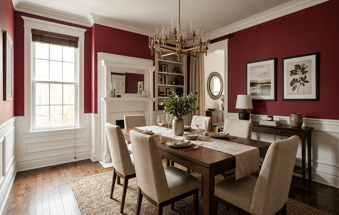
These are the reds people picture when they say "red wall." Saturated and lively, they suit rooms you pass through or gather in for short bursts (dining rooms, entryways, powder rooms) rather than spaces where you relax for hours.
- Benjamin Moore Caliente AF-290, the brand's 2018 Color of the Year, is still the reference true red. Its undertone sits right in the middle, neither too blue nor too orange, so it holds as red instead of drifting toward pink or brick. If you just want a great red for a dining room or entry and would rather not overthink it, this is the safe one.
- Sherwin-Williams Real Red SW 6868 is a slightly warmer, brighter primary red that reads a hair lighter than Caliente at LRV ~10. Excellent as an accent wall behind built-in shelving or in a playroom.
- Benjamin Moore Million Dollar Red 2003-10 is the glamorous cooler blue-red, deep and lipstick-rich, the classic dramatic dining room red. Because it leans cool, give it warm 2700K bulbs so it does not tip toward magenta at night.
Deep brick and oxblood reds: warm and grounded
This is where red turns cozy and architectural. These colors carry brown, plum, or terracotta within the red, lowering the saturation and making them livable in rooms where you actually spend time. This is the "moody red" trend in a nutshell, the look that pushed gray aside as the go-to enclosing color for 2026.
- Benjamin Moore Heritage Red HC-181 is a warm colonial brick red from the Historical Collection, traditional and settled. Ideal for a library, study, or paneled dining room with antique wood.
- Sherwin-Williams Rookwood Red SW 2802, from the SW historic palette, reads as a smoky brick-brown red. It pairs beautifully with Craftsman and bungalow interiors, quarter-sawn oak, and cream trim.
- Sherwin-Williams Antique Red SW 7587 is a deep oxblood that flirts with wine, enveloping in a small home office or powder room. Its low LRV reflects little light, so reserve it where drama beats brightness.
- Farrow & Ball Eating Room Red No. 43 is the mellow historic British brick-red for those who want red without shout. Its soft, dusty quality flatters candlelight and warm metals.
- Farrow & Ball Incarnadine No. 248 is the opposite extreme, a vivid, almost lacquered blue-red with serious presence. Use it in a small high-impact space (a coat closet, a powder room, the back of a bookcase).
Earthy and muted reds: the easiest to live with
If a true red feels like too much, these terracotta and clay-leaning reds give warmth without the visual volume, reading almost like a baked-clay neutral in good light. Forgiving is the word. They suit bedrooms and larger living spaces where a saturated red would overwhelm, and they sit right alongside the tones in our earthy and warm interior colors guide.
- Benjamin Moore Dinner Party AF-300 is a muted, sophisticated terracotta-red, brown-grounded. At LRV ~13 it is the brightest and gentlest pick here, great for a dining room or warm accent wall with wood and rattan.
- Sherwin-Williams Carnelian SW 7580 reads as a rich red-clay, earthy and Southwestern, glowing in warm afternoon light alongside leather, jute, and unglazed pottery.
- Behr Red Pepper PPU2-02 is a warm, friendly orange-red that stays cheerful rather than formal. Behr's quality base covers well, a strong value pick for an accent wall or a laundry room.
Test Caliente, an oxblood, and a terracotta side by side on your actual wall, free.
Which red for which room
Because red sits so low on the LRV scale, room choice matters more than with any pastel. Match the color to how the space is used and how much daylight it gets:
- Dining room: the classic red room. Caliente, Million Dollar Red, or Eating Room Red flatter skin under warm light and make the table feel intimate.
- Powder room or coat closet: go as deep as you like. Incarnadine or Antique Red turns a tiny, windowless space into a jewel box (see our best bathroom paint colors for adjoining baths).
- Home office or library: Heritage Red and Rookwood Red read serious and focused without being harsh.
- Bedroom: the muted earthy reds. Dinner Party or Carnelian give warmth without the stimulation of a true red.
- Living room accent wall: Real Red or Red Pepper behind a fireplace or shelving adds a focal point while the rest of the room stays neutral, a strategy detailed in our pillar on room-by-room color ideas.
For balance, red works best as one of three values: the deep red walls, a warm off-white for trim and ceiling, and a mid neutral (greige, soft gold, or warm wood) for furnishings. If white is part of that mix, our guide to the best white room colors helps you pick a white that will not fight the red.
Trim, ceiling, and decor that make red look expensive
Red lives or dies by what surrounds it. Field-tested rules:
- Trim: a soft warm white (Benjamin Moore White Dove OC-17 or Sherwin-Williams Alabaster SW 7008) frames red without the harsh contrast a bright cool white throws against brick red.
- Ceiling: keep it the trim white, or for deep oxblood rooms try the wall color at 25% strength for a soft, enveloping effect rather than a top-heavy bright white.
- Metals: brass, bronze, and aged gold warm red up; chrome and cool nickel fight warm reds, so save them for cool blue-reds like Incarnadine.
- Wood and textiles: walnut, mahogany, and warm oak are red's natural partners; cream, camel, soft gold, forest green, and navy all ground it.
Brand notes: SW vs BM vs Behr vs Farrow & Ball for reds
Any of the four will give you an excellent red; the differences are small but worth knowing. Benjamin Moore (Aura, Regal Select) gives the deepest, most uniform coverage and the widest red palette; Sherwin-Williams (Emerald, Duration) is close behind and easy to color-match in-store; Behr (Marquee, Dynasty) is the value play; and Farrow & Ball carries the most pigment depth at a premium price.
Torn between the two biggest US brands? Our head-to-head on Sherwin-Williams vs Benjamin Moore for interiors compares coverage, durability, and price, and our interior painting cost guide covers how many coats a saturated red really needs.
How to test a red before you commit
No red should be bought off a fan-deck chip. Saturated colors read very differently at full scale, and reds shift more than any family between chip and wall. Two reliable methods:
- Large painted samples: paint a 12-inch peel-and-stick swatch (or two coats on poster board) and tape it to more than one wall. Check it morning, midday, and under your evening bulbs, because a red that looks perfect at noon can turn brown or magenta after dark.
- Digital preview first: before buying samples, upload a photo of your real room into our best interior paint colors workflow and see several reds on your actual walls and trim in seconds. Nothing narrows twelve choices down to the two or three worth a real sample faster than that.
Upload your room and see Caliente, Heritage Red, and Dinner Party on your wall, free.
Frequently asked questions
What is the best true red paint color for a wall?
For a clean, confident red that stays red across different light, Benjamin Moore Caliente AF-290 (the brand's 2018 Color of the Year, LRV around 6) is the most reliable pick because its undertone is balanced rather than strongly blue or orange. Sherwin-Williams Real Red SW 6868 is a brighter, warmer alternative, and Benjamin Moore Million Dollar Red 2003-10 is the glamorous cooler option for a dramatic dining room.
Are red walls a good idea, or will they make a room feel small?
Red walls work well in the right room. Most saturated reds have a low LRV (5 to 12), so they reflect little light and make a space feel cozier and more enclosed, a benefit in dining rooms, powder rooms, libraries, and entryways. In a large, bright, all-day living room, full-coverage true red can feel intense, so an accent wall or a muted earthy red like BM Dinner Party AF-300 is safer there.
What trim color goes best with red walls?
A soft, warm white frames red better than a bright cool white. Benjamin Moore White Dove (OC-17) and Sherwin-Williams Alabaster (SW 7008) soften the contrast and read tailored. Pair the walls with brass or bronze hardware and warm wood such as walnut, mahogany, or oak. Reserve crisp pure whites and chrome for cool blue-reds.
Why does my red paint look pink or brown on the wall?
Two causes. A red that looks pink usually needs more coats: saturated reds often require a tinted gray primer plus two color coats, and a thin application dries lighter and chalkier. A red that looks brown is an undertone-and-light mismatch, typically a warm orange-red in cool north light or a deep red under dim warm bulbs. Prime properly and test a large swatch in morning, midday, and evening light before committing.
See any of these 12 reds on your actual room and trim before buying a single sample.
Disclaimer: Color names and codes referenced here are trademarks of their respective owners: Benjamin Moore, Sherwin-Williams, Behr, and Farrow & Ball. FacadeColorizer is an independent paint visualization service and is not affiliated with, endorsed by, or sponsored by any paint manufacturer. LRV and undertone values are rounded from publicly published manufacturer technical data and may vary slightly by batch, finish, and screen calibration. Always confirm with a manufacturer sample on your own wall before purchase. Sources: Benjamin Moore, Sherwin-Williams, Behr, and Farrow & Ball published color data 2026; The Spruce and designer color references.
Trademarks mentioned (Sherwin-Williams, Benjamin Moore, Behr, Caparol, Brillux, Sto, Alpina, Valspar, PPG, Glidden, Dulux, Crown Trade, Sandtex, Farrow & Ball, Johnstone's, Leyland) are property of their respective owners. FacadeColorizer is independent and not affiliated with any of them. Nominative fair use under Lanham Act §1125.