Ask Americans of any age to name their favorite color and most say the same thing: blue. No surprise, then, that it has quietly become the most-requested wall color after white in US homes. But "blue" is a huge category, and that is exactly where rooms go wrong. The chip that looked calm on the rack can turn cold, dingy, or aggressively bright once it is rolled across a wall, all because the depth or undertone was off. This guide breaks down 18 of the best blue paint colors for 2026, organized by how dark they go, with the LRV, undertone, and lighting behavior to choose with confidence.
Every color below is a real, currently-stocked shade from Sherwin-Williams, Benjamin Moore, or Behr, with published technical values. This is the indoor companion to our room-by-room paint color guide, zoomed in on the blue family.
Upload a photo of your room and preview any of these blues under your actual light in about 30 seconds, free.
How blue behaves indoors (the one thing chips hide)
Blue is a cooling color that lowers a room's perceived temperature, great in a hot south-facing den and risky in a cold north-facing bedroom. The value that predicts how a blue will read is its LRV (Light Reflectance Value), the percent of light it bounces back, from 0 (black) to 100 (pure white).
- LRV above 60: powder and sky blues. Light and airy, they brighten small rooms and stay close to the chip in most light.
- LRV 25 to 50: mid-tone slate, denim, and dusty blues. The most flexible group, but the most undertone-sensitive (green, gray, or violet can surface).
- LRV under 12: navy and near-black blues. Dramatic and cozy, but they absorb most of the light that hits them, so they need real light or a deliberate moody plan.
The second thing chips hide is the undertone. Two blues at the same LRV can lean green, gray, or violet, and north light exaggerates those cool casts while warm west light can push a blue toward green. We unpack that interaction in our interior paint color families guide.
The 18 best blue paint colors for 2026
Organized light to dark, with the published LRV, the dominant undertone, and the rooms each color flatters. Codes are from the manufacturer fan deck.
| Color (brand, code) | LRV | Undertone | Best for |
|---|---|---|---|
| Behr Frost (PPU14-09) | 76 | Cool, slight gray | Small bathrooms, north halls |
| SW Misty (SW 6232) | 62 | Soft gray-blue | Bedrooms, nurseries |
| BM Palladian Blue (HC-144) | 61 | Green-blue | Spa baths, kitchens |
| SW Sea Salt (SW 6204) | 63 | Green-gray-blue | Bathrooms, laundry, sunrooms |
| BM Woodlawn Blue (HC-147) | 56 | Green-blue | Living rooms, dining |
| SW Rainwashed (SW 6211) | 59 | Aqua-green | Coastal baths, bedrooms |
| Behr Sail Cloth (S470-3) | 47 | Clear sky-blue | Kids rooms, offices |
| BM Buxton Blue (HC-149) | 53 | Green-gray-blue | Living rooms, porches |
| SW Aleutian (SW 6241) | 39 | Dusty violet-blue | Bedrooms, studies |
| SW Distance (SW 6243) | 24 | Gray-navy | Bedrooms, accent walls |
| Behr Dark Pewter (PPU18-04) | 21 | Blue-charcoal | Offices, media rooms |
| BM Van Deusen Blue (HC-156) | 15 | Mid navy-blue | Dining, libraries |
| SW Cyberspace (SW 7076) | 6 | Blue-black | Accent walls, powder rooms |
| BM Hale Navy (HC-154) | 6 | Soft blue-black | Dens, dining, cabinets |
| BM Newburyport Blue (HC-155) | 8 | Classic navy | Studies, entries, doors |
| SW Naval (SW 6244) | 4 | True navy | Libraries, accent walls |
| Behr Midnight Show (N480-7) | 5 | Deep indigo-navy | Bedrooms, media rooms |
| BM Gentleman's Gray (2062-20) | 5 | Inky blue-teal | Powder rooms, libraries |
Try it on your house
No photo? Try a sample
Sources: Sherwin-Williams, Benjamin Moore, and Behr technical data sheets, 2026. LRV values as published by each manufacturer; undertone descriptions per The Spruce and Benjamin Moore Color Lab references.
Light and airy: powder and sky blues (LRV 60+)
These blues brighten rather than darken. Bouncing back more than 60% of available light, they make small or low-light rooms feel larger and are the safest bet when you cannot test first.
Benjamin Moore Palladian Blue (HC-144) is the modern classic of the group, a soft green-blue that reads spa-like in a bathroom and fresh in a kitchen, though heavy north light can tip it green-gray. Sherwin-Williams Sea Salt (SW 6204) is its chameleon cousin, drifting between pale green, blue, and gray by the hour, a favorite for bathrooms and sunrooms but a gamble if you want a committed blue. In a sun-drenched room that shift becomes an asset, and our roundup of the best sunroom paint colors for 2026 shows which soft blues hold up under all that light. For a true-blue powder with no green, Behr Frost (PPU14-09) and Sherwin-Williams Misty (SW 6232) stay cleaner and cooler.
Light blues look best with crisp warm-white trim rather than a stark cool white, which can read clinical. Bathrooms are where these shades earn their keep, and our bathroom paint color picks go deeper on the spa-blue end.
The flexible middle: slate, denim, and dusty blues (LRV 25 to 50)
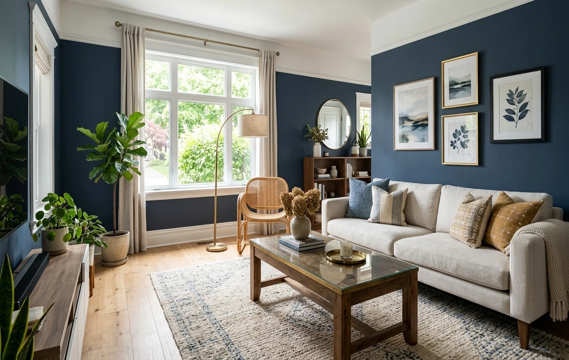
No band of blues is more useful, or more misunderstood, than this one. Mid-tones are dark enough to feel like a real color yet light enough to live with all day, which is why most of the blue living rooms and bedrooms that actually work land right here.
Sherwin-Williams Aleutian (SW 6241) is a dusty, slightly violet blue that turns soft in a bedroom and grown-up in a study; cool north light shows its violet side, warm light settles it into a denim. Benjamin Moore Van Deusen Blue (HC-156) is a deeper navy-blue with just enough gray to feel timeless rather than nautical, strong in dining rooms and libraries. Sherwin-Williams Distance (SW 6243) splits the difference, a gray-navy that behaves like a neutral and pairs effortlessly with brass, walnut, and cream. For a blue that leans more charcoal than navy, Behr Dark Pewter (PPU18-04) grounds a media room or home office. If the room doubles as a workspace, our guide to productivity-focused office colors weighs which of these blues keeps you focused without feeling cold.
Sitting close to gray, mid-blues pair beautifully with warm neutrals. If you are building a whole-home palette, see how blue slots in beside the warmer tones in our earthy warm interior paint colors guide, and how it sits opposite the warm end of the wheel in our red walls color guide.
Slate, denim, and dusty blues shift the most by light. Preview yours on a real photo before buying a sample, free.
Deep and dramatic: navy and near-black blues (LRV under 12)
Navy is the blue designers reach for when a room needs gravity. At single-digit LRVs these colors absorb most of the light that hits them, making a den feel like a cocoon. A deep navy is not "small room poison" either: it can make a tiny powder room feel jewel-box rich, as long as you light it well.
Benjamin Moore Hale Navy (HC-154) is the most-used navy in the country for a reason. At LRV 6 it is genuinely dark, but its soft, muted base keeps it from going harsh and pairs with almost any warm wood or brass. Sherwin-Williams Naval (SW 6244) is a truer, brighter navy, dramatic on a library wall. Benjamin Moore Newburyport Blue (HC-155) is the cleaner, more classic East Coast navy, equally at home on an interior door. For a green-teal twist, Benjamin Moore Gentleman's Gray (2062-20) reads inky in a powder room, while Sherwin-Williams Cyberspace (SW 7076) straddles navy and charcoal where true navy feels too saturated.
Get navy right and two things have to be true. It needs light, and plenty of it: a good window, or layered lamps and sconces. Lean on one weak overhead fixture and the whole room goes flat and dim. It also needs warm contrast to break it up (brass, white oak, rattan, crisp white trim), because without that the wall reads as a void.
Trim, ceiling, and decor pairings for blue walls
Nothing cheapens a blue room faster than the wrong white. Go high-contrast and cool and the trim reads sterile; reach for a warm white instead and it softens the whole scheme, balancing the blue. A few reliable combinations:
- Best all-purpose trim: Benjamin Moore White Dove (OC-17, LRV 85) or Sherwin-Williams Pure White (SW 7005, LRV 84), warm enough to balance the blue, bright enough to read as clean trim.
- For navy walls: keep trim crisp and warm, add one warm metal (brass or aged gold) rather than chrome, and use walnut or white oak floors to return warmth.
- Ceilings: a soft warm white opens up a mid or deep blue room; drenching the ceiling in the wall color is a moody, enveloping look best saved for a study, powder room, or bedroom with good light.
- Avoid: pairing a green-leaning blue (Palladian, Sea Salt) with a yellow-green trim or rug, which can push the wall toward an unintended teal.
Which brand blue is right for you?
Each brand has a recognizable take on blue. Sherwin-Williams blues (Naval, Distance, Aleutian) read clean and slightly more saturated; Benjamin Moore blues (Hale Navy, Palladian, Van Deusen) lean softer and more muted, which is why designers favor them for "barely there" undertones. Behr, at Home Depot, offers close matches at a lower price.
Deciding between the two premium brands? Our Sherwin-Williams vs Benjamin Moore interior comparison covers coverage, finish, and price head to head. For where blue fits among this year's trending shades, see our best interior paint colors of 2026, and our interior house painting cost guide has current per-square-foot ranges.
How to test a blue before you commit
Of all the color families, blue disappoints on the wall the most, simply because its undertone shifts so easily with light. A 2-inch fan-deck chip reads lighter and cleaner than a rolled wall, and it hides the green, gray, or violet that only shows up at scale. Two reliable ways to test:
- Painted samples: brush a 12-inch swatch (or a peel-and-stick sample) onto two walls and check it at 9 a.m., at 2 p.m., and after dark under your normal lamps. A navy that looks perfect at noon can read black at night.
- Digital preview: upload a real photo of your room into an interior paint visualizer and apply several blues from this list side by side, before buying a single pot. Judge each one against your actual trim, floor, and largest piece of furniture, not a white sheet of paper. Context is everything with this color.
Compare several blues on your real room under your own light, free, no sample pots required.
Frequently asked questions
What is the most popular blue paint color for interiors?
Benjamin Moore Hale Navy (HC-154) is the most widely used navy in US homes, prized for a soft, slightly muted base that reads rich without going harsh. For lighter rooms, Benjamin Moore Palladian Blue (HC-144) and Sherwin-Williams Sea Salt (SW 6204) are the most requested soft blue-greens. Which one is "right" for you comes down to two things: how dark you want to go, and how much natural light the room actually gets.
Is a blue room a good idea for a small or north-facing space?
Yes, with the right depth. In a small or dim room, a light blue above LRV 60 (such as Behr Frost or SW Misty) keeps it feeling open. A deep navy can also work in a small room as a deliberate jewel-box look, but only if you light it well with lamps or sconces. North light cools and grays blue, so lean toward blues with a touch of warmth or test carefully before committing.
What colors go with blue walls?
Blue is cool, so it pairs best with warm accents that balance it: white oak and walnut woods, brass and aged gold metals, and cream, oatmeal, terracotta, mustard, or blush textiles. For trim, a warm white like Benjamin Moore White Dove (OC-17) or Sherwin-Williams Pure White (SW 7005) is more flattering than a stark cool white, which can make a blue room feel clinical.
Why does my blue paint look gray or green on the wall?
Most blues carry a secondary undertone (gray, green, or violet) that a small chip hides but a full wall reveals. North and overcast light strip the warmth from blue and push it toward gray, while a green-leaning blue like Sea Salt or Palladian can read teal next to yellow-green floors or rugs. The fix is to test a large swatch (or a digital preview) against your actual trim and flooring at several times of day before painting.
From powder blue to deep navy, see any shade from this guide on your actual walls before you buy.
Disclaimer: Sherwin-Williams, Benjamin Moore, and Behr, along with the individual color names and codes referenced above, are trademarks of their respective owners. FacadeColorizer is an independent paint visualization service and is not affiliated with, endorsed by, or sponsored by Sherwin-Williams, Benjamin Moore, or Behr. Color reproduction on screens approximates the manufacturer's chip; always confirm with a manufacturer sample before purchase. Sources: Sherwin-Williams, Benjamin Moore, and Behr technical data sheets 2026 (LRV and color codes as published), The Spruce interior color references, and Benjamin Moore Color Lab undertone guidance.
Trademarks mentioned (Sherwin-Williams, Benjamin Moore, Behr, Caparol, Brillux, Sto, Alpina, Valspar, PPG, Glidden, Dulux, Crown Trade, Sandtex, Farrow & Ball, Johnstone's, Leyland) are property of their respective owners. FacadeColorizer is independent and not affiliated with any of them. Nominative fair use under Lanham Act §1125.