
"Light blue" sounds like one decision until you stand in the Sherwin-Williams aisle and find two dozen of them, each pulling a little green, a little gray, or a little lavender. Pick the wrong one and a soft sky color turns icy, periwinkle, or flat by dinnertime. This roundup narrows the Sherwin-Williams light blue lineup to the picks that actually behave well on a wall, from the barely-there grayish blues to the airy spa tones, with the LRV, undertone, and best room for each so you can shortlist fast.
It is part of our wider Sherwin-Williams interior paint colors guide, and it pairs with our deeper single-color profiles like SW Windy Blue 6240 when you want every undertone and trim pairing for one favorite.
Upload one photo and preview any SW light blue under your room's actual light in about 30 seconds, free.
The best Sherwin-Williams light blues at a glance
Start with the numbers. LRV (Light Reflectance Value) tells you how light a color reads (higher is lighter), and the undertone tells you which way it leans before your light has its say. These figures come from the Sherwin-Williams color tools.
| Color & code | LRV | Undertone | Best use |
|---|---|---|---|
| Windy Blue (SW 6240) | 53 | Soft gray-blue, faint green | Bedrooms, calm offices, soft accent walls |
| Sleepy Blue (SW 6225) | 50 | Blue-gray with a green whisper | Nurseries, bedrooms, restful baths |
| Rain (SW 6219) | 41 | Muted blue-green-gray | Powder rooms, vanities, moodier accents |
| Misty (SW 6232) | 53 | Gray-blue, slight green | Living rooms, hallways, open plans |
| Upward (SW 6239) | 59 | Airy blue, soft gray base | Bedrooms, ceilings, light-filled rooms |
| Atmospheric (SW 6505) | 57 | Clear sky blue, low gray | Kids' rooms, sunrooms, cheerful spaces |
| Tradewind (SW 6218) | 57 | Blue-green spa, gray base | Bathrooms, coastal bedrooms |
| Quietude (SW 6212) | 39 | Deeper blue-green-gray | Cozy baths, dens, cabinetry |
Sources: Sherwin-Williams color data for SW 6240, 6225, 6219, 6232, 6239, 6505, 6218 and 6212, retrieved 2026; The Spruce paint undertone references.
One pattern jumps out: almost every popular Sherwin-Williams "light blue" is really a blue-gray or a blue-green. Pure, saturated sky blues are rare on this list because they overwhelm a wall fast. The colors people actually live with are softened with gray (Windy Blue, Misty, Upward) or pulled toward green (Tradewind, Rain, Quietude). Knowing which way your pick leans is half the battle, and our interior color families guide explains why those undertones shift so much with the room.
The soft gray-blues: Windy Blue, Misty, Upward
These are the crowd-pleasers, the "barely there" blues that read as a calm, sophisticated neutral with a hint of color rather than a bold statement. They are the safest place to start if you have never lived with blue walls.
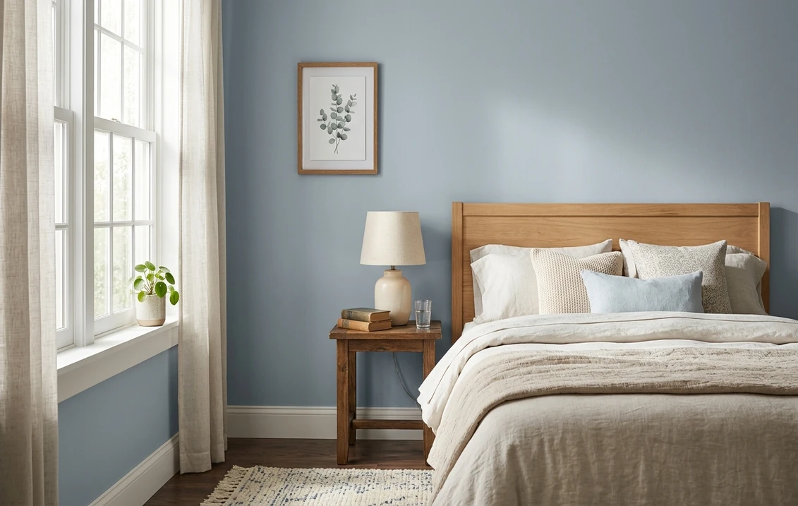
- Windy Blue (SW 6240, LRV 53). The quiet favorite. A soft gray-blue with the faintest green that stays restful instead of cold, ideal for a bedroom or a home office where you want focus without chill. The full undertone and trim breakdown lives in our Windy Blue 6240 profile.
- Misty (SW 6232, LRV 53). A close cousin of Windy Blue but a touch more open and airy across a big room. Misty is the go-to for living rooms and open-plan spaces where the color has to read consistently on several walls at once.
- Upward (SW 6239, LRV 59). The lightest of the three and a 2018 Color of the Year for a reason. Higher LRV means it stays soft and luminous even in low light, which makes it a favorite for bedroom ceilings and rooms that need to feel taller and brighter.
All three behave best in rooms with decent natural light. In a dim, north-facing room a gray-blue can drift toward flat gray, so push your bulbs slightly warm to keep the blue alive.
Free AI visualizer: see three soft gray-blues side by side under your real light.
The restful sleep blues: Sleepy Blue and Atmospheric
If the goal is a room that lowers your shoulders the moment you walk in, two picks lead the field for bedrooms and nurseries.
- Sleepy Blue (SW 6225, LRV 50). The name is the brief. A gentle blue-gray with a green whisper that reads soothing rather than babyish, which is why it shows up as often in adult bedrooms and powder rooms as in nurseries. It is light enough to keep a small room calm without feeling closed in.
- Atmospheric (SW 6505, LRV 57). The clearest, most cheerful blue on this list, with less gray holding it back. Think a soft daytime sky. It is the right call for a kid's room, a sunroom, or any space where you want the color to feel happy and bright rather than muted and grown-up.
The difference matters: Sleepy Blue is the muted, sophisticated choice; Atmospheric is the optimistic, saturated one. If you cannot decide, that is exactly the kind of side-by-side a visualizer settles in seconds. For more whole-room blue schemes, our blue living room paint ideas roundup shows how these tones read at full-wall scale.
The spa blue-greens: Tradewind, Rain, Quietude
Some of the most loved "light blues" are technically blue-greens, the spa colors that read clean against white tile and feel like a coastal exhale. They earn their keep in bathrooms most of all.
- Tradewind (SW 6218, LRV 57). The spa star: a light blue-green-gray that turns a plain bathroom into something that feels like a retreat. It plays beautifully with white subway tile, chrome, and natural wood. It sits in the same family as Sherwin-Williams Sea Salt, and our Sea Salt SW 6204 profile is the must-read if you are torn between the two.
- Rain (SW 6219, LRV 41). A step deeper and moodier, a muted blue-green-gray that adds drama to a powder room or looks custom on a vanity. The lower LRV means it reads as a real color, not a whisper, so reserve it for spaces that can take a little depth.
- Quietude (SW 6212, LRV 39). The deepest blue-green here, a cozy, enveloping option for a den, a small bath, or cabinetry. It is where "light blue" tips into "soft teal," so sample it carefully if you want it to still read blue rather than green.
The trap with blue-greens is light: under cool, north-facing light they lean blue and spa-like; under warm light or a 2700K bulb they pull green. Decide which read you want, then steer the bulbs to match.
Free preview: see Tradewind, Rain or Quietude on your actual room before you buy a sample.
Matching the blue to the room
Undertone and LRV only tell you half the story; the room decides the rest. A quick decision guide:
| Room | First-choice blue | Why |
|---|---|---|
| Primary bedroom | Windy Blue or Sleepy Blue | Soft, restful, neither too cold nor too saturated |
| Living / open plan | Misty or Upward | Reads consistently across many walls and light |
| Bathroom / spa | Tradewind or Rain | Blue-green reads clean against white tile and chrome |
| Nursery / kids' room | Sleepy Blue or Atmospheric | Calm or cheerful without being babyish |
| Ceiling ("fifth wall") | Upward | High LRV stays luminous and lifts the room |
| Kitchen island / cabinets | Rain or Quietude | Deeper tones read custom against white uppers |
Sources: Sherwin-Williams color data 2026; designer field notes on light blue interiors.
For the cabinetry direction specifically, the blue-grays on this list overlap heavily with the picks in our blue-gray kitchen cabinet colors roundup, where finish and durability matter as much as hue.
Trim, ceiling, and pairings that keep blues fresh
Light blues live or die by the white beside them. A few reliable rules:
- Crisp trim for cool blues. For Windy Blue, Misty, Atmospheric and Sleepy Blue, a clean white like SW Pure White (SW 7005) frames the color without dulling it.
- Warmer trim for spa tones. The blue-greens (Tradewind, Rain, Sea Salt's family) take well to a soft white like SW Alabaster (SW 7008) that nudges them cozy rather than clinical.
- Ceilings. A flat white keeps a blue room open, or use Upward overhead for a subtle wash of color that does not close the room in.
- Coordinating depth. A navy such as SW Naval (SW 6244) reads as an in-family step down for a vanity, a built-in, or a single accent.
To ground a blue scheme with a warm neutral in adjoining rooms, a greige bridges the two without a jarring switch. Comparing Sherwin-Williams against the other big US brand on coverage and finish? Our Sherwin-Williams vs Benjamin Moore comparison covers how each wears, and the wider field of soft hues sits in our best interior paint colors for 2026 roundup.
How to choose without a dozen sample cans
Light blues are exactly the colors where a 3-inch fan-deck chip lies to you. Under store light near 4000K, half a dozen of these blues land in the same balanced spot that none of them holds at home. The reliable physical method is a large peel-and-stick sample taped to at least two walls and checked mid-morning, mid-afternoon, and after dark under your normal bulbs. The faster, no-paint first pass is a digital visualizer: upload one photo of the room and apply two or three candidates side by side, say Windy Blue against Sleepy Blue against Tradewind, to see which way your light pulls each one and rule out the ones that were never going to work before you spend on samples.
Free: 1 HD render plus 3 variations, so you can compare several SW blues on your own room.
Frequently asked questions
What is the most popular Sherwin-Williams light blue?
For soft, livable walls, Windy Blue (SW 6240) and Misty (SW 6232) are the most reached-for gray-blues, while Sleepy Blue (SW 6225) leads for bedrooms and nurseries. For bathrooms, the blue-green spa tones Tradewind (SW 6218) and Sea Salt (SW 6204) dominate. The "right" one depends on your light and room, which is why most people shortlist two or three and compare them in place.
Why do Sherwin-Williams light blues look gray on my wall?
Most popular SW "light blues" are really blue-grays, softened with gray so they read as a sophisticated neutral. In low or north-facing light, that gray base can take over and drain the blue. To keep the blue alive, pick a clearer option like Atmospheric (SW 6505), choose a higher-LRV blue like Upward (SW 6239), or push your bulbs slightly warm to counter cool, indirect light.
What is a good light blue Sherwin-Williams color for a bathroom?
The blue-green spa tones are the bathroom favorites: Tradewind (SW 6218, LRV 57) for a light, airy spa feel, Rain (SW 6219, LRV 41) for a moodier powder room, and Sea Salt (SW 6204) if you want a color that shifts gently between blue and green. They all read clean against white tile, chrome, and natural wood.
What trim color goes with a light blue wall?
For cool, gray-blue walls like Windy Blue or Misty, a clean white such as SW Pure White (SW 7005) frames the color crisply. For warmer blue-green spa tones like Tradewind or Rain, a softer white like SW Alabaster (SW 7008) keeps the scheme cozy rather than clinical. A flat white ceiling keeps any light-blue room feeling open.
See several Sherwin-Williams blues under your real light before you buy a single can.
Disclaimer: Sherwin-Williams and the color names and codes referenced here are trademarks of The Sherwin-Williams Company. Benjamin Moore is a trademark of its respective owner. FacadeColorizer is an independent paint visualization service and is not affiliated with, endorsed by, or sponsored by Sherwin-Williams or Benjamin Moore. Screen color approximates the manufacturer's sample; always confirm with a physical sample before purchase. Sources: Sherwin-Williams color data 2026 for the colors listed, The Spruce paint undertone references, and designer field notes on light blue interiors.
Trademarks mentioned (Sherwin-Williams, Benjamin Moore, Behr, Caparol, Brillux, Sto, Alpina, Valspar, PPG, Glidden, Dulux, Crown Trade, Sandtex, Farrow & Ball, Johnstone's, Leyland) are property of their respective owners. FacadeColorizer is independent and not affiliated with any of them. Nominative fair use under Lanham Act §1125.


