
Sherwin-Williams Windy Blue (SW 6240) is the color you reach for when "blue" sounds too strong and "gray" sounds too flat. It is a soft, gentle gray-blue with a faint green breath underneath, the kind of quiet hue that lowers your shoulders the moment you walk into the room. It never shouts, never goes baby-blue, and never tips into the cold steel territory people fear from a blue wall. That restraint is exactly its appeal, and also why it is easy to underestimate from a tiny fan-deck chip.
This profile is for the homeowner already circling Windy Blue: how its undertones behave, the published LRV and hex, the rooms it flatters, how the light in your house steers it, and the trim and coordinating colors that keep it crisp. It is one of the calming hues in our wider Sherwin-Williams interior paint colors guide, and you can see how soft blues fit the year in our best interior paint colors for 2026 roundup.
Upload one photo and preview SW Windy Blue under your room's actual light in about 30 seconds, free.
The numbers behind Windy Blue SW 6240
Start with the published data; these figures predict the wall far better than the chip in your hand. They come from the Sherwin-Williams color tools:
| Spec | Value |
|---|---|
| SW code | SW 6240 Windy Blue |
| HEX (screen approximation) | #B5C7CC |
| RGB approximation | 181, 199, 204 |
| LRV (Light Reflectance Value) | 55 |
| Hue family | Soft gray-blue with a faint green undertone |
| Color collection | Part of the SW core fan deck, Cool Neutrals / soft blues |
| Closest SW cousins | Silvermist (SW 7621), Copen Blue (SW 0068), Moody Blue (SW 6221) |
Sources: Sherwin-Williams SW 6240 Windy Blue color data, retrieved 2026; The Spruce paint undertone references.
The LRV of 55 is the figure that does the heavy lifting. That is a true mid-tone: light enough to keep a bedroom or bathroom feeling open and restful, but with enough depth that the wall reads as a real, present color rather than a washed-out tint. It sits noticeably lighter than a saturated periwinkle like SW Moody Blue (LRV 24) and a touch lighter than the grayer SW Silvermist (LRV 53), which is why Windy Blue lands as airy-but-cozy instead of either pale or moody. If you want something darker and more enveloping in the same family, our SW Naval undertones guide shows what a low-LRV blue does to the same rooms.
The undertones: gray-blue with a green whisper
Windy Blue is, at heart, a gray-blue. The gray is what keeps it grounded and grown-up; without it, this would read as a nursery blue. The blue is what gives it its calm, sky-after-rain quality. But there is a third, quieter direction layered underneath, and noticing it is the difference between picking the right white and ending up with a wall that looks dingy:
- The dominant gray-blue. In most balanced daylight, Windy Blue reads as a soft, dusty blue with a clear gray softening it. This is the version on the chip and the one most people picture: serene, never bright.
- The green whisper. Underneath the blue there is a faint green-gray cast, the same family thread that runs through colors like Silvermist. Under warm light or beside warm wood, that green can surface just enough to make Windy Blue feel slightly spa-like rather than purely blue.
- The cool, near-gray read. In dim or strongly cool light, the blue recedes and Windy Blue can drift toward a pale, cool gray. This is the read that surprises people who expected more obvious color.
Crucially, Windy Blue has no violet or purple in it, which is what separates it from the periwinkles. Where SW Moody Blue and many "soft blues" lean purple in shade, Windy Blue stays on the blue-green side of the wheel. That keeps it clean and restful instead of moody, but it also means a warm or yellow-tinted bulb can flatten it; the green whisper is most likely to show under that warmth. The interior color families guide explains how this kind of finely balanced gray-blue shifts more by light than a committed primary color does.
How light steers Windy Blue, room by room
Because the gray and blue are close in weight, the direction a room faces, and the bulbs you use, move Windy Blue more than they would move a deep, saturated color. Here is the typical behavior across the four Northern Hemisphere orientations:
| Room orientation | Daylight character | How Windy Blue reads |
|---|---|---|
| North-facing | Cool, indirect, no direct sun | Coolest and bluest, can drift toward pale gray-blue; pair with warm wood and warm bulbs |
| South-facing | Warm, abundant midday light | Softest and most flattering; the green whisper lifts slightly, very serene |
| East-facing | Warm early sun, cooler later | Warm and gentle in the morning, settling to a calm gray-blue by afternoon |
| West-facing | Cool by day, warm at sunset | Quiet gray-blue most of the day, glowing softer at golden hour |
Sources: American Institute of Architects daylight reference; Sherwin-Williams SW 6240 color data; designer field notes on soft gray-blues.
Bulb color temperature matters just as much. Under 2700K warm white bulbs, Windy Blue softens, the green whisper can show, and it feels cozy and residential, the best choice for a bedroom or relaxing bath. Under 4000K cool white, it sharpens to a cleaner, slightly more obvious blue, which can look crisp in a bathroom but a touch clinical in a bedroom. Avoid hard 5000K daylight bulbs in a north room, where they push Windy Blue toward a cold gray and drain its warmth entirely. If you want a steadier neutral that barely moves across all of this, our SW Repose Gray guide is the predictable counterpoint to a shifting gray-blue.
The rooms Windy Blue was made for
Windy Blue's whole character is calm, so it shines in the rooms where rest and a clear head are the goal. Its mid LRV of 55 means it has enough presence to feel intentional without darkening a space:
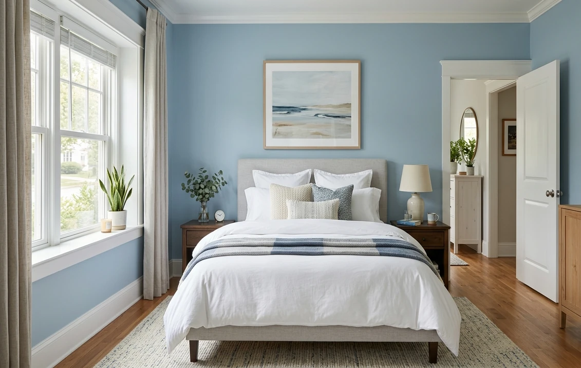
- Bedrooms: arguably its best room. The soft gray-blue is genuinely restful, reads sophisticated rather than juvenile, and layers beautifully under white, cream, soft gray, or natural-linen bedding. For more in this direction, our blue bedroom paint ideas roundup shows it in context.
- Bathrooms and powder rooms: the spa-clean side of Windy Blue reads fresh against white tile, marble, and chrome or brushed-nickel fixtures. It is soft enough to feel relaxing rather than sterile. See it alongside other options in our blue bathroom paint ideas guide.
- Home offices and reading nooks: blue is the classic focus-and-calm color, and Windy Blue's gray steadies it so it never distracts. A strong pick for a work-from-home space that needs to feel composed.
- Nurseries and kids' rooms: gentle and gender-neutral, with enough gray to grow with the child rather than reading strictly as a baby color.
- Laundry and mudrooms: it brings quiet life to small utility spaces and hides smudges better than a flat white.
Where to be careful: a windowless bathroom under warm builder bulbs can flatten Windy Blue's freshness, and a large, bright, all-glass great room wrapped in it can feel like a lot of cool color at once, where many designers use it on an accent wall or below a chair rail instead of wall to wall. When you are budgeting the repaint, our interior house painting cost guide covers what to expect per room.
Free AI visualizer: test Windy Blue in a bedroom, bath, or office before you buy a sample.
Trim, ceiling, and coordinating colors
Because Windy Blue is a soft cool color, the white you set beside it decides whether it reads crisp and current or slightly muddy. Clean whites that are not heavily warm work best:
- Best all-around trim: Sherwin-Williams Pure White (SW 7005, LRV 84). Bright and only faintly warm, it frames Windy Blue cleanly and keeps it fresh without going icy. The reliable default.
- For a slightly softer scheme: SW High Reflective White (SW 7757) or a true crisp white keeps the contrast sharp in a bathroom. Avoid a heavily creamy white like a deep antique white, which can make Windy Blue look dull next to it.
- Ceiling: a flat white keeps a bedroom or bath feeling open. Windy Blue itself on a ceiling can be lovely in a cozy bedroom but will deepen the cool feel, so reserve it for rooms with good warm light.
- Deeper coordinating tones: for an accent wall, built-in, or vanity, step down to a deeper blue like SW Moody Blue (SW 6221) or a navy like SW Naval (SW 6244) for a tonal, in-family scheme.
- Warm balance: ground a Windy Blue room with warm wood tones, brass or aged-brass hardware, and natural fibers; the warmth keeps the cool blue from feeling chilly.
To flow Windy Blue into adjoining rooms with a warm neutral, the greiges are natural partners; our profiles of SW Agreeable Gray and SW Accessible Beige both sit comfortably beside a soft gray-blue. For more pairing ideas across the palette, see our guide to colors that go with light blue.
Windy Blue vs the colors people cross-shop
Windy Blue has a handful of near-twins that shoppers line up against it. Knowing the difference saves a wasted sample:
- vs SW Moody Blue (SW 6221): the obvious depth contrast. Moody Blue is a far deeper, more saturated periwinkle-blue (LRV around 24) with a soft purple lean, made for a rich, enveloping room. Windy Blue (LRV 55) is the light, airy, no-purple version of the same calm-blue idea. Choose Moody Blue for drama and cocooning, Windy Blue for an open, restful feel.
- vs SW Silvermist (SW 7621): the closest sibling, and the trickiest to tell apart. Silvermist (LRV 53) carries more green and reads more clearly as a gray-green spa tone, while Windy Blue holds its blue side and reads as a gray-blue. In a north room they can look almost identical; in warm light Silvermist greens up and Windy Blue stays bluer. Pick Windy Blue when you want blue to win, Silvermist when you want the green-gray.
- vs SW Copen Blue (SW 0068): from the historic color line, Copen Blue is a clearer, dustier mid-blue with more chroma and less gray. It looks like a real, recognizable blue across the room, where Windy Blue stays softer and more neutral. Choose Copen Blue when you want the wall to read "blue" at a glance, Windy Blue when you want a quieter gray-blue that nearly behaves like a neutral.
The headline takeaway: Windy Blue is the softest and most neutral of this group. It is lighter than Moody Blue, bluer than Silvermist, and grayer than Copen Blue. If you find any of those three either too dark, too green, or too saturated, Windy Blue is often the in-between answer. For the broader picture of where these blues sit, our best interior blue paint shades guide maps the full range.
How to test Windy Blue before you commit
Windy Blue is a textbook case where a 3-inch fan-deck chip will lie to you. Under store light near 4000K, the chip reads cleaner and bluer than it will in a warm-lit bedroom, where it softens and may show its green whisper. The reliable physical method is a large peel-and-stick sample (Sherwin-Williams sells one) taped to two walls and checked mid-morning, mid-afternoon, and after dark under your normal bulbs; the dim-light read is the version you live with at night. The faster, no-paint first pass is a digital visualizer: upload a photo of the room and apply Windy Blue beside a deeper alternative (Moody Blue) and a grayer-greener one (Silvermist) to see exactly which way your light pulls it, and rule out the colors that were never going to work.
Preview Windy Blue beside Moody Blue and Silvermist under your real light, free: 1 HD render plus 3 variations.
Frequently asked questions
What undertones does SW Windy Blue have?
Windy Blue (SW 6240) is a soft gray-blue. The gray keeps it grounded and grown-up, the blue gives it its calm, sky-after-rain feel, and there is a faint green whisper underneath that can surface under warm light or beside warm wood. It has no purple or violet in it, which is what keeps it clean and restful rather than moody. In dim or strongly cool light it can drift toward a pale cool gray.
What is the LRV of SW Windy Blue?
Windy Blue has a Light Reflectance Value of about 55, a true mid-tone. That is light enough to keep a bedroom or bathroom feeling open and airy, but with enough depth that it reads as a real color rather than a washed-out tint. It is much lighter than a saturated blue like Moody Blue (LRV around 24) and almost the same lightness as Silvermist (LRV 53), the greener-grayer sibling it is most often confused with.
What trim color goes with Windy Blue?
Sherwin-Williams Pure White (SW 7005, LRV 84) is the most reliable trim pairing. It is bright and only faintly warm, so it frames Windy Blue crisply and keeps the color reading fresh rather than dull. A clean, true white like High Reflective White also works well in a bathroom. Avoid a heavily creamy antique white, which can make Windy Blue look muddy beside it. A flat white ceiling keeps the room feeling open.
What is the difference between Windy Blue and Silvermist?
They are close in lightness (LRV 55 versus 53) and easily confused, but Windy Blue holds its blue side while Silvermist (SW 7621) carries more green and reads as a gray-green spa tone. In cool north light they can look nearly identical; in warm light Silvermist greens up and Windy Blue stays bluer. Choose Windy Blue when you want blue to lead, and Silvermist when you want a green-gray.
What rooms is Windy Blue best for?
Windy Blue is at its best in restful rooms: bedrooms, where its calm gray-blue reads sophisticated and layers under neutral bedding; bathrooms and powder rooms, where the spa-clean side looks fresh against white tile and chrome; and home offices, where blue supports focus while the gray keeps it from distracting. It also works well in nurseries and small utility rooms. Be cautious in windowless rooms with warm builder bulbs, where it can flatten.
See SW Windy Blue under your real light, beside a deeper and a greener alternative, before you buy.
Disclaimer: Sherwin-Williams and SW 6240 Windy Blue are trademarks of The Sherwin-Williams Company. Benjamin Moore and Behr are trademarks of their respective owners. FacadeColorizer is an independent paint visualization service and is not affiliated with, endorsed by, or sponsored by Sherwin-Williams, Benjamin Moore, or Behr. Screen color approximates the manufacturer's sample; always confirm with a physical sample before purchase. Sources: Sherwin-Williams SW 6240 Windy Blue color data 2026, Sherwin-Williams Silvermist SW 7621, Copen Blue SW 0068, Moody Blue SW 6221 and Pure White SW 7005 color data, The Spruce paint undertone references, and designer field notes on soft gray-blues.
Trademarks mentioned (Sherwin-Williams, Benjamin Moore, Behr, Caparol, Brillux, Sto, Alpina, Valspar, PPG, Glidden, Dulux, Crown Trade, Sandtex, Farrow & Ball, Johnstone's, Leyland) are property of their respective owners. FacadeColorizer is independent and not affiliated with any of them. Nominative fair use under Lanham Act §1125.


