The first time I cut in a deep navy around a client's powder room mirror, she went quiet, then said it looked like a hotel. That is the thing about a blue bathroom: of every room in the house, this is the one where blue almost never misses. Water lives here, so the eye expects it. The trick is picking the right blue for the size and light you actually have, because a navy that feels like a jewel box in one bath can feel like a cave in another. Below are 16 blue bathroom ideas, grouped from softest to boldest, with the shades, tile pairings, and trim that make each one work.
A word on how to read this list. I have grouped the looks by depth, not by brand, because the family matters more than the exact name. Within each group I name specific colors you can take to a counter, but the principle (light reflectance value, undertone, where the blue sits between gray and true blue) is what you are really choosing. This room-by-room piece sits under our broader room paint color ideas guide, and for the full bathroom-specific shortlist across every color family, the best bathroom paint picks for 2026 is the companion pillar.
Upload a photo of your actual bathroom and preview any blue under your own light in about 30 seconds, free.
Soft and pale blues (ideas 1 to 5): keep a small bath open
If your bathroom is small, north-facing, or short on windows, start here. A high-LRV blue gives you the color you want without swallowing the light. These pale blue bathroom walls read fresh and clean, never heavy.
- Idea 1, soft sky blue: a pale, slightly cool blue in the high-60s to low-70s LRV range. On all four walls of a guest bath it feels like daylight even when there is none. Pair with white subway tile and a warm-white trim.
- Idea 2, powder blue with white wainscoting: paint above the chair rail, keep crisp white below. This is the most forgiving small-bathroom move there is, and it reads classic in a Cape or colonial.
- Idea 3, blue ceiling, white walls: a soft blue overhead (the old porch-ceiling trick) bounces a faint wash of color down without committing the whole room. Great for a bath with good natural light.
- Idea 4, pale blue-green: when a straight blue feels too cold, nudge toward a sea-glass blue-green. It warms up under bulbs and flatters skin tones at the mirror.
- Idea 5, blue cabinetry, white walls: a soft blue vanity against white walls gives you the color hit on the one surface you do not have to live inside. Easiest blue to live with long term.
One painter's note on pale blues: they shift more than any other family under artificial light. A 2700K bulb pulls them gentle and slightly green; a 4000K bulb snaps them crisp and cooler. Always check your swatch at night under your real fixtures before you commit.
Blue-gray: the no-regret middle (ideas 6 to 9)
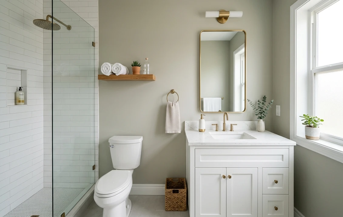
This is the group I steer most clients toward, because a blue-gray is the bathroom blue that almost nobody tires of. It reads gray in flat, cool light and quietly blue when the sun hits, so it gives you spa calm without the commitment of a saturated color. For the full undertone breakdown of this family, our blue-gray paint colors and undertones guide goes deep.
- Idea 6, soft blue-gray walls, marble-look tile: the dependable spa formula. A mid-light blue-gray (LRV mid-40s to 50s) against gray-veined white tile reads expensive for almost no risk.
- Idea 7, denim blue-gray vanity: a slightly deeper, denim-leaning blue-gray on the vanity with light walls. Modern, a little moody, still neutral enough for resale.
- Idea 8, blue-gray with brass: warm brass or unlacquered-brass fixtures against a cool blue-gray is the pairing that keeps showing up in design magazines, and for good reason. The warm metal stops the blue from going clinical.
- Idea 9, full blue-gray, including ceiling: in a bath with decent light, taking a soft blue-gray up over the ceiling (a color drench) erases the lines and makes a small room feel like a cocoon rather than a box.
| Blue family | Rough LRV | Best bathroom size and light | Tile and trim that flatter it |
|---|---|---|---|
| Soft sky / powder blue | 65 to 75 | Small, low-light, north-facing | White subway, warm-white trim |
| Blue-gray | 40 to 55 | Any size; the safest all-rounder | Gray-veined marble look, brass fixtures |
| Mid / true blue | 25 to 40 | Daylight helps; great on an accent wall | Crisp white tile, white or navy trim |
| Teal / blue-green | 20 to 40 | Mid-size, some natural light | Warm wood vanity, terracotta accents |
| Navy / deep blue | 5 to 12 | Powder rooms or well-lit full baths | White tile, brass or matte-black fixtures |
Sources: manufacturer color data (Benjamin Moore, Sherwin-Williams) 2026; The Spruce and Better Homes & Gardens bathroom color coverage; designer field reports compiled by FacadeColorizer. LRV ranges are typical, not exact for any single color.
Free AI visualizer. Test the blue on your real walls before buying a single sample pot.
Mid and true blues (ideas 10 to 12): color you can feel
When a client wants the room to actually say blue, this is where we land. A clear mid-tone blue has presence, but it needs light to look its best, so I tend to use it on one wall or one surface rather than wrapping a dim room in it. For the full range of saturated interior blues, our interior blue paint shades guide lays them out side by side.
- Idea 10, true-blue accent wall behind the vanity: one saturated blue wall, framed by white tile and a big mirror, gives you drama without darkening the whole room. The single safest way to go bold.
- Idea 11, French blue with white beadboard: a slightly grayed, classic French blue over white beadboard reads coastal-cottage and ages well. Warmer and friendlier than a primary blue.
- Idea 12, cobalt tile, white walls: if you love bold blue but fear repainting, put the saturation in the tile and keep walls a quiet white. The color is permanent in the best way.
A real caution with mid and true blues: they get heavier as the day goes on. A blue that looks lively at noon can go flat and dull by evening under warm bulbs. If your bath has no daylight at all, drop down to the blue-gray group instead. Choosing what pairs with a strong blue is its own task, and our colors that go with blue guide covers the whites, woods, and metals that keep it from feeling cold.
Teal and blue-green (ideas 13 to 14): warmer than a straight blue
Not every blue bathroom wants to feel cool. Push the blue toward green and you get teal, which carries a warmth that flatters skin at the mirror and pairs beautifully with natural wood. These are my pick for a bath that should feel relaxing rather than crisp.
- Idea 13, deep teal vanity, white walls: a rich blue-green on the cabinetry with light walls is the look that reads custom. Warm-wood floating shelves and brass hardware finish it.
- Idea 14, soft teal walls, terracotta accents: a muted teal on the walls with warm clay or terracotta tile and a wood stool is the cozy, lived-in version of a blue bathroom. Less hotel, more home.
See walls, vanity, and tile together in one preview before you buy.
Deep navy and dark blue (ideas 15 to 16): the jewel box
Here is the bold end, and honestly my favorite. A powder room is the single best place in any house to go dark, because you are only in it for minutes and the drama lands hard. Navy on the walls, or even just the vanity, reads timeless next to white tile. Benjamin Moore Hale Navy (HC-154) is the reference point most designers reach for, and our full Hale Navy HC-154 review covers exactly how it behaves.
- Idea 15, navy powder room, white tile and brass: wrap a small windowless powder room in navy, keep the tile and trim crisp white, add brass fixtures and a round mirror. This is the look that makes guests text you about the paint color.
- Idea 16, navy vanity, light walls: if a full dark room feels like too much, put the navy on the vanity only against soft white or pale blue walls. You get the depth and the anchor without losing any light.
Two finish notes for the dark end. First, always do a second coat on a deep navy in a bathroom; thin coverage shows roller streaks under vanity lighting more than any other color. Second, use an eggshell or satin sheen here, not flat, so it stands up to splashes and steam. For how navy slots into a whole-room palette, our bathroom color schemes guide pairs it with the right tile, counter, and metal finishes.
Preview a deep navy against your real tile and lighting, free.
How to pick the right blue for your bathroom
A fan-deck chip is the number-one reason people end up with a bathroom blue that disappoints: it reads lighter and flatter than a rolled wall, and it cannot show how the color shifts between your daylight and your night bulbs. Three rules cut the risk:
- Match depth to light. Small or windowless bath, stay in the pale or blue-gray groups (LRV 40 plus). Save navy and saturated mid-blue for powder rooms you pass through or full baths with real daylight.
- Mind the undertone against your tile. A blue with a green lean fights a pink-beige travertine; a blue with a violet lean fights warm wood. Hold the swatch flat against your actual tile and floor, not against the white box store wall.
- Preview it digitally first. Upload a photo of your real bathroom and apply a few blues (one pale, one blue-gray, one deep) before you buy any sample pots, narrowing the field to the one worth painting. Budget context for the whole job sits in our interior house painting cost guide for 2026.
Preview three blues side by side on your real bathroom walls, free.
Frequently asked questions
What is the best blue for a small bathroom?
For a small or low-light bathroom, stay with a high-LRV pale blue (roughly 65 to 75) or a soft blue-gray. Both keep the room feeling open instead of closing it in. Pair them with white tile and warm-white trim. Save deep navy and saturated true blues for powder rooms you only pass through, or for a single accent wall, since they absorb light and can make a tight space feel smaller.
Is a blue bathroom a good idea?
Yes. The bathroom is the room where blue is the safest bet in the house, because the eye associates blue with water and cleanliness. Blue-gray and soft sky blue are low-risk and broadly liked at resale, while navy on a vanity or powder room reads timeless. The only real caution is light: match the depth of the blue to how much natural and artificial light the room actually gets.
What colors go with blue bathroom walls?
Crisp white tile and warm-white trim are the dependable backbone for any blue bathroom. Brass or unlacquered-brass fixtures warm up a cool blue and stop it from feeling clinical; matte black suits a navy. Natural wood (white oak, walnut) and woven textures add warmth, and a touch of terracotta or clay pairs especially well with teal and blue-green. Avoid cool gray-washed wood, which can leave the room feeling flat.
What sheen should I use for blue bathroom paint?
Use eggshell or satin in a bathroom, not flat. The slight sheen stands up to splashes, humidity, and wiping, which matters in a wet room. For a deep navy, satin also helps the color read rich rather than chalky. Always plan on a second coat with saturated and dark blues, because thin coverage shows roller streaks under vanity lighting more than lighter colors do.
Will a navy bathroom feel too dark?
Not if you use it in the right room. A powder room is ideal for navy because you are only in it briefly and the drama lands; crisp white tile, a large mirror, and brass or warm lighting keep it from feeling like a cave. If you want navy in a full bathroom that lacks daylight, put it on the vanity only against light walls so you keep the brightness while still getting the deep, anchoring color.
Preview any blue on your actual bathroom walls under your own light before buying a single sample.
Disclaimer: Benjamin Moore and Hale Navy (HC-154) are trademarks of Benjamin Moore & Co. Sherwin-Williams is a trademark of The Sherwin-Williams Company. FacadeColorizer is an independent paint visualization service and is not affiliated with, endorsed by, or sponsored by Benjamin Moore or Sherwin-Williams. LRV ranges given here are typical for each color family and are not exact for any single product; color reproduction on screens approximates the manufacturer's chip, so always confirm with a manufacturer sample under your own bathroom light before purchase. Sources: Benjamin Moore and Sherwin-Williams color data 2026, The Spruce and Better Homes & Gardens bathroom color coverage, designer field reports compiled by FacadeColorizer.
Trademarks mentioned (Sherwin-Williams, Benjamin Moore, Behr, Caparol, Brillux, Sto, Alpina, Valspar, PPG, Glidden, Dulux, Crown Trade, Sandtex, Farrow & Ball, Johnstone's, Leyland) are property of their respective owners. FacadeColorizer is independent and not affiliated with any of them. Nominative fair use under Lanham Act §1125.