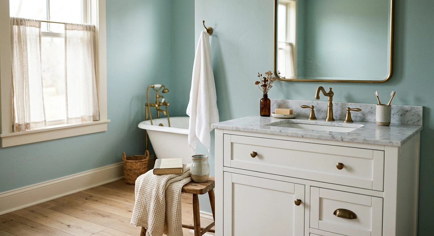

The smallest room in the house is the one people repaint twice. A bathroom has hard surfaces everywhere (tile, mirror, chrome, glass), almost no soft furnishing to absorb a wrong note, and lighting that swings from harsh vanity bulbs to a single foggy window. That is why a wall color that looked great in the bedroom can fall apart over the tub. Good bathroom color schemes are not just a wall color: they are the wall, the tile, the vanity, and the metal working as one. Below are 12 palettes that hold up, plus the honest note on which ones quietly fail in a small or windowless bath. This guide sits inside our wider interior color schemes guide for 2026.
One thing up front. A bathroom is a tiny box of reflective surfaces, so undertone clash gets amplified, not hidden. A gray that reads neutral in a living room can turn faintly purple next to white subway tile, and a beige can go yellow under warm LEDs. Every scheme here is built around a dominant neutral plus one supporting note, because that is what survives the lighting and the steam. If you want the room-by-room paint shortlist instead of full color ideas for bathrooms, our best bathroom paint picks for 2026 covers individual swatches; this page stays on the whole palette.
Upload a photo of your actual bathroom and preview a full color scheme under your own light in about 30 seconds, free.
How to read a bathroom palette before you commit
A bathroom palette is really four decisions stacked together. Get the order right and the color choices get easy:
- Fixed surfaces first: tile, countertop, and floor rarely change. Pull your scheme from their undertone, not the other way around. Cool gray tile fights a warm beige wall every single time.
- Pick a dominant neutral: roughly 60 percent of the visible surface. In most baths this is the wall and any large tile field.
- Add one supporting color: the vanity, an accent wall, or a green-blue you can live with daily. This is where the personality lives.
- Lock the metal: brushed brass and matte black read warm; chrome and polished nickel read cool. The metal is a color too, and it sets the temperature of the whole room.
- Check LRV for small baths: in a windowless or tiny room, keep the wall above LRV 60 or it closes in fast. A deep navy works only with real light or as a deliberate moody choice.
For the underlying logic of warm versus cool families and which neutrals pair with what, our interior paint color families guide is the map behind every scheme below.
12 bathroom color schemes that actually work
1. Warm white on warm wood (the fail-safe)
A creamy white wall, a white-oak or walnut vanity, brushed brass, and white tile. This is the spa-bath default for a reason: it is bright, forgiving, and timeless. The warm wood keeps the white from feeling clinical. If you only trust one scheme, trust this one.
2. Cool white on matte black
A crisp clean white with black hardware, black-framed shower glass, and black grout lines. Sharp, modern, and graphic. The catch: cool white over a north window can go flat and gray, so reserve this for rooms with decent light.
3. Greige and white (quiet neutral)
A warm greige wall with white trim and tile. The everyday workhorse for a family bath that has to please everyone. It hides water spots better than stark white and pairs with both brass and nickel.
4. Sea-salt green-blue and white
A muted green-blue (think Sherwin-Williams Sea Salt) with white trim and natural wood. It reads spa, not nautical, and it is the most requested bathroom color in America for good reason: it flexes between green and blue depending on the light, so it rarely looks wrong.
5. Soft blue and crisp white (classic coastal)
A gentle sky or powder blue against bright white tile and chrome. Fresh, clean, and easy in a kids' bath or a guest bath. Keep the blue soft: a saturated blue in a small bath can feel cold. For pairing logic, our guide to colors that go with blue interiors shows which whites and woods keep blue warm.
6. Navy and brass (the small-bath power move)
A deep navy on the walls or lower half, brushed brass fixtures, and white upper tile. Counterintuitive but true: in a small windowless powder room, dark walls feel intentional and jewel-box rich rather than cramped. The brass keeps it from going somber. See our dramatic powder room colors for the full moody playbook.
7. Charcoal and white (modern contrast)
A deep charcoal gray paired with bright white and chrome or nickel. Cleaner and cooler than navy, with a hotel feel. Works best as an accent wall behind the vanity rather than wrapping all four walls in a tight space.
8. Terracotta and cream (warm and earthy)
A clay or terracotta tone with cream trim, warm wood, and aged brass. Cozy and current, especially with handmade-look tile. This is the antidote to the all-gray bathroom era. It needs warm light: under a cool 4000K bulb terracotta can read muddy.
9. Sage green and cream (the 2026 favorite)
An earthy sage green with cream walls or trim and brushed brass. Calm, natural, and the quiet star of 2026 bathrooms. Sage flatters skin tones in the mirror better than a cool gray ever will. For pairings, our sage green shades and pairings guide lists the creams and whites that keep it from going gray-green.
10. Blush and white (soft and warm)
A barely-there blush or warm pink with white tile and gold fixtures. Done right it reads as a warm neutral, not a nursery, and it gives flattering light at the mirror. Keep the saturation low and let the metal do the rest.
11. Deep green and white marble
A forest or hunter green against white marble-look tile and brass. Rich, traditional, and a touch English. This is a primary-bath move: it wants space and light to breathe, and it rewards a freestanding tub.
12. All-white tonal (small-bath rescue)
Layered whites and off-whites: a warm white wall, white tile, an oak floor, and a single brass note. When a bathroom is tiny or has no window, a tonal white scheme makes it feel twice the size. It is the safest possible answer for a problem space.
Free AI visualizer. Test a full color scheme on your real walls before buying a single sample pot.
Bathroom color schemes side by side
Here is the quick reference. The mood column is honest about where each scheme belongs, and the best-for column accounts for size and light:
| Scheme | Dominant + support | Metal | Best for |
|---|---|---|---|
| Warm white + wood | Warm white, oak vanity | Brass | Any size, the safe default |
| Cool white + black | Cool white, black trim | Matte black | Bright, well-lit baths |
| Greige + white | Warm greige, white tile | Brass or nickel | Busy family bathrooms |
| Sea-salt green-blue | Muted green-blue, white | Chrome or brass | North or south, very forgiving |
| Soft blue + white | Powder blue, white tile | Chrome | Kids' and guest baths |
| Navy + brass | Deep navy, white tile | Brass | Small powder rooms |
| Charcoal + white | Charcoal gray, white | Chrome or nickel | Accent wall, well-lit baths |
| Terracotta + cream | Clay, cream trim | Aged brass | Warm-light rooms only |
| Sage + cream | Earthy sage, cream | Brushed brass | Any size, flatters the mirror |
| Blush + white | Soft blush, white tile | Gold or brass | Flattering mirror light |
| Deep green + marble | Forest green, white marble | Brass | Larger primary baths |
| All-white tonal | Layered whites, one accent | Brass | Tiny or windowless baths |
Sources: Sherwin-Williams and Benjamin Moore color data 2026; The Spruce and Better Homes & Gardens bathroom color coverage; designer field reports compiled by FacadeColorizer.
Schemes that flop in a small or windowless bath
Not every pretty palette survives a real bathroom. A few honest warnings, because I see these go wrong constantly:
- All-gray everything: gray walls, gray tile, gray vanity. In bathroom light this reads cold and slightly dirty, and it drains color from skin at the mirror. Add a warm note or skip it.
- Saturated cool blue in a tiny bath: a strong cobalt or navy with only chrome and white tile can feel like a walk-in freezer. Warm it with brass or wood, or move it to a room with a window.
- Two competing undertones: a warm beige wall against cool gray floor tile. They will fight forever, and no amount of accessories fixes a clashing undertone.
- Deep dark walls with no light: a moody charcoal in a windowless box without good vanity lighting just looks like a closet. Navy and brass can work there; a flat dark gray usually does not.
If your bathroom is genuinely small, the size-specific shortlist is worth a look before you pick: our small bathroom paint colors guide ranks colors by how much they open up a tight room, and our best blue room ideas shows which blues stay warm enough to use in a compact space.
Preview a warm and a cool option side by side on your real walls, free.
How to test a bathroom scheme before you commit
A fan-deck chip is the worst possible way to choose a bathroom color. It cannot show you how the wall reacts to your tile, your metal, and that single foggy window. Two better methods:
- Swatch against the tile, not on a clean wall: roll a 12-by-12-inch sample right next to your actual tile and countertop, then look at it under the vanity lights at night and by the window in the day. Watch for the wall going purple or yellow next to white tile.
- Preview the whole scheme digitally first: upload a real photo of your bathroom and apply the wall, then compare a warmer and a cooler option before you buy any samples. It narrows three contenders to the one worth painting, and it shows the wall with your existing tile and metal already in frame.
Preview your full bathroom scheme against your real tile and fixtures, free.
Frequently asked questions
What is the most popular bathroom color scheme?
Soft white walls with warm wood and brushed brass is the most-used bathroom scheme in America, because it is bright, timeless, and forgiving in almost any light. Right behind it is a muted green-blue (sea-salt style) with white trim, which reads spa-like and flexes between green and blue depending on the light, so it rarely looks wrong.
What color scheme makes a small bathroom look bigger?
A tonal all-white or off-white scheme makes a small bathroom feel largest, because layered light values blur the edges of the room and bounce the most light. Keep the wall above LRV 60. The surprising exception is a deep navy-and-brass powder room: in a tiny windowless space, going dark and rich can feel intentional and jewel-box-like rather than cramped.
Should bathroom walls be lighter or darker than the tile?
In most small or average baths, keep the walls equal to or lighter than the tile so the room stays open. Going darker than the tile works only when you have good light or you are deliberately chasing a moody, enclosed feel, as with a navy or forest-green primary bath. Most important is that the wall and tile share an undertone (both warm or both cool) so they do not clash.
Does the metal finish change the bathroom color scheme?
Yes, the metal is a color too and it sets the temperature of the room. Brushed brass and matte black read warm and pair naturally with greige, sage, terracotta, and navy. Chrome and polished nickel read cool and suit crisp whites, soft blues, and charcoal. Mixing a warm wall with cold chrome (or the reverse) is the most common reason a scheme feels slightly off.
What bathroom color schemes should I avoid?
Avoid an all-gray scheme (gray wall, gray tile, gray vanity), which reads cold and drains color from skin at the mirror. Avoid a saturated cool blue in a tiny chrome-and-white bath, which feels icy. And avoid pairing a warm wall with a cool floor tile, since clashing undertones fight forever and no accessories will fix it.
Preview a full bathroom palette on your actual walls under your own light before buying a single sample.
Disclaimer: Sherwin-Williams, Sea Salt (SW 6204), and Evergreen Fog are trademarks of The Sherwin-Williams Company. Benjamin Moore is a trademark of Benjamin Moore & Co. Color names are referenced for guidance only. FacadeColorizer is an independent paint visualization service and is not affiliated with, endorsed by, or sponsored by any paint manufacturer. Color reproduction on screens approximates the manufacturer's chip; always confirm with a manufacturer sample under your own light before purchase. Sources: Sherwin-Williams and Benjamin Moore color data 2026, The Spruce and Better Homes & Gardens bathroom color coverage, designer field reports compiled by FacadeColorizer.
Trademarks mentioned (Sherwin-Williams, Benjamin Moore, Behr, Caparol, Brillux, Sto, Alpina, Valspar, PPG, Glidden, Dulux, Crown Trade, Sandtex, Farrow & Ball, Johnstone's, Leyland) are property of their respective owners. FacadeColorizer is independent and not affiliated with any of them. Nominative fair use under Lanham Act §1125.


