A client called me last spring in a small panic. She had rolled a gorgeous sage on her dining room walls, loved it for one day, then hung a cool gray-blue curtain next to it and watched the room go flat and slightly seasick. The green had not changed. The partner color had. That is the thing nobody tells you about green: the shade you pick matters far less than what you set beside it. Green sits in the middle of the color wheel, so it swings warm or cool depending on its neighbors. Get the partners right and a green room feels collected and expensive. Get them wrong and it reads like a mistake you have not admitted yet.
This guide is the practical answer to the question I get most: what are the colors that go with green indoors, and how do they change by the shade you are working with? I have split it by family, sage, olive, and forest, because a soft gray-green wants completely different company than a deep saturated one. For the bigger picture of building a room around any anchor color, our interior color schemes guide is the parent map. This page zooms in on green.
Upload a photo of your room and preview a green wall with different trim and accents in about 30 seconds, free.
First, read your green's undertone
Before you pick a single partner, figure out which way your green leans. This one step prevents most clashing. Every green carries a bias, and that bias decides whether warm or cool company flatters it.
- Yellow-leaning greens (olive, moss, chartreuse, many sages) are warm. They love warm whites, cream, terracotta, brass, and tan. Set a cold blue-white beside them and they look dingy.
- Blue-leaning greens (emerald, teal-green, some forest greens) are cool. They take crisp whites, gray, navy, and chrome or nickel without going muddy.
- Gray-greens (Evergreen Fog, eucalyptus, most muted sages) sit on the fence. They are the most flexible, but their low saturation means a too-bright partner can overpower them.
A quick painter's trick: hold your green chip next to a pure-white card. If it looks yellow or gold, it is warm. If it looks crisp and slightly blue, it is cool. That single comparison tells you which half of this guide to trust most.
The pairings at a glance
Here is the cheat sheet of green color combinations I keep in my head on site. Match your green family to its safest and boldest partners before committing to a sample:
| Green family | Undertone | Safest partners | Boldest partner |
|---|---|---|---|
| Sage (soft gray-green) | Neutral to warm | Warm white, oak, greige, soft black | Blush pink or terracotta |
| Olive (yellow-green) | Warm | Cream, tan, walnut, rust | Mustard or burnt orange |
| Forest (deep cool green) | Cool to neutral | Crisp white, brass, navy, camel | Blush or dusty rose |
| Emerald (jewel green) | Cool | Gold, white, charcoal, plum | Hot pink or coral |
Sources: color-wheel pairing principles; The Spruce and Architectural Digest green-room coverage; designer field reports compiled by FacadeColorizer.
Colors that go with sage green
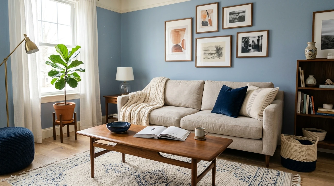
Sage is the easiest green to live with and to pair, which is why it has been everywhere for years. It is a muted, dusty gray-green, low in saturation, often faintly warm. Because it is so quiet, almost any neutral sits happily beside it. The skill is choosing partners that add interest without shouting.
Warm white and cream (the default)
A soft warm white on trim and ceiling is sage's best friend. It keeps the green clean and fresh without the cold, clinical edge a stark blue-white brings. Think creamy whites in the LRV 80s. Avoid the bluest whites here: against sage they make the wall look gray and tired. If sage is your main event, our deeper sage green interior shades and pairings guide walks through trim picks shade by shade.
Natural wood and warm neutrals
Sage and wood is a combination I almost never see fail. White oak, walnut, rattan, and unbleached linen reflect warmth back onto the green and keep the room organic rather than styled. Pair sage walls with a greige sofa and an oak coffee table and you have a calm, grounded living room.
Blush pink and terracotta (the bold move)
Here is where sage gets interesting. A dusty blush or muted terracotta sits near-opposite green on the wheel, creating a soft complementary contrast that feels designed, not random. A blush velvet chair or terracotta pillows against sage walls is a quiet luxury. Keep both muted; a bright candy pink against sage looks like a nursery accident.
Soft black for definition
Sage drifts toward washed-out if the whole room is pale. A few hits of soft black, matte-black hardware, an iron fixture, a black frame, give the eye somewhere to land and make sage look intentional.
Free. Test a sage wall against warm white, wood, and a blush accent, side by side.
Colors that go with olive green
Olive is the warm, earthy, yellow-leaning green, and it asks for warm company. This is where people go wrong most: they treat olive like sage, reach for a cool gray, and it instantly looks like dried herbs. Lean into the warmth and olive becomes one of the richest, most sophisticated wall colors you can use.
- Cream and tan: a soft cream trim with tan or camel upholstery echoes olive's yellow base and keeps the room sunlit even on a gray day. The safest olive scheme.
- Walnut and dark wood: olive against deep walnut or stained oak reads vintage and library-warm, a natural fit for a study, den, or moody dining room.
- Rust and burnt orange: rust is olive's analogous warm neighbor and the pairing feels autumnal in the best way. A rust leather chair against olive walls is timeless.
- Mustard and ochre (bold): push the warmth further with mustard textiles. Yellow and olive are close on the wheel, so this reads tonal rather than clashing.
- Black and brass: matte black grounds olive, brass amplifies its gold undertone. This trio is the backbone of the warm, organic-modern look.
When you ask what goes with green and the green is olive, the avoid list is short: cool gray, icy blue-white, and chrome. They fight the yellow base and leave olive looking drab. The one cool accent that holds up is a deep navy, saturated enough to feel intentional.
Colors that go with forest and emerald green
Deep greens are the drama category, and more forgiving than people fear because their saturation does the heavy lifting. Forest green leans cool and slightly blue; emerald is the jewel-toned cousin. Both take crisper, brighter partners than sage or olive ever could.
Crisp white and brass
This is the classic for a reason. A clean white trim makes a forest-green wall look sharp and architectural, and warm brass hardware keeps the cool green from feeling cold. Forest green, white, and brass is the safest deep-green scheme there is, at home in a powder room, a bookcase, or a kitchen.
Navy and camel
Forest green and navy sound risky and look fantastic, two deep saturated tones that read as a layered palette rather than a clash. Add camel or cognac leather to warm it up and you have a handsome room, my go-to for a study.
Blush and dusty rose (the unexpected one)
Pink and deep green is the pairing that converts skeptics. A soft blush or dusty rose against forest green is the same red-green complementary logic as sage and terracotta, turned up. It softens the green's depth and feels modern and a little romantic. Keep it muted and matte.
Gold, plum, and charcoal for emerald
Emerald is a jewel, so treat it like one. Real gold or brass, a deep plum, and charcoal gray all flatter its richness without competing. For a kitchen taking the deep-green route on the lower cabinets, our green kitchen cabinet paint colors guide shows forest and sage cabinetry with their best counters.
One flexible deep green worth singling out is a gray-green like Sherwin-Williams Evergreen Fog. Sitting between green and gray, it pairs as easily with warm whites and brass as a sage does, while delivering a darker color's depth. Our full Evergreen Fog undertones and best rooms guide breaks down how its light shifts and which partners hold up.
Free preview. Apply a deep green to your room and test partner colors before you cut in a single coat.
Metals, neutrals, and the rules that always hold
Whatever green you choose, a few principles cut across every shade:
- Brass and gold flatter almost every green. Warm metals pull out the life in green, the most reliable accent across every family.
- Match the white to the green's temperature. Warm green wants warm white; cool green takes a crisper white. Mismatch it and the trim looks off first.
- Wood is a free win. Natural wood bridges green to a room better than any neutral paint, because green and brown are neighbors in nature.
- Pink is green's secret weapon. Every green has a pink that flatters it, blush for soft greens, dusty rose for deep ones. The contrast most people overlook.
- Cool gray is the usual culprit. When a green room feels flat, a cool gray partner is almost always why. Swap it for greige, warm white, or wood.
How to test green pairings before you commit
Green is notoriously light-sensitive: the same sage reads fresh in the morning and muddy under cool evening LEDs, and its partners shift with it. A 3-inch chip shows none of that. Two better ways to choose:
- Sample big, sample together: roll a 12-by-12-inch swatch of your green and tape your candidate trim white and an accent swatch beside it. Check it mid-morning, mid-afternoon, and at night under your normal bulbs. The partner that holds up in all three wins.
- Preview it digitally first: upload a real photo of your room and apply the green plus a warm white and a bold accent before buying sample pots, narrowing the field to the one combination worth painting. To zoom back out to whole-room schemes, the interior color schemes guide shows how green fits into 60-30-10 and complementary plans.
Preview a green wall against warm white, wood, and an accent color, side by side, free.
Frequently asked questions
What is the best color combination for green?
The most reliable across every shade is green with a temperature-matched white, natural wood, and warm brass. For a soft sage, add blush pink as the accent; for a deep forest green, add navy and camel or a dusty rose. The rule that holds: match the white to the green's undertone, warm white for yellow-leaning greens, crisp white for blue-leaning ones.
What colors go with sage green walls?
Sage pairs beautifully with warm white and cream trim, natural oak and walnut, greige neutrals, and matte-black accents for definition. For contrast, a muted blush pink or soft terracotta creates a designed complementary look. Avoid cold blue-whites and bright cool grays next to sage, which can make it read slightly gray and tired.
Does pink go with green?
Yes, and it is one of green's most underused partners. Pink and green are near-complementary on the color wheel, so they create a soft, intentional contrast. Use a dusty blush with soft greens like sage and a deeper dusty rose with forest or emerald. Keep the pink muted and matte; bright candy pink against green tends to look juvenile rather than designed.
What goes with olive green and what should you avoid?
Olive is a warm, yellow-leaning green, so it wants warm company: cream, tan, walnut, rust, mustard, brass, and matte black. Avoid cool grays, icy blue-whites, and chrome, which fight olive's yellow base and leave it drab. The one cool color that holds up is a deep, saturated navy.
What metal hardware looks best with green?
Brass and gold are the most flattering metals for nearly every green, because their warmth pulls out the life in the color, true for sage, olive, forest, and emerald alike. Matte black is the reliable second choice for a grounded, modern edge. Polished chrome and cool nickel work only with the coolest greens (emerald, teal-green) and look flat next to warm or muted ones.
Preview a green wall and its partner colors under your own light before buying a single sample.
Disclaimer: Sherwin-Williams and Evergreen Fog (SW 9130) are trademarks of The Sherwin-Williams Company. Any other paint names, color names, and brand references are the property of their respective manufacturers and are used here for identification and editorial comparison only. FacadeColorizer is an independent paint visualization service and is not affiliated with, endorsed by, or sponsored by Sherwin-Williams or any other paint manufacturer. Color reproduction on screens approximates a manufacturer's chip; always confirm with a manufacturer sample under your own light before purchase. Sources: color-wheel pairing principles, The Spruce and Architectural Digest green-room coverage, Sherwin-Williams SW 9130 Evergreen Fog color data 2026, designer field reports compiled by FacadeColorizer.
Trademarks mentioned (Sherwin-Williams, Benjamin Moore, Behr, Caparol, Brillux, Sto, Alpina, Valspar, PPG, Glidden, Dulux, Crown Trade, Sandtex, Farrow & Ball, Johnstone's, Leyland) are property of their respective owners. FacadeColorizer is independent and not affiliated with any of them. Nominative fair use under Lanham Act §1125.