
The first navy wall I ever cut in was a client's dining room, and she was nervous the whole time: too dark, too much, too 2010. Then we hung a single brass sconce, leaned a warm-white console against it, and she went quiet in the good way. That is navy in a sentence. On its own it can feel heavy and a little cold, but the right second color flips it into something rich and grounded. The question is never whether navy works. It is what goes with navy blue in your specific room. Below are the 12 pairings I reach for, ranked by how reliably they land, with the ones I would skip called out plainly.
One framing note before the list. A true mid-tone navy sits at a very low Light Reflectance Value (roughly LRV 6 to 12), which is why it behaves almost like a neutral: it pairs widely, the way charcoal or black does, rather than fighting other colors. That low LRV is also why navy needs a brighter partner to keep a room from going cave-dark. This guide lives inside our wider interior color schemes guide, and it is the deep-end companion to our broader interior pairings for blue: that one covers the whole blue range, this one stays locked on navy. If you are still choosing the navy itself, our interior blue paint shades roundup maps the field.
Upload a photo of your actual room and preview navy with any second color under your own light in about 30 seconds, free.
Why navy blue pairs so widely
Navy is a deep, desaturated blue, and that combination of low LRV and muted chroma is what makes it so cooperative. It reads as a backdrop, not a statement shouting over everything else. Designers treat a soft navy like Hale Navy almost the way they treat a warm black: a grounding anchor that lets a lighter or warmer color sit on top and glow.
Two practical truths shape every pairing below. First, navy is cool, so a purely cool scheme (navy plus gray plus crisp white) can tip clinical fast. You almost always want at least one warm element in the room to keep it human. Second, undertone matters more than you would think. Some navies lean slightly purple or black, others lean green-gray, and that lean decides whether brass, blush, or sage flatters or fights. When in doubt, test on your actual wall, not a chip.
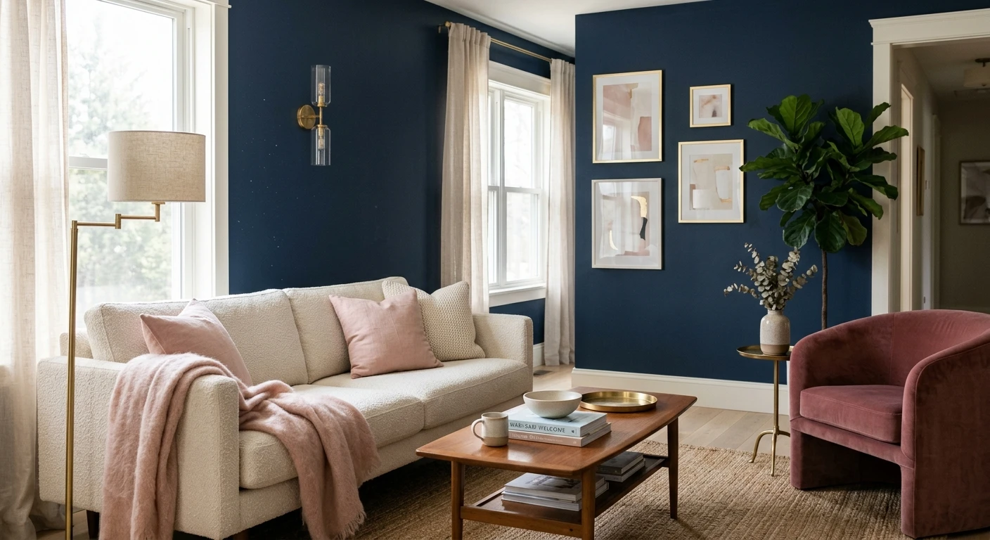
The 12 best colors that go with navy blue
Ranked roughly from most foolproof to most advanced. Navy blue goes with all of these, but the bottom few demand a steadier hand.
1. Crisp white
The classic, and for good reason. A clean white (think Benjamin Moore White Dove OC-17 or Chantilly Lace) gives navy maximum contrast and a fresh, nautical-meets-modern edge. This is the safest pick for trim, ceilings, and millwork against navy walls. It never dates and it never muddies. If your navy leans cool, a slightly warm white keeps the pair from going icy.
2. Warm white and cream
My personal default. A cream-leaning white softens navy's coolness and turns a sharp contrast into something cozy and lived-in. Use it when crisp white feels too corporate. For the full range of cream-side whites that pair this way, see our warm white paint colors guide.
3. Brass and warm gold
Not a paint color, but the single best accent for navy, so it earns a slot. Brass hardware, gold picture frames, and warm metal lighting make navy look intentional and expensive. The warm metal against the cool blue is the contrast that does most of the heavy lifting in those magazine rooms. Aged or unlacquered brass beats shiny polished brass here.
4. Soft gray and greige
A light warm gray or greige is the calm, tonal partner: navy as the deep note, greige as the quiet mid-tone. It reads sophisticated and restrained, ideal for a bedroom or a study. The one caution: keep the gray warm. A cool blue-gray next to navy can leave the whole room feeling flat and chilly.
5. Natural wood and tan
White oak, walnut, leather, rattan, and tan textiles bring exactly the warmth navy is missing. This is the pairing that keeps a navy room from feeling like a corporate lobby. A navy accent wall over a white-oak floor with a tan leather chair is hard to get wrong.
6. Blush and dusty pink
The unexpected winner. A muted, grayed-down blush against navy is soft, current, and a little romantic without going sweet. It works because pink sits opposite blue on the warm-cool axis, so the two flatter each other. Skip a bright bubblegum pink, which fights navy instead of complementing it.
7. Sage and muted green
Navy and sage is one of the most-requested combinations of the moment, and it deserves the hype. Both are deep, both are slightly grayed, so they read as a sophisticated nature palette rather than a clash. Add warm wood and the room feels like a quiet library. For more on building it out, our sage green shades and pairings piece pairs cleanly with this navy.
8. Mustard and ochre
A high-energy, retro-leaning pair. Navy and mustard is genuinely striking, but it is an accent move, not a whole-room move. A mustard throw, a single ochre chair, or art with gold-yellow against navy walls reads confident. Mustard walls plus navy walls in the same room is usually too much.
9. Terracotta and warm rust
The cool blue and the earthy clay are complementary opposites, which is why this combination feels grounded and a little Mediterranean. Terracotta tile, rust velvet, or a clay-toned rug warms navy beautifully. This is one of my favorite ways to make navy feel relaxed instead of formal.
10. Mid-tone caramel and camel
A richer cousin of the natural-wood pairing. Caramel and camel leather, suede, or paint give navy a warm, slightly luxe partner with more saturation than plain tan. Excellent in a den or home office where you want depth on both sides of the contrast.
11. Charcoal and black
For a moody, masculine, layered look, navy plus charcoal plus black reads intentional rather than dark-for-dark's-sake, as long as you vary the finishes and add metal. Use black on hardware, window frames, and a fixture (a warm near-black like Tricorn Black) so it does not blur into the navy. This is advanced: without a bright accent somewhere, it can swallow the light. Our Tricorn Black undertones guide covers how to keep the black from going flat.
12. Bright coral or chartreuse (accent only)
The boldest play on the list. A hit of coral or chartreuse against navy is electric and modern, but strictly as a small accent: a pillow, a piece of art, a single chair. As a wall partner it overwhelms. Treat it like seasoning, not a main ingredient.
Free AI visualizer. Test navy with white, brass, blush, or sage on your real walls.
Navy color combinations at a glance
A quick reference for which navy combinations suit which mood and which room. Use this to narrow your shortlist before you swatch anything.
| Partner color | Mood it creates | Best room | Difficulty |
|---|---|---|---|
| Crisp white | Fresh, nautical, timeless | Any room, trim and ceilings | Easy |
| Warm white / cream | Cozy, soft, inviting | Living room, bedroom | Easy |
| Brass / gold | Refined, expensive-looking | Dining, entry, kitchen | Easy |
| Soft greige | Calm, tonal, restrained | Bedroom, office | Easy |
| Natural wood / tan | Warm, grounded, organic | Living room, den | Easy |
| Blush pink | Soft, current, romantic | Bedroom, powder room | Medium |
| Sage green | Sophisticated, nature-led | Study, living room | Medium |
| Mustard / ochre | Energetic, retro | Accents only | Medium |
| Terracotta / rust | Earthy, Mediterranean | Living room, kitchen | Medium |
| Charcoal / black | Moody, layered, masculine | Office, library | Advanced |
| Coral / chartreuse | Bold, modern, electric | Small accents only | Advanced |
Sources: Benjamin Moore Hale Navy HC-154 color data 2026; The Spruce and Better Homes & Gardens color-pairing coverage; designer field reports compiled by FacadeColorizer.
Navy pairings room by room
The same navy behaves differently depending on the space and its light, so the best second color shifts by room.
- Living room: navy plus warm white plus natural wood is the no-fail base; layer in brass or a single blush or rust accent for personality.
- Bedroom: navy plus soft greige or navy plus blush reads restful and grown-up. Keep the contrast gentle so the room stays calm at night under lamp light.
- Kitchen: navy lower cabinets with white uppers and brass hardware is a modern classic. For where it sits among the year's cabinet trends, see our kitchen cabinet colors guide.
- Office or study: navy plus charcoal plus warm wood makes a focused, library-like room. Add one bright accent so it does not go cave-dark.
- Powder room: small and windowless is where navy thrives, because you want drama, not brightness. Navy plus brass plus a warm white ceiling is a reliable powder-room formula.
See walls, trim, and an accent together in one preview, free.
Combinations to skip with navy
A few pairings get suggested constantly and rarely work. Saying so plainly will save you a sample pot:
- Navy plus cool blue-gray plus stark white (all cool): with zero warmth, the room reads cold and corporate. Add wood, brass, or a warm white to rescue it.
- Navy plus bright royal or cobalt blue: two strong blues compete instead of layering. If you want a tonal blue scheme, pair navy with a much paler, softer blue, not another saturated one.
- Navy plus pure jet black with no metal or variation: the two deep tones blur into one murky mass. Black works only when you add brass, glass, or a finish change to separate them.
- Navy plus bright bubblegum pink: the muted blush works, the candy pink fights. Grayed-down beats saturated every time here.
If you want the single safest navy to build any of these around, our Benjamin Moore Hale Navy HC-154 review covers the most forgiving option, soft enough that nearly every pairing above lands.
How to test a navy pairing before you commit
A small chip lies about navy more than almost any other color: it reads flatter, lighter, and less moody than a rolled wall, and it cannot show how the second color interacts across a day. Two better methods:
- Swatch both colors side by side: roll a generous sample of the navy and your candidate partner on the same wall, leave a gap, and check the pair in morning, afternoon, and night light. Watch whether the room loses all its warmth after dark.
- Preview it digitally first: upload a real photo of your room and apply the navy with two or three different partner colors before buying any samples. It narrows your shortlist to the one worth painting and shows you the contrast at full scale, not chip scale.
Preview navy against white, brass, blush, and sage, side by side, free.
Frequently asked questions
What colors go best with navy blue?
Crisp white, warm white and cream, and brass or warm gold are the three most reliable partners for navy blue, because they add the brightness and warmth navy lacks. After those, natural wood, soft greige, blush pink, and sage green all pair beautifully. Bolder options like mustard, terracotta, charcoal, and coral work too, but mostly as accents rather than whole-room partners.
Does navy blue go with gray?
Yes, navy goes with gray, but warm gray and greige work far better than cool blue-gray. A warm light gray gives a calm, tonal scheme with navy as the deep note. A cool gray next to navy makes the whole room feel cold and flat, so add wood or a warm white to keep at least one warm element in the space.
What accent color works with navy walls?
Brass and warm gold are the standout accents for navy walls: the warm metal against the cool blue is the contrast that makes navy look intentional and expensive. Blush pink, mustard, terracotta, and a small hit of coral or chartreuse also work as accents. Keep saturated brights small, a pillow or a single chair, since they overwhelm navy at wall scale.
Do navy blue and black go together?
They can, for a moody, layered look, but only if you separate them. Use black on hardware, window frames, and a fixture (a warm near-black like Tricorn Black) and add brass or glass so the two deep tones do not blur into one murky mass. Without a finish change or a bright accent somewhere in the room, navy plus black reads flat and swallows the light.
What color trim goes with navy walls?
A clean white such as Benjamin Moore White Dove OC-17 is the safest trim and ceiling partner for navy, giving crisp, timeless contrast. If your navy or your light leans cool, a slightly warm white keeps the pairing from turning icy. Avoid a stark blue-white, which can make navy walls feel cold and corporate rather than rich.
Preview navy blue with white, brass, blush, or sage on your actual walls under your own light before buying a single sample.
Disclaimer: Benjamin Moore, Hale Navy (HC-154), White Dove (OC-17), and Chantilly Lace are trademarks of Benjamin Moore & Co. Sherwin-Williams and Tricorn Black (SW 6258) are trademarks of The Sherwin-Williams Company. FacadeColorizer is an independent paint visualization service and is not affiliated with, endorsed by, or sponsored by Benjamin Moore or Sherwin-Williams. Color names and pairings are described for guidance only; navy blue refers to a deep blue color family rather than a single product. Color reproduction on screens approximates the manufacturer's chip; always confirm with a manufacturer sample under your own light before purchase. Sources: Benjamin Moore Hale Navy HC-154 color data 2026, The Spruce and Better Homes & Gardens color-pairing coverage, designer field reports compiled by FacadeColorizer.
Trademarks mentioned (Sherwin-Williams, Benjamin Moore, Behr, Caparol, Brillux, Sto, Alpina, Valspar, PPG, Glidden, Dulux, Crown Trade, Sandtex, Farrow & Ball, Johnstone's, Leyland) are property of their respective owners. FacadeColorizer is independent and not affiliated with any of them. Nominative fair use under Lanham Act §1125.


