
A client called me last spring half-convinced beige was a mistake. She had rolled a warm sandy beige across her living space, loved it for a week, then watched it go flat the moment her gray sofa and bright white frames moved in. The beige was fine. The companions were wrong. That is the whole story with this neutral: it almost never fails on its own, it fails by association. Get the partner colors right and a beige room reads layered and expensive; get them wrong and the same walls look like a rental nobody finished. Here are the colors that go with beige that actually hold up on a real wall, and the undertone logic behind each one.
One rule before the list. Beige is not a single color, it is a family with a warm spine and a wandering secondary undertone (yellow, pink, green, or gray). A pairing that sings against a yellow-beige can look muddy against a pink-beige. So every combination below comes with the undertone it loves and the one it fights. If you are still nailing down which beige you own, our guide to beige undertones sorts the shades first, and this pairing piece is the natural next step. Together they sit inside our broader interior color schemes guide.
Upload a photo of your actual room and preview beige with a partner color under your own light in about 30 seconds, free.
First, read your beige's undertone
Before you pick a single accent, figure out where your beige leans. Hold the wall against a sheet of plain printer paper. Next to true white, the secondary undertone jumps out: a buttery cast means yellow, a faint blush means pink, a slightly olive cast means green, and a flat dustiness means gray (that last one is technically greige, covered in our greige warm-neutral guide).
Why this matters: warm partners (terracotta, brass, oak) amplify whatever warmth your beige already has, great for a yellow-beige and risky for one already going orange in afternoon light. Cool partners (navy, sage, charcoal) calm a too-warm beige and add the contrast that keeps the room from reading like one beige blur. The deeper and more saturated your beige (think a taupe-beige), the more it follows the rules in our taupe undertones guide. Keep your beige's lean in mind for every pairing below.
The 8 best colors to pair with beige
Ranked roughly from safest to boldest. Every one of these has earned its place on jobs I have actually painted, not just on a mood board.
1. Warm white (the foundation move)
The single most reliable partner for beige is a clean warm white on trim, ceiling, and millwork. It gives the eye a crisp edge and stops beige from looking like it bled across the whole room. The trap is a stark blue-white: that cold contrast drags the warmth out of the beige and leaves it dingy. Reach for a soft warm white such as SW Pure White (SW 7005, LRV 84) or BM White Dove (OC-17) instead. This is the contrast that makes every other color on this list read intentionally.
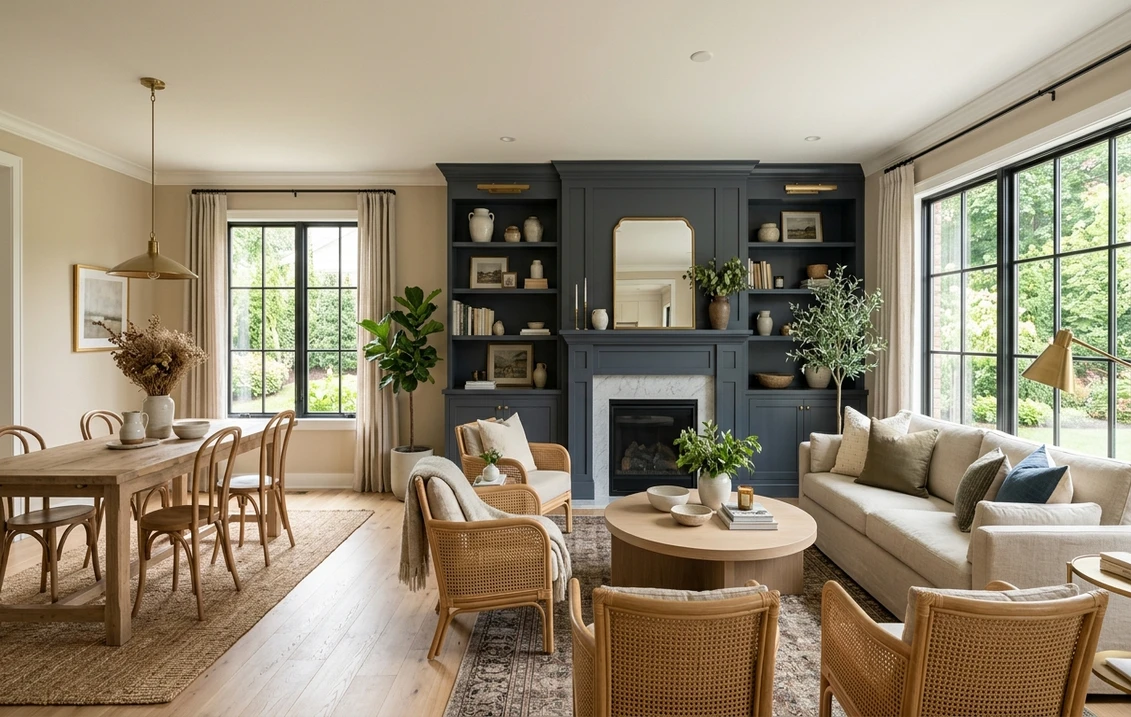
2. Navy blue (the dependable contrast)
Navy and beige is the pairing I recommend most when a client wants beige to feel current rather than dated. A deep, slightly grayed navy like BM Hale Navy (HC-154) reads almost like a neutral itself, so it grounds a beige room without shouting. Use it on a single accent wall, a kitchen island, or built-in cabinetry, then echo it small in textiles. The cool depth flatters every beige undertone, singing loudest against a yellow-leaning beige.
3. Sage and gray-green
A muted gray-green is my favorite "quietly designed" partner for beige. SW Evergreen Fog (SW 9130) or a softer sage pulls the latent green-gray in many beiges into a deliberate scheme, so the room feels collected instead of accidental. This is the pairing to choose when navy feels too sharp and you want something restful. It works best with a green- or gray-leaning beige; against a strongly pink-beige it can tip slightly murky, so sample that combination on the wall first.
4. Charcoal and near-black
For modern rooms, nothing sharpens beige like a warm near-black on doors, window frames, or a fireplace surround. SW Tricorn Black (SW 6258) gives crisp graphic contrast, while SW Urbane Bronze (SW 7048), a brown-leaning dark, feels softer and more organic against warm beige. Charcoal is the high-contrast option, so use it in measured doses (frames, legs, hardware) rather than full walls in a small space, or the room can feel heavy.
5. Terracotta and rust
This is the warm-on-warm play, and it is gorgeous when it lands. A clay terracotta or muted rust in cushions, a rug, or pottery makes a yellow-beige room feel sun-baked. The caution is real: pile warm terracotta onto a beige already drifting orange and you get the dated, flat 1990s "tuscan kitchen" look most people want to escape. Anchor it with a cool note (a black frame, a charcoal lamp) so the warmth has something to push against.
6. Soft blush and dusty rose
A grayed-down blush is an underrated partner for beige, especially in a bedroom. It pulls out the pink in a pink-beige and adds a barely-there warmth that lamp light loves. Keep it desaturated: a clean candy pink fights beige, but a dusty, almost-mauve rose settles into it. Bring it in through bedding, a velvet bench, or curtains rather than a full wall unless the room is large and bright.
7. Deep olive and forest green
Where sage is the gentle green, a saturated olive or forest green is the confident one. On a beige backdrop it reads earthy and a little luxe, the kind of contrast that makes a study or dining room feel grown-up. Olive in particular shares a yellow-green base with many beiges, so the two feel related rather than opposed. Use it on a feature wall or cabinetry and let beige stay the calm surround.
8. Brass, brown, and natural wood (the metals and textures)
Not a paint color, but no honest list of beige combinations skips it. Beige is built to frame warm materials: unlacquered brass, aged leather, walnut, white oak, rattan, and natural linen all reflect warmth back and bring it to life. This is what separates a layered beige room from a flat one. Cool chrome and gray-washed wood do the opposite, so lean warm on hardware and floors.
Free AI visualizer. Test a partner color on your real walls before buying a single sample pot.
Beige pairing cheat sheet
Here is the whole system on one screen: the partner color, the mood it creates, and the beige undertone it flatters most. Print it, take it to the paint counter, and skip most of the mistakes.
| Partner color | Mood it creates | Best beige undertone | Where to use it |
|---|---|---|---|
| Warm white (Pure White, White Dove) | Crisp, clean, foundational | Any beige | Trim, ceiling, millwork |
| Navy (Hale Navy) | Grounded, classic, current | Yellow or neutral beige | Accent wall, island, cabinetry |
| Sage / gray-green (Evergreen Fog) | Restful, quietly designed | Green or gray beige | Bedroom, study, full wall |
| Charcoal / near-black (Tricorn Black) | Modern, graphic, high contrast | Any beige, in small doses | Doors, frames, hardware |
| Terracotta / rust | Warm, sun-baked, earthy | Yellow beige (anchor with a cool note) | Textiles, rugs, pottery |
| Dusty blush / rose | Soft, warm, intimate | Pink beige | Bedding, curtains, bench |
| Olive / forest green | Earthy, confident, luxe | Yellow or green beige | Feature wall, dining room |
| Urbane Bronze (warm dark) | Organic, soft contrast | Any warm beige | Built-ins, trim, exterior doors |
Sources: Sherwin-Williams and Benjamin Moore color data 2026; The Spruce and Better Homes & Gardens neutral-pairing coverage; designer field reports compiled by FacadeColorizer.
Three beige palettes that work
A pairing is one thing, a full beige paint palette is another. These three are field-tested, each built on a beige body (Accessible Beige SW 7036 is a safe stand-in, see our Accessible Beige room-by-room guide).
- Coastal calm: beige walls, warm-white trim, Hale Navy accents, natural oak and rattan. Reads relaxed and timeless, hard to get wrong.
- Modern organic: beige walls, Evergreen Fog or olive on a feature wall, Urbane Bronze on doors, brass and leather. Earthy and current.
- Soft transitional: beige walls, dusty rose textiles, charcoal frames, white oak floors. Warm and intimate without going sweet.
Notice what every palette shares: a clean white for contrast, one cooler color to balance the warmth, and warm wood or metal for life. That triangle (white, a cool note, a warm material) is the backbone of nearly every beige room that photographs well.
See walls, trim, and accent together in one preview, free.
Colors to use with beige carefully (or skip)
Plenty of color charts say beige goes with everything. It does not, and pretending otherwise is how rooms go wrong. A few honest cautions:
- Stark blue-white trim: the most common beige mistake. It chills the beige and makes it look dirty by comparison. Always go warm white.
- Cool gray (true blue-gray): warm beige plus a cold gray can clash into a muddy, undecided non-scheme. If you want gray with beige, use a greige or a warm gray, not an icy one.
- Bright primary yellow: too close to beige's own undertone, so it amplifies the warmth into something garish. A muted ochre is the safer move.
- Lavender and cool purple: fights the warm base directly and almost always reads off. Skip it unless your beige is unusually cool.
How to test a beige pairing before you commit
Beige pairings go sideways because a 3-inch chip cannot show you how two colors behave together across a full day of light. The accent that looks crisp at the paint counter can read cold at dusk. Two better ways to decide:
- Swatch them side by side: paint a large sample of your beige and the partner color on the same wall, touching, and check them mid-morning, mid-afternoon, and at night under your normal bulbs. Watch for the moment the warm and cool start fighting.
- Preview it digitally first: upload a real photo of your room and apply the beige with two or three candidate partners before buying samples, so you narrow a long list to the one combination worth painting. Budgeting the full repaint? Our interior house painting cost guide for 2026 has the numbers, and the top living room paint colors for 2026 roundup pairs well with beige schemes.
Preview beige with a warmer and a cooler partner, side by side, free.
Frequently asked questions
What colors go with beige walls?
The most reliable partners are a warm white on trim, a deep navy like Hale Navy for grounded contrast, and a muted sage or gray-green such as Evergreen Fog for a restful look. For bolder rooms, charcoal or warm near-black sharpens beige, while terracotta and olive add earthy warmth. Across all of them, the goal is one cool note to balance beige's warmth plus warm wood or brass for life.
What is the best accent color for a beige room?
Navy is the most dependable accent for beige because a slightly grayed navy reads almost like a neutral, so it grounds the room without overpowering it and flatters nearly every beige undertone. Use it on a single accent wall, an island, or cabinetry. If navy feels too sharp, a muted sage green is the gentler alternative.
Does gray go with beige?
It depends on the gray. A warm gray or a greige (gray plus beige) sits beautifully next to beige, but a true cool blue-gray often clashes, leaving both colors looking muddy and undecided. If you want a gray in a beige scheme, choose a warm or greige version rather than an icy one, and sample the two together on the wall before committing.
What white trim looks best with beige?
A soft warm white such as SW Pure White (SW 7005) or BM White Dove (OC-17) is the best trim with beige. It gives a crisp edge while still flattering the warmth. Avoid a stark blue-white like Extra White next to beige, because the cold contrast drains the warmth and can make the walls read dingy.
What colors should you avoid with beige?
Steer clear of stark blue-white trim, true cool blue-gray, bright primary yellow, and cool lavender. Each one either chills beige until it looks dirty or sits so close to its undertone that the warmth turns garish. A muted ochre, a warm white, and a desaturated cool note are the safer substitutes.
Preview beige with navy, sage, or charcoal on your actual walls under your own light before buying a single sample.
Disclaimer: Sherwin-Williams, Accessible Beige (SW 7036), Evergreen Fog (SW 9130), Urbane Bronze (SW 7048), Tricorn Black (SW 6258), Pure White (SW 7005), and Extra White are trademarks of The Sherwin-Williams Company. Benjamin Moore, Hale Navy (HC-154), and White Dove (OC-17) are trademarks of Benjamin Moore & Co. FacadeColorizer is an independent paint visualization service and is not affiliated with, endorsed by, or sponsored by Sherwin-Williams or Benjamin Moore. Color reproduction on screens approximates the manufacturer's chip; always confirm with a manufacturer sample under your own light before purchase. Sources: Sherwin-Williams and Benjamin Moore color data 2026, The Spruce and Better Homes & Gardens neutral-pairing coverage, designer field reports compiled by FacadeColorizer.
Trademarks mentioned (Sherwin-Williams, Benjamin Moore, Behr, Caparol, Brillux, Sto, Alpina, Valspar, PPG, Glidden, Dulux, Crown Trade, Sandtex, Farrow & Ball, Johnstone's, Leyland) are property of their respective owners. FacadeColorizer is independent and not affiliated with any of them. Nominative fair use under Lanham Act §1125.


