For most of the 2010s, beige was a punchline. A decade of cool gray buried it, and "builder beige" became shorthand for a dated, yellow wall nobody chose on purpose. That era is over. Warm neutrals came roaring back, and in 2026 beige is again one of the most-painted interior colors in the United States, this time as a deliberate choice rather than a default the builder picked for you.
The catch is that beige is the trickiest neutral to get right. The same swatch can read as creamy oatmeal in one home and faintly pink, green, or dingy tan in the next, all because of an undertone you cannot see on a fan deck. This profile is about reading those undertones before they surprise you, and picking the shade, LRV, and trim that keep beige from sliding back into "builder" territory.
Upload a room photo and preview the top beige shades under your real light in about 30 seconds, free.
Beige is a warm neutral, not a single color
On a color chart, beige is a pale, low-saturation neutral built on a warm (usually yellow) base. In a real room, where a beige lands is decided by its secondary undertone: the quiet second pigment under that warm base. Two beiges with identical lightness can feel worlds apart because one leans pink and the other green. Four undertone directions cover almost every beige on the shelf.
- Yellow-base beige (the classic): the warmest and most traditional. Glows in sun, but can tip toward gold or "1990s tan" in a low-light room.
- Pink/red-base beige: a red undertone adds rosy richness in warm light, but it is the number-one beige trap, flashing pink under cool north light or LED bulbs.
- Green/gray-base beige (greige-leaning): a faint green or gray base mutes the yellow for a current, neutral warm. Most "new beige" shades lean this way.
- Taupe-leaning beige: deeper and browner, reading as a grounded, earthy neutral rather than a light wall color.
Beige sits in the warm-neutral aisle next to greige, taupe, and warm white; for the full map of how these families relate, see our interior paint color families guide. If your samples keep reading cool and flat, you may actually want a true neutral, covered in our light gray paint colors guide.
The best beige paint colors for 2026, by LRV
Light Reflectance Value (LRV) runs from 0 (black) to 100 (white) and measures how much light a color bounces back. For beige walls, the mid-50s to low-70s is the comfortable zone: bright enough to keep a space airy, deep enough to read as a warm color rather than an off-white. Below are the beige shades US designers reach for most, with their published manufacturer values.
| Color (code) | LRV | Undertone | Reads best in |
|---|---|---|---|
| SW Accessible Beige (7036) | 58 | Warm yellow with a soft gray base | Any room; the safe modern default |
| BM Manchester Tan (HC-81) | 64 | Yellow-green, very balanced | Living rooms, whole-house palettes |
| SW Natural Linen (9109) | 66 | Soft warm beige, slight green base | North and low-light rooms wanting warmth |
| BM Shaker Beige (HC-45) | 54 | Warm tan with a gold base | South and west rooms, traditional spaces |
| SW Kilim Beige (6106) | 57 | Pink-red base (the classic trap) | Warm-lit rooms only; skip in north light |
| BM Ballet White (OC-9) | 73 | Light beige with a faint yellow-gray base | Small or dark rooms needing brightness |
Try it on your house
No photo? Try a sample
Sources: Sherwin-Williams and Benjamin Moore official technical data sheets (LRV values), 2026; The Spruce neutral paint roundups; professional designer reference palettes.
The practical read: Accessible Beige (SW 7036) is the lowest-risk workhorse, warm without going yellow, while north-facing homes should lean greener (Natural Linen, Manchester Tan). Kilim Beige is gorgeous in a sun-soaked room and a liability anywhere cool, which is the failure mode that ruins more beige jobs than any other.
The pink-beige trap (and how to dodge it)
If you have ever painted a "warm tan" and ended up with walls that look faintly like a Band-Aid, you met the pink-beige trap. Many beiges carry a red or red-violet pigment under the warm base. In warm light that red reads as cozy richness, but in cool north light or under a "daylight" LED bulb the warm wavelengths are stripped away and the red is what your eye locks onto, so the wall flashes pink.
You can avoid it without a color-theory degree.
- Check the undertone first. Pull the chip next to a true-neutral beige like Accessible Beige; if your candidate looks rosy by comparison, it has a pink base.
- Match the undertone to the light. Reserve pink-base beiges like Kilim Beige for south and west rooms, where warm light flatters them.
- In cool or north light, choose a green or gray-base beige. The green quietly cancels the pink, which is why Manchester Tan and Natural Linen stay neutral where Kilim Beige goes rosy.
- Always test after dark, since the pink flash usually appears the first night the bulbs come on, not at noon.
How beige changes its mind from morning to night
Beige sits so close to neutral that it soaks up whatever light is in the room. Which way your windows face will tell you far more than the chip you grabbed at the store.
- South-facing: beige looks its best, rich and glowing. The only risk is gold-base shades like Shaker Beige edging toward yellow at midday.
- North-facing: cool blue light mutes the warm base and exposes any pink, so choose a green or gray-leaning beige and skip pink-base shades.
- East and west: both swing across the day. West beige turns golden at sunset, lovely in a living room, trickier in a home office.
Bulbs finish the job: warm-white LEDs (2700K) flatter every beige, while cool "daylight" bulbs (4000K and up) can leave it gray, washed out, or pink after dark.
Free AI paint visualizer. Upload your photo to see how beige reads in your light before buying a sample.
Where beige earns its place, room by room
Beige works anywhere in the house. Still, a few rooms wear it better than the rest.
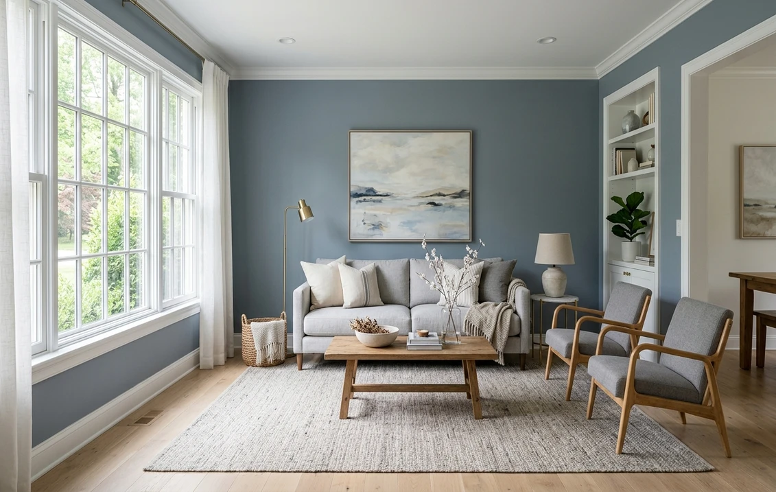
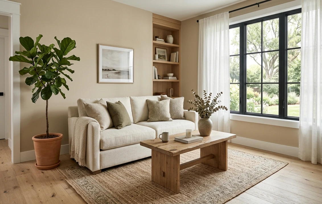
Living rooms and open plan
Here is where beige does its best work. Wood, leather, rattan, brass, black metal: it flatters all of them in one breath. And as light drifts across an open-plan layout, shades like Manchester Tan and Accessible Beige hold their neutral.
Bedrooms
A genuinely restful, cocooning choice with white linen and natural wood. In a north-facing bedroom, pick a lighter, greener beige so it reads warm in the morning.
Kitchens, dining, and hallways
Soft beige behind white or wood cabinets bridges warm and cool finishes and feels friendlier than gray at night. In low-light hallways, a mid-to-high LRV beige (around 60 to 70) keeps the space from feeling closed in.
Trim, ceiling, and decor that keep beige looking intentional
The fastest way to make beige look dated is the wrong trim. The rule: pair it with a clean warm white, never a stark blue-white, so the walls read as a chosen warm neutral instead of a tired tan.
- Best trim whites: Sherwin-Williams Alabaster (SW 7008, LRV 82) and Benjamin Moore White Dove (OC-17, LRV 85). Both are warm whites that let beige read crisp without looking dingy.
- Avoid: very cool, blue-based whites like BM Chantilly Lace (LRV 90) against a warm beige; the high contrast can make the walls look muddy or yellow by comparison.
- Ceiling: a warm white, or the trim white scaled up, keeps the warmth consistent; a bright blue-white ceiling over beige walls can feel disconnected.
- Wood floors: white oak, natural maple, and honey-toned wood bounce warm light onto the walls. Cool gray-washed floors fight the warmth.
- Metals and accents: brass, aged bronze, and matte black all read well, and black in particular keeps a beige room feeling current rather than soft.
- Color accents: sage green, terracotta, and navy all pair cleanly. For a green companion room, see our sage green interior shades guide; for a cooler counterpoint, our blue-gray paint colors guide.
Beige vs greige vs taupe: which warm neutral do you actually want?
People swap these three names around constantly. The fastest way out of the confusion is to ask one question: how do you want the room to feel?
- Want true warmth and a sunlit glow? Beige. Its yellow base is the warmest of the three, ideal for a cozy, light-filled room.
- Want warmth but more modern and less yellow? Greige. The gray tones the yellow down, and it is the safest pick if "beige" still sounds dated to you. Our greige paint colors guide covers the best gray-beige hybrids shade by shade.
- Want something deeper and grounded? Taupe. Its brown-gray base gives a richer, earthier wall, good as a cozy accent or a moody whole-room color.
So many beiges and greiges blur into each other that the label on the can barely counts. What counts is the undertone you actually test. If you are weighing the two biggest names, our Sherwin-Williams vs Benjamin Moore interior comparison breaks down how their neutrals differ. Beige also stays famously resale-friendly, which is partly why it appears across our best interior paint colors for 2026 picks.
How to test a beige before you commit
Beige shifts so much with light that testing is non-negotiable, and a fan-deck chip is the worst way: it reads roughly 25 to 35% lighter than the rolled wall and cannot show the pink or gold flash. Instead:
- Paint a 12-inch swatch (or a peel-and-stick sample) on at least two walls, including the one that gets the least light.
- Look three times: morning, midday, and after dark under your actual bulbs, since the night check is where pink and gold undertones appear.
- Judge it against your trim and floor, not bare drywall, ideally next to a second undertone so the difference is obvious.
- Or narrow the field first with a digital visualizer: upload a photo of your room and apply several beiges to cut six options to two before buying samples.
A preview costs you nothing. A repaint is the line that actually hurts the budget, so it pays to look first. For materials, labor, and per-square-foot pricing, see our interior painting cost guide.
Upload your room and compare the top beige shades side by side, free.
Frequently asked questions
What is the most popular beige paint color for 2026?
Sherwin-Williams Accessible Beige (SW 7036, LRV 58) is the most-painted modern beige in the US. Its warm yellow base is grounded by a soft gray, so it reads current and neutral instead of dated tan, which makes it the lowest-risk pick. Benjamin Moore Manchester Tan (HC-81) and SW Natural Linen (SW 9109) are the other go-to warm beiges.
Why does my beige paint look pink?
Many beiges carry a red or red-violet pigment under the warm base. In warm light it reads as richness, but cool north light or "daylight" LED bulbs strip the warm wavelengths and expose the red, so the wall flashes pink or peach, usually worst after dark. SW Kilim Beige (SW 6106) is a classic pink-base example. In cool or north-facing rooms, choose a green or gray-base beige like Manchester Tan or Natural Linen instead.
What is the difference between beige and greige?
Beige is a warm neutral built on a yellow base, so it reads cozy and traditional. Greige adds gray to that mix, which tones the yellow down for a cooler, more modern neutral. If beige sounds too yellow or dated to you, greige is usually the safer choice; if you want true sunlit warmth, beige is the one.
What trim color goes with beige walls?
A warm white. Sherwin-Williams Alabaster (SW 7008) and Benjamin Moore White Dove (OC-17) are the safest trims because they let beige read crisp and intentional. Avoid stark blue-based whites like Chantilly Lace against warm beige, since the high contrast can make the walls look muddy or overly yellow by comparison.
See the best 2026 beige shades on your room before buying a sample pot.
Disclaimer: Sherwin-Williams, Accessible Beige, Natural Linen, Kilim Beige, and Alabaster are trademarks of The Sherwin-Williams Company. Benjamin Moore, Manchester Tan, Shaker Beige, Ballet White, White Dove, and Chantilly Lace are trademarks of Benjamin Moore and Co. Behr is a trademark of its respective owner. FacadeColorizer is an independent paint visualization service and is not affiliated with, endorsed by, or sponsored by Sherwin-Williams, Benjamin Moore, or Behr. Color reproduction on screens approximates the manufacturer's chip; always confirm with a manufacturer sample before purchase. Sources: Sherwin-Williams and Benjamin Moore official technical data sheets 2026 (LRV values), The Spruce neutral paint roundups, and professional designer reference palettes.
Trademarks mentioned (Sherwin-Williams, Benjamin Moore, Behr, Caparol, Brillux, Sto, Alpina, Valspar, PPG, Glidden, Dulux, Crown Trade, Sandtex, Farrow & Ball, Johnstone's, Leyland) are property of their respective owners. FacadeColorizer is independent and not affiliated with any of them. Nominative fair use under Lanham Act §1125.