There is no such thing as a single "off-white." There are hundreds, and the difference between two cans that look identical on the chip is the whole game. Off-white paint is any white softened with a touch of pigment so it stops being a stark builder white and starts feeling livable. That pigment, which can be yellow, beige, gray, green, or pink, is invisible on a fan-deck chip and impossible to miss across a sunlit room. Pick the wrong undertone and the warm cream you fell for at the store can read dingy or oddly cool on the wall.
This is a working profile of the off-white family for interior walls: the undertone, the Light Reflectance Value (LRV) band that keeps a white soft rather than bright, the shades worth knowing by name, the best rooms for each, and the trim that stops an off-white from looking dirty. For how this family sits next to grays, greiges, and greens, start with our interior paint color families guide.
Upload a room photo and preview real off-white shades under your actual light in about 30 seconds, free.
What makes a white an "off-white"
A pure white reflects almost every wavelength evenly. An off-white is that same base with a small, deliberate dose of color to take the harshness off: white with a personality, just a quiet one. That personality is the undertone, and it is where homeowners get tripped up. Off-whites fall into three rough camps:
- Warm off-whites (yellow, cream, beige base). The biggest and most popular group, soft and inviting. The risk is that too much yellow tips toward "old wall" or buttery in strong sun.
- Neutral off-whites (barely-there undertone). The hardest to formulate and the safest to use. They lean neither warm nor cool and flatter most rooms, though in very cool light they can flatten toward gray.
- Cool off-whites (gray, blue, or green base). Crisp and modern, leaning toward a true white. Great in bright south rooms; in a dim north room they can read sterile.
The trap is treating these as interchangeable: a warm cream and a cool gray-white can look identical on the chip, then read like different colors on the same wall.
LRV: how soft your white will feel
LRV measures how much light a color reflects on a 0 (black) to 100 (pure white) scale, printed on every manufacturer chip. For off-whites it separates a soft, easy white from a bright, almost-true white. Most off-whites people love live in the LRV 80 to 87 band: high enough to read white and bounce light, low enough that the wall feels gentle rather than glaring. Past 88 to 90 you reach near-pure builder whites (Chantilly Lace, Simply White) that can feel stark on a big wall; below 75 you cross into a soft greige.
| Shade | Code | LRV | Undertone read |
|---|---|---|---|
| BM White Dove | OC-17 | 85 | Soft warm white, the gentle all-rounder |
| SW Alabaster | SW 7008 | 82 | Warm, slight yellow-green base; cozy |
| BM Swiss Coffee | OC-45 | 84 | Creamier, clearer yellow warmth |
| SW Greek Villa | SW 7551 | 84 | Clean warm white, peachy-yellow, less green |
| SW Shoji White | SW 7042 | 74 | Greige-leaning warm white; edge of the family |
| BM Simply White | OC-117 | 91 | Brightest here, barely off-white, fresh |
Try it on your house
No photo? Try a sample
LRV values from Sherwin-Williams and Benjamin Moore technical color data, 2026. Cross-check codes on a sample before buying.
For a white that works almost anywhere, stay in the LRV 82 to 86 band with a warm-to-neutral pick like White Dove or Greek Villa, and save a brighter near-white like Simply White for rooms flooded with light. If a sample drifts muddy in a dim room, you have gone too low in LRV or too heavy on a gray-green base.
How light reveals (or hides) an off-white's undertone
Daylight is not neutral, and off-white is unusually honest about it. Because the color is mostly white, it broadcasts whatever the room's light is doing, so one can of warm cream can read three ways in three rooms of one house.
- North-facing rooms get cool, indirect sky light (roughly 7,500 to 10,000 K) and no direct sun. Cool light subtracts warmth, so a warm off-white loses cream and a gray-green base reads faintly greige. Lean warmer than you think you need.
- South and west rooms run warm: off-whites glow, though a very yellow cream can look buttery at midday or peachy at a west-facing sunset. East rooms are bright and slightly cool in the morning, where most off-whites look clean.
- After dark, warm 2700K bulbs add yellow and make a cream feel heavier; 3000K to 3500K keeps a white crisp at night.
The shift is most dramatic the further north you live: a warm white that reads creamy in a Charleston dining room can read flat greige in a Seattle north-facing office. Light grays share this sensitivity, mapped out in our light gray paint colors guide.
Free AI visualizer. Test White Dove, Alabaster, and Swiss Coffee on your real walls before buying a sample.
The off-whites worth knowing by name
The codes and LRV sit in the table above; here is how each of these favorites actually behaves on a wall.
- Benjamin Moore White Dove (OC-17). The most popular off-white in the United States. Its yellow-beige base carries almost no green or gray, so it reads creamy without going buttery and works in north and south light alike, the classic "set and forget" pick for walls and trim.
- Sherwin-Williams Alabaster (SW 7008). The SW counterpart and a 2016 Color of the Year. A faint green-gray whisper makes it soft in warm rooms, but it is also why Alabaster can flatten toward greige in cool north light. Our light gray paint colors guide covers the same drift in deeper neutrals.
- Benjamin Moore Swiss Coffee (OC-45). A creamier, cozier off-white like a soft latte on the wall, a favorite for traditional and farmhouse rooms. It edges toward true cream in bright sun, so it shines in bedrooms and dining rooms.
- Sherwin-Williams Greek Villa (SW 7551). A clean warm white with a peachy-yellow undertone instead of green-gray. The SW answer to White Dove, it resists cool-light flattening well in north-facing rooms where Alabaster can fall flat.
- Benjamin Moore Simply White (OC-117). The brightest of the group, right on the line between off-white and true white. Fresh and clean with a faint warm cast, ideal for light-filled rooms; in a dim room it reads almost white-white, so save it for spaces with real light.
The brand you choose shifts the exact undertone (SW tends slightly greener in its whites, BM slightly creamier). Our Sherwin-Williams vs Benjamin Moore interior comparison covers coverage, washability, and how each handles whites, and our best interior paint colors of 2026 guide shows where off-white fits in the wider 2026 direction.
Best rooms for off-white, and why
Few paint families flatter as many rooms as off-white does. Even so, the best one still comes down to the room you are painting.
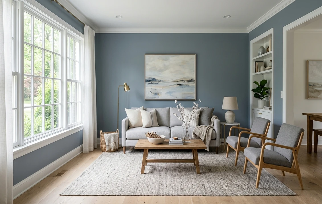
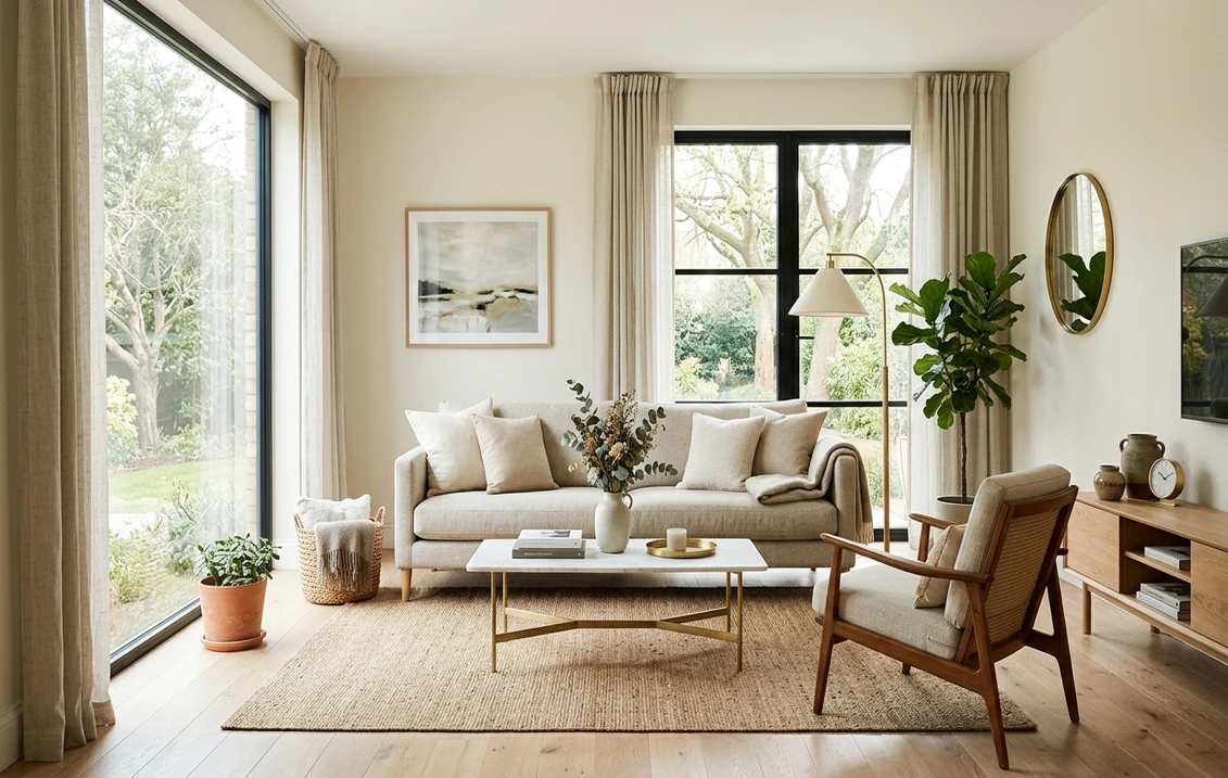
- Living rooms and open-plan main floors. A warm, neutral off-white (White Dove, Greek Villa) flatters wood, fabric, and art and flows room to room without jarring shifts.
- Bedrooms. A cozier cream like Swiss Coffee or Alabaster feels soft and restful with warm bulbs and linen. Skip the brightest whites unless the room gets strong morning light.
- Kitchens. Off-white dominates American cabinets and walls. Pair white cabinets with a slightly different off-white wall so the two do not clash.
- Trim, ceilings, and north rooms. A bright off-white like Simply White or a clean White Dove is a workhorse for trim and ceilings. In north rooms, lean to the warmest yellow-based whites and avoid gray-green bases.
If a room is dim or you want more visible warmth than a white can give, a warm neutral may serve it better. Our greige paint colors guide covers when to step up into a soft greige, the natural next stop down in LRV from this family.
Trim, ceiling, and decor that keep an off-white clean
Crisp or dirty: that verdict usually has less to do with the wall paint than with everything you hang next to it. Put a warm cream beside a bright cool-white trim and it can read yellow by comparison, even when nothing is wrong with the wall. These pairings tend to hold up:
- Trim: keep it within about 2 to 5 LRV points of the wall and on the same undertone side. With a warm wall like Alabaster, a slightly brighter warm white (SW Pure White, BM White Dove) gives gentle contrast; a stark cool white above LRV 90 makes a warm cream read yellow.
- Ceiling: the trim white, or the wall color at 50 percent strength, keeps a room calm. A bright white ceiling over a warm off-white is fine in a light room but intensifies cool flattening in a north one.
- Wood and warmth: off-white is the perfect backdrop for natural wood, rattan, jute, and brass. White oak, walnut, and honey floors bounce warm light back, keeping a cream rich rather than flat and rescuing a cooler off-white from tipping sterile.
- Color accents: off-white sits beautifully beside sage, blue-gray, terracotta, black, and brass. For the soft-green pairing logic behind many 2026 palettes, see our sage green interior shades and pairings guide.
How to test off-white before you commit
Because the undertone is invisible on a chip and obvious on a wall, off-white is one of the riskiest families to choose blind. Paint a 12 by 12 inch swatch (or use peel-and-stick samples) on two walls, one near the window and one across the room, and check it morning, midday, and after dark under your actual bulbs. Holding pure white printer paper alongside makes the undertone jump out, and sampling one warmer and one cooler shade together shows the family's range in your light.
Want to skip the paint pots entirely? Upload a photo of your room, drop several off-white shades onto the walls, and watch which ones stay crisp and which drift. Once you have chosen, our interior house painting cost guide breaks down per-room pricing.
See which off-white stays crisp and which drifts yellow in your actual room, before buying samples.
Frequently asked questions
Why does my off-white paint look dingy or yellow on the wall?
Off-white broadcasts whatever your light and surrounding colors are doing. A warm cream next to a stark cool-white trim reads yellow by comparison, and 2700K bulbs amplify the yellow base at night. Keep the trim on the same undertone within a few LRV points, and lean more neutral if the warmth reads heavy.
What is a good LRV range for off-white walls?
The LRV 80 to 87 band reads white and bounces light while still feeling soft: White Dove is about 85, Alabaster 82, Swiss Coffee 84. Above 88 to 90 you reach near-pure builder whites like Simply White (91); below about 75 you cross into greige.
What are the best off-white paint colors to know by name?
The reliable all-rounders are Benjamin Moore White Dove (OC-17) and Sherwin-Williams Alabaster (SW 7008). For a cozier cream go to Swiss Coffee, for a warm white that resists cool-light flattening Greek Villa, and for a bright near-white Simply White. Always confirm the undertone on a sample in your own light.
What is the best off-white for a north-facing room?
North-facing rooms get cool, indirect light that subtracts warmth, so lean to the warmest, most yellow-based off-whites and avoid gray-green bases. Greek Villa (SW 7551) and Swiss Coffee (OC-45) hold their warmth well, while a green-gray whisper like Alabaster can read flat or faintly greige.
Upload your room photo and compare off-white shades side by side under your actual light.
Disclaimer: Sherwin-Williams, Benjamin Moore, and the color names and codes referenced (OC-17 White Dove, SW 7008 Alabaster, OC-45 Swiss Coffee, SW 7551 Greek Villa, SW 7042 Shoji White, OC-117 Simply White, OC-65 Chantilly Lace, SW 7005 Pure White) are trademarks of their respective owners. FacadeColorizer is an independent paint visualization service and is not affiliated with, endorsed by, or sponsored by Sherwin-Williams, Benjamin Moore, or Behr. Color reproduction on screens approximates the manufacturer's chip; always confirm with a manufacturer sample under your own lighting before purchase. Sources: Sherwin-Williams and Benjamin Moore technical color data sheets 2026, The Spruce paint color references, and published designer undertone guidance.
Trademarks mentioned (Sherwin-Williams, Benjamin Moore, Behr, Caparol, Brillux, Sto, Alpina, Valspar, PPG, Glidden, Dulux, Crown Trade, Sandtex, Farrow & Ball, Johnstone's, Leyland) are property of their respective owners. FacadeColorizer is independent and not affiliated with any of them. Nominative fair use under Lanham Act §1125.