Ask a designer why they keep specifying Benjamin Moore Revere Pewter (HC-172, LRV 55), and the answer usually circles back to one word: taupe. It is darker and earthier than greige, warmer and more grounded than gray, and softer than a full beige, the shade designers reach for when a space needs to feel calm and expensive. That is the appeal, and also the trap: the word taupe is stretched across at least four very different undertone families, and the gap between a rosy taupe and a green-gray taupe is the difference between a bedroom that feels like cashmere and one that turns muddy by 4 p.m.
This profile breaks taupe down the way it behaves on a wall: the four hidden undertones, the LRV that decides how heavy a room feels, the best rooms, the light it shifts under, and the trim that makes it sing. Every code and LRV below comes from the manufacturers' own published data.
Upload a room photo and preview the top taupe shades under your real light in about 30 seconds, free.
What "taupe" actually is
The name comes from the French word for "mole," after the velvety dark gray-brown of mole fur. In paint terms it is a low-saturation neutral built from gray plus brown, usually with a third undertone (red, yellow, green, or violet) tilting it warm or cool. That makes it a close cousin of greige, which leans lighter and grayer, while taupe leans deeper and browner and feels cozier. Paint companies apply the label generously, so the only useful way to shop it is to ignore the label and read the undertone.
The four taupe undertones (this is the whole game)
Nearly every taupe falls into one of four undertone families. Identify which you are looking at and you can predict, before opening a can, whether it reads warm and cozy or cool and a little severe.
1. Pink / mauve taupe (the "rosy" group)
A red-violet base makes these the warmest, softest taupes. They flatter skin tones and photograph cozy, the reason they are bedroom and powder-room favorites. The risk: in cool north light or under LED bulbs the pink can surface and tip the wall toward "dusty rose." The classic example is Sherwin-Williams Mega Greige (SW 7031).
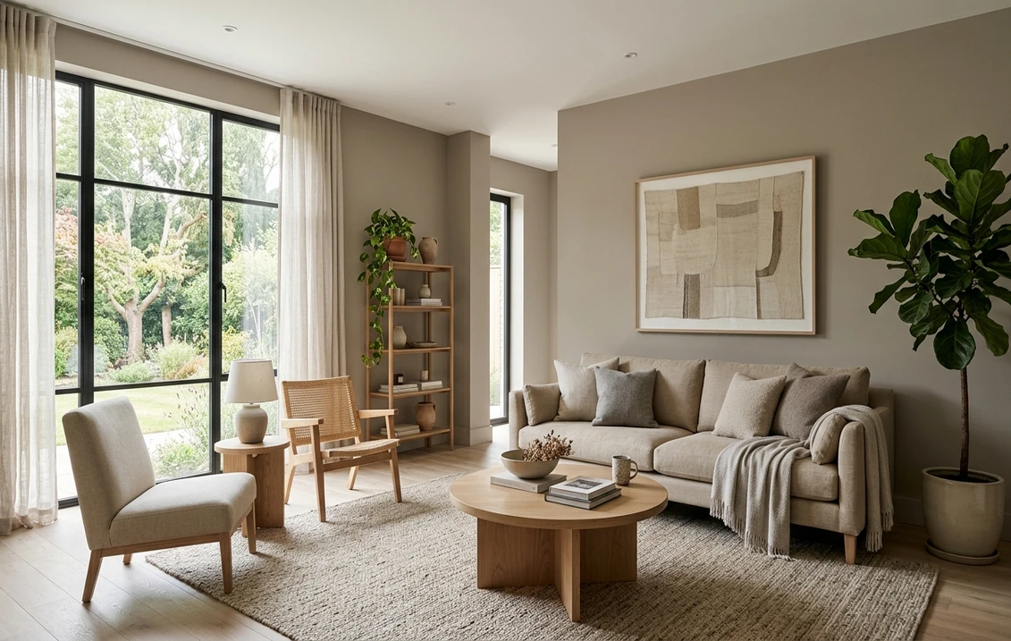
2. Yellow / brown taupe (the "putty" group)
A yellow base sands these down into a putty character that feels traditional and sunny. South and west rooms forgive them most, and they look lovely next to cream trim and natural wood. Pushed too far, the yellow can read gold or "khaki." Benjamin Moore Bennington Gray (HC-82) and Sherwin-Williams Accessible Beige (SW 7036) sit here, the latter one of the most-painted warm neutrals in the country.
3. Green / gray taupe (the "stone" group)
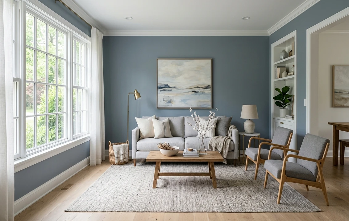
A quiet green undertone lends these a stony, organic calm that reads modern and architectural. Bright rooms suit them best: the green stays subtle there and grounds the space without going warm. Starve them of light, though, and they drift gray and feel cooler than you expected. Sherwin-Williams Worldly Gray (SW 7043) is the reference point, a green-leaning griege-taupe.
4. Neutral / true taupe (the "balanced" group)
The hardest to find and the most flexible. These hold gray and brown in near-balance with no loud third undertone, so they stay chameleon-like across the day, the safest whole-house choice. Benjamin Moore Revere Pewter (HC-172) is the textbook balanced griege-taupe; Sherwin-Williams Agreeable Gray (SW 7029) sits at the lighter, cooler edge of the same idea.
None is "better." The right family depends on your light and trim, which the rest of this guide sorts out. For how taupe sits next to gray, beige, and the other neutrals, see our interior paint color families guide.
Best taupe paint colors for 2026, by LRV
Light Reflectance Value (LRV) runs from 0 (black) to 100 (pure white) and measures how much light a color bounces back. For taupe it predicts how heavy or airy a wall feels before undertone enters the picture. Rule of thumb: LRV above 55 keeps a room open, 45 to 55 is a true mid-tone, and below 45 feels cozy-to-dark and needs good natural light. The most-specified taupes, with their published values:
| Color & code | LRV | Undertone family | Best use |
|---|---|---|---|
| SW Agreeable Gray (SW 7029) | 60 | Neutral, slight green | Light whole-house griege-taupe |
| SW Accessible Beige (SW 7036) | 58 | Yellow / putty | Warm open-plan living areas |
| BM Revere Pewter (HC-172) | 55 | Balanced, faint green | Flexible whole-house mid-taupe |
| SW Worldly Gray (SW 7043) | 57 | Green / stone | Bright modern rooms |
| SW Mega Greige (SW 7031) | 37 | Pink / rosy | Cozy bedrooms, accent walls |
| BM Bennington Gray (HC-82) | 47 | Yellow / putty | Traditional studies, dining rooms |
Try it on your house
No photo? Try a sample
Sources: Sherwin-Williams and Benjamin Moore official technical data sheets, 2026. LRV values are the manufacturers' published figures; on-wall appearance varies with light and finish.
Notice the split: lighter taupes (LRV 55 to 60) read almost as warm grays and work whole-house, while the deeper ones (LRV 37 to 47) are dedicated mood colors. Torn between a light taupe and a cleaner gray? Our light gray paint color guide covers that side.
Free AI visualizer. Drop in your room photo and see Revere Pewter, Accessible Beige, and Worldly Gray on your actual walls.
How taupe shifts under different light
Taupe is more light-sensitive than a pure gray, because its undertone does the heavy lifting and undertones are exactly what daylight amplifies or strips away. The behavior is predictable by orientation.
- North-facing rooms: cool blue light mutes warmth and pulls taupe grayer, so a rosy taupe can read mauve and a stone taupe flat. Lean warmer and puttier.
- South-facing rooms: abundant warm light all day, so taupe reads at its richest and even a green-gray stays inviting, the most forgiving orientation.
- East and west rooms: taupe drifts over the day, and west light can push a yellow taupe briefly gold at sunset, so test in a room you use at those hours.
- Artificial light: warm 2700K bulbs deepen the brown; cooler 4000K bulbs gray it out and can revive a pink undertone. Check your sample under the bulbs you own.
This is the same cool-light problem that trips up the bluer neutrals; our blue-gray paint guide explains the undertone-versus-light mechanism in more depth, and it transfers directly to taupe.
Best rooms for taupe
Taupe goes almost anywhere. What changes room to room is the LRV and undertone each one rewards.
- Living rooms and open-plan spaces: a light putty or balanced taupe (LRV 55 to 60) like Accessible Beige or Revere Pewter keeps the space bright while warming it. Taupe's home turf.
- Primary bedrooms: a deeper rosy or balanced taupe (LRV 37 to 50) makes a cocooning envelope. Mega Greige on all four walls is the classic cozy-bedroom move.
- Home offices: a green-gray stone taupe reads focused and architectural without the chill of true gray, given daylight.
- Kitchens: mid-LRV putty taupes on walls or island cabinetry pair effortlessly with white uppers, wood, and brass.
- Hallways and stairwells: often dim, so lean lighter and warmer to avoid a tunnel effect. A light putty taupe carries low light better than a stone or rosy one.
For a little more color life, taupe sits beautifully beside muted greens; our sage green shades and pairings guide covers the taupe-plus-sage combination that has become the default warm-modern palette.
Trim, ceiling, and decor pairings
Trim makes or breaks taupe. The wrong white turns it dingy or washes it out entirely. The rule that works: match the trim's temperature to the taupe's undertone, then keep enough LRV contrast that the line reads crisp.
- Warm / putty / rosy taupes: pair with a soft warm white. SW Alabaster (SW 7008, LRV 82) or BM White Dove (OC-17, LRV 85) keep the trim from looking blue-cold against the warm wall.
- Green / stone taupes: can take a slightly cleaner white such as BM Simply White (OC-117) or SW Pure White (SW 7005) without fighting the undertone.
- Avoid: a bright builder white like SW Extra White (LRV 86) or BM Chantilly Lace (LRV 90) against a warm taupe; the cold contrast can make the wall read muddy.
- Ceilings: a warm or neutral white, or the trim color, reads cleaner over taupe than a stark pure white, which can drop a faint blue cast onto the wall.
- Wood, metals, textiles: taupe loves white oak, walnut, rattan, aged brass, and matte black, and layers easily with cream, terracotta, olive, and rust, letting a colored sofa or rug do the talking.
Preview taupe walls against your real trim, wood floor, and furniture in one image, free.
Taupe vs greige vs gray vs beige
These four blur together on a chip but behave differently on a wall. Gray is the coolest (a blue, green, or violet base, cold in low light). Beige is the warmest (a yellow base that can drift "tan"). Greige splits the difference and stays light and airy, the popular safe pick. Taupe is the deepest and most grounded, with more body than greige and more warmth than gray, the choice when you want cozy and substantial rather than light and breezy.
Because so many top taupes carry SW and BM codes, the brand you start from matters; our Sherwin-Williams vs Benjamin Moore comparison covers how the two lines differ, and our roundup of the best interior paint colors for 2026 places taupe among the year's most-specified shades.
How to test taupe before you commit
No neutral punishes a guess more than taupe, because its undertone only reveals itself on a real wall under real light. A 2-inch fan-deck chip reads lighter and flatter and hides that undertone. Two reliable methods:
- Large painted or peel-and-stick samples. Put a 12-inch swatch (two coats) on two walls, one near the window and one in the darkest corner, and look at 9 a.m., 2 p.m., and after dark under your bulbs. Undertones that hide at noon often appear at the extremes.
- A digital visualizer first. Upload a real photo and apply several taupes before buying a sample. It narrows six candidates to two in minutes and shows each against your actual furniture and floor. Try it free on the FacadeColorizer upload page.
Budget for the surrounding work too: our interior house painting cost guide for 2026 breaks down real per-room and per-square-foot US pricing, including how a deeper taupe can need an extra coat.
Because taupe's undertone flips with orientation, preview these taupes on your own room photo before you commit to a gallon.
Frequently asked questions
Is taupe warm or cool?
It can be either, which is what makes it tricky. Its third undertone decides the temperature: pink, rosy, and yellow-putty taupes read warm, while green-gray and "stone" taupes read cooler. The same paint also shifts warmer in a sunny south room and cooler in north light. Identify the undertone, not just the label.
What is the difference between taupe and greige?
They overlap heavily. Both are gray-plus-brown neutrals, but greige sits lighter and grayer (typically LRV 55 to 65) and reads airy, while taupe sits deeper and browner with more body. Many "griege" paints like Revere Pewter and Agreeable Gray are sold as both.
What is a good light taupe paint color?
For an airy, whole-house light taupe, Sherwin-Williams Agreeable Gray (SW 7029, LRV 60) and Accessible Beige (SW 7036, LRV 58) are the most-painted options, with Benjamin Moore Revere Pewter (HC-172, LRV 55) as the balanced classic. All three stay bright enough for living rooms and hallways while adding warmth. Test on your own wall, since light taupes are sensitive to orientation.
What trim color goes with taupe walls?
Match the trim white to the taupe's warmth. Warm and rosy taupes pair best with a soft warm white like SW Alabaster (SW 7008) or BM White Dove (OC-17). Cooler stone-green taupes can take a cleaner white such as SW Pure White (SW 7005) or BM Simply White (OC-117). Avoid a stark builder white like Chantilly Lace, whose cold contrast can make a warm taupe look muddy.
See the top taupe shades on your actual room before buying a single sample pot.
Disclaimer: Sherwin-Williams, Benjamin Moore, and their respective color names and codes are trademarks of their owners. FacadeColorizer is an independent paint visualization service and is not affiliated with, endorsed by, or sponsored by Sherwin-Williams, Benjamin Moore, or Behr. Color reproduction on screens approximates the manufacturer's chip; always confirm with a manufacturer sample before purchase. Sources: Sherwin-Williams and Benjamin Moore official technical data sheets (2026), The Spruce paint and color guides, and professional designer references on neutral undertones.
Trademarks mentioned (Sherwin-Williams, Benjamin Moore, Behr, Caparol, Brillux, Sto, Alpina, Valspar, PPG, Glidden, Dulux, Crown Trade, Sandtex, Farrow & Ball, Johnstone's, Leyland) are property of their respective owners. FacadeColorizer is independent and not affiliated with any of them. Nominative fair use under Lanham Act §1125.