
A client once handed me three sample pots labeled "gray," held them against her north-facing dining wall, and asked why one looked lavender, one looked muddy brown, and one looked almost blue. None of them looked gray. That is the whole problem with this family in one sentence: gray paint colors are rarely just gray. Every can carries a hidden warm or cool bias, and the light in your room decides which one wins. This guide is the map I wish she had read first: how the gray family splits into warm and cool, where greige ends and true gray begins, and the room each shade belongs in.
Gray has been the most-specified interior neutral in America since the 2010s. It is also the easiest to get wrong, because the gap between a gray that feels calm and one that feels like a parking garage is a single undertone you cannot see on a 3-inch chip. Gray sits inside the larger neutral world alongside whites, beiges, and taupes; for the full picture of how the families relate, start with our interior paint color families guide. This page zooms all the way into gray.
Upload a room photo and preview the top gray shades under your real light in about 30 seconds, free.
The one thing that makes gray hard: undertone
A "true" gray, in the lab sense, is a perfectly balanced mix of black and white with no warm or cool lean. Almost no paint on a fan deck is actually that. To keep gray from reading dead on a wall, manufacturers nudge it: a little yellow or red to warm it, a little blue or violet to cool it, sometimes a quiet green to soften it. That nudge is the undertone, invisible on the chip but obvious once a whole wall is rolled. Get the second coat up, stand back at dusk, and the bias jumps out.
Four undertone leans cover almost every interior gray you will meet:
- Warm (yellow or red base): reads soft and cozy, leans toward greige (gray plus beige). Forgiving in homes with wood and cream trim. Example: Sherwin-Williams Agreeable Gray (SW 7029).
- Cool (blue base): crisp and modern, can tip icy or "hospital" in low light. Best with lots of natural light and white trim. This is where bluish gray paint lives. Example: Benjamin Moore Stonington Gray (HC-170).
- Violet or purple base: the sneaky one. Looks neutral on the chip, flashes mauve or lavender in cool north light or under LED bulbs. Example: Sherwin-Williams Repose Gray (SW 7015) in some rooms.
- Green base: the most balanced and most popular, because green-gray rarely goes ugly. Reads as a calm soft neutral. Example: Benjamin Moore Revere Pewter (HC-172).
The practical rule I give every client: never choose a gray from the chip alone, and never choose it in the store. The fluorescent light at a paint counter is the worst possible place to judge an undertone. Take it home, put it on the wall, and watch it for a day.
Warm gray vs cool gray: how to pick a side first
Before you shortlist a single name, decide whether you want warm or cool. This one choice eliminates half the aisle and prevents the most common regret, which is buying a cool gray for a room that needed warmth.
Choose warm gray (greige) when your room has wood floors, cream or beige trim, north-facing light, or simply when past gray attempts felt cold and clinical. Warm gray adds back the coziness without giving up the modern neutral look. If that sounds like your space, our dedicated greige paint colors guide breaks down the warm end shade by shade.
Choose cool gray when your room has bright south or west light, crisp white trim, black-framed windows, or a modern, minimalist feel you want to keep clean and current. Cool gray photographs sharp and reads contemporary, but it punishes a dim room. For the lighter, cleaner end of that spectrum, our guide to lighter cool grays covers the most reliable picks and the rooms they flatter.
| If your room is... | Lean toward | Why |
|---|---|---|
| North-facing, low or cool light | Warm gray (greige) | Cool grays go flat and icy here; warmth counteracts the blue light |
| South or west, bright sun | Cool gray or balanced gray | Strong warm light can push warm grays toward dingy beige |
| Lots of wood and cream | Warm gray | Greige flatters wood; a cool gray fights it |
| White trim, modern, minimal | Cool gray | Keeps the crisp, current contrast you are after |
| Mixed light or whole-house | Balanced gray (near-true) | A neutral-leaning gray travels room to room with the least drama |
Sources: Sherwin-Williams and Benjamin Moore official color data 2026; The Spruce neutral-paint undertone coverage; designer field reports compiled by FacadeColorizer.
Free AI visualizer. Upload your real photo and compare a warm gray against a cool one in your own light.
Greige vs true gray: where the line sits
The biggest fork inside the gray family is greige versus true gray, and people mix them up constantly. Greige is gray with a visible warm beige base; true gray keeps a near-neutral or cool identity so it never looks beige. The distinction matters because they behave like different colors next to wood and white.
- Greige (warm gray-beige): reads soft, cozy, slightly sandy. Pairs with warm white trim and wood. The "fixed the cold-gray decade" neutral. Agreeable Gray and Revere Pewter live here.
- Near-true gray (balanced): mostly neutral with the faintest lean, so it stays reading as gray without going cold or beige. Repose Gray is the classic example, which is exactly why it gets used as the safe whole-house gray.
- Cool true gray (blue base): crisp and clean, no beige in it at all. Stonington Gray and many architectural grays sit here. This is the realm of shades of gray paint that look modern but need real light.
If you are torn between the two warmest examples, our deep dives settle it room by room: see the Agreeable Gray undertones and rooms guide for the most popular greige, and the Repose Gray undertones and rooms guide for the near-true gray that stays cooler. They are first cousins, and which one wins comes down entirely to your light.
The best gray paint colors for 2026, by LRV
Light Reflectance Value (LRV) runs from 0 (black) to 100 (pure white) and tells you how much light a color bounces back. For wall grays, the workable range is wide: a light gray at LRV 70 keeps a small room open, while a mid gray at LRV 50 grounds a big bright space. Below are the grays US designers specify most, with published manufacturer values, sorted light to dark.
| Color (code) | LRV | Warm / cool | Undertone | Best for |
|---|---|---|---|---|
| BM Stonington Gray (HC-170) | 59 | Cool | Blue-gray | Bright rooms wanting crisp, modern gray |
| SW Repose Gray (7015) | 58 | Near-neutral | Faint violet-gray | Whole-house, stays reading as gray |
| SW Agreeable Gray (7029) | 60 | Warm | Green-gray greige | Any room; the safe default |
| BM Revere Pewter (HC-172) | 55 | Warm | Green base, can flash mauve | Living rooms with good light |
| SW Gauntlet Gray (7019) | 17 | Warm-neutral | Deep charcoal | Accent walls, moody dens, exteriors |
| SW Tricorn Black (6258) | 3 | Neutral | Near-true black | Doors, trim, contrast against light gray |
Sources: Sherwin-Williams and Benjamin Moore official technical data sheets (LRV values), 2026; The Spruce neutral paint roundups; designer reference palettes.
A quick read on that table: if you want one gray you cannot mess up, it is Agreeable Gray (warm) or Repose Gray (near-true). For the cool, architectural look, Stonington Gray is the reliable pick. And do not skip the bottom two rows; a near-black like Tricorn Black is technically the darkest gray, and it is the single best partner for a light gray wall on doors and built-ins.
How gray shifts from morning to night
Gray sits so close to neutral that even a small shift in light tips it. The same wall can look cool stone at 8 a.m. and soft taupe at 4 p.m., then flat and slightly purple under cheap bulbs at night. Two factors drive it: north light subtracts warmth (so violet-base grays flash mauve and cool grays go icy), while warm-white bulbs at 2700K flatter every gray and cool "daylight" bulbs at 4000K and up strip the warmth back out. West rooms are the wild card, turning golden at sunset in a way that warms a cool gray beautifully but can muddy a warm one.
Free AI paint visualizer. Upload your real photo to see how a gray reads in your light before buying a sample.
Best rooms for gray walls
Gray goes almost anywhere, which is why the whole-house request comes up so often. Still, the smart move is to match the gray's temperature to the room's light and use.
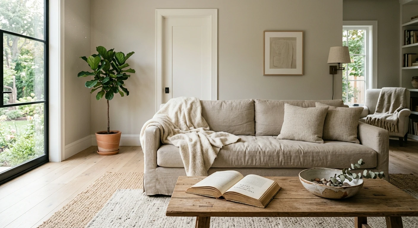
Living rooms and open plans
A balanced or warm gray is the quiet backdrop that lets furniture, art, and wood do the talking. Agreeable Gray and Repose Gray flow between connected zones without clashing, which is why they fill so many open-plan palettes.
Bedrooms
A soft warm gray makes a restful, grown-up bedroom; the warmth keeps it from feeling cold under lamp light at night. In a north-facing bedroom, go a little lighter so the morning does not feel gloomy.
Kitchens and cabinetry
Gray reads expensive on cabinets and makes a calm wall behind white uppers. A mid-tone gray on a lower run with white above is one of the most resale-friendly kitchen looks going.
Accent walls and moody rooms
This is where the dark end earns its keep. A charcoal like Gauntlet Gray or a near-black like Tricorn Black turns a den, office, or dining wall dramatic. For the full deep-and-dark playbook, our black interior walls guide covers the near-black grays in detail.
Trim, ceiling, and what to pair with gray
Gray lives or dies on its trim, and the temperatures have to agree. A warm gray wall wants a warm white trim; a cool gray wall can take a crisper, cooler white. Mismatch them and the wall reads dingy or the trim reads dirty.
- Warm gray with warm white trim: SW Alabaster (SW 7008) or BM White Dove (OC-17) let a greige read as itself instead of going cold.
- Cool gray with crisp white trim: SW Pure White (SW 7005) or a clean bright white keeps the modern contrast sharp.
- Avoid the temperature clash: a stark blue-white next to a warm greige makes the walls look muddy; a cream trim next to a cool gray can look yellowed.
- Ceilings: match the trim white scaled up, or keep it a clean warm white. A heavy cool-white ceiling over warm gray amplifies any flat, cool-light read.
- Floors and metals: warm wood and brass flatter warm gray; black metal and white oak suit cool gray. Gray is the rare neutral that can bridge both, which is why it photographs so well.
For the full pairing playbook, including accent colors, furniture, and the exact whites that work with each temperature, our what goes with gray walls guide covers the combinations room by room.
When gray is the wrong call
I will say the unpopular part out loud: gray is not always right. A small, windowless powder room under cool LEDs will make almost any gray look like wet cement, and no second coat fixes that; a warm white serves it better. A cool blue-gray in a dim north office reads depressing by 3 p.m. And a flat builder-grade gray across a whole house, with no warm wood or texture to relieve it, is exactly the cold look people are now repainting over.
If your samples keep reading flat and lifeless, that is your room telling you it wants warmth. Move toward greige, or step over to a blue-leaning gray on purpose for a richer, deliberate cool, covered in our blue-gray paint colors guide, rather than fighting a near-neutral that has nothing to give back.
Upload your room and compare warm, cool, and near-true grays side by side under your light, free.
How to test a gray before you commit
Gray shifts so much with light that skipping the test is how people end up repainting. A fan-deck chip reads roughly 25 to 35 percent lighter than the rolled wall and cannot show the undertone flash at all. Do this instead:
- Paint a 12-inch swatch (or a peel-and-stick sample) on at least two walls, including the one that gets the least light, and let it dry fully before judging.
- Look at it three times: morning, midday, and after dark under your actual bulbs. The night check is where mauve and beige flashes show up.
- Hold it against your trim and floor, not bare drywall, since the context decides whether the gray reads clean or muddy.
- Or skip the wall test first with a digital visualizer: upload a photo of your room and apply several grays to narrow the field before you spend a dime on sample pots.
The repaint is the bigger budget line, so previewing first pays off twice. For materials, labor, and square-foot pricing, see our interior house painting cost guide for 2026.
Frequently asked questions
What is the most popular gray paint color?
Sherwin-Williams Agreeable Gray (SW 7029, LRV 60) is the most-painted gray in the US. It is technically a warm greige with a balanced green-gray base, which is why it reads neutral in most light and rarely goes wrong. Benjamin Moore Revere Pewter (HC-172) and SW Repose Gray (SW 7015) are the other two heavyweights.
How do I tell if a gray is warm or cool?
Hold the sample next to a sheet of plain white paper on the wall it will go on. Against true white, a warm gray will look slightly beige, tan, or greenish, while a cool gray will look slightly blue or violet. Do this in daylight and again at night under your bulbs, because the undertone you cannot see on the chip becomes obvious once a full wall is rolled.
What is the difference between gray and greige?
Greige is gray with a visible warm beige base, so it reads soft and cozy and pairs with wood and cream trim. A true or near-true gray keeps a neutral or cool identity and never looks beige. Greige fixed the cold-gray look of the 2010s; choose it for warmth, and choose a true gray when you want the color to stay reading clearly as gray.
Why does my gray paint look purple or blue?
It has a violet or blue undertone that is surfacing in cool light. North-facing rooms and cool-white LED bulbs subtract the warm wavelengths, which lets the cool base step forward and flash mauve or blue. Switching to a warmer, green-base or near-neutral gray, or to 2700K warm bulbs, usually fixes it.
Is gray still in style in 2026?
Yes, but it has shifted. Cool, flat builder-gray is on the way out, while warm grays and greiges remain a default neutral and dramatic charcoals are rising for accent walls. Gray is no longer the automatic whole-house answer it was, but the right temperature in the right room is still one of the most resale-friendly, designer-recommended choices.
See the best 2026 gray shades on your actual room before buying a single sample pot.
Disclaimer: Sherwin-Williams, Agreeable Gray (SW 7029), Repose Gray (SW 7015), Gauntlet Gray (SW 7019), Tricorn Black (SW 6258), Alabaster (SW 7008), and Pure White (SW 7005) are trademarks of The Sherwin-Williams Company. Benjamin Moore, Revere Pewter (HC-172), Stonington Gray (HC-170), Hale Navy (HC-154), and White Dove (OC-17) are trademarks of Benjamin Moore and Co. FacadeColorizer is an independent paint visualization service and is not affiliated with, endorsed by, or sponsored by Sherwin-Williams or Benjamin Moore. Color reproduction on screens approximates the manufacturer's chip; always confirm with a manufacturer sample under your own light before purchase. Sources: Sherwin-Williams and Benjamin Moore official technical data sheets 2026 (LRV values), The Spruce neutral-paint undertone coverage, and professional designer reference palettes.
Trademarks mentioned (Sherwin-Williams, Benjamin Moore, Behr, Caparol, Brillux, Sto, Alpina, Valspar, PPG, Glidden, Dulux, Crown Trade, Sandtex, Farrow & Ball, Johnstone's, Leyland) are property of their respective owners. FacadeColorizer is independent and not affiliated with any of them. Nominative fair use under Lanham Act §1125.


