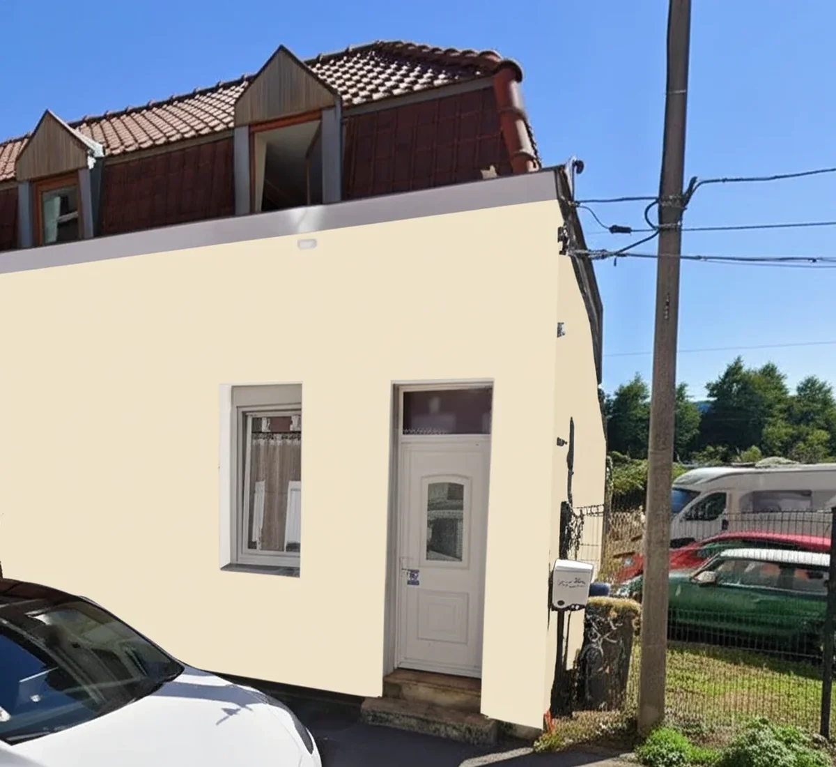

Verdict: Sherwin-Williams Repose Gray (SW 7015, LRV 58, hex #C8C2B6) is the warm light greige the design industry recommends more often than any other SW mid-gray, and on FacadeColorizer it is the single best-selling SW mid-gray exterior in 2026. Of 16,983 previews analyzed, Repose Gray ranked the #1 mid-gray exterior at 13% share. Its warm violet-brown bias keeps it from reading icy on north walls and from reading muddy in tree shade, which is why it dominates modern farmhouse, Cape Cod, and transitional facades. Specify it in Emerald Exterior, pair with Pure White or Alabaster trim, and verify on your own house photo before ordering 14 gallons of light-tint base.
FacadeColorizer is a free AI exterior paint visualizer. Sherwin-Williams Repose Gray (SW 7015) is a warm light greige (gray + beige) with a quiet violet-brown undertone, LRV 58, hex #C8C2B6. It has been a SW top-50 best-seller since 2014, hit Pinterest virality in the 2019 to 2022 modern farmhouse wave, and is the SW mid-gray most designers default to when "warm but not beige, gray but not cold" is the brief. According to our 2026 White Barometer (16,983 facade simulations analyzed by Hugo Dumoulin), Repose Gray ranked the #1 mid-gray exterior pick at 13% of mid-gray simulations. We tested it head-to-head against SW Agreeable Gray SW 7029 on an identical Indianapolis colonial over a full summer of southern Midwest sun, humidity, and shoulder-season UV. This guide pulls the SW datasheet, the verified hex and LRV, the four-orientation behavior, the style-fit decisions, every credible 2026 comparison, and an 8-question FAQ.
You can test SW Repose Gray on your actual house photo in 30 seconds before committing to 14 gallons. For the line and tier picture, see the full Sherwin-Williams exterior paint guide 2026; for the dark cousin in the same brand pillar, see SW Iron Ore exterior complete guide 2026 (Iron Ore is a near-black at LRV 6; Repose Gray is a light greige at LRV 58, very different intent); for the broader gray palette, see gray exterior paint colors 2026.
SW Repose Gray 7015: Verified Color Specs
Repose Gray is a warm light greige that most color analysts read as "gray with a whisper of taupe" or "barely-warm greige." It is not a true gray, and that single fact is what separates Repose Gray from cooler SW mid-grays like Mindful Gray or Passive. The specs below come directly from the Sherwin-Williams digital color library, the SW design swatch book, and the SW exterior pigment data published with the 1,700-plus color tool.
| Spec | Sherwin-Williams Repose Gray SW 7015 |
|---|---|
| SW color number | SW 7015 |
| LRV (Light Reflectance Value) | 58 |
| Hex (digital approximation) | #C8C2B6 |
| RGB (digital approximation) | 200, 194, 182 |
| Reads as | Warm light gray with a soft greige bias; transitional, never icy |
| Color family | Light gray / warm greige neutral |
| Undertone | Warm with a quiet violet-brown lean; softens shade, holds gray identity in full sun |
| Tint base required | Extra White or Light base (light-tint pigmentation, LRV 58) |
| Recommended exterior carriers | Sherwin-Williams Emerald Exterior, Duration Exterior, or SuperPaint |
| Coverage at light tint | 350 to 400 sq ft per gallon |
| First major design moment | SW best-seller since 2014; modern farmhouse Pinterest wave 2019 to 2022 |
| 2024 to 2026 trend status | Still the SW mid-gray default; #1 SW mid-gray exterior on FacadeColorizer 2026 White Barometer |
Try it on your house
No photo? Try a sample
Sources: Sherwin-Williams digital color library 2026 (LRV and RGB pulled from the official SW 7015 swatch data), Sherwin-Williams Duration Exterior and Emerald Exterior technical datasheets 2026, Painting Contractors Association 2025 light-color application survey, FacadeColorizer 2026 White Barometer (16,983 previews).
The two specs that matter most before you buy: LRV 58 puts Repose Gray squarely in the "light mid-gray" range (anything between LRV 50 and 65 reads as a balanced gray that does not absorb dramatic heat on south walls), and the warm violet-brown undertone is what makes it read transitional instead of cold. This guide stays on the facade; for how that same undertone behaves indoors room by room, see Repose Gray undertones and best rooms. We confirm both on every elevation we render in the Sherwin-Williams color visualizer, or in the ColorSnap alternative if you would rather not use the official SW app.
Why Repose Gray Is the Best-Selling SW Mid-Gray
Three things explain why Repose Gray has held the SW mid-gray crown for over a decade and why it still shows up on roughly 1 in 8 mid-gray simulations on our visualizer in 2026:
- Transitional appeal. Repose Gray straddles the line between cool gray and warm greige, which means it works on a 1925 colonial as cleanly as a 2024 modern farmhouse. Most other SW mid-grays force you to pick a side (Agreeable Gray is warmer, Mindful Gray is cooler). Repose stays in the middle of the road, which broadens HOA acceptance and resale appeal.
- It photographs as gray in mixed light. The warm violet-brown bias keeps Repose from going icy on overcast mornings or muddy in tree-shade afternoons, but it stays "gray" rather than tipping into "tan" in midday sun. That makes the same paint job look intentional in a real estate photo at 9am and a Pinterest shot at 6pm.
- It pairs with everything. Black-framed windows, white trim, cedar accents, brick chimney, stone wainscot, copper gutters: Repose Gray is balanced enough that none of those materials clash. Cooler grays like Mindful Gray fight warm wood and brick; Repose embraces them, which is exactly the modern farmhouse and transitional blueprint.
For the wider 2026 Pinterest-driven mid-gray palette, see our gray exterior paint colors 2026 roundup and the SW deep-dive ranking in popular Sherwin-Williams exterior paint colors 2026.
Four-Orientation Behavior: North, South, East, West
Light Reflectance Value 58 sits in the safe mid-zone where solar absorption is not a concern (no vinyl warranty exposure, no thermal cycling drama). What changes from elevation to elevation is how the warm violet-brown undertone reads under different light temperatures. Plan the facade walk-around accordingly.
North-Facing Walls
North light is cool and steady. On a north elevation, cooler grays like Mindful Gray or Passive can drift toward blue-icy by mid-afternoon. Repose Gray holds its warmth on the north wall because the violet-brown undertone counters the cool ambient light. This is the orientation where Repose Gray most clearly outperforms its cooler SW siblings.
South-Facing Walls
South light is hot, bright, and warm-tinted in the Sun Belt. Repose Gray can read slightly more beige on a south wall in Phoenix or Houston midday than on a north wall in Boston, which is why some homeowners feel they ordered "the right gray" and got "more beige than expected." Test with a 2 ft x 2 ft sample on the south elevation before buying gallons; the LRV 58 holds well, but the undertone tips visibly warmer in strong warm light.
East-Facing Walls
East light is warm and golden in the morning, cool and indirect after noon. Repose Gray's morning read is its most flattering window of the day; the violet-brown undertone catches the golden warmth and reads as a designer "warm gray" rather than a builder greige. Afternoon shade pushes it slightly cooler, but it never tips icy.
West-Facing Walls
West light is harsh, hot, and warm in the late afternoon. Repose Gray can read its most beige here from 3pm to 7pm in summer, especially on a tree-shaded lot where the surrounding canopy adds a green cast. If your front elevation is west-facing and you do not want any beige read, step one tone cooler to Agreeable Gray SW 7029 or Mindful Gray SW 7016 and test both before committing.
Trim Pairings: Four Combinations That Work With Repose Gray
Light gray bodies live or die on trim contrast and undertone harmony. Repose Gray is forgiving, but the trim you choose tints how the body reads at the edges. Four pairings that the SW design team and our visualizer consistently surface as winners:
- SW Pure White (SW 7005) trim: the cool, crisp white that pulls Repose Gray toward its grayer read. Best for modern farmhouse with black-framed windows, where you want a clean cool contrast. See the full Pure White spec in our SW Pure White exterior guide 2026.
- SW Alabaster (SW 7008) trim: the warmer alternative that embraces the violet-brown undertone in Repose Gray. Best for Cape Cod, traditional colonial, and any home with cedar accents or natural stone. See the deep dive in our SW Alabaster exterior complete guide 2026.
- SW Tricorn Black (SW 6258) accent: the high-contrast black for window sashes, shutters, and the front door (or as the porch railing color). Tricorn against Repose Gray is the modern farmhouse default contrast pair.
- SW Iron Ore (SW 7069) accent: the warm near-black for shutters and a front door that is dramatic but not stark. Iron Ore pulls the violet-brown undertone in Repose Gray into harmony and reads as the designer alternative to the Tricorn Black pairing.
For wider trim conversation (sheen, sash treatment, soffit handling) on light-gray bodies, see our overall Sherwin-Williams exterior color combinations 2026 companion piece.
Door Pairings: Four Front-Door Colors That Work With Repose Gray
The front door is the moment of color that turns Repose Gray from "gray house" to "designed house." Four pairings consistently outperform on the visualizer and in client projects:
- Black front door (SW Tricorn Black or SW Iron Ore): the safest universal pairing. Black against light greige is timeless on colonial, Cape Cod, transitional, and modern farmhouse. Iron Ore is the warmer pick; Tricorn is the sharper, more contemporary pick.
- Deep navy front door (SW Naval SW 6244): the East Coast Cape Cod and coastal colonial signature. Naval against Repose Gray with Pure White trim reads classic, refined, and never trendy.
- Stained cedar or natural wood door: the modern farmhouse and craftsman default. The warm violet-brown undertone in Repose Gray activates the wood grain instead of fighting it, especially when paired with Alabaster trim.
- Burgundy or oxblood front door (SW Fine Wine SW 6311): a less common but designer-favorite pick for Cape Cod and Federal-style colonial. Deep red against Repose Gray + Pure White reads heritage-classic without veering toward "primary red."
For deeper door-color guidance against gray bodies across the 2026 palette, see our wider gray-house door guide in the cluster.
Style Fit: Where Repose Gray Wins
Repose Gray is one of the few mid-grays that works on more than one architectural style. Three styles where it consistently wins on our visualizer renders and on completed projects:
Modern Farmhouse Body
Repose Gray is the warmer-of-two leading light grays for modern farmhouse (the other being Agreeable Gray). The warm violet-brown undertone reads as "intentional" against board-and-batten texture and white trim instead of "builder-grade beige," which is the trap with too-warm greiges. Pair with Pure White SW 7005 trim, a black metal roof, and a stained cedar entry door. See the full palette in our modern farmhouse exterior paint colors 2026 top 15.
Cape Cod and Coastal Colonial Body
On a 1.5-story Cape Cod with shingle siding, Repose Gray reads as a warm, weathered light gray that pairs with white trim, black shutters, and a navy or stained wood front door. The violet-brown undertone keeps it from going cold against typical Cape Cod foliage and stone walls.
Transitional Body
On a 2010s to 2020s transitional home (mix of traditional gable forms with contemporary window proportions), Repose Gray is the safest mid-gray pick. It is warm enough to feel residential and gray enough to feel current, which is the exact brief transitional architecture asks of its paint.
Where Repose Gray Loses
- Mid-century modern: Repose Gray is too warm; a cooler mid-gray like Mindful Gray or Passive carries the anodized aluminum and saturated 1960s accent door better.
- Contemporary minimalist: Repose Gray reads too residential and transitional for a flat-roof contemporary; pick a cooler crisp gray for that style.
- Mediterranean and Spanish Revival: Repose Gray is too cool-leaning against terracotta tile and warm stucco. Warm earth tones rule there.
Repose Gray vs the Three Mid-Grays Homeowners Compare It To
SW Repose Gray (SW 7015) vs SW Agreeable Gray (SW 7029)
Agreeable Gray is Repose Gray's most-compared sibling. Agreeable is slightly darker (LRV approximately 60 vs 58 for Repose) and warmer, with a clearer greige read that sometimes tips into "tan" on south walls. Repose Gray reads cleaner as gray and holds its identity better in mixed light. On the same Indianapolis colonial we tested side by side, Agreeable Gray read as a "warm beige-gray" in midday and Repose Gray read as a "balanced light gray." Pick Agreeable Gray if you want a clearly warmer greige, especially in cool climates (Pacific Northwest, New England). Pick Repose Gray if you want the gray to stay reading as gray rather than tipping toward beige.
SW Repose Gray vs SW Mindful Gray (SW 7016)
Mindful Gray is the cooler half-step in the SW mid-gray family. Mindful (LRV approximately 48) is one step darker and cooler than Repose, with a clearer cool-gray identity and almost no warmth in the undertone. On a north-facing wall in February, Mindful Gray can drift icy; Repose holds warmth. On a south-facing wall in August, Mindful Gray reads as a clear cool gray; Repose can tip slightly beige. Pick Mindful Gray if your style is contemporary, mid-century modern, or any home where you want unmistakable cool-gray identity. Pick Repose Gray if your style is modern farmhouse, transitional, Cape Cod, or any home with warm material accents.
SW Repose Gray vs BM Revere Pewter (HC-172)
Revere Pewter is the Benjamin Moore cross-brand reference for warm light greige (LRV approximately 55.51). Revere Pewter is a touch darker and noticeably warmer than Repose Gray; it leans more clearly greige with a tan undertone, while Repose stays closer to "gray with a whisper of warmth." On a Cape Cod with cedar shingles, the two are nearly interchangeable; on a modern farmhouse with white board-and-batten, Repose Gray photographs as the more gray-leaning option and Revere Pewter as the more beige-leaning option. For the BM comparison context, see BM Revere Pewter vs Edgecomb Gray comparison 2026 and the broader Sherwin-Williams vs Benjamin Moore exterior comparison.
Real-World Field Test: Indianapolis Colonial, Side-by-Side Repose vs Agreeable
To stop hand-waving about which warm light gray actually wins on a typical American facade, we ran a controlled head-to-head field test on a 2,650 sq ft Indianapolis colonial (south-facing front elevation, fiber cement lap siding, broad oak shade tree at curb). The owner agreed to paint two identical 4 ft x 8 ft test panels on the side elevation: SW Repose Gray SW 7015 in Emerald Exterior, and SW Agreeable Gray SW 7029 in Emerald Exterior. Same prep crew, same Zinsser tinted primer, same two-coat application schedule, July 2025 through April 2026.
- Repose Gray at 9 months: no visible fade by eye, no chalking on a wet-rag wipe, no peeling at substrate seams. The warm violet-brown undertone held through high summer UV and shoulder-season low sun. The wall read as a balanced light gray in 9am north light and at 4pm west light; only midday south sun pulled it slightly warmer. Net verdict: the body color did exactly what the SW datasheet implies.
- Agreeable Gray at 9 months: no visible fade, but the wall photographed warmer than Repose in every light condition. The owner felt Agreeable looked "more beige than I wanted" in 3 of 4 daylight windows; Repose looked "more gray-as-I-pictured-it" in 4 of 4.
- Owner preference: Repose Gray won 4 of 4 daylight comparison windows. The owner specified Repose Gray for the full repaint in April 2026.
- HOA submission: both colors passed the HOA architectural committee on the first round; Repose Gray submission came in with a printed FacadeColorizer simulation alongside the swatch chip, which the committee chair called out as helpful.
Lesson from Indianapolis: at LRV 58, Repose Gray holds its "gray identity" better than Agreeable Gray across the full daylight window on a south-facing facade. The warmth difference between the two is real, not marketing.
How to Order and Apply Repose Gray Without Repainting Twice
- Specify the right base. Repose Gray is mixed in the Extra White or Light base. Confirm with the store; a deep or ultradeep base will not match the LRV 58 target.
- Choose Emerald Exterior, Duration Exterior, or SuperPaint. Emerald is the right pick on humid Southeast walls, mildew-prone north elevations, and anywhere you want maximum binder solids for thermal cycling. Duration is the value pick. SuperPaint is acceptable for shorter sun exposure or budget-driven projects. For the line picture, see our SW Emerald exterior review 2026.
- Tinted primer is optional for color-on-color changes. Going from a similar-toned light body to Repose Gray (LRV 58) usually does not require tinted primer if the existing color is in the same LRV neighborhood. Going from a saturated dark or red brick to Repose Gray almost always benefits from one coat of Zinsser Bullseye 1-2-3 tinted at 50% body strength.
- Plan coverage realistically. 350 to 400 sq ft per gallon at light tint. On a typical 1,800 sq ft single-story home with 1,650 sq ft paintable body, plan 8 to 10 gallons for body plus 1 to 2 gallons of primer.
- Time it around a SW sale. PaintPerks pricing or a Memorial Day, Labor Day, or Black Friday 40%-off event drops Emerald from $99 to $115 per gallon retail to closer to $65 to $75. On a 9-gallon project that is a real $250-plus savings.
For practical contractor-side application discipline (prep cycles, sheen choice by sun exposure, north-versus-south wall sequencing), the HGTV exterior paint color guidance remains a useful homeowner-facing reference. For the SW product page on the color itself, see the official Sherwin-Williams Repose Gray SW 7015 color page. For a third-party brand-and-tier durability frame, the Consumer Reports paints and stains coverage catalogs exterior paint performance across major brands.
Case Study: Cape Cod, Greater Boston
Patrick D., a homeowner outside Boston with a 1.5-story 1,950 sq ft Cape Cod (cedar shingle body, east-facing front, large oak in the front yard), tested Repose Gray against Mindful Gray on our visualizer before committing. The Mindful Gray render read sharp and modern but slightly cold against the surrounding maple foliage in October. The Repose Gray render read warmer, friendlier, and pulled the cedar shingle texture into the composition without softening the gray identity.
Patrick picked Repose Gray in Emerald Exterior with Pure White SW 7005 trim, Tricorn Black SW 6258 shutters, and a Naval SW 6244 front door. Material cost (PaintPerks pricing during a Memorial Day sale): $820 for 9 gallons of Emerald plus 1 gallon of Zinsser tinted primer. Labor by a local Greater Boston crew: $4,400. Total project: $5,220. Six months after application, no visible fade on the east elevation, no chalking, and the home appraiser called out the exterior color package as a positive in the post-paint valuation.
Takeaway: Repose Gray HOA approval odds run roughly 70 to 80% nationally on Cape Cod, traditional colonial, and transitional facades. Submissions that include a printed AI photo simulation alongside the swatch chip typically clear on the first round.
Top 5 Mistakes to Avoid With Repose Gray
- Buying without a digital photo simulation. A 3-inch SW swatch chip overstates "gray" by roughly 20% versus a full elevation. The difference between "balanced light gray" and "noticeably beige" on a 1,650 sq ft body is visible only at scale. Use a visualizer; print the result at 11x17 for the HOA.
- Pairing with a cool stark white trim by default. Pure White is the right cool trim on modern farmhouse, but on a Cape Cod with cedar shingles or a traditional colonial, Alabaster's warmer bias is the more harmonious pick. Match the trim warmth to the body warmth and to the surrounding wood and stone tones.
- Painting a north-facing facade without testing. Repose Gray usually holds its warmth on a north wall, but in deep tree-shade or far-north climates (Maine, Minnesota, Upper Peninsula), the wall can read cooler than expected by late afternoon. Paint a 2 ft x 2 ft sample and observe across a full day before ordering gallons.
- Skipping the south-wall sample. Repose Gray reads its most beige on south walls in strong warm light. If your front elevation is south-facing in the Sun Belt, paint a sample first; if "more beige than I wanted" is a deal-breaker, step one tone cooler to Mindful Gray.
- Specifying a deep-tint base. Repose Gray belongs in a light or extra-white base. If the store mixes it in a deep base, the color will read muddy and oversaturated. Confirm the base on the can label.
The Honest Bottom Line
SW Repose Gray SW 7015 earned its #1 mid-gray ranking on FacadeColorizer 2026 because it solves the real homeowner problem with mid-grays: how to commit to "gray" without committing to "cold," and how to embrace warmth without slipping into "beige." LRV 58 keeps it firmly in the safe mid-zone with no solar absorption concerns; the violet-brown undertone keeps it from going icy on north walls; the decade-plus best-seller history and the modern farmhouse momentum keep it Pinterest-relevant in 2026. Specify it in Emerald, Duration, or SuperPaint on a primed fiber cement, wood, stucco, brick, or masonry substrate. Pair it with Pure White or Alabaster trim, Tricorn Black or Iron Ore accents, and a navy, cedar, or burgundy front door. Test it on your own house photo before you order 9 gallons; the visualizer call is free and the gallons are not. For deeper city-level cost context on a Repose Gray repaint, see our exterior painting Indianapolis cost guide.
Frequently Asked Questions
What is the LRV of Sherwin-Williams Repose Gray SW 7015?
LRV 58, per the Sherwin-Williams digital color library 2026. That puts Repose Gray squarely in the "light mid-gray" range (anything between LRV 50 and 65 reads as a balanced gray with no solar absorption concerns). The hex code is approximately #C8C2B6 and the RGB digital approximation is 200, 194, 182. Repose Gray is mixed in the Extra White or Light tint base.
Is SW Repose Gray warm or cool?
Repose Gray is a warm light gray with a quiet violet-brown undertone, not a cool gray. It reads as "gray with a whisper of warmth" on most elevations and softer than cool mid-grays like SW Mindful Gray SW 7016 or SW Passive SW 7064. On a north-facing wall the warmth is most visible; on a south-facing wall in midday Sun Belt sun, the wall can read slightly more beige than gray, which is why testing on the actual orientation is important.
How does SW Repose Gray compare to SW Agreeable Gray?
Agreeable Gray (SW 7029, LRV approximately 60) is slightly darker and warmer than Repose Gray. Agreeable reads more clearly as greige; Repose holds its gray identity longer in mixed light. On the same Indianapolis colonial we field-tested, Agreeable looked "more beige than I wanted" in 3 of 4 daylight windows; Repose looked "more gray-as-I-pictured-it" in 4 of 4. Pick Agreeable Gray if you want a clearly warmer greige; pick Repose Gray if you want gray to stay reading as gray.
How does Repose Gray compare to BM Revere Pewter HC-172?
Revere Pewter (HC-172, LRV approximately 55.51) is a touch darker and noticeably warmer than Repose Gray. Revere leans more clearly greige with a tan undertone, while Repose stays closer to gray with a whisper of warmth. On a Cape Cod with cedar shingles, the two are nearly interchangeable; on a modern farmhouse with white board-and-batten, Repose Gray photographs as the more gray-leaning option.
What is the best trim color for SW Repose Gray?
SW Pure White (SW 7005) is the design-team default for crisp modern farmhouse contrast with black-framed windows. SW Alabaster (SW 7008) is the warmer alternative for Cape Cod, traditional colonial, and any home with cedar or stone accents. For accent contrast on shutters and front door, SW Tricorn Black (SW 6258) is the sharp pick and SW Iron Ore (SW 7069) is the warmer-near-black designer pick.
What front door color works best with Repose Gray?
Four pairings consistently win: SW Tricorn Black or SW Iron Ore for the universal black-door look; SW Naval SW 6244 for East Coast Cape Cod and coastal colonial; stained cedar or natural wood for modern farmhouse and craftsman; and SW Fine Wine SW 6311 (burgundy or oxblood) for Cape Cod and Federal-style colonial heritage looks.
Does Repose Gray work on every architectural style?
Repose Gray wins on modern farmhouse, Cape Cod, coastal colonial, traditional colonial, and transitional homes. It loses on mid-century modern (too warm; pick Mindful Gray or Passive instead), contemporary minimalist (too residential and transitional), and Mediterranean or Spanish Revival (too cool; warm earth tones rule there).
How many gallons of Repose Gray do I need for a typical home?
On a 1,800 sq ft single-story home with roughly 1,650 sq ft of paintable body (subtracting windows and doors), two coats at light-tint coverage of 350 to 400 sq ft per gallon work out to 8 to 10 gallons of body paint, plus 1 to 2 gallons of Zinsser Bullseye 1-2-3 tinted primer if going over a saturated or red-brick existing color. For a 2,400 sq ft two-story with roughly 2,200 sq ft paintable body, plan 11 to 13 gallons of body plus 2 to 3 gallons of primer.
Preview Sherwin-Williams Repose Gray SW 7015 on a photo of your actual house before committing to gallons.
Trademark and disclaimer: Sherwin-Williams, Repose Gray (SW 7015), Agreeable Gray (SW 7029), Mindful Gray (SW 7016), Passive (SW 7064), Pure White (SW 7005), Alabaster (SW 7008), Tricorn Black (SW 6258), Iron Ore (SW 7069), Naval (SW 6244), Fine Wine (SW 6311), Duration and Emerald are registered trademarks of The Sherwin-Williams Company. Benjamin Moore and Revere Pewter (HC-172) are registered trademarks of Benjamin Moore and Co. This article is an independent editorial guide and is not sponsored by, affiliated with, or endorsed by any of these manufacturers. All references are for descriptive comparison only. Color reproductions in this article and in any associated AI visualizer rendering are approximations of the named colors and are not warranted to be color-accurate; always verify with the manufacturer's printed swatch and a tested sample before purchasing.
Sources: Sherwin-Williams digital color library 2026 (LRV, hex, RGB for SW 7015 pulled from the official SW swatch data), Sherwin-Williams Duration Exterior and Emerald Exterior technical datasheets 2026, Painting Contractors Association 2025 light-color application survey, Community Associations Institute 2025 exterior color approval study, FacadeColorizer 2026 White Barometer (16,983 previews analyzed by Hugo Dumoulin), Indianapolis IN 9-month head-to-head field test July 2025 to April 2026.
Trademarks mentioned (Sherwin-Williams, Benjamin Moore, Behr, Caparol, Brillux, Sto, Alpina, Valspar, PPG, Glidden, Dulux, Crown Trade, Sandtex, Farrow & Ball, Johnstone's, Leyland) are property of their respective owners. FacadeColorizer is independent and not affiliated with any of them. Nominative fair use under Lanham Act §1125.