Scroll any "best safe gray" thread and Sherwin-Williams Repose Gray (SW 7015) is the name that keeps coming up. It is the gray people reach for when they want "gray, but not cold and not beige." Yet the same can that reads as a perfect warm neutral in a sunny open-plan kitchen can turn faintly lavender in a north-facing bathroom at dusk. That quiet purple shift is the whole ballgame: it decides whether you love Repose Gray or repaint within a year.
This is a room-by-room profile of Repose Gray as an interior wall color: its real LRV, the undertones hiding in the base, where it shines, where it sulks, and the pairings that keep it neutral. We cover it indoors here (walls, rooms, undertones, lighting); the Repose Gray SW 7015 exterior guide covers it on a facade (orientation, trim contrast, HOA approval, durability). Complementary pages, not duplicates.
Upload a photo of your room and preview SW Repose Gray under your real light in about 30 seconds, free.
Repose Gray SW 7015 at a glance
Repose Gray is a light, warm-leaning gray that most color analysts describe as "greige with the gray winning." Not a true cool gray. Not a beige either. It lives in the narrow lane between the two, and that in-between quality is what makes it so popular and so often second-guessed. The published figures that matter before you tape off a wall:
- SW number: 7015.
- LRV (Light Reflectance Value): 58, on the Sherwin-Williams digital color data. A true mid-tone: light enough to keep a room open, dark enough to read clearly as a color, not a soft white. If you are unsure how that number translates to a room, here is what LRV (light reflective value) means for this color and how it shapes the way Repose reads in your space.
- Hex approximation: #C8C2B6 (RGB roughly 200, 194, 182), a warm pebble gray with a faint mushroom cast on screen.
- Undertone: warm, with a quiet violet-brown (taupe) base. The brown keeps it grounded; the violet can surface as lavender in cool light.
- Family: warm gray / light greige neutral.
At LRV 58, Repose Gray is noticeably deeper than the off-whites people cross-shop it against. A warm white like SW Alabaster sits at LRV 82, so Repose reads as a clear, confident gray next to it, not a near-white. Want Repose's warmer, beige-leaning cousin? That is Agreeable Gray SW 7029; want a true warm tan instead of a gray? See Accessible Beige SW 7036.
The undertone story: why "neutral" can turn lavender
Every gray is a hidden mix of pigments, and the eye sees whichever ones the room's light fails to cancel out. Repose Gray's base carries a little violet alongside its brown. In warm light the brown dominates and the wall reads as a grounded warm gray. Strip the warmth out and the violet has nothing to hide behind, so it surfaces as a faint mauve or lavender cast, the "slightly purple" or "pinkish gray" look people see in photos but not in person.
Three conditions push Repose Gray toward that lavender read:
- North-facing rooms with no direct sun. North light skews cool and blue (around 7,500 to 10,000 K), subtracting the warm wavelengths Repose relies on, so the violet base shows.
- Cool LED bulbs. A 5000 K "daylight" bulb does the same thing artificially. Most people who see purple at night have a cool bulb problem, not a paint problem.
- Cool flooring and cool neighbors. A blue-gray rug, gray-washed floors, or a stark white quartz counter bounce cool light back and amplify the violet. Warm oak, jute, and cream do the opposite.
None of this makes Repose Gray a bad color. It makes it light-dependent, which is true of every warm gray built on a complex base. Nine times out of ten the cure is the lighting and the finishes around it, not a different can of paint. The interior-paint color-families guide maps how undertones behave across the neutral spectrum.
Free AI visualizer. See whether Repose reads warm gray or lavender in your room before buying a sample.
Best rooms for Repose Gray (and the rooms to test twice)
Because Repose Gray leans warm, it is happiest wherever the light and surrounding materials lean warm or neutral. Walk it room by room and the pattern is easy to see.
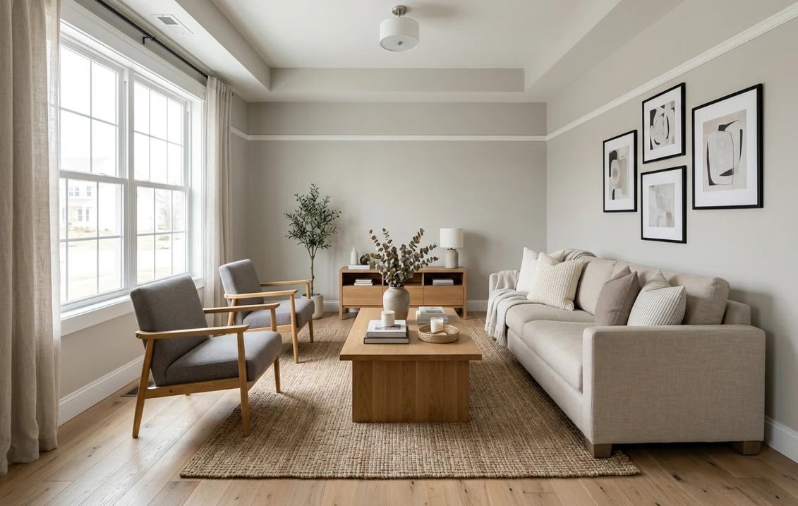
Open-plan living and great rooms
This is Repose Gray's strongest setting. A large room usually pulls light from more than one direction, which averages out the cool casts and lets the warm gray read as designed. At LRV 58 it stays calm and grounded without darkening the room, which is why it is a favorite whole-floor color. For more options here, see the 2026 living room paint colors roundup.
Bedrooms
Repose Gray makes a restful, enveloping bedroom, especially in a south or west-facing room where afternoon light keeps it warm. In a north-facing bedroom it can drift cool and faintly mauve at night, so this is a test-twice room. For a softer, sleep-focused palette, the calming master bedroom colors guide pairs well with this profile.
Kitchens and cabinets
On kitchen walls, Repose Gray is an easy backdrop for white, wood, or pale-gray cabinetry. It also works as a cabinet color itself, where its warmth reads soft and high-end rather than cold and clinical, which is why it shows up so often on island and perimeter cabinets, paired with a warm white counter and brass or matte black hardware. For the full cabinet picture, see the complete kitchen cabinet colors guide and the trending cabinet paint colors rundown.
Bathrooms and basements
These are the two riskiest rooms. Bathrooms are often north-facing, small, and lit by cool vanity bulbs, the exact recipe for the lavender shift, and basements have little natural light, so the bulb color decides everything. Use Repose in both only after swapping in warm-white bulbs (2700 K to 3000 K) and viewing a real sample on the wall. Home offices and hallways, by contrast, are easy wins: they borrow light from adjoining rooms, so Repose settles into a steady, low-fatigue neutral. See the room-by-room color ideas guide for the wider map.
Trim, ceiling, and decor pairings that keep it neutral
The fastest way to make Repose Gray look intentional is to surround it with the right neutrals: keep trim and decor in the same warmth family as the wall, and choose a crisp (not icy) white so the gray reads clean at the edges.
- Best all-rounder trim: SW Pure White (SW 7005, LRV 84). Crisp and only lightly warm, it gives Repose a clean edge without forcing the gray cool. The default for a modern, fresh look.
- Warmer trim option: SW Alabaster (SW 7008, LRV 82). A softer, creamier frame that leans into Repose's warmth, ideal in traditional rooms and anywhere with wood tones.
- Avoid: a blue-based pure white above LRV 90 on the trim. The cool contrast can tip Repose toward its gray-violet read and make the walls look dingy.
- Ceiling: a soft white such as Pure White, or the wall color cut 25%, keeps the room cohesive. A stark white ceiling over a north-facing Repose room amplifies the cool shift.
- Floors and decor: warm white oak, honey-toned wood, jute, rattan, cream linen, and brass pull Repose toward its warm gray sweet spot. Cool gray-washed floors, chrome, and stark blue-grays push it toward lavender.
The closest cross-brand cousin is Benjamin Moore Revere Pewter (LRV around 55), a touch deeper and more clearly greige with a green-ish warmth, while Repose holds a cleaner gray identity. The full Benjamin Moore Revere Pewter HC-172 review has the side-by-side.
Repose Gray vs the grays people confuse it with
A lot of repaints trace back to one mistake: grabbing the wrong neighbor in the gray family. Here is how Repose separates from the colors it gets confused with indoors:
| Color | LRV | Reads as | Pick it when |
|---|---|---|---|
| Repose Gray SW 7015 | 58 | Warm gray, faint violet-brown base | You want gray to stay gray, not beige |
| Agreeable Gray SW 7029 | ~60 | Warmer greige, clearer beige lean | You want a touch more warmth |
| Mindful Gray SW 7016 | ~48 | Deeper, cooler true gray | You want a darker, cooler gray |
| Revere Pewter HC-172 | ~55 | Greige with a green-warm base | You want the Benjamin Moore classic |
Try it on your house
No photo? Try a sample
Sources: Sherwin-Williams digital color data for SW 7015, SW 7029, SW 7016; Benjamin Moore color data for HC-172. LRVs marked with a tilde are widely published approximations.
Repose, then, is the "stays gray" pick. If you are torn between Repose and its darker sibling one step down the strip, the Repose Gray vs Mindful Gray side-by-side verdict settles that duel room by room. The Sherwin-Williams vs Benjamin Moore interior comparison covers formula, coverage, and price, and the Sherwin-Williams interior colors hub ranks where Repose sits among the neutrals.
How to test Repose Gray before you commit
Skip the 2-inch fan-deck chip. It is the worst possible way to judge Repose Gray, because it hides the lavender shift entirely and reads far lighter than a rolled wall. Do this instead:
- Paint a real swatch, not a chip. Brush a 12 by 12 inch sample (or a peel-and-stick sheet) on at least two walls, including the one that gets the least direct light.
- Watch it across three moments: mid-morning, mid-afternoon, and after dark under your normal bulbs. The evening read is where the violet shows up, so do not skip it.
- Fix the bulbs first. If you see purple at night, change a cool bulb to 2700 K to 3000 K warm white before blaming the paint. It often solves the problem outright.
- Preview it digitally to narrow the field. Before buying three sample pots, upload a photo of your room and try Repose Gray (and a warmer or cooler neighbor) virtually.
For the wider decision, the best interior paint colors of 2026 guide sets Repose in context, and the interior painting cost guide covers what the repaint runs.
Upload your room photo and compare Repose Gray with a warmer and cooler neighbor side by side, free.
Frequently asked questions
Is Repose Gray warm or cool?
Repose Gray (SW 7015) is a warm light gray with a quiet violet-brown undertone. In warm or neutral light the brown dominates and it reads as a grounded warm gray. In cool light (north-facing rooms or 5000 K bulbs) the warmth drops away and the violet base can surface as a faint lavender, so it is best described as a warm gray that depends on its light.
Why does my Repose Gray look purple or lavender?
Repose Gray carries a small amount of violet in its base. When the surrounding light is cool, blue, or low (a north-facing room, a cool LED bulb, or a dim basement), that violet is no longer balanced by warmth and reads as a faint purple. The usual fix is not a new color but warmer 2700 K to 3000 K bulbs and warmer flooring or decor. Test a real swatch under your evening lighting before deciding.
What is the LRV of Repose Gray, and is it too dark for a small room?
Repose Gray has an LRV of 58 on the Sherwin-Williams data, a true mid-tone. It is light enough to keep most rooms feeling open while still reading clearly as a color rather than an off-white. In a small, low-light room it will feel cozier and deeper, so pair it with good warm lighting and crisp white trim, or step to a lighter warm gray if you need maximum brightness.
What is the best white trim for Repose Gray walls?
SW Pure White (SW 7005, LRV 84) is the best all-rounder: crisp and lightly warm, it gives a clean edge without forcing the gray cool. For a softer, traditional look, SW Alabaster (SW 7008) leans into Repose's warmth. Avoid a stark blue-based white above LRV 90, which can push Repose toward its gray-violet read and make the walls look dingy.
See SW Repose Gray and a few warmer and cooler neighbors on your room before buying a sample.
Disclaimer: Sherwin-Williams, Repose Gray (SW 7015), Agreeable Gray (SW 7029), Mindful Gray (SW 7016), Pure White (SW 7005), and Alabaster (SW 7008) are trademarks of The Sherwin-Williams Company. Benjamin Moore and Revere Pewter (HC-172) are trademarks of Benjamin Moore and Co. FacadeColorizer is an independent paint visualization service and is not affiliated with, endorsed by, or sponsored by Sherwin-Williams or Benjamin Moore. Color reproduction on screens approximates the manufacturer's chip; always confirm with a manufacturer sample before purchase. Sources: Sherwin-Williams digital color data for SW 7015, SW 7029, and SW 7016 (2026), Benjamin Moore color data for HC-172 (2026), and designer undertone references including The Spruce and manufacturer technical data.
Trademarks mentioned (Sherwin-Williams, Benjamin Moore, Behr, Caparol, Brillux, Sto, Alpina, Valspar, PPG, Glidden, Dulux, Crown Trade, Sandtex, Farrow & Ball, Johnstone's, Leyland) are property of their respective owners. FacadeColorizer is independent and not affiliated with any of them. Nominative fair use under Lanham Act §1125.