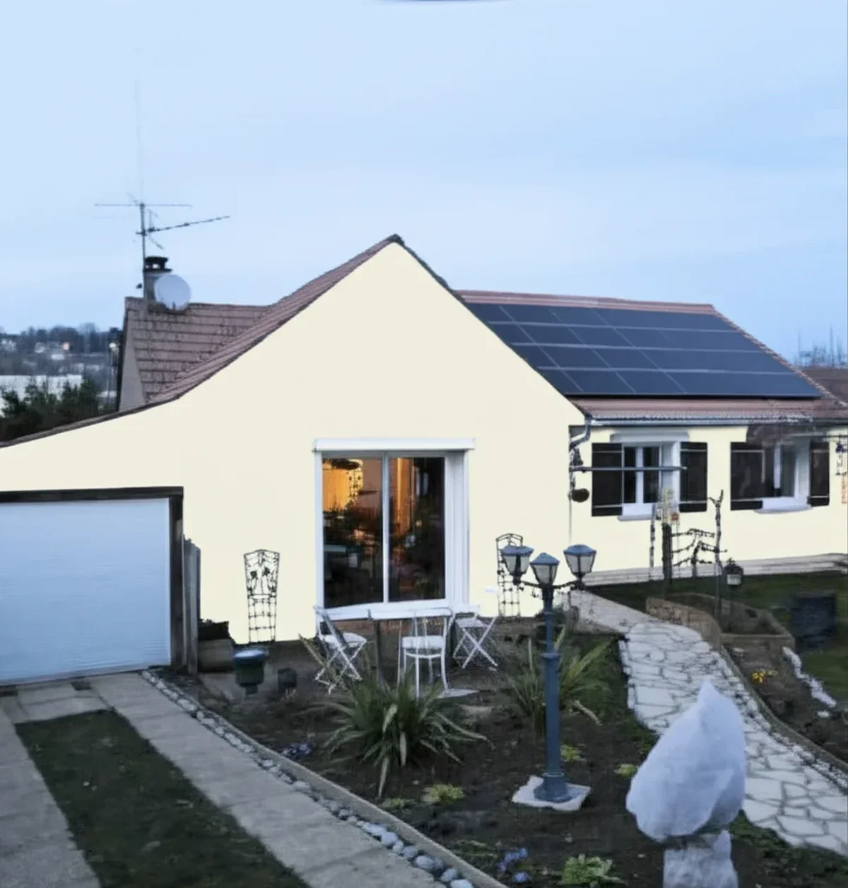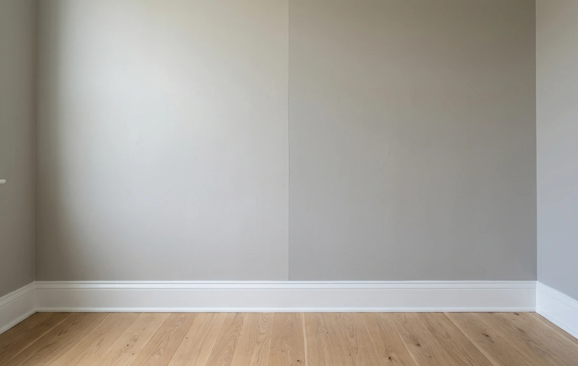
Try it on your house

The verdict in three lines. Repose Gray SW 7015 (LRV 58) is the lighter pick: an airy, forgiving greige that keeps rooms bright and works almost anywhere.
Mindful Gray SW 7016 (LRV 48) sits one step below it on the exact same strip: same undertone family, visibly more depth and presence on the wall.
Unlike most greige duels, this one is about depth, not undertone. Pick by how much gray your light can carry, then confirm on a photo of your own room.
Sherwin-Williams Repose Gray (SW 7015) and Mindful Gray (SW 7016) are not rivals from opposite corners of the deck. They are next-door neighbors on the same Sherwin-Williams color strip, mixed in the same undertone family, one full step apart in depth. That makes this duel refreshingly simple: you are not decoding warm versus cool, you are deciding how dark you want to go. This head-to-head puts the numbers side by side, walks the choice room by room and exposure by exposure, and tells you exactly when each shade wins. For the general playbook behind any two-color decision, start with our side-by-side method for comparing any two paint colors.
The numbers side by side
| Attribute | Repose Gray SW 7015 | Mindful Gray SW 7016 |
|---|---|---|
| Family | Light warm gray (greige) | Mid-tone warm gray (greige) |
| LRV | 58 | 48 |
| Approximate hex | #CCC9C0 | #BCB7AD |
| Approximate RGB | 204, 201, 192 | 188, 183, 173 |
| Position on the strip | Lighter neighbor | One full step darker, same strip |
| Undertone | Grayer base with a faint violet-taupe cast | Same greige base; can flash a subtle earthy, green-beige cast in some light |
| Loves | Crisp white trim, bright rooms, whole-house use | Generous daylight, white trim contrast, cozy rooms |
| Watch out for | Can wash out in intense sun | Can feel heavy or muddy in dim, low-light rooms |
| Overall vibe | Airy, calm, safe default | Grounded, enveloping, more deliberate |
Try it on your house
No photo? Try a sample
LRV values are the published Sherwin-Williams figures. Hex and RGB are approximate digital renderings; the authoritative reference is a physical Sherwin-Williams chip or peel-and-stick sample.
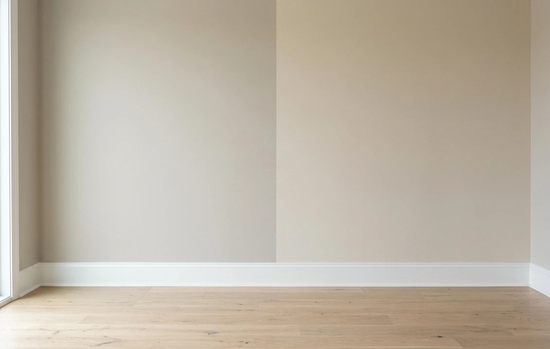
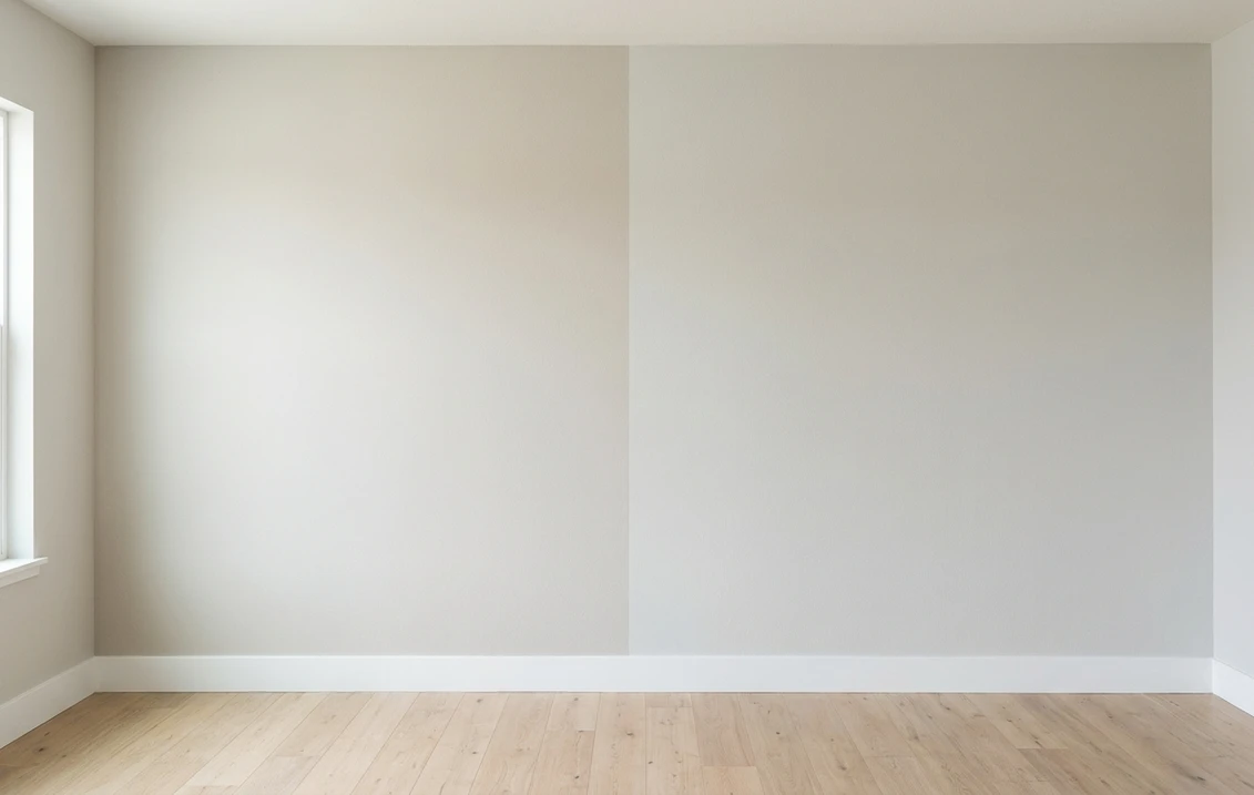
Read that table once and the shape of this duel is the mirror image of most greige matchups. Undertone is essentially a tie: these two are consecutive chips on the same strip, so their base character moves in lockstep. Depth is where everything happens. A 10-point LRV gap is clearly visible on a full wall: Repose Gray reads as a light neutral that recedes, while Mindful Gray reads as a color you chose on purpose. The two-coat sample rule and the white-paper undertone check from the pillar guide linked above still apply, but here they mostly confirm the numbers.
Upload one photo, get a photorealistic render, then swap to Mindful Gray in one click. Free, no signup.
Room by room, exposure by exposure
Because the undertones match, the same room rarely rejects one of these colors outright. What changes is how much light the room has to spend. Here is how the duel typically plays out across the most common situations.
| Situation | Usual winner | Why |
|---|---|---|
| North-facing or dim living room | Repose Gray | At LRV 58 it keeps a low-light room feeling bright; Mindful Gray can turn heavy |
| Bright south-facing room | Mindful Gray | Strong sun washes lighter grays toward off-white; Mindful Gray keeps its color |
| Open-plan whole-main-floor color | Repose Gray | The safer depth across mixed exposures; save Mindful Gray for one defined zone |
| Bedroom, den, or media room | Mindful Gray | The extra depth gives the cocooning, enveloping feel lighter grays cannot |
| Small hallway with no window | Repose Gray | Artificial light alone is unkind to mid-tones; the lighter chip stays cleaner |
| Exterior body color | Mindful Gray, usually | Outdoor light visually lightens every color, so the deeper chip often survives better |
That last row deserves a word. Full daylight is brutal to light neutrals: a color that looks decisive indoors can read as builder-white on siding at noon. This is why Mindful Gray, the deeper of the pair, is the more common exterior pick of the two. Orientation, trim pairings, and siding materials for that use case are covered in full in the Mindful Gray SW 7016 exterior guide.
When to choose Repose Gray
- The room is short on natural light. With 10 more points of LRV, Repose Gray gives back light that Mindful Gray absorbs. In north-facing or windowless spaces, that margin is the difference between calm and cave.
- You want one color for the whole main floor. Across mixed exposures, the lighter chip is the one that never overcommits. It recedes politely in every room instead of dominating one of them.
- You are selling or staging. Light, quiet neutrals photograph well and let buyers project their own furniture. Repose Gray is the lower-risk canvas.
- Your ceilings are low or the room is small. Lighter walls visually push boundaries outward; a mid-tone in a tight room can shrink it further.
For its full undertone breakdown, lighting behavior, and trim pairings, see the dedicated Repose Gray undertones and best rooms profile.
When to choose Mindful Gray
- The room is bright and sun-drenched. Where Repose Gray fades toward off-white, Mindful Gray keeps enough pigment to still look like a chosen color at 2 p.m.
- You want contrast with white trim. Against bright white baseboards and casings, Mindful Gray produces a crisp, tailored frame that the lighter chip only hints at.
- The brief is cozy, not airy. Dens, studies, bedrooms, and media rooms benefit from a wall color with real presence. Mindful Gray delivers depth without tipping into dark-and-moody territory.
- You are painting the exterior. The extra depth compensates for the washing-out effect of full daylight, which is exactly why its exterior guide exists.
If the cozy brief keeps pushing you past Mindful Gray, the next chip on this very strip is Dorian Gray SW 7017 at LRV 39, nine points below Mindful Gray, and Mindful Gray against Dorian Gray settles that step exactly as this page settles the one above it. The same argument reappears much further down the scale on the Benjamin Moore deck: Chelsea Gray HC-168 against Kendall Charcoal HC-166, LRV about 22 and about 12. Two near-identical undertones, one depth decision, and the room's light doing the arbitrating exactly as it does here.
Same wall, both depths, your actual light. Free render in about 30 seconds.
Frequently asked questions
What is the difference between Repose Gray and Mindful Gray?
Depth, not undertone. Repose Gray SW 7015 (LRV 58) and Mindful Gray SW 7016 (LRV 48) are consecutive chips on the same Sherwin-Williams strip, so they share the same warm-gray base. Mindful Gray is simply one full step darker, and that 10-point LRV gap is clearly visible on a painted wall.
Is Mindful Gray darker than Repose Gray?
Yes, noticeably. At LRV 48 versus 58, Mindful Gray reflects meaningfully less light than Repose Gray. On a chip the difference looks minor; across a full wall, Mindful Gray reads as a deliberate mid-tone gray while Repose Gray reads as a light, receding neutral.
Can I use Repose Gray and Mindful Gray together in the same house?
Yes, and it is one of the cleanest pairings in the deck. Because they come from the same strip, they layer like two values of one color rather than two competing grays. A classic plan is Repose Gray on the main walls with Mindful Gray in a den, a bedroom, or on a single accent wall.
Which is better for a dark or north-facing room?
Repose Gray, in most homes. Weak, cool light makes every gray look deeper and flatter than the chip suggests, and Mindful Gray can start to feel heavy or muddy without enough daylight to carry it. Choose Mindful Gray in a dim room only if a deliberately cocooning, enveloping mood is the goal.
Both colors here sit in the mid-light range; if the room needs more brightness with the same quiet character, Crushed Ice SW 7647 at LRV 66 is the lighter step, with a green rather than a violet undertone.
Settle it on your photo
Chips lie, screens lie, and a sample square on someone else's wall tells you about their light, not yours. Since this duel comes down to how much depth your room can carry, the fastest honest answer is to render both shades on a photo of your actual space and compare them at full-wall scale. And if your shortlist also includes the warmer best-seller from the other side of the deck, the Agreeable Gray vs Repose Gray duel settles that matchup the same way.
1 HD render plus 3 free color variations. Start with Repose Gray, swap to Mindful Gray in one click.
Trademark notice. Sherwin-Williams®, Repose Gray®, Mindful Gray®, Dorian Gray® and Agreeable Gray® are trademarks of The Sherwin-Williams Company. FacadeColorizer is not affiliated with, endorsed by, or sponsored by The Sherwin-Williams Company. Brand and color names are used for descriptive and editorial purposes only, consistent with nominative fair use. Hex and RGB values are approximate digital renderings; the only authoritative reference is a physical Sherwin-Williams color sample.
Trademarks mentioned (Sherwin-Williams, Benjamin Moore, Behr, Caparol, Brillux, Sto, Alpina, Valspar, PPG, Glidden, Dulux, Crown Trade, Sandtex, Farrow & Ball, Johnstone's, Leyland) are property of their respective owners. FacadeColorizer is independent and not affiliated with any of them. Nominative fair use under Lanham Act §1125.