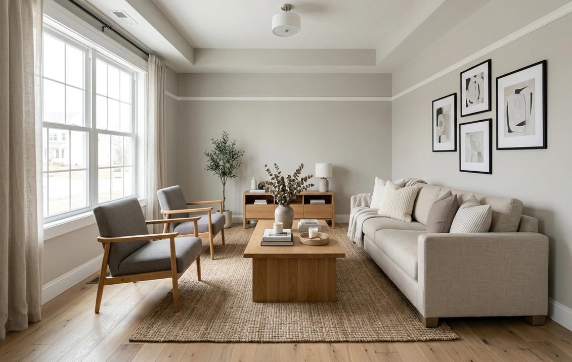
Most popular Sherwin-Williams grays are light, safe, and forgettable on purpose. Dorian Gray (SW 7017) is the opposite: the dark, grounded end of the warm-gray family, the color people choose when they want a room to feel deliberate rather than builder-beige. At an LRV of 39 it carries real weight on a wall, and that depth is exactly why it can swing, warm and greige in afternoon sun, cooler and faintly green or blue under an overcast sky or a daylight bulb. Get the light wrong and it reads murky; get it right and it is one of the most sophisticated neutrals SW makes.
Think of this as a room-by-room profile of Dorian Gray as an interior wall color. We cover the real LRV, the undertones hiding in the base, the rooms where a deep warm gray earns its keep, and the pairings that stop it going dull. It is the heavyweight sibling to the lighter grays you may be cross-shopping.
Upload a room photo and preview SW Dorian Gray under your real light, free.
Dorian Gray SW 7017 at a glance
Dorian Gray is a deep, warm-leaning gray that color analysts file under "dark greige." It sits a clear step below the everyday warm grays, with enough brown in the base to stay inviting instead of cold. The numbers that matter before you tape off a wall:
- SW number: 7017.
- LRV (Light Reflectance Value): 39, on Sherwin-Williams digital color data. A genuine deep mid-tone: dramatic and enveloping, still short of charcoal.
- Hex approximation: #928E84 (RGB roughly 146, 142, 132), a weathered stone gray with a warm taupe cast.
- Undertone: warm, with a quiet green-taupe base. The brown keeps it earthy; the green can surface in cool or overcast light, with a possible blue flicker under daylight bulbs.
- Family: deep warm gray, a dark greige neutral.
That LRV of 39 is the most important number here: it puts Dorian Gray well below the light neutrals people confuse it with. Repose Gray sits at LRV 58 and Agreeable Gray near LRV 60, so Dorian reads as a confident, room-defining color next to either, not a backdrop. The color-families guide maps where each one lands on the light-to-dark scale.
The undertone story: green in the shade, blue under bulbs
Every gray is a hidden blend of pigments, and the eye sees whichever ones the room's light fails to cancel out. Dorian Gray's base leans green-taupe. In warm afternoon light the brown half dominates and the wall reads as a grounded, earthy greige. Take the warmth away and the green shows, so Dorian can look softly sage or even mossy in a shaded corner or on an overcast day, while a cool 5000 K bulb pushes that green toward a flatter, harder blue-gray. The color does not change; the light does.
Because it is so much darker than a typical warm gray, Dorian exaggerates these swings rather than hiding them: a light greige at LRV 60 forgives a mediocre bulb, but at LRV 39 less light bounces back, so whatever cast is present has room to land. Three conditions push Dorian toward its cooler, greener read:
- North-facing rooms with no direct sun. North light skews cool and blue (roughly 7,500 to 10,000 K), subtracting the warmth Dorian relies on, so the green base steps forward.
- Cool LED bulbs. A 5000 K daylight bulb does the same artificially, often flattening Dorian after dark. Most "cold at night" complaints are a bulb problem, not a paint problem.
- Cool neighbors. Stark white quartz, chrome, gray-washed floors, and blue-gray textiles bounce cool light onto the wall and amplify the cast; warm oak, brass, leather, and cream do the reverse.
None of this makes Dorian Gray a difficult color, only a committed one: it rewards warm light and warm materials, so the fix is almost always lighting and finishes, not a different can of paint.
Free AI visualizer. See whether Dorian reads warm greige or cool blue-gray in your room.
Where Dorian Gray fits in the SW warm-gray ladder
Several SW warm grays step down in value while staying in one family, which is why so many homeowners use a lighter one on the walls and Dorian as the deep accent. Knowing the ladder stops you buying the wrong rung.
| Color | LRV | Reads as | Pick it when |
|---|---|---|---|
| Agreeable Gray SW 7029 | ~60 | Light warm greige, clear beige lean | You want the lightest, safest neutral |
| Repose Gray SW 7015 | 58 | Light warm gray, gray wins over beige | You want gray to stay gray, not beige |
| Mindful Gray SW 7016 | ~48 | Mid warm gray, more depth | You want a clear gray with weight |
| Dorian Gray SW 7017 | 39 | Deep warm greige, green-taupe base | You want a dramatic, grounded gray |
Try it on your house
No photo? Try a sample
Sources: Sherwin-Williams digital color data for SW 7029, SW 7015, SW 7016, and SW 7017. LRVs marked with a tilde are widely published approximations.
A classic move is Repose or Agreeable Gray on the main walls with Dorian on a fireplace, island, or doors. If you are torn between the two mid-tones on the strip, the Mindful Gray vs Dorian Gray side-by-side settles the one-step-lighter question room by room. The Sherwin-Williams interior colors hub ranks where Dorian sits among the neutrals, and for a warm tan instead of a gray, see Accessible Beige SW 7036.
Best rooms for Dorian Gray (and where to think twice)
For most homes, a deep gray is not a whole-house color. You place it with intent. Here is where Dorian Gray earns its depth.
Accent walls and fireplaces
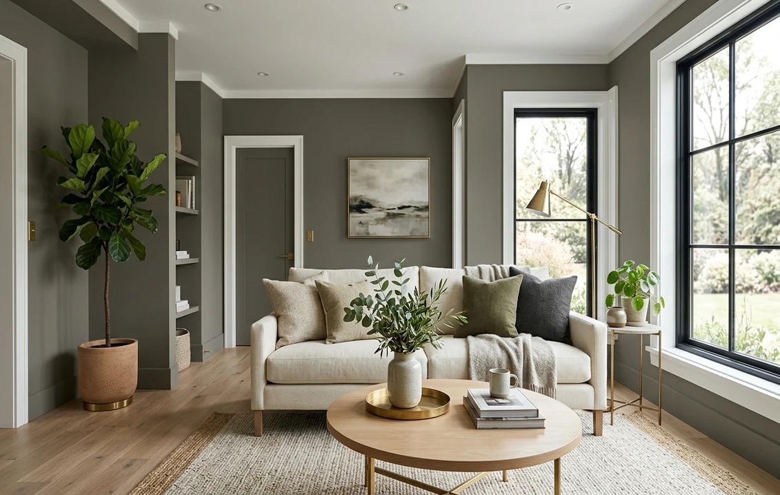
This is Dorian Gray's home turf. On a feature wall, a fireplace surround, or a built-in bookcase, the depth becomes an asset: it frames the room and makes lighter neutrals look intentional. With warm wood and brass, a Dorian Gray fireplace wall reads as quiet luxury rather than darkness.
Studies, dens, and moody bedrooms
In a room you want enveloping rather than bright (a home office, a library, a primary bedroom built for rest) Dorian Gray on all four walls is genuinely beautiful: it absorbs glare, flatters warm lamplight, and reads cocooning. The non-negotiable is warm 2700 K to 3000 K bulbs plus a good window, or it tips from cozy to dim.
Kitchen islands and cabinetry
Dorian Gray is a strong cabinet and island color. Its warmth keeps it from reading cold and industrial the way a true blue-gray can, and it grounds a kitchen of white perimeter cabinets and a warm-white counter, finished with brass or matte black hardware. In a small, dark kitchen, keep it on the cabinetry rather than the walls.
Small, north-facing, low-light rooms (test twice)
Tread carefully here. A small north-facing powder room or a dim basement gives Dorian Gray no warmth to work with, and at LRV 39 it bounces little light back, so the space can read cold and cramped. Warm, layered lighting can still rescue it. Just never choose it here sight-unseen.
Trim, ceiling, and decor pairings
Want Dorian Gray to look chosen rather than gloomy? Frame it with a crisp white at the edges, then bring in warm materials that keep the base earthy.
- Best all-rounder trim: SW Pure White (SW 7005, LRV 84). The high contrast against a deep gray reads sharp and modern and makes Dorian a deliberate statement.
- Warmer, softer trim: SW Alabaster (SW 7008, LRV 82). A creamier frame for traditional rooms and wood tones: less contrast, more warmth.
- Ceiling: a soft white keeps the room from feeling like a box. Matching the ceiling to the deep gray is a bold, cocooning move that needs good warm lighting.
- Floors and decor: warm oak, walnut, leather, jute, cream linen, and brass pull Dorian toward its sweet spot. Cool gray-washed floors, chrome, and stark blue-grays push it colder and greener.
- Coordinating wall color: a lighter warm gray such as Repose or Agreeable on adjoining walls keeps the palette cohesive and lets Dorian be the anchor.
The nearest Benjamin Moore relatives are its deeper warm grays in the Kendall Charcoal to Chelsea Gray range, though Dorian holds a greener, earthier base. The Sherwin-Williams vs Benjamin Moore interior comparison covers formula, coverage, and price, which matter more on a dark color where uneven application shows. And if Dorian still feels too tame, the Dorian Gray vs Gauntlet Gray duel weighs it against its much darker SW sibling.
How to test Dorian Gray before you commit
A small fan-deck chip is the worst way to judge a deep color: it reads far lighter than a rolled wall and cannot show the green or blue shift. Instead:
- Paint a real swatch, not a chip. Brush a 12 by 12 inch sample (or a peel-and-stick sheet) on at least two walls, including the one with the least direct light, where the green read shows first.
- Watch it across three moments: mid-morning, mid-afternoon, and after dark under your normal bulbs. Dark grays change most between daylight and evening, so the night view decides.
- Fix the bulbs first. If Dorian looks cold or blue at night, swap a cool bulb for 2700 K to 3000 K warm white before blaming the paint. On a deep gray this is often the difference.
- Plan two coats. Deep bases cover unevenly, so budget for a tinted primer or a second finish coat.
- Preview it digitally first. Before buying sample pots, upload a room photo and try Dorian Gray (and a lighter neighbor) virtually.
For the wider decision, the best interior paint colors of 2026 guide sets Dorian Gray in context, and the interior painting cost guide covers what a deep-color repaint runs. Weighing a soft greige instead? The Sea Salt SW 6204 profile shows the green-gray end of the spectrum several shades lighter.
Upload your room photo and compare Dorian Gray with a lighter warm gray, free.
Frequently asked questions
Is Dorian Gray warm or cool?
Dorian Gray (SW 7017) is a warm deep gray with a green-taupe undertone. In warm afternoon light the brown in its base dominates and it reads as an earthy, grounded greige. In cool or overcast light, or under a 5000 K daylight bulb, the warmth drops away and the green can step forward, sometimes reading slightly sage or blue-gray. At LRV 39 it reflects less light to soften any cast, so it depends heavily on its light.
What is the LRV of Dorian Gray, and is it too dark for a room?
Dorian Gray has an LRV of 39 on the Sherwin-Williams data, a genuine deep mid-tone: dramatic and enveloping, not a light backdrop. In a bright room with warm lighting it makes a beautiful moody bedroom, study, or accent wall. In a small, north-facing, low-light room it can feel heavy and read cold, so reserve it for feature walls, cabinetry, or rooms you want cocooning rather than airy.
Does Dorian Gray look green?
It can. Dorian Gray carries a green-taupe base, and in cool, shaded, or overcast light the warmth that balances the green is reduced, so the wall can read softly sage or mossy. Warm 2700 K to 3000 K bulbs and warm materials such as oak, brass, and leather pull it back to a warm greige. Test a real swatch in the room's shadiest corner and under evening lighting before deciding.
What is the difference between Dorian Gray and Repose Gray?
They share a warm-gray family but sit at opposite ends of the depth scale. Repose Gray (SW 7015) is a light warm gray at LRV 58 with a faint violet base, built to be a soft whole-room neutral. Dorian Gray (SW 7017) is far deeper at LRV 39 with a green-taupe base, built to be a statement or accent. A common pairing is Repose on the main walls and Dorian on a fireplace, island, or doors. For trim, SW Pure White (SW 7005) gives Dorian a crisp edge while SW Alabaster (SW 7008) frames it softer.
See SW Dorian Gray and a lighter warm-gray neighbor on your room first.
Disclaimer: Sherwin-Williams, Dorian Gray (SW 7017), Mindful Gray (SW 7016), Repose Gray (SW 7015), Agreeable Gray (SW 7029), Accessible Beige (SW 7036), Pure White (SW 7005), and Alabaster (SW 7008) are trademarks of The Sherwin-Williams Company. Benjamin Moore and any cited color names are trademarks of Benjamin Moore and Co. FacadeColorizer is an independent paint visualization service and is not affiliated with, endorsed by, or sponsored by Sherwin-Williams or Benjamin Moore. Color reproduction on screens approximates the manufacturer's chip; always confirm with a manufacturer sample before purchase. Sources: Sherwin-Williams digital color data for SW 7017, SW 7016, SW 7015, and SW 7029 (2026), Benjamin Moore color data (2026), and designer undertone references including The Spruce and manufacturer technical data.
Trademarks mentioned (Sherwin-Williams, Benjamin Moore, Behr, Caparol, Brillux, Sto, Alpina, Valspar, PPG, Glidden, Dulux, Crown Trade, Sandtex, Farrow & Ball, Johnstone's, Leyland) are property of their respective owners. FacadeColorizer is independent and not affiliated with any of them. Nominative fair use under Lanham Act §1125.