Ask five homeowners about Drift of Mist (SW 9166) and you get five different colors back. One calls it "the perfect soft gray." The next swears it turned purple in the hallway. A third insists it is basically a warm off-white. They are all looking at the same paint. Drift of Mist carries undertones so muted that the room, not the can, decides what you see, which is both its gift and its trap.
This is a single-color deep dive for the homeowner already leaning toward Drift of Mist: what its undertones do, the published LRV, how it flips between gray and greige as the light changes, the rooms it flatters, and the trim that keeps it crisp. It earns a spot among the soft whole-home neutrals in our wider Sherwin-Williams interior paint colors guide. Want to see how the whole light-gray category stacks up? That is the job of our best interior paint colors for 2026 roundup.
Upload one photo and preview SW Drift of Mist under your room's actual light in about 30 seconds, free.
The data sheet behind Drift of Mist SW 9166
Before the opinions, the numbers. These published values predict the wall far better than the tiny chip stapled to a fan deck:
- SW code: SW 9166 Drift of Mist.
- LRV (Light Reflectance Value): 69, near the off-white range.
- Hue family: warm gray, in the yellow hue family, with a muted green note.
- Undertone: soft green-leaning greige, with a faint cool side in low light.
- Closest SW cousins: Agreeable Gray (SW 7029), Gossamer Veil (SW 9165), Repose Gray (SW 7015).
Sources: Sherwin-Williams SW 9166 Drift of Mist color data, retrieved 2026; designer reviews (Kylie M Interiors); The Spruce undertone references.
The number that matters most is the LRV of 69, high for something called a gray. It puts Drift of Mist on the doorstep of the off-white range, which is why it reads so light and airy. Indoors that high reflectance is the appeal: it brightens a space the way a white would, but with a faint warmth that keeps it from feeling clinical. The catch is that high-LRV colors show their undertone honestly, with little depth to hide behind, so whatever cast the room throws lands right on the wall.
The undertone, and the green-versus-purple debate
Drift of Mist is a warm gray, but only just. Its undertone leans very softly green, the kind of muted green that reads as warmth and earthiness rather than an obvious color. Set it next to a true neutral gray and the green whisper appears; set it next to a green-gray like SW Sea Salt and Drift of Mist looks like a plain warm gray.
So where does the purple talk come from? When a gray carries a touch of green, some eyes (and some cameras) compensate by reading the opposite direction, which on the color wheel is red-violet. In a cool north room or under certain LED bulbs, a small share of people will swear they see a mauve cast while everyone else sees gray-green. Neither is wrong; it is a perceptual split, and exactly why designers flag Drift of Mist as sensitive around the green-versus-purple question. The lesson: do not choose this one from a chip and hope. Sample it on the real wall, and if a household member is purple-sensitive, the swatch tells you fast. For how greens, grays, and greiges relate, the interior color families guide maps the territory.
Gray or greige? Let the light decide
Because the undertone is so faint and the LRV so high, light direction moves Drift of Mist more than it moves a committed greige like Accessible Beige. The same gallon reads cool and gray in one room, soft and greige in another. The typical behavior across the four Northern Hemisphere orientations:
| Room orientation | Daylight character | How Drift of Mist reads |
|---|---|---|
| South-facing | Warm, abundant midday light | Warmest, softest greige; the green note is gentle and cozy |
| West-facing | Cool by day, very warm at sunset | Gray-leaning by day, warm greige in late-afternoon glow |
| East-facing | Warm early sun, neutral later | Soft and warm in the morning, cleaner gray by afternoon |
| North-facing | Cool, indirect, no direct sun | Coolest and grayest; the room where a purple read can surface |
Try it on your house
No photo? Try a sample
Sources: American Institute of Architects daylight reference; Sherwin-Williams SW 9166 color data; designer field notes on warm grays.
Two cautions live at the ends of that range. A sun-flooded south room can wash Drift of Mist out until it reads as a plain off-white and the warmth disappears. A dark, low-light room drags it the other way, where the high LRV that should brighten instead looks faintly dingy. It is happiest in rooms with steady, moderate natural light. For a gray with a more predictable identity across orientations, our profile of SW Repose Gray is the steadier counterpart, and the warmer, muddier sibling is covered in our SW Agreeable Gray profile.
Free AI visualizer: see whether your light pulls Drift of Mist gray or greige before you buy a sample.
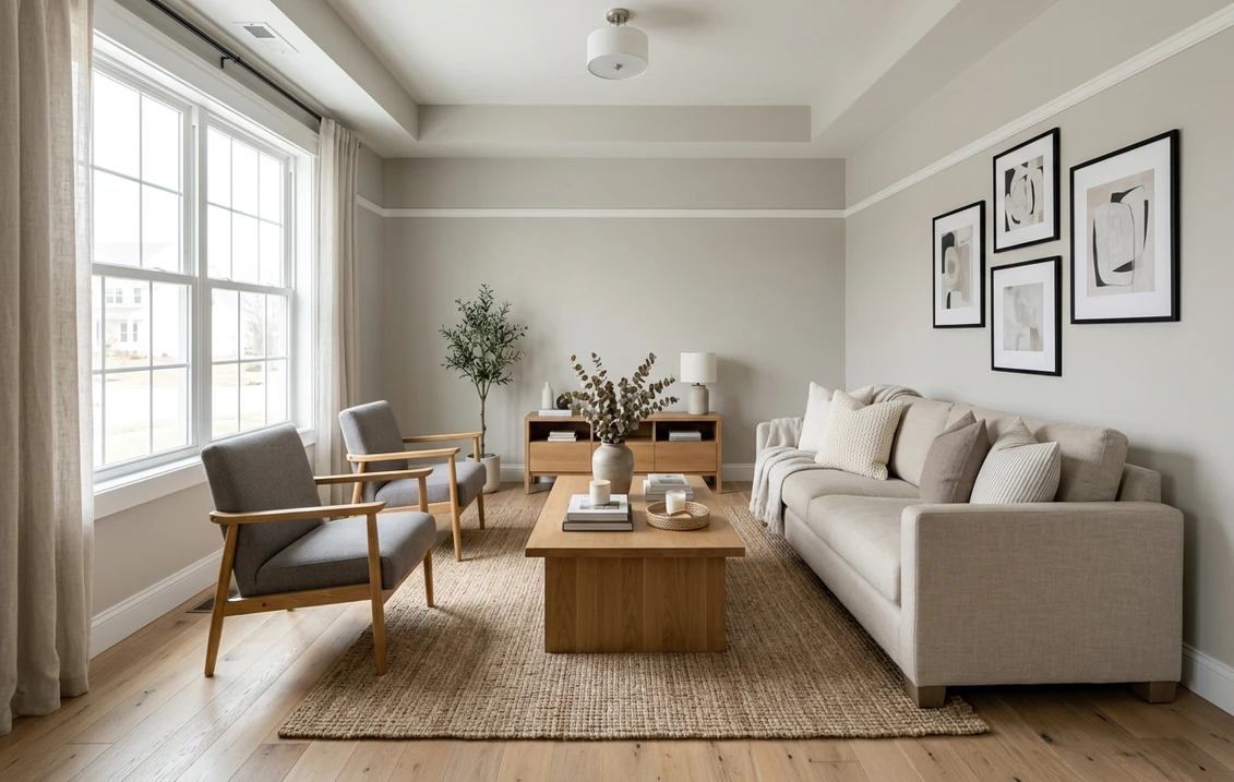
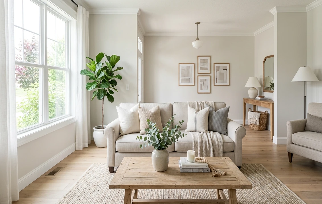
The rooms Drift of Mist flatters
This is a quiet color. It was made to brighten a room and step back, not to be the thing you notice, and that whole-home temperament pays off best in a clear set of spaces:
- Open-concept main floors: the strongest use. A high-LRV, low-saturation gray flows from kitchen to living to dining without fighting the changing light in each zone, and keeps a large footprint feeling bright and unified.
- Living rooms and bedrooms with moderate light: the soft warmth reads calm and restful, an easy backdrop for white, cream, wood, and almost any accent you layer on top.
- Kitchen walls and, with care, cabinets: as a wall color it lets white or wood cabinets lead. On cabinets it reads as a soft custom gray, but coordinate counters and hardware deliberately, since the subtle undertone is easily pushed warm or cool by nearby materials.
- Hallways and transitional spaces: it bridges rooms and bounces light down a corridor. Just confirm the north-facing or windowless stretches do not tip it toward the cool, purple-leaning read.
Where to think twice: a windowless powder room or basement under warm builder bulbs can flatten Drift of Mist to a muddy gray, and a glaring all-day-sun room can bleach it to a featureless off-white. Whatever the room, our interior house painting cost guide covers what the repaint should run.
Trim, ceiling, and decor pairings
Because Drift of Mist is so light, the white beside it has to be brighter or the trim vanishes. How crisp you go is a style call:
- For a soft, low-contrast scheme: Sherwin-Williams Pure White (SW 7005, LRV 84), bright and only faintly warm, frames it gently and keeps the palette mellow.
- For a clean, high-contrast look: SW High Reflective White (SW 7757, LRV 93) or Benjamin Moore Chantilly Lace (OC-65, LRV 90) make the trim pop and lean the wall a touch cooler.
- Ceiling: a flat white keeps the room open. Drift of Mist itself overhead can read heavy in a low room.
- Deeper coordinating tones: for built-ins, an island, or an accent, a soft black like SW Iron Ore or a navy like SW Naval reads as a confident step down.
- Decor and finishes: white oak and light woods, brass and aged bronze, and natural linen all lean into its warmth. Cool gray-washed floors and heavy cool grays flip it toward its grayer side.
To anchor a Drift of Mist palette with a warmer neutral in an adjoining room, a greige is the natural partner; our profile of SW Accessible Beige flows beside it, and for a cooler, more colorful adjacency the soft blue-green in our SW Sea Salt profile pairs cleanly with a light warm gray.
Drift of Mist versus the colors people cross-shop
Drift of Mist gets lined up against a handful of close neighbors. Learn what sets them apart and you spare yourself a wasted sample pot:
- vs SW Agreeable Gray (SW 7029, LRV 60): the most common comparison. Agreeable Gray is the warmer, muddier, more committed greige for a cozy whole-home look. Drift of Mist is lighter, airier, and cooler, the pick when you want a gray that reads almost white.
- vs SW Gossamer Veil (SW 9165, LRV 62): its slightly darker, stormier neighbor in the same warm-gray family. Gossamer Veil has more depth and a moodier presence; Drift of Mist is the brighter, more delicate of the two.
- vs BM Intense White (OC-51): the common Benjamin Moore cross-shop. Intense White is a touch warmer, muddier, and more clearly greige, where Drift of Mist stays a hair cleaner and grayer.
If you are weighing Drift of Mist against a Benjamin Moore alternative more broadly, our full Sherwin-Williams vs Benjamin Moore interior comparison breaks down how the two brands differ in formula, coverage, and finish wear.
How to test Drift of Mist before you commit
Drift of Mist is the textbook color where a 3-inch fan-deck chip will mislead you. Under store light near 4000K the chip lands on a balanced gray that may be neither the warm greige nor the cool, possibly purple-leaning read you get at home. Do this instead. Get a large peel-and-stick sample (Sherwin-Williams sells one) and tape it to at least two walls, one of them the wall that catches the least light. Then look at it three times: mid-morning, mid-afternoon, and after dark under your normal bulbs. Watch whether anyone sees purple in the cool light, because that reaction does not go away.
The faster, no-paint first pass is a digital visualizer: upload a real photo of the room and apply Drift of Mist beside a warmer alternative (Agreeable Gray) and a steadier one (Repose Gray) to see which way your light pulls each. It will not replace a final physical sample, but it rules out the directions that were never going to work and narrows the pots you actually buy.
Preview Drift of Mist beside a warmer and a steadier gray under your real light, free.
Frequently asked questions
Is Drift of Mist gray or greige?
It is technically a warm gray that leans toward greige depending on the light. Drift of Mist (SW 9166) sits in the yellow hue family with a very muted green undertone, so it reads soft and warm rather than cool and clinical. Warm south or west light softens it toward greige; cool north light reads cooler and grayer.
What is the LRV of Drift of Mist?
Drift of Mist has a Light Reflectance Value of 69, which is high for a color called a gray. That places it on the edge of the off-white range, so it reflects plenty of light and reads bright and airy. The high LRV is also why its undertone shows so honestly, with little depth to mask the room's cast, which is why sampling on the actual wall matters.
Does Drift of Mist look purple?
It can, to some people, in some light. Drift of Mist leans softly green, and when a warm gray carries a green note, certain eyes and cameras compensate by reading the opposite direction on the color wheel, which is red-violet. In a cool north room or under some LED bulbs, a share of viewers perceive a faint mauve cast while others see gray-green. It is a perceptual split, not a flaw, and a large physical sample in the room reveals it quickly.
What trim color goes with Drift of Mist?
Because Drift of Mist is light (LRV 69), the trim white needs to be clearly brighter or it disappears. For a soft, low-contrast scheme, Sherwin-Williams Pure White (SW 7005, LRV 84) frames it gently. For a crisp look, SW High Reflective White (SW 7757, LRV 93) or Benjamin Moore Chantilly Lace (OC-65, LRV 90) make the trim pop and lean the wall slightly cooler.
Drift of Mist or Agreeable Gray?
A clear split. Agreeable Gray (SW 7029, LRV 60) is warmer, muddier, and more committed as a greige, the cozier whole-home neutral with some weight. Drift of Mist (SW 9166, LRV 69) is lighter, airier, and a touch cooler, the pick when you want a gray that reads almost white and brightens an open floor plan. Dim rooms, lean Agreeable Gray; bright rooms where you want lift, lean Drift of Mist.
See SW Drift of Mist under your real light, beside a warmer and a steadier gray, before you buy.
Disclaimer: Sherwin-Williams and SW 9166 Drift of Mist are trademarks of The Sherwin-Williams Company. Benjamin Moore and Behr are trademarks of their respective owners. FacadeColorizer is an independent paint visualization service and is not affiliated with, endorsed by, or sponsored by Sherwin-Williams, Benjamin Moore, or Behr. Screen color approximates the manufacturer's sample; always confirm with a physical sample before purchase. Sources: Sherwin-Williams SW 9166 Drift of Mist color data 2026, Sherwin-Williams Pure White SW 7005, High Reflective White SW 7757, Agreeable Gray SW 7029 and Gossamer Veil SW 9165 color data, Benjamin Moore Chantilly Lace OC-65 and Intense White OC-51 color data, The Spruce paint undertone references, and designer field notes from Kylie M Interiors on warm grays.
Trademarks mentioned (Sherwin-Williams, Benjamin Moore, Behr, Caparol, Brillux, Sto, Alpina, Valspar, PPG, Glidden, Dulux, Crown Trade, Sandtex, Farrow & Ball, Johnstone's, Leyland) are property of their respective owners. FacadeColorizer is independent and not affiliated with any of them. Nominative fair use under Lanham Act §1125.