You taped a fistful of Sherwin-Williams white chips to the wall, and one kept pulling your eye back: soft, a little creamy, never stark. Odds are it was Dover White (SW 6385), the warm white designers reach for when a true white feels too clinical and a cream feels too yellow. At an LRV of 83 it sits at the bright end of the off-white range, so it still reads as a white, just a gentler, sun-warmed one.
This profile is for the homeowner who has shortlisted Dover White and wants specifics before buying a gallon: what its undertones do, the published LRV, the rooms it flatters, how your light tips it, and the trim and decor that pair with it. It is one of the warm whites in our Sherwin-Williams interior paint colors guide and one of our best interior paint colors for 2026.
Preview SW Dover White under your room's actual light in 30 seconds, free.
Dover White SW 6385 at a glance
Start with the published figures, which predict more about how a white behaves than the name on the chip. From Sherwin-Williams color data:
- SW code: 6385, in the Sherwin-Williams white and off-white group.
- LRV (Light Reflectance Value): 83. High enough to clearly read as white, but a notch below a bright builder white, which gives it that soft, easy-on-the-eye quality.
- Hue family: warm white. The base is a gentle yellow-cream with a faint touch of beige, grounded rather than icy.
- HEX / RGB approximation: roughly #ECE2CE, about RGB 240, 234, 220. A screen reference only, never a stand-in for a real sample.
- Closest relatives: SW Alabaster (7008, LRV 82) is softer with a green-gray whisper; SW Greek Villa (7551, LRV 84) is warmer and creamier; SW Antique White (6119, LRV 73) is markedly deeper and golden. Dover White lands between a clean white and a cream.
That LRV of 83 is the number to hold onto. In the low 80s a white is bright enough to bounce light around a room, yet not so reflective that it glares in direct sun. That forgiving brightness is why Dover White moves easily between walls, trim, and cabinetry.
What the undertones actually do
Dover White is a warm white, and the warmth comes from a yellow-cream undertone, not the pink or peach in some softer whites. In daily use it behaves three ways, depending on the light and what sits beside it:
- In warm or generous light, the cream base steps forward and it reads as a soft, inviting off-white, luminous without tipping into yellow. This is its best self.
- In cool or low light, the warmth pulls back and it reads closer to a clean, quiet white. The faint beige keeps it from ever going blue or gray the way a cool white does.
- Next to other whites, context decides. Beside a bright cool white like Extra White it looks clearly creamy; beside a true cream it can look almost crisp.
The undertone to watch is the yellow. In a strong south or west room with late-day sun, that cream can warm up enough to flirt with butter, especially in a glossy finish. It rarely becomes a problem, but if you are sensitive to any hint of yellow, that is the moment to check. Unlike Alabaster, Dover White carries no green-gray cast, so it stays cleaner in north light; our profile of SW Alabaster on north-facing walls is the natural comparison.
How your room's light changes the read
A white is only as good as the light it lives in. Because Dover White is warm but not heavily so, daylight direction nudges it without changing its identity:
- South-facing rooms get the most warm, abundant light, and Dover White looks its creamiest and most flattering here.
- West-facing rooms read clean off-white by day and golden cream at sunset. If you dislike yellow, sample the late-day version first.
- East-facing rooms catch warm morning sun and neutral afternoon light, giving a balanced, true-to-chip read most of the day.
- North-facing rooms get cool, indirect light, so Dover White loses some warmth and reads as a soft, quiet white. It holds up better than a yellow-heavy cream, but looks more reserved than in the showroom, and a warmer alternative may suit a sunless room.
After dark, your bulbs take over the job. Warm 2700K light deepens the cream, while cool 5000K daylight strips it out and can leave Dover White looking almost plain white. Test cool LEDs in a north room. That pairing is the one you live with on most evenings, so it is the one to get right. For where warm whites sit alongside greiges, grays, and true neutrals, the interior color families guide maps the landscape.
Best rooms for Dover White
This is a forgiving white. It earns its keep in rooms where you want light and a sense of calm, but the chill of a stark white would feel wrong:
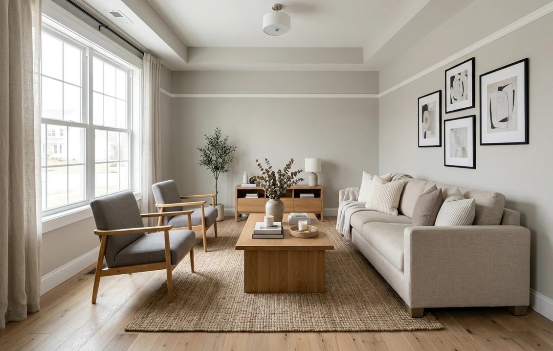
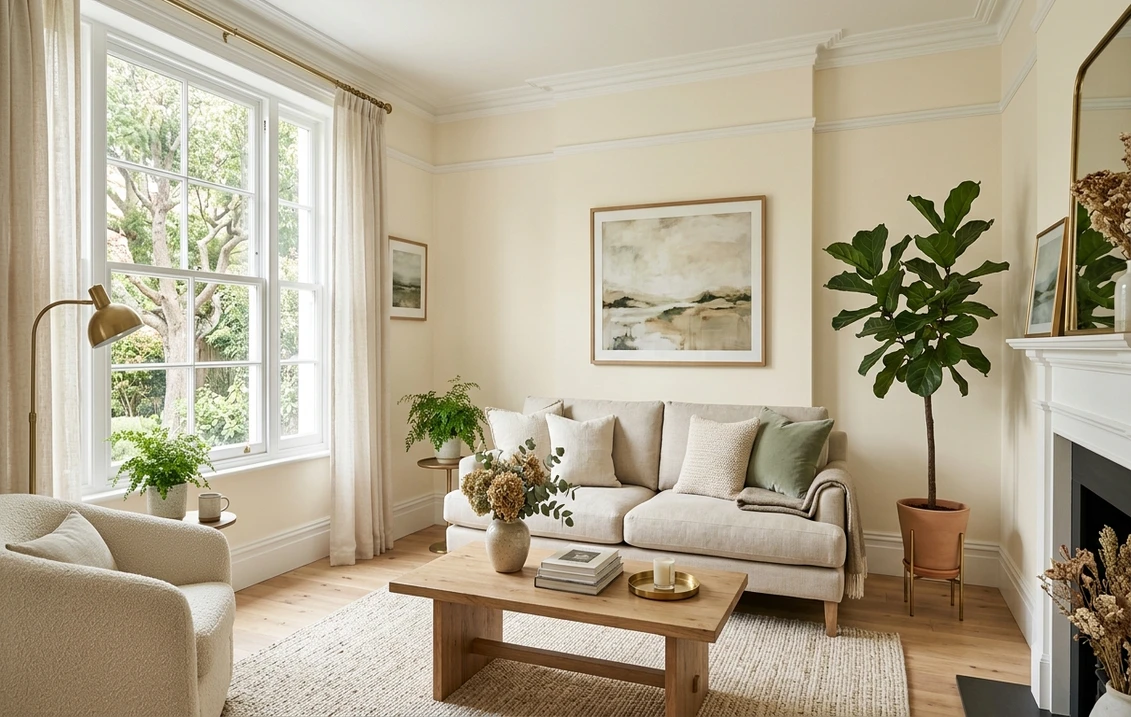
- Living rooms and open-plan spaces: the gentle warmth keeps a big, bright room from feeling sterile, and the high LRV carries light window to window. Pairs naturally with warm wood and linen.
- Bedrooms: warm enough to feel restful, neutral enough to sit under any bedding or art. A soothing backdrop, not a statement.
- Kitchens and cabinetry: one of its strongest uses. On cabinets it is a warm, timeless alternative to bright white that pairs beautifully with wood floors, butcher block, and brass or aged-bronze hardware.
- Trim and millwork: a warm trim white softens the line between wall and woodwork, suiting traditional, farmhouse, and transitional interiors better than an icy white.
Two situations call for care. A windowless north-facing bathroom can read flat, and in a strict modern, high-contrast scheme the white may feel too soft against true blacks and cool grays. Sample those first. For a barely-there color in a coastal or spa-style space, compare the soft green-gray of SW Sea Salt.
Trim, ceiling, and decor that pair best
Dover White is warm on its own, so pairing it is less about matching a trim white over a colored wall and more about playing with contrast and warmth. These combinations land reliably:
- Crisp trim contrast: to make millwork pop, a brighter, cleaner white like SW Pure White (7005, LRV 84) or SW Extra White (7006, LRV 86) lifts it without going cold.
- Tone-on-tone calm: for a seamless look, run Dover White on both walls and trim and let sheen separate them: eggshell walls, semi-gloss trim.
- Ceiling: the same Dover White or a flat white ceiling keeps the warmth consistent overhead. A very cool ceiling white can make the walls look faintly yellow.
- Coordinating deeper tones: warm greiges and soft taupes pair naturally for an accent wall or adjoining room. Set against a warm neutral like SW Accessible Beige or the middle-ground greige SW Agreeable Gray, Dover White reads as a clean, intentional white.
- Decor and finishes: warm metals (brass, gold, aged bronze), natural linen and rattan, white oak and walnut, and a little matte black for definition. Cool chrome and gray-washed floors fight it.
If the surrounding rooms lean cooler and grayer, Dover White can clash with a true gray wall, where a cleaner white bridges better; our profile of SW Repose Gray shows how a cooler neutral wants a cooler trim. Once the color is set, our interior house painting cost guide covers what walls, trim, and ceilings should run.
Test Dover White walls, crisp white trim, and warm oak in a single preview, free.
Dover White vs the warm whites people cross-shop
Dover White is usually weighed against a short list of soft whites and creams:
| Color | LRV | Undertone | How it differs from Dover White |
|---|---|---|---|
| SW Dover White (6385) | 83 | Warm, yellow-cream | The baseline: soft warm white, clean for its warmth |
| SW Alabaster (7008) | 82 | Warm with green-gray | Slightly softer and more muted; can read greige in cool light |
| SW Greek Villa (7551) | 84 | Warm, peachy-cream | A touch creamier and brighter; very forgiving in cool rooms |
| SW Antique White (6119) | 73 | Deep yellow-cream | Noticeably darker and more golden; a true cream, not a white |
| BM White Dove (OC-17) | 85 | Soft warm neutral | Slightly brighter and more neutral; the cross-brand favorite |
Try it on your house
No photo? Try a sample
Sources: Sherwin-Williams SW 6385, SW 7008, SW 7551, and SW 6119 color data; Benjamin Moore OC-17 color data; The Spruce.
So which one? Dover White is your pick for a soft warm white that stays relatively clean. Reach for Greek Villa when you want creamier and more cool-light proof, Alabaster for the most muted softness, and Antique White only if you actually want a frank cream. Deciding between the two big US brands? Our Sherwin-Williams vs Benjamin Moore interior comparison covers the formula, coverage, and price differences once the shade is chosen.
How to test Dover White before you commit
A fan-deck chip is the worst way to judge a white: it reads roughly 25 to 35 percent lighter than a rolled wall and cannot show how warm Dover White goes under your light. The reliable method is a large peel-and-stick sample on two walls, viewed mid-morning, mid-afternoon, and after dark under your normal bulbs. The warmest moment matters most: how creamy it gets in your brightest light tells you whether the yellow bothers you.
The faster, no-paint first pass is a digital visualizer. Upload a photo of the room and apply Dover White beside a cleaner white and a warmer cream to see which way your light pulls it, then let a physical sample confirm the winner.
Preview Dover White beside a cleaner white and a warmer cream.
Frequently asked questions
Is Dover White a warm or cool white?
Dover White (SW 6385) is a warm white. Its warmth comes from a yellow-cream undertone, and a faint touch of beige keeps it soft rather than icy. Compared with Alabaster it is less muted, and you get none of that color's green-gray cast, which is why it stays relatively clean for a warm white. In cool or dim light it reads quieter and closer to a plain white, but it never tips cool or blue.
What is the LRV of SW Dover White?
Dover White has a Light Reflectance Value of 83 on the Sherwin-Williams color data. That places it at the bright end of the off-white range: high enough to clearly read as white and bounce light around a room, but a notch below a stark builder white like Extra White (LRV 86), which is what gives Dover White its soft, easy quality.
What trim color goes with Dover White walls?
If Dover White is on the walls and you want crisp millwork, a cleaner, brighter white like SW Pure White (7005, LRV 84) or SW Extra White (7006, LRV 86) gives contrast without going cold. For a seamless look, use Dover White on both walls and trim and let the sheen difference (eggshell walls, semi-gloss trim) do the separating. Avoid a very cool ceiling or trim white, which can make Dover White look faintly yellow by comparison.
What is the difference between Dover White and Alabaster?
Both are popular warm whites at nearly the same brightness (Dover White LRV 83, Alabaster LRV 82), but Alabaster carries a subtle green-gray pigment that can make it read as a soft greige in cool north light. Dover White leans a cleaner yellow-cream and stays more reliably white. Choose Dover White for a soft warm white that stays crisper; choose Alabaster when you want the most muted, blended softness.
See SW Dover White under your real light, with a cleaner white and a warmer cream alongside.
Disclaimer: Sherwin-Williams and SW 6385 Dover White are trademarks of The Sherwin-Williams Company. Benjamin Moore and Behr are trademarks of their respective owners. FacadeColorizer is an independent paint visualization service and is not affiliated with, endorsed by, or sponsored by Sherwin-Williams, Benjamin Moore, or Behr. Screen color approximates the manufacturer's sample; always confirm with a physical sample before purchase. Sources: Sherwin-Williams SW 6385 Dover White color data 2026, Sherwin-Williams SW 7008 Alabaster, SW 7551 Greek Villa, SW 6119 Antique White, SW 7005 Pure White and SW 7006 Extra White color data, Benjamin Moore OC-17 White Dove color data, and The Spruce warm-white references.
Trademarks mentioned (Sherwin-Williams, Benjamin Moore, Behr, Caparol, Brillux, Sto, Alpina, Valspar, PPG, Glidden, Dulux, Crown Trade, Sandtex, Farrow & Ball, Johnstone's, Leyland) are property of their respective owners. FacadeColorizer is independent and not affiliated with any of them. Nominative fair use under Lanham Act §1125.