You roll on the gray you fell for, wait for it to dry, and at dusk it turns blue. The beige goes pink under your LED bulbs. The white looks dingy next to bright trim. None of that is a paint defect. These are undertone problems, and they trace back to one decision made before you opened a fan deck: which color family the room belongs to.
This guide maps the whole neighborhood of interior neutrals. We cover the seven paint color families behind most US interior repaints (gray, greige, sage green, beige, taupe, white, and black), and for each one: the undertones to watch, the rooms where it shines, the trim that flatters it, and one most-painted reference color. Treat it as a hub. Once you know the family, jump to the deep dives linked throughout for codes, LRV charts, and side-by-side tests.
Upload one photo and preview gray, greige, sage, beige, and white on your actual walls in 30 seconds, free.
Two things that decide every color family: undertone and LRV
Two ideas do most of the heavy lifting. Undertone is the faint secondary color hiding under the main one. A "gray" is almost never pure gray; it leans blue, green, violet, or warm taupe, and that lean is what you see once the room's light hits the wall. North-facing rooms (cool blue daylight) can make a warm beige look gray, while south and west rooms can make a soft white read butter-yellow. It is why the same can of paint looks different in two houses.
LRV (Light Reflectance Value) is a 0 to 100 scale of how much light a color bounces back (0 is black, 100 is pure white), published on every technical data sheet and a better predictor of behavior than the chip name. As a field guide: above 70 reads white or pale, 50 to 70 is a light mid-tone, 25 to 50 is a true mid-tone (most "moody" greige and sage live here), and under 25 reads dark. A low-LRV color feels cave-like in a windowless room but rich in a sun-drenched one.
The seven interior paint color families at a glance
Here is the whole landscape on one screen. Find your family, then drop into the section below for detail.
| Family | Typical undertone | Best-fit rooms | Reference color |
|---|---|---|---|
| Gray | Blue, green, or violet | Bedrooms, bathrooms, modern living rooms | SW Repose Gray 7015 |
| Greige | Warm taupe, faint green or purple | Open-plan main floors, hallways | SW Agreeable Gray 7029 |
| Sage green | Gray-green, soft yellow-green | Kitchens, cabinets, bedrooms, studies | SW Evergreen Fog 9130 |
| Beige | Yellow, gold, sometimes pink | Living rooms, bedrooms, north-facing rooms | SW Accessible Beige 7036 |
| Taupe | Warm brown-gray, mauve | Dining rooms, accent walls, cozy dens | BM Revere Pewter HC-172 |
| White and off-white | Warm cream or cool blue-gray | Trim, ceilings, whole-home, kitchens | BM White Dove OC-17 |
| Black and charcoal | Blue-black, brown-black, green-black | Accent walls, doors, cabinetry, trim | BM Black Beauty 2128-10 |
Try it on your house
No photo? Try a sample
Reference colors and undertone notes from Sherwin-Williams and Benjamin Moore technical data sheets (2026). LRV figures appear in each family section below.
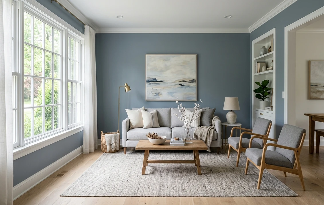
Gray: the modern default, and its blue trap
Gray dominated US interiors through the 2010s and is still the safest "modern neutral" for a buyer-friendly repaint. The catch is undertone: a gray that looks neutral on the chip can flip blue, green, or violet on the wall depending on light, and a too-cool gray in a north room reads cold and clinical.
- Cool blue-gray: Sherwin-Williams Repose Gray (SW 7015, LRV 58) is the most-painted light gray in the country because its blue-violet undertone is gentle. Full breakdown in our Repose Gray undertones and best rooms guide.
- Warmer "almost greige" gray: when a straight gray feels too cold, slide toward greige (next section) instead of fighting the undertone.
- Best rooms: bedrooms and bathrooms (cool feels restful) and contemporary living rooms with plenty of glass.
- Trim: a crisp warm white like BM White Dove keeps gray from reading flat, while pure cool whites can make a cool gray look dingy by comparison.
Choosing among many grays at once? Our Sherwin-Williams interior color guide ranks the brand's top grays with codes and LRV, and the calming master bedroom colors guide shows which read soft rather than cold at night.
Greige: gray plus beige, the whole-house workhorse
Greige is the hybrid that solved the "gray is too cold, beige is too dated" standoff. It carries enough gray to feel current and enough beige to feel warm, which makes it the default where one color must flatter a kitchen, a living area, and a hallway at once.
- The category reference: Sherwin-Williams Agreeable Gray (SW 7029, LRV 60) is arguably the most-painted greige in the US. Our Agreeable Gray undertones guide covers where its faint green-purple base shows and where it disappears.
- Warmer greige: Sherwin-Williams Accessible Beige (SW 7036) sits on the beige-leaning edge of greige, detailed in our Accessible Beige best-rooms guide.
- Best rooms: anywhere a single color must travel: great rooms, open kitchens, stairwells, and connected hallways.
- Watch for: warm west light can tip the warmest greiges toward tan and cool north light can leave the grayest ones flat, so sample on the actual wall.
Greige anchors most "best of" lists: see where it lands in our best interior paint colors for 2026 and the top 15 living room paint colors roundup.
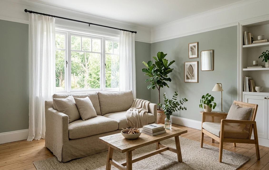
Sage green: the color of the moment
If one family has taken share from gray lately, it is sage. Soft, gray-tinted greens read calming and natural, photograph beautifully, and are among the most-requested kitchen cabinet and bedroom colors in the US right now.
- The defining color: Sherwin-Williams Evergreen Fog (SW 9130, LRV 30) was the brand's 2022 Color of the Year and remains the benchmark muddy sage. At LRV 30 it deepens dramatically in low light.
- Lighter sages (LRV 40s to 50s) keep a room airy; deeper sages (LRV 20s to low 30s) feel enveloping and suit cabinetry and accent walls.
- Best rooms: kitchen cabinets, bedrooms, home offices, and reading nooks.
- Trim and pairing: a warm off-white softens sage and brass hardware brings out the green, while cool stainless can make a gray-sage read colder.
Sage on cabinets deserves its own playbook: the complete kitchen cabinet colors guide covers durability and sheen, and the trending kitchen cabinet colors for 2026 lists the sage shades designers specify now.
Free AI visualizer. Try Evergreen Fog and other sages on your real walls or cabinets before buying a sample.
Beige: warm, forgiving, and quietly back in fashion
Beige spent a decade out of favor while gray ruled, but warm neutrals are back and modern beige is far more refined than the builder-yellow of the early 2000s. Its strength is light: it holds its warmth in cool north-facing rooms where gray goes cold, the smart choice for the dim side of the house.
- The modern reference: Sherwin-Williams Accessible Beige (SW 7036, LRV 58) is the crossover greige-beige that defines today's beige: warm without being yellow. Deep dive in the Accessible Beige undertones guide.
- Undertones to test: warm ones read yellow or gold; a few beiges hide a pink or peach base that only shows under LED bulbs, so check at night.
- Best rooms: living rooms, bedrooms, and any north-facing space that needs to feel warmer.
- Pairing: beige loves warm wood, rattan, and cream trim; cool blue-grays can clash unless the gray also carries warmth. It is a popular, restful bedroom base for exactly this warmth reason.
Taupe: the sophisticated brown-gray
Taupe is greige gone a step deeper and warmer: a brown-gray with real presence. Reach for it when a neutral needs to feel intentional rather than safe. Because it holds both warm and cool notes at once, it bridges palettes that would otherwise clash.
- The icon: Benjamin Moore Revere Pewter (HC-172, LRV 55) is the most famous taupe-greige in the country, a warm gray with a soft green base that flatters almost any wood floor. Full analysis in our Revere Pewter review.
- Undertones to watch: taupe can lean mauve (a pink-purple cast) in cool light, which surprises people expecting plain brown. Test on a north wall first.
- Best rooms: dining rooms, dens, libraries, and accent walls that want quiet depth.
- Pairing: works with warm cream and cool white trim; against bright white it reads grayer, against ivory it reads warmer and browner.
White and off-white: the family that runs every room
Whites are the most-used and most-misunderstood family. There is no single "white": warm whites have a cream or yellow base, cool whites a blue or gray base, and true whites sit as close to neutral as paint gets. The base is everything. A warm white on cool trim, or a cool white in a warm room, is the most common reason a fresh job looks slightly off.
- Warm white benchmark: Benjamin Moore White Dove (OC-17, LRV 85) is the best-selling soft white in the US, a creamy near-neutral that flatters walls, trim, and cabinets alike. See the White Dove OC-17 review.
- Soft warm white walls: Sherwin-Williams Alabaster (SW 7008, LRV 82) is creamy on south and west walls but can read greige in cool north light; our Alabaster on north-facing rooms guide shows when to switch.
- Creamy off-white at the warmest edge: the Swiss Coffee shade, compared across brands in our Swiss Coffee Behr vs Benjamin Moore OC-45 comparison.
- Best uses: trim and ceilings everywhere, whole-home schemes, and kitchens and bathrooms where bright and clean is the goal.
- The trim rule: keep wall white and trim white in the same temperature family, a few LRV points apart, not a warm wall against a cool builder white.
Black and charcoal: contrast, used sparingly
The smallest family by square footage but the one with the biggest impact. Black and deep charcoal have moved from bold accent to mainstream on interior doors, window sashes, cabinetry, and feature walls. Undertone still matters: an interior black can lean blue, brown, or green, which decides whether it reads cold and graphic or soft and warm.
- True soft black: Benjamin Moore Black Beauty (2128-10) is a near-true black with a whisper of blue, a popular choice for doors and trim.
- Warm charcoal: browner blacks feel cozier on cabinetry and libraries; cooler blue-blacks feel crisp on metal-frame windows.
- Best uses: interior doors, window mullions, a single accent wall, lower cabinets, and built-ins. Whole rooms in black need strong natural light and clear intent.
- Pairing: black needs a warm or natural element nearby (wood, brass, leather, greenery) to avoid feeling stark. Charcoal lower cabinets are a major kitchen trend; pair a dark base with a lighter upper to keep it from feeling heavy.
How to choose the right family for your room
Now the choice gets practical. Work through these four questions in order and the right family usually picks itself:
- Which way does the room face? North-facing and dim rooms favor warm families (beige, greige, warm white, sage); cool families read cold there. South and west rooms carry cooler grays and whites without going flat.
- How much natural light? Low-light rooms want a higher LRV (70+) to stay bright, unless you are going moody on purpose. Bright rooms take a mid-tone (sage, taupe, deep greige) without feeling dark.
- Warm or cool fixed elements? Match the family to what you cannot change: warm wood and brass favor greige, beige, sage, and warm white; cool tile, nickel, and marble favor gray and cool white.
- What is the color's job? A whole-floor backdrop wants a flexible greige or warm white; a feature wall or cabinet run can take a committed sage, taupe, or charcoal.
For a room-by-room version of this decision, the paint color ideas by room guide walks through every space with specific picks, and the best interior paint colors of 2026 gathers the current favorites across all seven families.
Pick a brand, then a chip
Every family above exists in every major brand, but formulations and undertones differ. Most homeowners pick on store access, price, and the exact shade they love. These hubs and head-to-heads help:
- Sherwin-Williams: the Sherwin-Williams interior colors guide for the full lineup of grays, greiges, and whites with codes.
- Benjamin Moore: the Benjamin Moore interior colors guide for White Dove, Revere Pewter, and warm neutrals.
- Behr: the Behr interior colors guide for the Home Depot lineup and budget-friendly matches.
- Head-to-head: Sherwin-Williams vs Benjamin Moore and Behr vs Sherwin-Williams compare quality, coverage, and price.
Once the color is chosen, the interior house painting cost guide covers per-square-foot pricing and what a professional 2026 repaint runs.
The one step that prevents a repaint: test on your wall
Here is the honest limit of any chart, this one included. Your light, your floors, your bulbs are yours alone, so none of them can tell you exactly how a color will land on your wall. A fan-deck chip reads 25 to 35% lighter than a rolled wall and cannot show undertone shift. The reliable method is a 12-inch peel-and-stick sample on two walls, checked morning, afternoon, and after dark.
The faster no-paint option is a visualizer: upload one photo and preview a whole family of colors on your actual walls before buying a sample pot. Nothing rules out the families that go wrong in your light faster, leaving you just the few worth sampling for real.
Free AI paint visualizer. Upload your photo and compare gray, greige, sage, beige, taupe, and white side by side.
Frequently asked questions
What is the difference between greige and taupe?
Both are warm gray-beige neutrals, but greige is lighter and grayer while taupe is deeper and browner. Greige (for example SW Agreeable Gray, LRV 60) reads as a light, flexible backdrop and is the go-to for open main floors. Taupe (for example BM Revere Pewter, LRV 55) carries more brown and presence, which suits dining rooms, dens, and accent walls. In short: greige recedes, taupe makes a statement.
Which paint color family is best for a north-facing room?
Warm families. North-facing rooms get cool blue daylight with no direct sun, which strips warmth from a color and can make gray and cool white read cold or dingy. Beige, greige, sage green, and warm whites hold their character better because they carry enough yellow base to resist the shift. If you love gray, choose a warmer "greige-leaning" gray and always test a sample on the actual north wall first.
What does LRV mean and why does it matter for color choice?
LRV stands for Light Reflectance Value, a 0 to 100 scale of how much light a color reflects (0 is black, 100 is pure white), published on every technical data sheet. It predicts behavior: a high LRV (70+) keeps a low-light room bright, while a mid-tone (25 to 50) like a deep sage or greige feels rich in a sunny room but cave-like in a dim one. Checking LRV first is the best way to avoid a room that turns out darker than you pictured.
Is sage green still on trend for 2026?
Yes. Sage green has been one of the fastest-growing interior families in recent years and remains strong into 2026, especially on kitchen cabinets, bedrooms, and home offices. Muddy, gray-tinted sages such as Sherwin-Williams Evergreen Fog (SW 9130) are the benchmark. Sage reads calming and natural and pairs with both warm brass and cool marble, which is a big part of why it has held its popularity rather than fading like brighter trend colors.
How many paint colors should I use in one home?
A common designer approach is one flexible whole-home neutral (a greige or warm white) on most walls, one coordinating trim white, and one or two accent colors from a different family (a sage cabinet, a charcoal door, a taupe dining room) for spaces that want their own identity. Keeping sightline-linked areas in a single family creates flow, while bounded rooms can break away. Sample each color in its own room before committing.
Upload your room photo and preview every interior color family on your real walls before buying a sample pot.
Disclaimer: Sherwin-Williams, Benjamin Moore, and Behr, along with the specific color names and codes referenced here (SW 7015 Repose Gray, SW 7029 Agreeable Gray, SW 9130 Evergreen Fog, SW 7036 Accessible Beige, SW 7008 Alabaster, BM HC-172 Revere Pewter, BM OC-17 White Dove, BM 2128-10 Black Beauty, OC-45 Swiss Coffee), are trademarks of their respective owners. FacadeColorizer is an independent paint visualization service and is not affiliated with, endorsed by, or sponsored by any paint manufacturer. Color reproduction on screens approximates the manufacturer's chip; always confirm with a manufacturer sample before purchase. LRV and undertone figures are drawn from the respective manufacturer technical data sheets (2026), with additional reference to The Spruce and professional designer color guidance.
Trademarks mentioned (Sherwin-Williams, Benjamin Moore, Behr, Caparol, Brillux, Sto, Alpina, Valspar, PPG, Glidden, Dulux, Crown Trade, Sandtex, Farrow & Ball, Johnstone's, Leyland) are property of their respective owners. FacadeColorizer is independent and not affiliated with any of them. Nominative fair use under Lanham Act §1125.