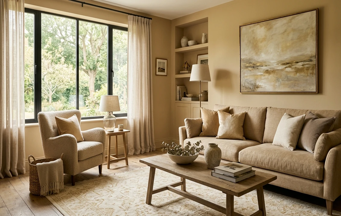

A champagne paint color is one of those shades that sounds glamorous on a chip and then quietly does the most useful job in the house. It is a warm neutral that leans gold and beige at once, soft enough to read as a backdrop, rich enough that the room never feels flat or builder-bland. The trouble is that "champagne" is a marketing word, not a fixed formula. One brand's champagne is a creamy off-white, another's is a pale taupe with a yellow flush, and a third's is almost a muted gold. This roundup sorts the real contenders across Sherwin-Williams, Benjamin Moore, and Behr so you can pick the one that actually fits your light.
Champagne sits in the warm-neutral family, the same neighborhood as cream, beige, and the gold-leaning greiges. If you want the full map of how these families relate, start with our interior paint color families guide, then come back here for the specific champagne picks. For the broader neutral shortlist, the neutral paint colors roundup pairs well with this page.
Upload a photo of your actual room and preview warm gold-beige neutrals under your own light in about 30 seconds, free.
What "champagne" actually means in paint
Picture the drink, not the metal. Champagne the color is pale, warm, and a little luminous, with a gold-beige base and a faint hint of yellow or peach depending on the formula. It is warmer than a true greige and cleaner than a heavy tan. The defining trait is that low-key glow: in good light it looks soft and expensive, and in poor light it can slide toward plain beige or, worse, toward a sallow yellow.
Because the word is unregulated, the smart way to shop champagne is to ignore the name and read three things: the undertone, the Light Reflectance Value (LRV), and the room you are putting it in. A champagne with a green-gold undertone behaves nothing like one with a pink-gold undertone, even if both sit at the same lightness. The table below gives you those numbers up front.
The best champagne paint colors for 2026, compared
These are the shades designers reach for when a client asks for "champagne" across the three big US brands, with the published LRV and the dominant undertone so you know what you are really getting:
| Color (Brand + Code) | LRV | Undertone | Best use |
|---|---|---|---|
| SW Champagne (SW 6644) | about 75 | Yellow-gold, soft | Bedrooms, hallways, low-light rooms |
| SW Creamy (SW 7012) | about 81 | Warm cream, faint yellow | Whole-room neutral, trim partner |
| BM Pale Oak (OC-20) | about 70 | Warm greige, pink-beige lean | Open living spaces, north light |
| BM Manchester Tan (HC-81) | about 64 | Green-gold, muted | Dining rooms, studies, deeper champagne |
| Behr Sand Pearl | about 73 | Gold-beige, warm | Budget whole-house neutral |
| SW Accessible Beige (SW 7036) | about 58 | Greige with gold warmth | Bright rooms wanting a deeper champagne |
Sources: Sherwin-Williams, Benjamin Moore, and Behr published color and LRV data 2026; designer field reports compiled by FacadeColorizer. LRV values are approximate and rounded.
A quick read of the table: anything near LRV 75 and up will behave like a luminous off-white champagne, ideal when you want lightness with warmth. Drop into the 60s and the gold deepens into a true tan-champagne that wants more natural light to stay flattering. That single number is the best predictor of how the color lands on a big wall.
Free AI visualizer. Test a light and a deeper champagne on your real walls before buying a sample.
The light champagne whites: SW Champagne and Creamy
If "champagne" to you means a glowing, barely-there warm neutral, these two are the anchors.
Sherwin-Williams Champagne (SW 6644)
The one named for the job. At roughly LRV 75 it is a soft yellow-gold that reads as a warm, creamy neutral rather than a true white. It is the right answer for a north-facing bedroom or a dim hallway that needs warming up without going dark. The caution: that yellow-gold base can tip too sunny in a room with strong afternoon light, so it is happiest where the light is cool or limited. Pair it with a crisp white trim to keep it from looking like a single muddy wash.
Sherwin-Williams Creamy (SW 7012)
A touch lighter at about LRV 81, Creamy is the champagne-adjacent pick when you want something closer to a warm white that still carries a gold whisper. It is one of the most forgiving warm neutrals in the SW deck, working as a whole-room color and as a soft trim partner for deeper champagnes. If you are torn between a true white and a champagne, Creamy is the honest middle. For where it sits among other whites, our best white paint for walls guide is the next stop.
The greige-champagne crossovers: Pale Oak and Accessible Beige
Champagne and greige overlap heavily, and two of the most popular "champagne" requests are really warm greiges with a gold tilt.
Benjamin Moore Pale Oak (OC-20)
At about LRV 70, Pale Oak is a warm greige with a pink-beige lean that often reads as a cool, sophisticated champagne in open living spaces. It is a chameleon: it can look near-white in bright rooms and pull a soft mushroom-pink in shade. That shift is exactly why people love it and why a swatch is mandatory. It is the champagne to choose when you want restraint rather than gold warmth.
Sherwin-Williams Accessible Beige (SW 7036)
The deeper, more grounded champagne. At LRV 58 it is a greige with a gold warmth that gives you the richer end of the champagne range without sliding into a heavy tan. It needs decent light to stay luminous; in a dim room it can read flat. In a bright living room it is a designer-favorite warm neutral. For the full landscape of warm gray-beiges, our greige warm-neutral paint guide maps how these crossovers compare.
See walls, trim, and floor together in one preview, free, before the undertone surprises you.
The deeper gold champagnes: Manchester Tan and Sand Pearl
When a client wants the room to feel unmistakably champagne, gold and all, these carry it.
Benjamin Moore Manchester Tan (HC-81)
A muted, green-gold champagne at about LRV 64. It is the dressy option for a dining room or a study, with enough depth to feel intentional and enough gold to feel warm. The green in the undertone keeps it from going brassy, which is the failure mode of cheaper golds. Watch it under warm bulbs at night; the gold intensifies, so a swatch under your actual lighting matters.
Behr Sand Pearl
The value pick. At roughly LRV 73, Sand Pearl is a warm gold-beige that delivers the champagne look at a big-box price, which makes it a strong whole-house neutral when you are covering a thousand square feet. The trade-off is that the gold can read a little simpler than the Benjamin Moore options, with less of the undertone shift that gives premium colors their depth. For a kid-friendly hallway or a rental refresh, that simplicity is a feature, not a flaw. The wider Behr palette is covered in our Behr interior paint colors guide.
How to choose your champagne by room and light
Champagne lives or dies by light, more than almost any other neutral, because its gold base amplifies whatever the room throws at it. A few rules that hold up:
- North-facing, low light: reach for a lighter champagne at LRV 73 and up (SW Champagne, Creamy, Behr Sand Pearl). They keep the room warm without dragging it dark.
- South and west, strong light: a yellow-gold champagne can tip too sunny here. Lean on the greige-champagnes like Pale Oak or the green-gold Manchester Tan to stay balanced.
- Bright, open living spaces: a deeper champagne like Accessible Beige at LRV 58 reads rich and grounded without going flat, because the light keeps it luminous.
- Warm artificial light at night: every champagne shifts gold under incandescent and warm LED bulbs. Always check your sample after dark, not just at noon.
Champagne pairs naturally with crisp whites, soft greiges, warm woods, and brushed gold or unlacquered brass hardware. It clashes with cool, blue-based grays, which fight the gold base and make the whole scheme look uncertain. For building a full palette around it, our interior color schemes guide walks through how to pair a warm neutral with accents.
How to test champagne before you commit
Champagne is the warm neutral that fools people most on a screen, because the gold either reads stronger or vanishes entirely depending on your monitor. Two ways to get it right before you buy gallons:
- Use peel-and-stick samples: the major brands sell sample sheets painted in the real color. Put two candidates on different walls and check them mid-morning, mid-afternoon, and at night under your normal bulbs. Watch for the gold tipping sunny on south walls.
- Preview it digitally first: upload a real photo of your room and apply a light and a deeper champagne before you order a single pot, narrowing the field to one or two worth sampling. Budget context for the repaint is in our interior painting cost guide.
Preview a champagne shade against a warmer and a cooler option, side by side, free. One HD render plus three variations on the house.
Frequently asked questions
What color is champagne paint?
Champagne is a warm neutral with a gold-beige base and a faint yellow or peach undertone, named for the drink rather than the metal. It is warmer than a true greige and cleaner than a heavy tan, reading soft and luminous in good light. Because the name is unregulated, formulas range from creamy off-whites like SW Champagne (LRV about 75) to deeper golds like Benjamin Moore Manchester Tan (LRV about 64).
Is champagne the same as beige or greige?
They overlap but are not identical. Beige is a flat warm tan, greige is a gray-beige blend, and champagne is the gold-leaning warm neutral that sits between them with a faint luminous glow. Some popular champagne picks, like Benjamin Moore Pale Oak and Sherwin-Williams Accessible Beige, are really warm greiges with a gold tilt, which is why the categories blur in practice.
What is the best champagne paint color for a low-light room?
In a north-facing or dim room, choose a lighter champagne at LRV 73 or higher, such as Sherwin-Williams Champagne (SW 6644), Creamy (SW 7012), or Behr Sand Pearl. These keep the room warm without dragging it dark. Avoid the deeper golds like Accessible Beige (LRV 58) in poor light, since they can read flat and lose their luminous quality.
What colors go with champagne paint?
Champagne pairs naturally with crisp whites, soft warm greiges, natural woods, and brushed gold or unlacquered brass hardware. It works against deep navy or charcoal as an accent for contrast. Avoid cool, blue-based grays, which fight the gold base and make the scheme look uncertain. A crisp white trim keeps a champagne wall from reading as a single muddy wash.
Why does my champagne paint look yellow?
Champagne has a gold base, and strong south or west light plus warm bulbs amplify that yellow, especially at night. If a champagne reads too sunny, switch to a greige-champagne like Benjamin Moore Pale Oak or the green-gold Manchester Tan, which balance the gold. Always check a sample under your actual lighting both at noon and after dark before committing to a whole room.
Preview shades like SW Champagne, Pale Oak, and Manchester Tan on your actual walls under your own light before buying a single gallon.
Disclaimer: Sherwin-Williams, Champagne (SW 6644), Creamy (SW 7012), Accessible Beige (SW 7036), Benjamin Moore, Pale Oak (OC-20), Manchester Tan (HC-81), Behr, and Sand Pearl are trademarks of their respective owners. FacadeColorizer is an independent paint visualization service and is not affiliated with, endorsed by, or sponsored by any brand named here. LRV and color values are approximate, rounded, and based on each manufacturer's published data. Color reproduction on screens approximates the manufacturer's sample; always confirm with a manufacturer sample under your own light before purchase. Sources: Sherwin-Williams, Benjamin Moore, and Behr published color and LRV data 2026, designer field reports compiled by FacadeColorizer.
Trademarks mentioned (Sherwin-Williams, Benjamin Moore, Behr, Caparol, Brillux, Sto, Alpina, Valspar, PPG, Glidden, Dulux, Crown Trade, Sandtex, Farrow & Ball, Johnstone's, Leyland) are property of their respective owners. FacadeColorizer is independent and not affiliated with any of them. Nominative fair use under Lanham Act §1125.


