
The first time I cut in Benjamin Moore Hale Navy around a client's dining room window, the homeowner stood in the doorway and said, flatly, "That's black." It was noon and the room faced north, so she was half right. Two hours later the sun swung west, hit the wall, and the same paint bloomed into a deep, warm blue that made her oak table look like a million dollars. That gap, between what a navy chip promises and what the rolled wall actually does, is the whole reason this guide exists. Navy paint colors are the most rewarding and the most misjudged family on the deck. Here are the 12 deep blue shades worth your time, what each one really does under light, and where I would and would not use them.
A word on what counts as navy. A true navy paint sits low on the Light Reflectance Value scale (roughly LRV 3 to 12), reads clearly blue rather than gray or teal, and almost always carries a secondary undertone (green, violet, or black) that decides how it behaves in your room. This article is the family hub: a fast, honest comparison of the best deep blue wall paint across Benjamin Moore, Sherwin-Williams, Behr, and Farrow and Ball. It sits inside our wider interior paint color families guide, and it pairs with our broader interior blue paint shades guide (that one covers the full blue spectrum from sky to slate; this one stays in the deep end).
Upload a photo of your real room and preview any navy under your own light in about 30 seconds, free.
What makes navy tricky: LRV, undertone, and your light
Three numbers and one habit decide whether a navy works. Get these straight and you will skip the two-sample-pots-and-still-wrong cycle that wastes most weekends.
- LRV (Light Reflectance Value): most navies live between 3 and 12. Below about 6 the color reads near-black in any dim or north light and only resolves to blue when direct sun or warm lamps hit it. Above 10 it stays recognizably blue most of the day. Neither is better; they are different jobs.
- Undertone: this is the make-or-break trait. A green-leaning navy (Hague Blue) feels inky and old-world. A violet-leaning navy can go purple under LED. A clean blue navy (Naval) stays crisp and nautical. Always name the undertone before you commit.
- Finish: deep blues show every roller mark and touch-up in a flat sheen. I push clients to eggshell on walls and satin or semi-gloss on trim and cabinets, both for durability and to let the color read with some life instead of dead matte.
- The habit: navy is the family most punished by a tiny chip. A 2-inch swatch hides the undertone and exaggerates the darkness. You have to see it big, on your wall, across a full day.
One blunt opinion before the list: navy is not a one-coat color. Plan on a tinted gray primer plus two finish coats, sometimes a third on the cut-in edges. Anyone selling you a single-coat deep blue is selling you streaks.
Free AI visualizer. See whether a navy reads blue or black under your own light before buying a pot.
The 12 best navy paint colors, compared
Here is the working shortlist I actually pull from on jobs. LRV values are from each manufacturer's published color data; the undertone and "reads like" notes are field observations across real rooms, not the chip.
| Navy color | Brand / code | LRV | Undertone | Reads like |
|---|---|---|---|---|
| Hale Navy | Benjamin Moore HC-154 | 6.3 | Warm, faint black | Charcoal-blue, near-black in shade |
| Naval | Sherwin-Williams SW 6244 | 4 | Clean blue | True classic navy, crisp and nautical |
| Hague Blue | Farrow and Ball No. 30 | 6.4 | Green | Inky, dramatic, old-world |
| Newburyport Blue | Benjamin Moore HC-155 | 7.9 | Slight green-gray | Softer navy, more forgiving |
| In the Navy | Sherwin-Williams SW 9178 | 8 | Muted gray-blue | Calm, less intense navy |
| Gentleman's Gray | Benjamin Moore 2062-20 | 5.8 | Teal-blue | Rich, peacock-leaning navy |
| Salamander | Benjamin Moore 2050-10 | 5.3 | Green-black | Almost-black navy with depth |
| Cyberspace | Sherwin-Williams SW 7076 | 5 | Blue-gray | Navy-charcoal hybrid, very modern |
| Stiffkey Blue | Farrow and Ball No. 281 | 5.9 | Slate-violet | Moody, slightly purple navy |
| Very Navy (Behr) | Behr M500-7 | 5 | Clean blue | Budget true navy, big-box accessible |
| Dark Navy (Behr) | Behr S530-7 | 4.2 | Blue-gray | Deep dramatic navy on a budget |
| Van Deusen Blue | Benjamin Moore HC-156 | 8.5 | Soft, balanced | Lighter heritage navy, friendly |
Sources: Benjamin Moore, Sherwin-Williams, Behr, and Farrow and Ball published color data 2026; designer and painter field reports compiled by FacadeColorizer.
My picks by job: which navy for which room
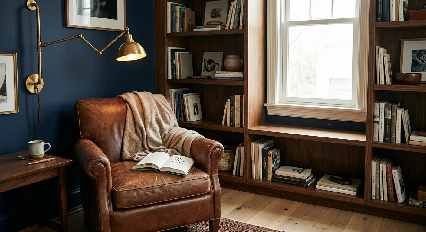
The do-everything navy: Hale Navy
If you want one navy that flatters trim, cabinets, a front door, and an accent wall, this is the one I reach for first. Its warmth keeps it from going cold and corporate, and at LRV 6 it has that chameleon quality (near-black in shade, deep blue in light) that designers love. It is the most-specified navy in America for good reason. For the full breakdown on this single color, including its trim pairings, read our Benjamin Moore Hale Navy HC-154 review.
The true classic navy: Naval
When a client says "I want navy, not blue-black," Naval (SW 6244) is the answer. It reads as an honest, clean, nautical navy with no muddy undertone games. It is gorgeous on kitchen islands and built-ins, and it holds its blue identity better than Hale Navy in low light. The trade-off: it can feel a touch flatter, less moody, less "expensive." That is a feature for some rooms and a bug for others.
The dramatic navy: Hague Blue and Stiffkey Blue
For a small, jewel-box room (a powder room, a study, a dining room you only use at night), the green-leaning Hague Blue or the violet-leaning Stiffkey Blue deliver real drama. They are inky and atmospheric in a way no clean navy can match. Where they do not work: a bright, sun-flooded family room. The depth that looks luxurious by lamplight can read heavy and cave-like in full daylight. Match the moody navy to the moody room.
The soft navy for bedrooms: In the Navy and Newburyport Blue
A full-strength navy on all four bedroom walls can feel like sleeping inside a tuxedo. The grayer, gentler options (In the Navy SW 9178, Newburyport Blue HC-155) give you the color without the weight, which makes them my default for a calming bedroom that still has personality. They forgive imperfect light, too.
The budget navy: Behr
You do not need a boutique brand to get a great navy. Behr Very Navy (M500-7) and Dark Navy (S530-7) are genuinely good deep blues at a big-box price, and the paint-and-primer body coats well. If cost is the deciding factor, start a Behr navy in cart and move on with your life.
See two navies on the same wall in one preview, free, before you commit.
What to pair with navy walls
A deep blue wall is only as good as the colors around it. Navy is a quasi-neutral, so it takes pairings well, but a few combinations consistently outperform the rest:
- Warm white trim (the safe default): a soft white like BM White Dove or SW Alabaster against navy gives crisp, traditional contrast without the harshness of a stark blue-white. This is the pairing I recommend nine times out of ten.
- Brass and aged gold: warm metal hardware and lighting against navy is the single highest-impact, lowest-cost upgrade. It is why navy kitchens with brass pulls photograph so well.
- Natural wood: white oak, walnut, and rattan warm a navy room up and stop it reading cold. Navy plus warm wood plus brass is close to foolproof.
- Soft blush or terracotta: for a less expected scheme, a muted warm pink or clay accent makes navy feel current rather than nautical-cliche.
- Avoid: pure stark white next to a green-undertone navy like Hague Blue. The cool white can make the navy look slightly dirty by contrast. Lean warm.
For a full palette workbook (exact whites, woods, metals, and accent colors that flatter deep blue), see our guide to colors that go with navy blue. If your navy is heading onto cabinet doors specifically, the finish and prep are different, and our blue kitchen cabinet paint colors guide covers that case.
How to test a navy before you commit
Navy is the family where the chip lies most. Two methods beat guessing:
- Paint a large swatch over primer: roll a real sample (12 by 12 inches minimum) on two walls, ideally over a coat of gray primer so the depth shows true. Check it at mid-morning, mid-afternoon, and at night under your own bulbs. A navy that reads blue at 3pm can read black at 8pm, and you need to like both.
- Preview it digitally first: upload a photo of your actual room and apply two or three navy candidates before you buy any pots. It is the fastest way to rule out the ones that go black or purple in your specific light. Budget for the repaint with our interior house painting cost guide.
Preview three navy shades against your trim and floor, side by side, free.
Frequently asked questions
What is the most popular navy paint color?
Benjamin Moore Hale Navy (HC-154) is the most-specified navy in America and the one most designers reach for first. It is a warm, slightly black-leaning navy at LRV 6 that reads near-black in shade and deep blue in direct light. Sherwin-Williams Naval (SW 6244) is the runner-up and the better choice if you want a cleaner, more obviously blue navy.
Does navy paint make a room look smaller?
A deep navy at low LRV absorbs light, so a small or dim room can feel more enclosed, which is great for a cozy study or powder room and risky for a room you want to feel open. To keep a navy room from closing in, use it on one accent wall, pair it with warm white trim and good lamp light, or pick a softer, higher-LRV navy like In the Navy (SW 9178) or Van Deusen Blue (HC-156).
What is the difference between Hale Navy and Naval?
Hale Navy (BM HC-154) is warmer and slightly black-leaning, so it shifts between charcoal and blue depending on light. Naval (SW 6244) is a cleaner, truer navy that holds its blue identity even in low light. Choose Hale Navy for moody, expensive-looking depth; choose Naval when you want an unmistakable classic navy with no undertone surprises.
How many coats does navy paint need?
Plan on a tinted gray primer plus two finish coats, and sometimes a third coat along cut-in edges and corners. Deep blue pigments have lower hide than mid-tones, so a single coat almost always leaves streaks and roller marks. An eggshell sheen on walls and satin or semi-gloss on trim helps the color read evenly and stay cleanable.
What colors go best with navy walls?
Warm white trim (BM White Dove or SW Alabaster), brass or aged-gold hardware, and natural wood like white oak or walnut are the strongest pairings for navy. For a softer, more current look, add muted blush or terracotta accents. Avoid stark blue-white next to a green-undertone navy such as Hague Blue, since the cool contrast can make the wall look slightly dingy.
Preview any deep blue on your actual walls under your own light before buying a single sample.
Disclaimer: Benjamin Moore, Hale Navy (HC-154), Newburyport Blue (HC-155), Van Deusen Blue (HC-156), Gentleman's Gray (2062-20), and Salamander (2050-10) are trademarks of Benjamin Moore & Co. Sherwin-Williams, Naval (SW 6244), In the Navy (SW 9178), and Cyberspace (SW 7076) are trademarks of The Sherwin-Williams Company. Behr, Very Navy, and Dark Navy are trademarks of Behr Process Corporation. Farrow and Ball, Hague Blue (No. 30), and Stiffkey Blue (No. 281) are trademarks of Farrow and Ball Limited. FacadeColorizer is an independent paint visualization service and is not affiliated with, endorsed by, or sponsored by any of these brands. Color reproduction on screens approximates the manufacturer's chip; always confirm with a manufacturer sample under your own light before purchase. Sources: Benjamin Moore, Sherwin-Williams, Behr, and Farrow and Ball published color data 2026, designer and painter field reports compiled by FacadeColorizer.
Trademarks mentioned (Sherwin-Williams, Benjamin Moore, Behr, Caparol, Brillux, Sto, Alpina, Valspar, PPG, Glidden, Dulux, Crown Trade, Sandtex, Farrow & Ball, Johnstone's, Leyland) are property of their respective owners. FacadeColorizer is independent and not affiliated with any of them. Nominative fair use under Lanham Act §1125.


