
The first time a client asked me for a chocolate brown dining room, I winced. For a decade brown was the color you painted over, the builder beige and the 2008 espresso cabinets everyone wanted gone. Then I rolled the second coat, hung one brass sconce, and stood there a little embarrassed at how good it looked. Brown paint is having a real moment in American interiors, and not the muddy version you remember. Done right, a warm brown wall feels like a leather club chair: grounded, expensive, quietly confident. Done wrong, it goes flat and dirty fast. This guide is the family map: the shades worth painting, the undertones that betray you, and the rooms where brown earns its keep.
Quick orientation. Brown is not one color, it is a family that runs from pale dusty taupe-brown all the way down to near-black espresso, with mocha, caramel, and chocolate in between. What unites them is a warm base built on red, orange, or yellow pigment, which is exactly why brown reads cozy where a cool gray reads clinical. This page is one stop in our wider interior paint color families guide, and it sits right next to our earthy warm interior paint colors roundup. Think of this one as the deep-dive on the brown family specifically, where the others zoom out to the whole warm spectrum.
Upload a photo of your actual room and preview a warm brown under your own light in about 30 seconds, free.
The brown paint family, sorted by depth
The most useful thing to know before you shop is where a brown lands on the light scale. LRV (Light Reflectance Value) runs 0 (black) to 100 (white) and tells you how dark a room will actually feel. Browns swing across a huge range, so two colors that both say "brown" on the chip can behave like completely different paints. How the family breaks down indoors:
| Shade | Rough LRV | Reads as | Best use indoors |
|---|---|---|---|
| Taupe-brown | 45 to 55 | Pale, dusty, near-neutral | Whole rooms, low-light spaces, walls you want to feel open |
| Caramel / camel | 30 to 40 | Golden, sunny, warm | Living rooms and dens with decent natural light |
| Mocha | 18 to 26 | Coffee with milk, mid-depth | Cozy bedrooms, studies, dining rooms, accent walls |
| Chocolate | 8 to 14 | Deep, rich, enveloping | Accent walls, dining rooms, libraries, built-ins |
| Espresso / near-black brown | 4 to 8 | Almost black, dramatic | Doors, cabinetry, moody powder rooms |
Sources: manufacturer LRV data for popular brown interior colors 2026; The Spruce and Better Homes & Gardens warm-neutral coverage; designer field reports compiled by FacadeColorizer.
The practical takeaway: if your room is small or short on windows, stay at the top of that table (taupe-brown or caramel). Save chocolate and espresso for an accent wall or a room you want to feel like a cocoon. A common rookie mistake is painting all four walls of a dim north room in chocolate brown, then wondering why it feels like a closet. That is not the color failing, that is LRV 10 doing exactly what LRV 10 does.
Brown undertones: where it goes muddy
Every brown is built by stacking pigment on a base, and that base leaks through as an undertone. People skip this part, and it is the part that decides whether your brown reads "warm leather" or "wet cardboard." Three leans in particular:
- Red-brown (russet, mahogany): the richest and most flattering under warm light, glowing in west and south rooms. The risk: under cool LED bulbs it can tip slightly pink or rust, so test the bulb you actually own.
- Yellow / gold-brown (caramel, camel, golden mocha): the sunniest and friendliest, great for north rooms that need warming up. Push the yellow too far, though, and it slides into mustard or that dated "honey oak" cast.
- Gray-brown (taupe-brown, greige-brown): the most modern and the safest. The gray quiets the warmth so it never feels heavy. The honest downside: in flat daylight it can read as dirty putty. A warm bulb fixes it instantly.
Here is the opinion part. Pure gray-leaning "greige" browns with almost all the warmth pulled out do not work as brown. They read as a slightly off neutral and lose the whole reason you wanted brown. If that is the look you are after, just buy a proper greige and skip the confusion: our greige paint colors guide is the better starting point. When you want a soft pale brown that still reads warm, the taupe paint undertone guide covers that lighter end.
Free AI visualizer. See how a brown shifts under your real bulbs before buying a sample pot.
Best rooms for brown paint colors
Brown is a homebody. It loves rooms where you want to slow down, and it is wasted on bright, busy, pass-through spaces. Where it consistently pays off:
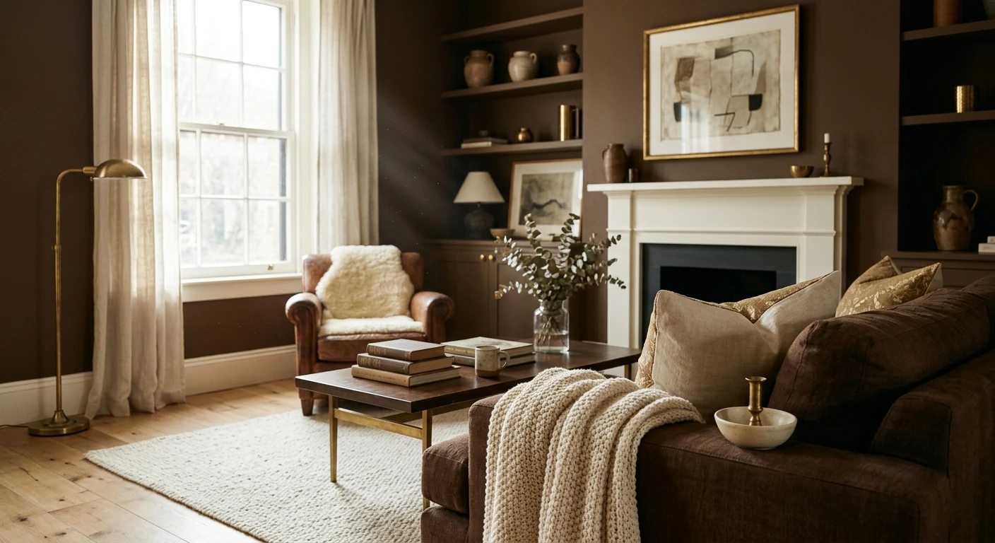
Dining rooms
Brown's strongest room. A chocolate or deep mocha dining room turns an ordinary box into a candlelit restaurant once the lamps come on, and it flatters skin tones around the table better than any cool color. Pair it with warm brass and a cream ceiling. For the wider dining palette, see our elegant dining room paint colors for 2026.
Bedrooms and studies
A mocha or caramel bedroom reads grown-up and restful, like a fine hotel rather than a beige builder special. In a study or home office, a deeper brown makes the room feel like a place to concentrate. Keep the LRV mid-range unless the room has real light. Our guide to calming master bedroom paint colors shows where warm browns sit next to other restful tones.
Living rooms and dens
A whole-room caramel or a single chocolate accent wall behind the sofa gives a living room instant warmth and a backdrop that makes wood, leather, and greenery pop. Brown is the natural partner to natural materials, so let the textures do the rest.
Powder rooms and accents
A windowless powder room is the one place to go all in on espresso brown. There is no daylight to lose, so the darkness becomes a feature: jewel-box and dramatic. Same logic for a single accent wall or a run of built-in shelves.
Where to think twice
Kitchens full of cool stainless and cold downlights can make a mid-brown read drab. Small, north-facing rooms with one tiny window are risky for anything below LRV 30. There, drop to a pale taupe-brown or warm the lighting first.
Trim, ceiling, and decor pairings
A brown wall lives or dies on what frames it. The wrong white trim makes a beautiful chocolate look like spilled coffee; the right one makes it look custom. What actually works:
- Creamy white trim (most harmonious): a soft warm white like Sherwin-Williams Alabaster or Benjamin Moore White Dove flatters brown's warmth and keeps the contrast gentle and expensive-looking. This is the safe default for chocolate and mocha rooms.
- Crisp white trim (cleaner, cooler): a brighter white gives a sharper, more modern frame and makes a deep brown feel intentional rather than dated. Best in contemporary rooms.
- Avoid: a stark blue-white trim against a warm red-brown. The cool-against-warm fight makes the brown look dirty and the trim look icy. Keep both in the same temperature lane.
- Ceilings: a warm white ceiling lifts a dark brown room and keeps it from feeling low. In a small jewel-box space you can paint the ceiling the wall color for a wrapped, cocoon effect, but only when you want drama.
- Floors and decor: brown loves other naturals: oak and walnut, rattan, jute, leather, terracotta, brass, and live plants. Cool chrome and gray-washed floors fight it. For full pairing logic, our interior color schemes guide walks through accent shades that lift each undertone.
One favorite combination: a chocolate brown body, cream trim, a few cognac leather pieces, and a single olive or sage accent. The green wakes the brown up and stops the room reading flat.
See walls, trim, and floor together in one preview, free.
Chocolate brown vs mocha vs taupe-brown
Most brown searches end in a comparison, because the names blur together at the counter. The plain difference between the three most-requested:
- Chocolate brown: the deepest of the three, LRV roughly 8 to 14, dramatic and enveloping. Reserve it for accent walls, dining rooms, libraries, and rooms you want dark on purpose. Chocolate brown paint is a statement, not a default.
- Mocha: the mid-tone middle ground, LRV around 18 to 26, the color of coffee with a splash of milk. It wraps a room in warmth without going cave-dark, which makes mocha wall paint the most forgiving way into a whole brown room.
- Taupe-brown: the lightest and safest, LRV high 40s to mid 50s, a soft dusty brown that behaves almost like a warm neutral. Use it when you want the warmth of brown but the openness of a greige.
If you are nervous, start with mocha. It gives you the unmistakable brown character without the commitment of a near-black wall, and it is far easier to live with.
How to test a brown before you commit
Brown is the most light-sensitive family on the wall. A fan-deck chip is genuinely useless here: dark colors shift more between a 3-inch chip and a rolled wall than any other shade, and the undertone you missed shows up at full size. Two better moves:
- Paint a large swatch, two coats: roll a 2-foot square (browns almost always need a true second coat for even color) on two walls and check it mid-morning, late afternoon, and at night under your own bulbs. Cut in a clean edge so you can judge it against your real trim.
- Preview it digitally first: upload a real photo of your room and apply a chocolate, a mocha, and a taupe-brown side by side, narrowing three contenders to the one worth painting before you buy a sample. For budgeting the repaint, our interior house painting cost guide for 2026 covers what a room actually runs.
Preview chocolate, mocha, and taupe-brown side by side on your real walls, free.
Frequently asked questions
Is brown paint coming back in style?
Yes. After years of cool gray dominating American interiors, warm browns (mocha, chocolate, caramel, and soft taupe-browns) are firmly back for 2026 as part of the broader move toward earthy, grounded rooms. The difference from the 2000s version is the pairing: today's browns are matched with creamy whites, brass, leather, and natural wood instead of the heavy all-espresso look of a decade ago.
What rooms work best with brown paint?
Dining rooms, bedrooms, studies, dens, and windowless powder rooms are where brown shines, because it rewards spaces you want to feel cozy and intimate. Lighter taupe-browns and caramels also work as whole-room colors in living areas with decent light. Brown is least reliable in small, north-facing rooms with only cool light, where anything below about LRV 30 can read drab.
What is the difference between chocolate brown and mocha?
Chocolate brown is darker, around LRV 8 to 14, and reads deep and dramatic, best reserved for accent walls or rooms you want enveloping. Mocha is a mid-tone, around LRV 18 to 26, the color of coffee with milk. Mocha wraps a room in warmth without going cave-dark, which makes it the more forgiving choice for painting all four walls.
What trim color goes with brown walls?
A soft creamy white like Sherwin-Williams Alabaster or Benjamin Moore White Dove is the most harmonious trim, because its warmth flatters brown instead of fighting it. A crisper bright white gives a cleaner, more modern frame for deep browns. Avoid a stark blue-white trim against a warm red-brown, which can make the wall look dirty and the trim look icy.
Will a dark brown make my room look smaller?
A deep brown (low LRV) will make a room feel cozier and visually smaller, which is an advantage in a dining room or powder room but a problem in an already tight, low-light space. To keep a small room open, choose a pale taupe-brown in the high 40s LRV, or use a deep brown on just one accent wall while keeping the rest light.
Preview chocolate, mocha, and taupe-brown on your actual walls under your own light before buying a single sample.
Disclaimer: Sherwin-Williams and Alabaster are trademarks of The Sherwin-Williams Company. Benjamin Moore and White Dove are trademarks of Benjamin Moore & Co. Color and LRV ranges in this guide are approximate and describe the brown family in general, not a single product; always confirm the exact shade and LRV with a manufacturer sample. FacadeColorizer is an independent paint visualization service and is not affiliated with, endorsed by, or sponsored by any paint manufacturer named here. Color reproduction on screens approximates the manufacturer's chip; always confirm with a manufacturer sample under your own light before purchase. Sources: manufacturer LRV data for popular brown interior colors 2026, The Spruce and Better Homes & Gardens warm-neutral coverage, designer field reports compiled by FacadeColorizer.
Trademarks mentioned (Sherwin-Williams, Benjamin Moore, Behr, Caparol, Brillux, Sto, Alpina, Valspar, PPG, Glidden, Dulux, Crown Trade, Sandtex, Farrow & Ball, Johnstone's, Leyland) are property of their respective owners. FacadeColorizer is independent and not affiliated with any of them. Nominative fair use under Lanham Act §1125.


