
Brown cabinets never really left. While white, gray, and green took turns owning the trend cycle, brown quietly stayed the most livable cabinet color in the country, because nothing reads as warm, grounded, and forgiving the way a good brown does. The catch is that "brown" covers an enormous distance: a pale greige tan and a near-black espresso are both technically brown, yet they build completely different kitchens, and the line between a rich, current mocha and a flat, muddy 2005 builder-brown is often just a couple of percent of the wrong undertone. So the skill was never choosing brown. It is choosing the right brown for your light, your countertop, and how dark you actually want to go.
Below are twelve brown and brown-adjacent paint colors that cabinet painters and designers keep coming back to, each with its manufacturer code, published Light Reflectance Value (LRV), and true undertone, arranged from lightest tan to deepest espresso. This is the brown chapter of our complete kitchen cabinet color guide. If you want brown's warmth without painting over real wood, the related ideas in white kitchens with oak cabinets show how to keep natural tones, and if brown turns out a half-step too earthy, the green cabinet profile and the always-safe white cabinets sit right next to it.
Upload a photo of your real kitchen and preview any of these 12 browns in about 30 seconds, free. No sample pots, no painter's tape.
Why brown cabinets work (and where they go wrong)
Brown is, at its core, a darkened and muted orange, which is exactly why it feels cozy rather than cold. Lean the undertone toward gray and you get the modern "greige" and taupe browns that read fresh and current. Lean it toward red and you get rich chocolate and cinnamon tones. Lean it toward yellow and you get honey and caramel, beautiful in the right light but the easiest to date. The failure modes live at the edges: too much yellow tips a tan into the flat orange-brown that dominated early-2000s kitchens, and too much gray drains the warmth until the cabinets look like wet cardboard under cloudy light.
LRV decides how heavy the color feels, measuring reflected light on a 0 (black) to 100 (pure white) scale. A light tan in the high 40s or 50s behaves almost like a warm neutral and keeps a small kitchen open. A mid mocha in the 15 to 30 range reads clearly as color and grounds the room. A deep espresso below 8 acts like a near-black: dramatic and luxe, but it eats light, so it usually wants an island-only application, good daylight, or pairing with a much lighter counter and wall. Match the LRV to the job before you fall for a chip.
The 12 best brown cabinet paint colors, lightest to deepest
The list runs from the softest tans at the top to the deepest espressos at the bottom. Codes are each manufacturer's published values, and the LRVs come from their technical data sheets. "Best use" is the placement designers reach for most with each shade.
| Paint color | Code | LRV | Undertone | Best use |
|---|---|---|---|---|
| SW Accessible Beige | SW 7036 | 58 | Light greige, soft gray lean | All cabinets, small kitchens |
| BM Shaker Beige | HC-45 | 52 | Warm tan, gentle gold | All cabinets, traditional |
| SW Latte | SW 6108 | 36 | Warm mid-tan, soft beige | All cabinets, islands |
| BM Alexandria Beige | HC-77 | 31 | Earthy taupe-brown | Lowers, two-tone |
| SW Mocha | SW 6067 | 19 | Warm mid-brown, red lean | Islands, lowers |
| BM Hot Spring Stones | 1591 | 18 | Mushroom brown, gray base | All cabinets, modern |
| SW Sturdy Brown | SW 6097 | 15 | Rich caramel-brown | Islands, accents |
| BM Branchport Brown | HC-72 | 12 | Deep chocolate, warm balance | Islands, lowers |
| SW Turkish Coffee | SW 6076 | 8 | Deep cocoa, soft gray cast | Island only, two-tone |
| BM Espresso | CSP-90 | 6 | Near-black brown, neutral | Island only, drama |
| SW Black Fox | SW 7020 | 5 | Brown-black, warm charcoal | Island only, lowers |
| BM Bittersweet Chocolate | 2114-10 | 4 | Darkest espresso, rich | Island only, statement |
| Behr Sealskin | N310-7 | 5 | Deep brown, gray-violet hint | Island only, modern |
Sources: Sherwin-Williams, Benjamin Moore, and Behr technical data sheets 2026; The Spruce cabinet color references; designer undertone notes. LRV values are the manufacturers' published figures.
Stack a light tan, a warm mocha, and a deep espresso on the same photo, free.
The three browns everyone is actually painting
Sherwin-Williams Accessible Beige (SW 7036)
The most-painted light brown in America for a reason. At LRV 58, Accessible Beige is technically a greige, a tan with just enough gray to keep it from reading yellow or dated. On cabinets it behaves like a warm neutral: light enough to keep a small kitchen open, brown enough to add the warmth that gray cabinets often lack. Pair it with white or cream quartz, brushed nickel or matte black hardware, and warm wood floors and it works in almost any light. This is the safe entry point if you want brown's coziness without committing to a deep tone.
Sherwin-Williams Mocha (SW 6067)
The mid-brown that reads as color without going dark. At LRV 19, Mocha is a warm, slightly red-leaning brown that lands right in the "coffee with a splash of cream" zone. It is the most popular choice for an island or for lower cabinets in a two-tone kitchen, where it grounds the room while white or cream uppers keep things light. With a creamy countertop and unlacquered brass it builds the warm, modern-traditional look that has replaced the cold all-gray kitchen.
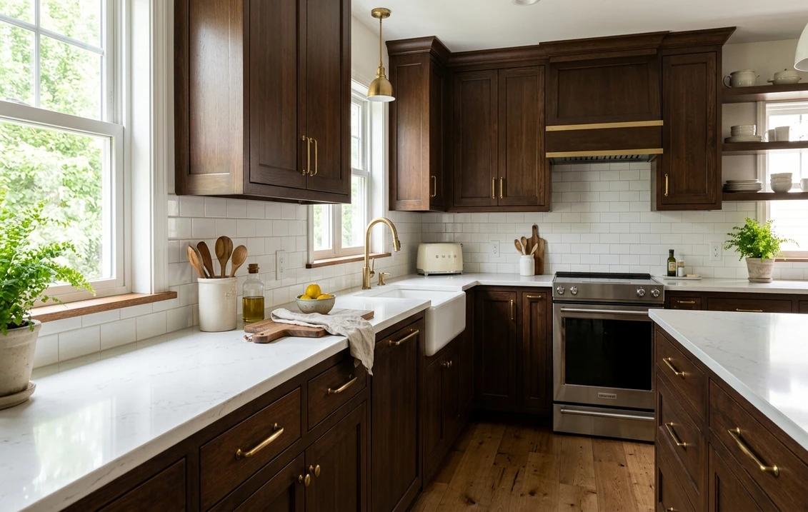
Benjamin Moore Espresso (CSP-90)
The drama pick, at LRV 6. Espresso is a near-black brown with a clean, neutral base, which is what separates a luxe modern espresso from the orange-brown stains of two decades ago. Designers use it island-only or on lowers under white uppers, where the depth reads expensive rather than heavy. It loves a bright white or marble counter for contrast, and it is one of the few deep colors that pairs equally well with brass, matte black, and polished chrome.
How kitchen light changes your brown
Brown is among the most undertone-sensitive cabinet families, because the eye reads the warmth or coolness of whatever light is left after the room absorbs the rest. The same can shifts noticeably from a north window to a south window, and again under warm LED task lighting. Plan around your dominant light, not the paint-store fluorescents.
- North-facing kitchens (cool, no direct sun) pull brown toward gray and can flatten a tan into something dull. Lean a step warmer than the chip suggests; a red- or gold-leaning brown such as Mocha or Shaker Beige holds its warmth, while a gray-based greige can go lifeless.
- South-facing kitchens (warm, bright) push brown toward yellow and orange. Watch gold-leaning tans, which can tip toward the dated builder-brown look in strong afternoon sun. A grayer, more balanced brown such as Hot Spring Stones or Accessible Beige stays clean.
- East and west kitchens are more forgiving: east light is cool and fresh in the morning then warms by midday, while west light turns golden late, flattering deep chocolates and espressos but over-warming a yellow-based tan at dinnertime.
- Artificial light matters too. Warm-white LEDs (around 2,700 K) deepen and enrich brown; cool daylight bulbs (4,000 K and up) gray it out and can make a warm mocha look muddy. Sample under the bulbs you run at night, not just in daylight.
Want the physics behind why a color shifts like this? Our interior paint color families guide breaks down how undertones behave room by room, across every color family.
Countertops, trim, hardware, and floors that flatter brown
Brown is forgiving with pairings, but a few combinations do the heavy lifting in real kitchens and a few quietly date the room.
- Countertops: White, cream, and warm-white quartz are the safest defaults and let a deep brown read as intentional rather than dark. Light browns also pair beautifully with honed marble or quartz that has soft warm veining. The combination to avoid is busy speckled granite in brown-tan tones, which is what made early-2000s brown kitchens feel heavy.
- Hardware and faucet: Unlacquered (living) brass and antique brass are the signature pairing, the warm metal echoing brown's warmth without competing. Matte black reads more modern and sharpens deep espressos; brushed nickel keeps lighter tans crisp and traditional. Avoid shiny gold against a yellow-based tan, which doubles the warmth.
- Trim, walls, and ceiling: A soft warm white keeps brown from feeling closed-in. Warm whites like BM White Dove or SW Alabaster are the go-to for walls and upper cabinets in a two-tone scheme; reserve crisp bright-whites for the grayer, cooler browns.
- Backsplash: White or cream subway tile is the classic; handmade zellige in cream or soft taupe adds texture without fighting the cabinets. A warm-toned natural stone slab backsplash makes a deep espresso feel custom.
- Floors: This is where brown earns its keep. A light tan or mocha cabinet over a contrasting wood floor (lighter or darker, not matching) avoids the tone-on-tone "everything is brown" trap that plagued older kitchens. A deep espresso cabinet pairs best with a lighter oak or pale tile floor for contrast.
Light tan vs warm mocha vs dark espresso: which one is right
The brown family really splits into three jobs. Light tans and greiges (Accessible Beige, Shaker Beige, Latte) are the lowest-risk play: they read as warm neutrals, suit a full kitchen of cabinets, keep small rooms open, and are the friendliest for resale. Warm mochas and mid-browns (Mocha, Alexandria Beige, Sturdy Brown) are the sweet spot for an island or two-tone kitchen, adding real color and warmth without darkening the whole room. Deep espressos (Espresso, Turkish Coffee, Bittersweet Chocolate, Black Fox) are the statement: luxe and dramatic, almost always best island-only or on lowers under light uppers, and most flattering with serious daylight and a bright counter for contrast.
Worried about brand? It matters less than people think. Sherwin-Williams, Benjamin Moore, and Behr all make excellent browns. If you are weighing them on sheen, durability, and coverage for a cabinet respray, our Sherwin-Williams vs Benjamin Moore comparison lays out the differences, and the interior painting cost guide covers what a professional cabinet job actually runs.
How to test a brown before you commit
Brown punishes the fan-deck chip harder than most colors, because a 2-inch sample cannot show how the red or yellow undertone behaves across a full run of doors in your light, or how it argues with your existing floor and counter. Two reliable methods:
- Paint a real sample. Roll two coats onto a large poster board or a spare cabinet door, then move it around the kitchen and check it at three moments: morning, mid-afternoon, and at night under your normal bulbs. Hold it against your countertop and floor, not just the wall, since brown lives or dies by those neighbors.
- Preview it digitally first. Upload a photo of your actual kitchen into our cabinet visualizer workflow and apply several browns before you spend a cent on sample pots. It narrows twelve candidates to two or three in minutes, so you only sample the finalists. For where warm earth tones sit among this year's most-requested shades, see our 2026 best interior paint colors guide.
Upload your kitchen and see Accessible Beige, Mocha, and Espresso side by side, free.
Frequently asked questions
What is the most popular brown for kitchen cabinets right now?
For a light brown, Sherwin-Williams Accessible Beige (SW 7036, LRV 58) is the standout, a greige that reads as a warm neutral and suits a full kitchen. For a mid-tone, Sherwin-Williams Mocha (SW 6067, LRV 19) is the go-to island and two-tone choice. For deep drama, Benjamin Moore Espresso (CSP-90, LRV 6) is the luxe near-black brown designers reach for, usually island-only or on lowers under light uppers.
Are brown kitchen cabinets dated?
Not the right brown. The dated look from the early 2000s came from yellow- and orange-based browns paired with busy speckled granite and matching brown floors. A modern brown leans either greige and gray-balanced (Accessible Beige, Hot Spring Stones) or rich and red-balanced (Mocha, Branchport Brown), pairs with a clean white or cream counter, and contrasts rather than matches the floor. Chosen that way, brown reads timeless and warm rather than dated.
What countertop and hardware go best with brown cabinets?
White, cream, and warm-white quartz are the safest countertops because they let a deep brown read as intentional and keep a light tan from feeling flat. For hardware, unlacquered (living) brass and antique brass are the signature pairing, while matte black sharpens deep espressos and brushed nickel keeps lighter tans crisp. Avoid shiny gold against a yellow-based tan and busy brown-tan granite, which both push the room toward the dated look.
Should dark espresso cabinets go on the whole kitchen or just the island?
For light tans and mid mochas (LRV 18 and up), a full kitchen of brown is very wearable. For deep espressos below LRV 8, an island or lower cabinets paired with white or warm-white uppers is the lower-risk and most popular approach, adding the drama of the dark color without darkening the whole room. Pair the espresso with a bright counter for contrast, and test both layouts on a photo of your kitchen before deciding.
See your top browns on your actual cabinets before you buy a single sample pot. One HD render plus three variations, free.
Disclaimer: Sherwin-Williams, Accessible Beige, Mocha, Turkish Coffee, Black Fox, and related color names and codes are trademarks of The Sherwin-Williams Company. Benjamin Moore, Espresso, Shaker Beige, Bittersweet Chocolate, and related color names and codes are trademarks of Benjamin Moore & Co. Behr and Sealskin are trademarks of Behr Process Corporation. FacadeColorizer is an independent paint visualization service and is not affiliated with, endorsed by, or sponsored by Sherwin-Williams, Benjamin Moore, or Behr. Color reproduction on screens approximates the manufacturer's chip; always confirm with a manufacturer sample before purchase. Sources: Sherwin-Williams, Benjamin Moore, and Behr technical data sheets 2026, The Spruce cabinet color references, designer undertone notes. LRV values are the manufacturers' published figures.
Trademarks mentioned (Sherwin-Williams, Benjamin Moore, Behr, Caparol, Brillux, Sto, Alpina, Valspar, PPG, Glidden, Dulux, Crown Trade, Sandtex, Farrow & Ball, Johnstone's, Leyland) are property of their respective owners. FacadeColorizer is independent and not affiliated with any of them. Nominative fair use under Lanham Act §1125.