
The short answer: the best backsplash for a white kitchen is white subway tile with a grout color chosen to match your cabinet undertone, with gray, blue, and warm-marble options close behind when you want a little more depth. White cabinets are a blank canvas, so the backsplash is where the kitchen gets its personality. The one rule that prevents almost every regret is to match temperature: a warm cabinet white wants a warm or neutral backsplash, and a cool cabinet white wants a cool or true-white one. Get that right and any of the directions below will work.
This guide is the backsplash companion to our deep dive on the best white paint colors for kitchen cabinets, and it sits under the broader complete kitchen cabinet color guide. If your cabinets are not white, the sibling profiles on gray cabinets and two-tone cabinet combinations point you to the right backsplash logic for those.
Upload a photo of your real kitchen and preview a backsplash color against your actual white cabinets in about 30 seconds, free. No tile samples, no contractor visit.
At a glance: which backsplash for which white kitchen
Use this as a quick decision table. Match the row to your goal and your cabinet undertone, then refine the details in the sections below.
| Backsplash direction | Best with | Vibe | Watch out for |
|---|---|---|---|
| White subway, white grout | Any white, esp. cool whites | Seamless, bright, classic | Can read flat; lean on tile shape for interest |
| White subway, gray grout | Cool and neutral whites | Crisp, defined grid | Dark grout looks busy in small kitchens |
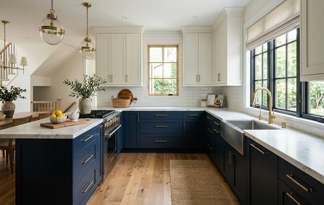
| Gray tile or slab | Cool or neutral whites | Modern, calm contrast | Warm whites can look dingy beside cool gray |
| Blue tile accent | Warm and cool whites | Coastal, characterful | Match blue temperature to the cabinet white |
| Warm marble or quartz slab | Warm whites (White Dove, Creamy) | Soft, luxe, layered | Cool-gray veining can clash with warm cabinets |
| Cream zellige or terracotta | Warm whites only | Handmade, organic, cozy | Reads yellow next to a crisp cool white |
General design guidance synthesized from common US designer practice and tile-and-stone references. Specific tile lines vary by retailer and region.
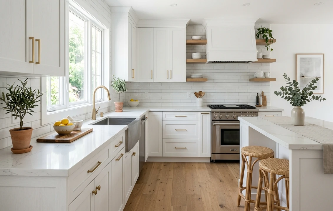
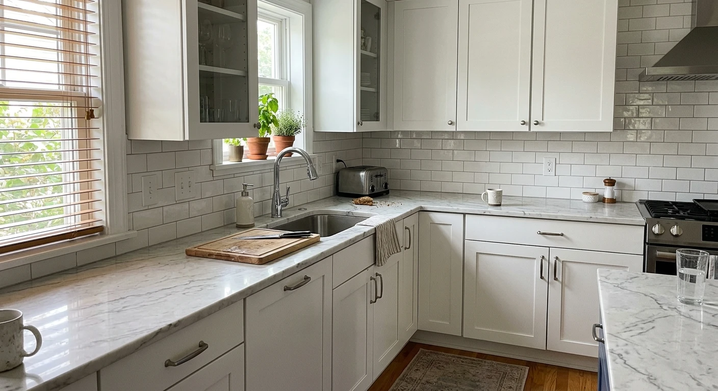
White-on-white: the seamless, bright look
A white backsplash on white cabinets is the most requested look and the easiest to get wrong, because two whites that are close but not matched will fight. The fix is to pick a tile white that is in the same temperature family as the cabinets. If your cabinets lean warm, a stark bright-white tile will make them look slightly yellow; if your cabinets lean cool, a creamy tile will make them look dull. When in doubt, choose a tile a touch brighter than the cabinets and let the cabinets read as the softer element.
The grout is the styling lever in a white-on-white kitchen. White or near-white grout gives the quietest, most seamless wall and is the right call in a small or low-light kitchen where you want maximum brightness. Light gray grout (the most popular middle path) defines the tile grid just enough to add texture without looking busy. Charcoal grout turns plain subway tile into a graphic, high-contrast feature, but it can overwhelm a small space, so save it for a larger kitchen or a single accent run.
Subway tile: still the safest pick, with more variety than you think
Classic 3x6 white subway tile remains the default for white kitchens because it is affordable, timeless, and resale-friendly. But the format is where you can add character without adding color. A vertical stack reads modern and makes low ceilings feel taller; a herringbone layout adds movement and a custom feel; handmade or zellige-style tile brings subtle surface variation that catches light and keeps a white wall from looking flat. Larger 4x12 or 4x16 tiles mean fewer grout lines and a calmer, more contemporary surface.
If your cabinets are a soft warm white, a handmade tile with gentle color variation is forgiving and rich. If your cabinets are a crisp cool white like Chantilly Lace, a flat-glaze subway tile in a clean bright white keeps the architectural, gallery feel intact. The undertone logic here is identical to choosing the cabinet white itself, and understanding light reflectance helps; our LRV and light reflectance guide explains why a bright tile (high LRV) can make adjacent cabinets look darker than they are.
Free AI visualizer. Upload one photo and compare white, gray, and blue backsplash directions under your own light.
Gray backsplash with white cabinets
A gray backsplash is the most popular way to add contrast to a white kitchen without committing to a color. It reads modern and calm and lets the white cabinets stay the star. The key is to match the gray's undertone to your cabinets: a cool, blue-gray tile pairs naturally with cool whites (Chantilly Lace, Pure White, Extra White), while a warm greige tile sits better beside warm whites (White Dove, Creamy). The most common mistake is a cool concrete-gray tile against a warm cream cabinet, which makes the cabinets look slightly dirty by comparison.
Gray works in several formats: a soft gray subway, a marble-look porcelain with gray veining, or a full-height gray quartz slab for a seamless modern wall. If you also have gray accents elsewhere, keep the whole kitchen in one temperature lane so the grays read as a set rather than a clash. The same temperature discipline that governs choosing a gray cabinet color applies to choosing a gray backsplash.
Blue backsplash with white cabinets
Blue is the friendliest color to introduce into a white kitchen because it flatters both warm and cool whites and never looks dated in a coastal or classic context. A blue handmade or zellige tile becomes the room's single piece of color, which keeps the look intentional rather than busy. Match the blue's temperature to your cabinets: a soft, grayed denim or slate blue works with almost any white, a warm, green-leaning blue sits well with cream cabinets, and a clean, cool navy snaps crisply against a bright cool white.
For a bolder version of the same idea, some homeowners run blue lower cabinets with white uppers and a white backsplash, which is its own well-trodden look covered in our two-tone cabinet combinations guide. If you want the color on the cabinets instead of the wall, the blue cabinet color guide is the next stop.
Warm options: marble, cream, and terracotta
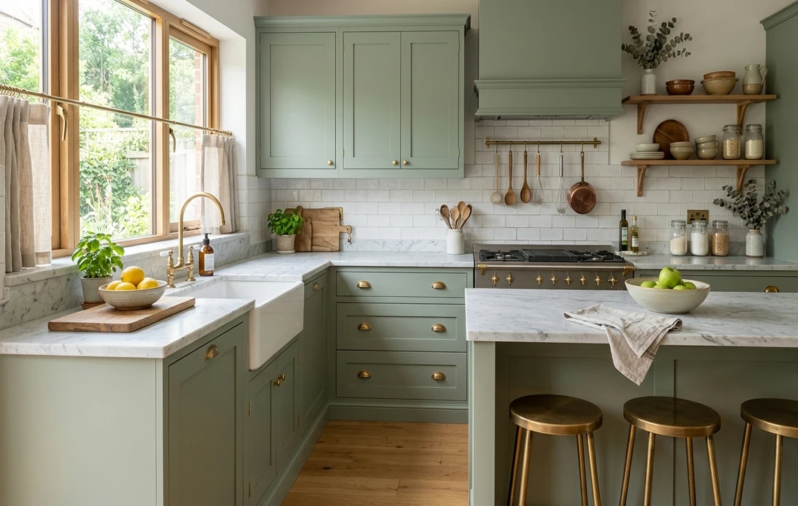
If your white cabinets lean warm and you want the kitchen to feel soft and layered rather than crisp, warm backsplashes deliver. A veined marble or marble-look quartz slab taken full height behind the range adds organic movement and is the easiest way to keep a white-on-white kitchen from feeling sterile; favor stone with warm beige or gold veining beside warm whites and cooler gray veining beside cool whites. Cream zellige brings a handmade, Mediterranean warmth that pairs beautifully with White Dove or Creamy but will read yellow next to a stark cool white. Terracotta or warm clay tile is the boldest warm move and belongs with cream cabinets, wood floors, and brass hardware.
How to choose: a quick framework
- Start with the cabinet undertone. Warm white wants warm or neutral; cool white wants cool or true white. This single rule prevents the most common backsplash regret.
- Pick your contrast level. White-on-white for seamless and bright, gray for quiet definition, blue or warm tile for character. More contrast suits bigger kitchens.
- Let the counter break the tie. A busy veined countertop wants a simple backsplash; a plain solid counter can carry a patterned or colored one.
- Use grout as a free design tool. White grout disappears, gray grout defines, charcoal grout dramatizes. Change the feel without changing the tile.
- Mind the light. North-facing kitchens go cool, so warm tile keeps them from feeling cold; south-facing kitchens carry cooler grays and bright whites easily.
See it before you buy it
A two-inch tile chip held against a cabinet door tells you almost nothing about how a full backsplash will read across a wall and under your kitchen's light. Ordering and returning sample boxes is slow, and re-tiling a backsplash you dislike is a real expense. The fast, no-mess way to narrow it down is a digital preview.
Upload a real photo of your kitchen to our free AI paint and color visualizer and try white-on-white, a gray, and a blue against your actual cabinets, counters, and light in the same frame. It will not replace a physical sample for your final choice, but it eliminates the directions that clearly do not work so you only order the few that already look right.
See white, gray, and blue backsplash directions on your real white cabinets before ordering a single tile sample, free.
Frequently asked questions
What is the best backsplash for white kitchen cabinets?
White subway tile is the most popular and safest choice because it is timeless, affordable, and resale-friendly, and the grout color lets you tune the look from seamless to graphic. If you want more depth, a soft gray tile adds quiet contrast and a blue handmade tile adds character. In every case, match the backsplash temperature to your cabinet undertone: warm whites with warm or neutral backsplashes, cool whites with cool or true-white ones.
Should the backsplash be lighter or darker than white cabinets?
Either works. A backsplash a touch brighter than the cabinets keeps the kitchen light and lets the cabinets read as the softer element, which suits a white-on-white look. A darker gray or charcoal-grouted backsplash creates deliberate contrast and a more defined, modern grid. The choice depends on contrast level: pick lighter for seamless and bright, darker for graphic and grounded.
What grout color goes with white subway tile and white cabinets?
Light gray grout is the most popular middle path: it defines the tile grid for subtle texture without looking busy. White or near-white grout gives the most seamless, brightest wall and is best in small or low-light kitchens. Charcoal grout turns plain tile into a graphic feature but can overwhelm a small space, so reserve it for larger kitchens or a single accent run.
Does a blue backsplash work with white cabinets?
Yes, blue is one of the easiest colors to add to a white kitchen because it flatters both warm and cool whites and reads timeless in coastal and classic settings. A blue handmade or zellige tile becomes the room's single piece of color, which keeps the look intentional. Match the blue's temperature to the cabinets: grayed slate blue works with almost any white, warm green-blue suits cream cabinets, and clean navy snaps against a crisp cool white.
Upload your kitchen photo and preview white, gray, and blue backsplash ideas on your actual white cabinets before you buy a single tile.
Disclaimer: All referenced paint color names and codes are trademarks of their respective owners. FacadeColorizer is an independent color visualization service and is not affiliated with, endorsed by, or sponsored by any paint or tile manufacturer. Color and tile reproduction on screens approximates real materials; always confirm with a physical sample before purchase. Backsplash and tile guidance reflects common US design practice; product lines and availability vary by retailer and region.