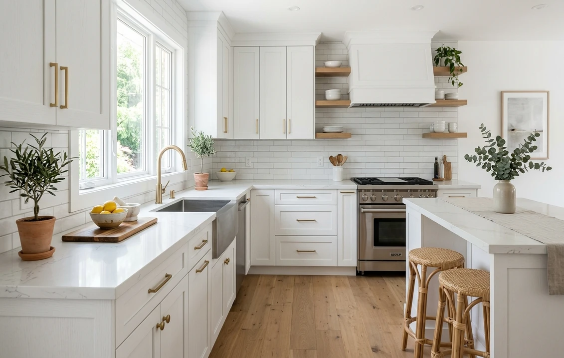
"White" is the most-requested cabinet color in America and the single hardest to get right, because there is no one white. Each can carries an undertone (yellow, gray, green, blue, or pink) that only reveals itself once it is rolled across a full run of doors and lit by your specific kitchen. The chip that looked clean in the paint aisle can turn buttery, dingy, or icy on the door. So the real question is not whether the cabinets should be white. It is which white, for your light, your countertop, and your floor.
Below are twelve white and off-white paint colors that professional cabinet painters reach for again and again, each with its published Light Reflectance Value (LRV) and real undertone, organized from warmest cream to crispest bright-white so you can place your taste on the scale. This is the indoor cabinet companion to our complete kitchen cabinet color guide; if white is not your color, the sibling profiles on gray cabinets, blue cabinets, and green cabinets cover the next steps.
Upload a photo of your real kitchen and preview any of these 12 whites in about 30 seconds, free. No sample pots, no painter's tape.
First, decode the undertone: warm vs cool white
Every white sits somewhere on a warm-to-cool axis. A warm white carries a yellow, cream, or faintly pink base; it feels soft and traditional and flatters wood floors and brass. A cool white carries a gray or blue base; it reads crisp and modern and pairs cleanly with stainless, chrome, and white marble. The trap is the middle: many popular cabinet whites have a sneaky green-gray undertone that photographs fine on a chip but goes muddy on a north-facing run of doors.
LRV tells the other half of the story. It measures how much light a color reflects, on a 0 (black) to 100 (pure white) scale. A bright cabinet white lands around LRV 90; a soft creamy white sits in the low 80s and feels gentler. Most designers keep cabinets between LRV 80 and 93: below 80 a color reads as off-white or greige, and above 93 it can feel clinical under bright kitchen task lighting.
The 12 best white cabinet paint colors, warmest to crispest
The list runs from the creamiest warm whites at the top to the brightest cool whites at the bottom. Codes and LRVs are each brand's published values from its technical data sheet.
| Paint color | Code | LRV | Undertone |
|---|---|---|---|
| SW Creamy | SW 7012 | 81 | Warm, yellow-cream |
| BM White Dove | OC-17 | 85 | Soft warm, yellow-beige |
| SW Alabaster | SW 7008 | 82 | Warm, faint green-gray |
| BM Swiss Coffee | OC-45 | 83 | Warm cream, faint yellow |
| SW Greek Villa | SW 7551 | 84 | Warm, peachy-yellow |
| BM Simply White | OC-117 | 89 | Soft, light yellow |
| SW Snowbound | SW 7004 | 83 | Cool-neutral, hint of pink-gray |
| SW Pure White | SW 7005 | 84 | Soft neutral, barely warm |
| BM Cloud White | OC-130 | 85 | Neutral, very soft yellow |
| SW Extra White | SW 7006 | 86 | Cool, faint blue |
| BM Chantilly Lace | OC-65 | 90 | Clean, crisp neutral |
| BM Decorator's White | OC-149 | 83 | Cool, gray-blue |
Try it on your house
No photo? Try a sample
Sources: Sherwin-Williams and Benjamin Moore technical data sheets 2026; The Spruce cabinet color references; designer undertone notes. LRV values are the manufacturers' published figures.
The warm whites (LRV 81 to 85)
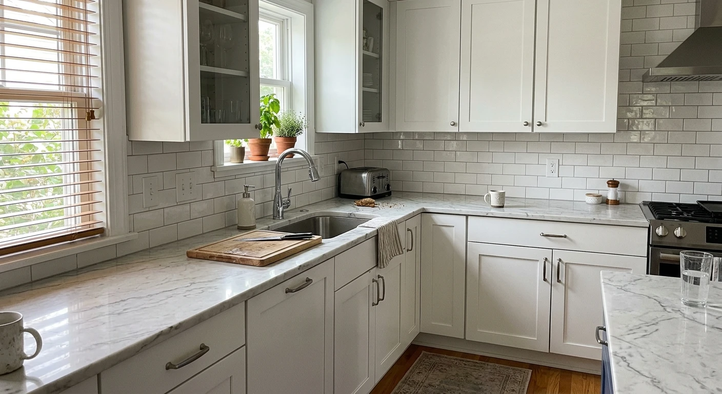
SW Creamy (SW 7012) is the warmest pick here, a true butter-cream that glows on Shaker doors in north and east kitchens where colder whites fall flat. BM White Dove (OC-17) is the most-recommended cabinet white in the country for a reason: it is warm enough to feel custom but neutral enough to sit beside almost any countertop. SW Alabaster (SW 7008) is creamy and soft but hides a green-gray base that can shift in cool light, so it rewards in-room testing. BM Swiss Coffee (OC-45) and SW Greek Villa (SW 7551) round out the cream family, both forgiving on aged kitchens because their warmth hides yellowing from older appliances and brass.
The soft neutrals (LRV 83 to 89)
This is the safe middle. SW Pure White (SW 7005) is the white professional sprayers reach for most. It carries the faintest warm cast, never tips into cream, and that single quality is what lets it flatter warm and cool finishes alike. BM Cloud White (OC-130) and BM Simply White (OC-117) add a touch more brightness while staying friendly. SW Snowbound (SW 7004) leans slightly cool with a whisper of pink-gray that keeps it from feeling sterile beside white quartz.
The crisp whites (LRV 83 to 90)
For a clean, modern, gallery-bright kitchen, the cool whites deliver. BM Chantilly Lace (OC-65) is the benchmark crisp white, the one designers specify when they want cabinets to read pure and architectural. SW Extra White (SW 7006) carries a faint blue base that snaps beautifully against black hardware and stainless. BM Decorator's White (OC-149) is the coolest of the group, a true gray-blue white that belongs in bright, south-facing modern kitchens where its crispness will not turn icy.
Free AI visualizer. Upload one photo and flip between White Dove, Pure White, and Chantilly Lace under your actual light.
How your kitchen light picks the winner
The same white can look like three different colors depending on which way your kitchen window faces. This matters more for white than for any other cabinet color, because white has almost no pigment of its own and mostly reflects whatever the room's light is doing.
- North-facing kitchens get cool, indirect blue light with no direct sun. Crisp cool whites (Chantilly Lace, Extra White, Decorator's White) can turn flat or faintly icy here. Lean warm: White Dove, Creamy, or Greek Villa hold their identity.
- South-facing kitchens get strong warm light most of the day. They carry the cool, bright whites without going cold, so this is where Chantilly Lace and Extra White truly shine.
- East-facing kitchens are warm at breakfast and cooler by afternoon. Soft neutrals (Pure White, Cloud White) ride that swing best, with just enough warmth to survive the cool hours.
- West-facing kitchens turn golden in late afternoon. Warm creams can read peachy at sunset, so balance them with cooler counters or choose a soft neutral like Pure White that absorbs the gold gracefully.
Artificial light is the second variable, and after dark it is the only one. Warm 2700K bulbs push every white toward cream; cool 4000K LEDs strip the warmth out and can make a warm white look yellow-gray. Match the two: pair bright daylight LEDs with a soft neutral or warm white, and pair cozy warm bulbs with a cooler white so the kitchen does not go amber at night.
Pairing white cabinets with counters, trim, and floors
White cabinets rarely fail on their own. They fail in combination, when a cool white meets a warm-cream countertop and looks dirty by contrast. The fix is simple: match temperature, warm with warm and cool with cool.
- Quartz and marble counters: bright white marble or white quartz wants a cooler cabinet (Chantilly Lace, Pure White) so the cabinets do not look yellow against the stone. Cream or beige-veined counters want a warm white (White Dove, Creamy) so nothing reads dingy.
- Trim and walls: keep wall trim within a few LRV points of the cabinets. Many designers run the same white on cabinets and trim, then take the walls a half-shade warmer or cooler so the cabinetry reads as the crisp element in the room.
- Wood floors: warm oak, honey, and walnut floors bounce warm light up onto the doors, which softens a cool white and enriches a warm one. This pairing is so common it has its own playbook in our white cabinets with oak floors and accents guide, including which whites avoid the dreaded yellow clash.
- Hardware: brass and gold flatter warm whites; matte black and polished nickel sharpen cool whites. Stainless appliances are neutral and lean slightly cool.
- Backsplash: white subway tile with light gray grout reads cleanly against any of the twelve; a warm zellige or cream tile asks for a warm cabinet white.
Want to see how these whites talk to the rest of your home? Our interior paint color families guide maps how whites, neutrals, and accents relate room to room, and the 2026 best interior paint colors guide picks up from there.
SW vs BM: do the brands matter for white cabinets?
Six of these whites are Sherwin-Williams and six are Benjamin Moore, which is no accident: both brands own this category, and the practical differences are small. Benjamin Moore's Advance cabinet enamel is prized for a glassy, self-leveling finish that hides brush marks, while Sherwin-Williams Emerald Urethane Trim Enamel is a painter favorite for durability on high-touch doors. The color ranges overlap heavily, so the choice often comes down to which store is nearer and which finish your painter prefers. Our Sherwin-Williams vs Benjamin Moore interior comparison covers finish, coverage, and price in full.
How to test a white before you commit
A fan-deck chip is the worst way to choose a cabinet white: a 2-inch sample reflects almost none of the room's light and reads 25 to 35 percent brighter than a full door. Painting cabinets commonly runs into the thousands (see our interior painting cost guide), so the test step is worth getting right.
The thorough method: mount peel-and-stick samples of your two or three finalists on actual cabinet doors (not the wall) and check them at three moments, 9 a.m., mid-afternoon, and after dark under your kitchen lights. Whichever white stays "white" across all three is your color.
The fast, no-mess method is a digital preview. Upload a real photo of your kitchen to our free AI paint visualizer and apply each white to your actual cabinets, with your real counters, floor, and light in the frame. It will not replace a physical sample on your final two, but it eliminates most of the twelve in minutes so you only buy samples for the whites that already look right.
See White Dove, Alabaster, Pure White, and Chantilly Lace on your own cabinets before buying a single sample pot, free.
Frequently asked questions
What is the most popular white for kitchen cabinets?
Benjamin Moore White Dove (OC-17, LRV 85) is the most-recommended cabinet white in the United States, prized for a warm, creamy neutrality that pairs with almost any countertop. Among Sherwin-Williams colors, Pure White (SW 7005, LRV 84) is the most-used by professional sprayers because its faint warmth flatters both warm and cool finishes. You will not go wrong with either at resale.
Should kitchen cabinets be a warm white or a cool white?
Let your light and finishes decide. Warm whites (White Dove, Creamy, Greek Villa) flatter north and east kitchens, wood floors, and brass hardware. Cool whites (Chantilly Lace, Extra White, Decorator's White) suit south-facing kitchens, white marble or quartz, stainless, and matte black hardware. Stuck between the two? A soft neutral like Pure White lands comfortably in the middle.
What LRV is best for white kitchen cabinets?
Most designers stay between LRV 80 and 93 for cabinets. Below 80 a white starts reading as off-white or greige; above 93 it can feel clinical under bright kitchen task lighting. Soft, livable whites like White Dove (85) and Pure White (84) sit mid-range, while a crisp gallery white like Chantilly Lace (90) reads brightest without tipping into stark.
Why do my white cabinets look yellow or dingy?
Usually one of three things is to blame. The white has a warm yellow or green undertone your lighting is amplifying, warm 2700K bulbs are pushing it toward cream, or a cooler-toned countertop is making the cabinets look dirty next to it. Fixing it comes down to matching temperatures (warm cabinets with warm counters and bulbs, cool with cool) and picking a white whose undertone suits your light. Test a full-size sample under your own lighting first and you head off the problem almost entirely.
Upload your kitchen photo and preview all 12 whites on your actual cabinets before you buy a single sample.
Disclaimer: Sherwin-Williams, Benjamin Moore, and all referenced color names and codes are trademarks of their respective owners. FacadeColorizer is an independent paint visualization service and is not affiliated with, endorsed by, or sponsored by Sherwin-Williams, Benjamin Moore, or Behr. Color reproduction on screens approximates the manufacturer's chip; always confirm with a manufacturer sample before purchase. Sources: Sherwin-Williams and Benjamin Moore technical data sheets 2026, The Spruce cabinet color references, and professional designer undertone notes. LRV values cited are the manufacturers' published figures.
Trademarks mentioned (Sherwin-Williams, Benjamin Moore, Behr, Caparol, Brillux, Sto, Alpina, Valspar, PPG, Glidden, Dulux, Crown Trade, Sandtex, Farrow & Ball, Johnstone's, Leyland) are property of their respective owners. FacadeColorizer is independent and not affiliated with any of them. Nominative fair use under Lanham Act §1125.