Benjamin Moore White Dove (OC-17, LRV 85) is the most-recommended kitchen cabinet color in the country, and that single fact tells you how much the cabinet shade defines a room. Cabinets cover roughly 40 percent of the visible surface in an average American kitchen, so their color sets the entire mood of the space. Get it right and the space reads custom and timeless. Get it wrong and a $6,000 cabinet repaint can look dated inside two years. This guide is the browse-everything starting point for kitchen cabinet colors in 2026: the shades that are selling, the ones designers are quietly retiring, and how to match a color to your light, your finishes, and your resale timeline.
We organize it the way a designer walks a client through it. First the big color families (white, greige, green, blue, black, two-tone), then the practical filters that narrow the field fast: durability, lighting, and resale. Every shade below uses a real, published Sherwin-Williams or Benjamin Moore code so you can sample it. For the up-to-the-minute trend ranking, pair this page with our trending kitchen cabinet paint colors for 2026.
Upload a photo of your real kitchen and preview any cabinet color in about 30 seconds, free. No sample pots, no painter's tape.
Start with light: the question that decides everything
Before you fall for a swatch, look at where your kitchen window faces. Light direction changes how a painted cabinet reads more than almost any other factor. Same can of paint, two kitchens: crisp in one, muddy in the other. The window is usually the reason.
- North-facing kitchens get cool, indirect light. Cool grays and stark whites can turn flat or slightly blue here, so warm whites and greiges usually flatter the room more.
- South-facing kitchens get strong warm light most of the day. They can carry cooler colors (true grays, deep blues, charcoal) without the room feeling cold.
- East-facing kitchens are warm at breakfast and cooler by afternoon. Mid-tone greens and soft greiges hold their identity across that swing.
- West-facing kitchens turn golden and intense late in the day, so test any bold shade in the evening too; saturated colors can read peachy at sunset.
If you want the physics behind why warm and cool whites flip in different orientations, our SW Alabaster north-facing undertones guide walks through the exact mechanism, and it applies to cabinets just as much as walls.
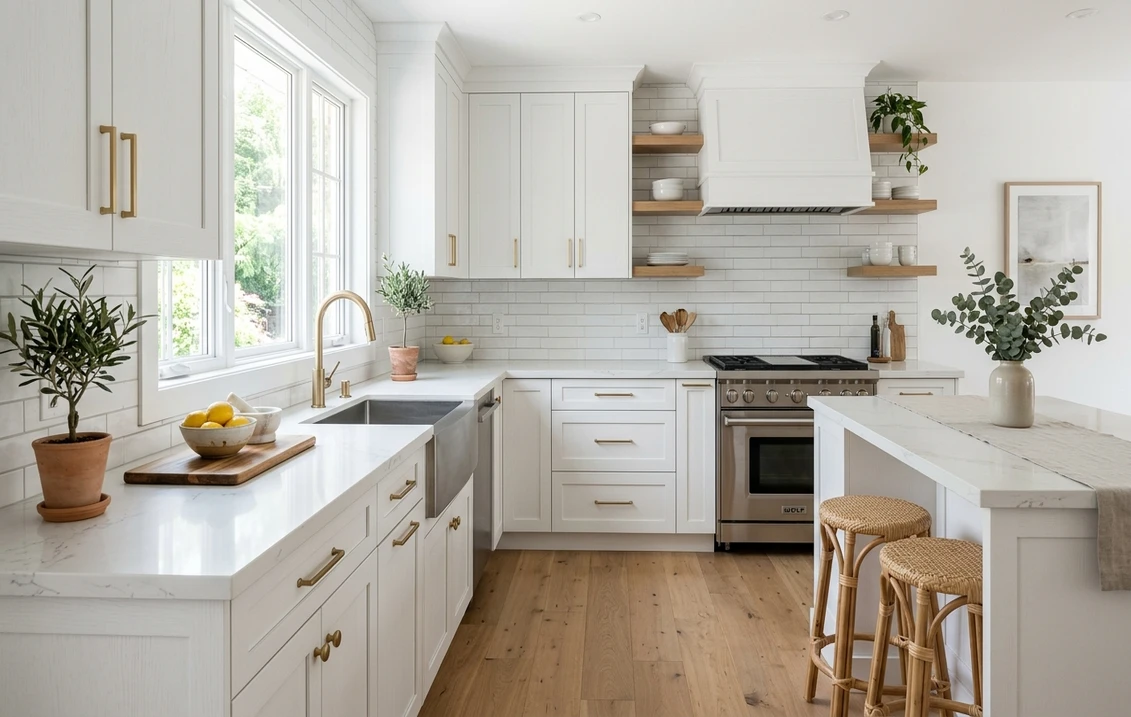
White and off-white cabinets: still the volume leader
White is the single most-painted cabinet category in the United States, and for resale it remains the safest bet. The mistake people make is reaching for a stark, builder-grade white that goes cold under kitchen lighting. The sweet spot in 2026 is a soft, warm white that reads clean without feeling clinical.
- Benjamin Moore White Dove (OC-17), LRV 85: the most-recommended cabinet white in the country. A warm, creamy off-white that pairs with almost any countertop. Read our full Benjamin Moore White Dove OC-17 review for room-by-room behavior.
- Sherwin-Williams Alabaster (SW 7008), LRV 82: a softer, slightly creamier white that feels custom on Shaker doors. It can shift cool in north light, so sample it in place.
- Swiss Coffee: a warm creamy white available across brands. Our Swiss Coffee comparison (Behr vs Benjamin Moore OC-45) shows how the two versions differ on cabinet doors.
Why off-white instead of pure white? A bright builder white can make stainless steel and white quartz look gray by comparison, and it shows every fingerprint near the dishwasher. A warm white at LRV 82 to 85 hides hand marks better and flatters wood floors and brass hardware.
Preview White Dove, Alabaster, and Swiss Coffee on your actual cabinets before buying a single quart.
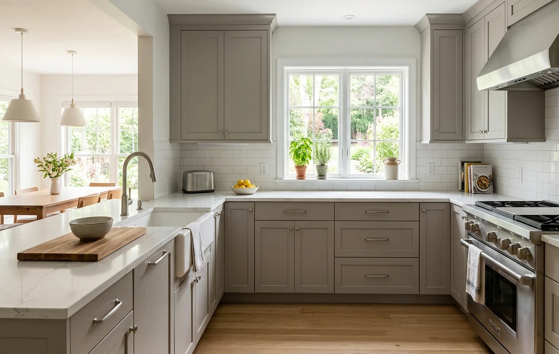
Greige and warm neutral cabinets: the quiet upgrade
Greige (gray plus beige) is where a lot of cool-gray kitchens from the 2010s are migrating. It keeps a neutral, calm backdrop but adds the warmth that pure gray was missing. On cabinets, greige reads as a soft, grounded color that lets countertops and backsplash do the talking.
- Sherwin-Williams Accessible Beige (SW 7036), LRV 58: a true greige with a soft beige base. Our Accessible Beige undertones and best rooms guide covers how its undertone behaves under different light.
- Sherwin-Williams Agreeable Gray (SW 7029), LRV 60: the most popular greige in America, balanced enough to read warm or cool depending on the room. See our Agreeable Gray undertones guide.
- Benjamin Moore Revere Pewter (HC-172), LRV 55.51: a warm greige with a green-gray base that pairs beautifully with white counters. Full breakdown in our Revere Pewter HC-172 review.
- Sherwin-Williams Repose Gray (SW 7015), LRV 58: a soft gray with a hint of warmth for kitchens that want to stay on the cooler side without going stark. Details in our Repose Gray undertones guide.
Want a color that just gets out of the way? Greige disappears into the background and never argues with whatever you cook, decorate, or renovate around it. It is a strong resale neutral too, calmer than white but liked just as widely.
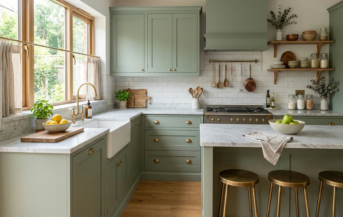
Green cabinets: the color of the moment
If one color defines the 2026 kitchen, it is muted green. Sage, olive, and deep forest tones have moved from accent to mainstream because they feel natural, calming, and warmer than gray. Green also flatters both warm brass and matte black hardware, which makes it flexible.
- Soft sage (light, gray-green): reads almost neutral and works on full kitchens, north or south. The safest entry point into green.
- Olive and earthy mid-greens: warmer and more saturated, ideal on a perimeter or island when you want personality without going dark.
- Deep forest and hunter greens: dramatic and rich, best on a lower run, island, or pantry where they ground the room. Pair with warm wood and brass to keep them from feeling heavy.
Here is the rare combination green pulls off: it feels current today, yet muted earth tones have the staying power to keep it from looking dated next season. For the specific green codes climbing the charts right now, see our trending kitchen cabinet paint colors for 2026.
Blue, black, and bold cabinets: high impact, manage with care
Navy blue has been a kitchen staple for several years and is not slowing down, especially on islands and lower cabinets paired with white uppers. Black and near-black charcoal are the bolder cousins: striking, modern, and forgiving of fingerprints in a matte finish, but they can shrink a small kitchen visually.
- Navy and deep blue: classic on an island or perimeter with brass hardware and a white or marble counter. Reads timeless rather than trendy.
- Black and soft black: dramatic and high-end on an island or full lower run. Best in a kitchen with good natural light; in a dim galley it can feel closed in.
- Charcoal gray: a slightly softer alternative to black that still delivers contrast and hides smudges well.
The practical rule with any dark or saturated cabinet color: balance it. Keep at least one large surface (uppers, counters, or backsplash) light so the room does not feel cave-like. For a wider sweep of bold and neutral options across the whole house, browse our best interior paint colors for 2026.
Two-tone kitchens: the most-requested layout of 2026
Two-tone is close to a default now. Splitting the cabinet color (one shade on uppers, a different one below or on the island) lets you have your bold color and your safe neutral at once, and it makes a custom-built look easy to achieve with paint.
The reliable formula: lighter on top, darker on the bottom or island. Light uppers keep the room open while a deeper base grounds it. The most popular pairings right now:
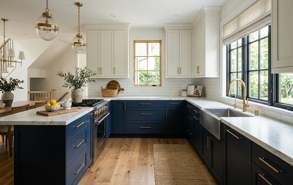
- Warm white uppers + navy lowers: the most-photographed combination, and the look in the photo at the top of this guide.
- White uppers + sage or green island: fresh, natural, and very 2026.
- Greige uppers + black or charcoal island: a calm, sophisticated, gallery-like contrast.
- Wood-tone uppers + painted lowers: blends the warmth of stained wood with a clean painted base. If you are keeping the wood-tone run, match the warmth with our guide to Minwax interior stain colors.
Two small chips held side by side tell you almost nothing about how the real runs will sit together. Preview both colors on the actual cabinets before you commit a dollar. That is what a visualizer does best.
Test white uppers with navy lowers, or any pairing, on your real photo in seconds.
Kitchen cabinet colors at a glance
Use this table as a fast filter. It maps each color family to the kitchens it flatters, the hardware that pairs best, and how it tends to perform for resale.
| Color family | Best for | Pairs with | Resale safety |
|---|---|---|---|
| Warm white | Any kitchen, small or dim spaces | Brass, black, or nickel; almost any counter | Highest |
| Greige / warm neutral | Open-plan, transitional kitchens | Bronze, black; white or wood counters | High |
| Sage / soft green | North or south light, full kitchens | Brass, gold, black; marble or butcher block | High and rising |
| Navy blue | Islands, lowers, well-lit kitchens | Brass, gold; white or marble counters | High |
| Black / charcoal | Larger, bright kitchens; islands | Brass or matte black; light counters | Moderate (polarizing) |
| Deep forest green | Statement lowers, pantries, islands | Brass, warm wood; light counters | Moderate to high |
Try it on your house
No photo? Try a sample
Sources: Sherwin-Williams and Benjamin Moore technical data sheets 2026 (LRV and color codes); The Spruce kitchen color guidance; designer resale references. Resale ratings reflect general buyer-appeal patterns, not a guaranteed return.
Durability: paint, sheen, and the prep that actually lasts
Cabinet color is only as good as the finish under it. Kitchen cabinets take more abuse than any other painted surface in the home (grease, water, door slams, cleaning chemicals), so durability matters as much as the hue.
- Sheen: satin and semi-gloss are the standard. They wipe clean and resist moisture far better than flat or eggshell. Semi-gloss is the most durable; satin hides imperfections slightly better.
- Paint type: a cabinet-grade or enamel paint that levels into a hard, smooth film cures harder than wall paint and stands up to daily wiping.
- Prep is non-negotiable: degrease, sand to dull the existing finish, and prime (especially over raw wood, oak grain, or anything previously stained). Skipping prep is the number one reason DIY cabinet paint chips within a year.
- Wear shows by value: deep colors hide grease but reveal dust and scuffs at handles; light colors hide dust but show fingerprints. Satin or semi-gloss minimizes both.
If you are budgeting a full kitchen refresh and want to know where cabinet painting sits against walls, trim, and labor, our interior house painting cost guide for 2026 breaks down the numbers.
Match cabinets to walls, counters, and the rest of the room
Cabinets do not live in isolation. To make a color feel intentional, coordinate it with the wall color and the adjacent room, especially in an open floor plan.
- Open-plan flow: keep cabinet and adjacent wall colors in the same temperature family. Warm white cabinets read seamless against a warm greige wall but can look mismatched against a cool gray.
- Countertop first: let chosen counters guide the cabinet. Warm-veined marble and butcher block love greige and green; cool white quartz can carry navy and charcoal.
- Whole-home cohesion: pull from the same color story used elsewhere so nothing clashes room to room.
To plan that flow, browse our room paint color ideas by room for 2026 for the spaces around the kitchen, our top 15 living room paint colors for 2026 for the open-plan side, and our interior paint color families guide to understand how undertones relate across a whole home. For bedrooms, our calming master bedroom paint colors rounds out the palette.
Picking by brand: where to source your exact color
Once you have a direction, the brand choice is mostly about availability and your painter's preference. All three major US brands make cabinet-suitable enamels in equivalents of these colors.
- Sherwin-Williams: the deepest cabinet color library and a go-to for pros. Browse the full range in our Sherwin-Williams interior paint colors guide.
- Benjamin Moore: beloved for its whites and greiges, with an Advance enamel popular for cabinets. See our Benjamin Moore interior paint colors guide.
- Behr: the value pick, widely available at Home Depot. Our Behr interior paint colors guide covers the lineup.
Cross-shopping two brands? Our head-to-head comparisons make it easy: Behr vs Sherwin-Williams and Sherwin-Williams vs Benjamin Moore.
Test before you commit (the 10-minute version)
A 2-inch chip is the wrong tool for a cabinet decision. Color reads differently at scale, under your lighting, and next to your counter. Two ways to test that actually predict the result:
- Paint a door: roll your top two candidates onto a spare door or a large peel-and-stick swatch, lean it against the cabinets, and look at it morning, midday, and at night under your kitchen lights.
- Preview digitally first: upload a photo of your real kitchen and apply colors virtually to narrow six options down to two before you buy any paint. This is the fastest way to rule out the misses.
Combining the two saves the most: digital preview to shortlist, then one painted door to confirm the finalist. It beats buying five sample pots.
Upload one kitchen photo and preview white, greige, green, navy, and black side by side, free.
Frequently asked questions
What is the most popular kitchen cabinet color in 2026?
Warm white remains the highest-volume choice and the safest for resale, led by Benjamin Moore White Dove (OC-17, LRV 85) and Sherwin-Williams Alabaster (SW 7008, LRV 82). The fastest-growing category, however, is muted green (sage to deep forest), which is defining the look of new and remodeled kitchens this year. Two-tone layouts that combine a warm white with navy or green are close to a default request.
What cabinet color is best for resale?
Warm white and greige are the strongest resale neutrals because they appeal to the widest range of buyers and do not lock the kitchen into a trend. Navy and sage are also broadly liked and considered safe. Black, deep charcoal, and very saturated colors are more polarizing; they can photograph beautifully but appeal to a narrower buyer pool, so reserve them for an island or lower run rather than the entire kitchen if resale is near term.
What paint finish is best for kitchen cabinets?
Satin or semi-gloss. Both resist moisture and grease and wipe clean, which flat and eggshell do not handle well in a kitchen. Semi-gloss is the most durable and easiest to clean; satin hides minor surface imperfections slightly better. Use a cabinet-grade or enamel paint that cures into a hard film, and always degrease, sand, and prime first, prep is the main reason painted cabinets last or fail.
Should kitchen cabinets be lighter or darker than the walls?
Either works, but keep the wall and cabinet colors in the same temperature family so the room reads cohesive. A common, reliable formula is light upper cabinets with a darker lower run or island, which keeps the space feeling open while grounding it. If cabinets and walls are both neutral, a slight value difference (cabinets a shade lighter or darker than the wall) adds subtle dimension without looking busy.
How do I choose a cabinet color for a small or dark kitchen?
Lean light and warm. Warm whites and soft greiges (LRV in the high 50s to mid 80s) reflect more light and make a small or dim kitchen feel larger. If you want color, soft sage stays light enough to keep the room open. Save black, deep charcoal, and forest green for kitchens with strong natural light or large footprints, in a small galley they can feel closed in. Previewing on a photo of your actual room is the most reliable way to judge how a color reads at your scale and light.
See white, greige, green, navy, and two-tone combinations on your real kitchen before you buy a drop of paint.
Disclaimer: Sherwin-Williams, Benjamin Moore, Behr, and the named color codes (SW 7008 Alabaster, SW 7036 Accessible Beige, SW 7029 Agreeable Gray, SW 7015 Repose Gray, OC-17 White Dove, HC-172 Revere Pewter, OC-45 Swiss Coffee) are trademarks of their respective owners. FacadeColorizer is an independent paint visualization service and is not affiliated with, endorsed by, or sponsored by Sherwin-Williams, Benjamin Moore, or Behr. Color reproduction on screens approximates the manufacturer's chip; always confirm with a manufacturer sample before purchase. LRV figures cited are from manufacturer technical data sheets. Resale guidance reflects general buyer-appeal patterns and is not a guarantee of return on investment. Sources: Sherwin-Williams and Benjamin Moore technical data sheets 2026, The Spruce kitchen color guidance, and professional designer references.
Trademarks mentioned (Sherwin-Williams, Benjamin Moore, Behr, Caparol, Brillux, Sto, Alpina, Valspar, PPG, Glidden, Dulux, Crown Trade, Sandtex, Farrow & Ball, Johnstone's, Leyland) are property of their respective owners. FacadeColorizer is independent and not affiliated with any of them. Nominative fair use under Lanham Act §1125.