Forget the fancy color. In a tight kitchen, the paint that wins is simply the one that reflects the most light. And there is a single number that decides whether a cramped galley feels airy or boxed in: LRV, the Light Reflectance Value, a 0 to 100 scale for how much light a paint bounces back into the room. In a kitchen under about 120 square feet, every point of LRV you keep is a point of perceived space you gain, which is why most of the 12 colors below sit at LRV 70 or higher.
This is a working color guide, not a mood board. For each pick you get the manufacturer code, the published LRV, the real undertone, and the pairing that keeps a compact room from reading flat. If you are choosing cabinets first, start with our complete kitchen cabinet colors guide, then come back for the small-space refinements.
Upload one photo of your small kitchen and preview any of the 12 colors below on your actual walls and cabinets in about 30 seconds, free.
Why LRV matters more than the color name in a small kitchen
A large open-plan kitchen can carry a deep navy because it has glass and wall area to spare. A small kitchen has the opposite physics: less natural light enters, fewer surfaces bounce it around, and dark walls absorb what little arrives, so it reads as a cave by 4 p.m. LRV, published on every color's data sheet, is your guardrail. As a rough designer field rule: above 70 keeps a room feeling open, 55 to 70 is a soft mid-tone that needs good light, and below 50 will shrink a compact kitchen unless it is confined to lower cabinets under a much lighter wall. The same logic drives our interior paint color families guide, where LRV bands explain why some families photograph bigger than others.
Here is the move that does the heavy lifting. Paint the walls, trim, and upper cabinets the same light color, or two shades within 3 LRV points of each other. That kills the contrast line where wall meets cabinet, the very seam that tells your eye how small the box really is. Lose the seam and the room reads bigger, which is why a light monochromatic scheme nearly always beats a two-tone one in a cramped space.
The 12 space-boosting colors, grouped by how they work
The 12 picks fall into four jobs: maximize light with a clean white, add quiet warmth without losing brightness, introduce a soft tint that stays airy, or anchor a lower run while keeping the room open. All codes and LRV values are from the manufacturers' published data sheets.
Bright whites that pull in the most light (LRV 80+)
- Benjamin Moore Chantilly Lace (OC-65), LRV 90. The brightest mainstream white here, clean and near-neutral with no obvious yellow or gray pull. It disappears the walls and lets cabinets and counters define the room. Best with at least one window; with poor light it can feel sterile.
- Sherwin-Williams Pure White (SW 7005), LRV 84. Softer and warmer than Chantilly Lace, with a barely-there warm base that keeps it from going cold under LED bulbs. The most forgiving "just paint it white" choice and the safest trim white to pair with almost anything.
- Benjamin Moore Simply White (OC-117), LRV 90. A warm white with a soft yellow undertone that reads bright but cozy, Benjamin Moore's 2016 Color of the Year. It carries warmth into a north-facing galley without tipping into cream.
Warm off-whites and creams that stay bright (LRV 74 to 83)
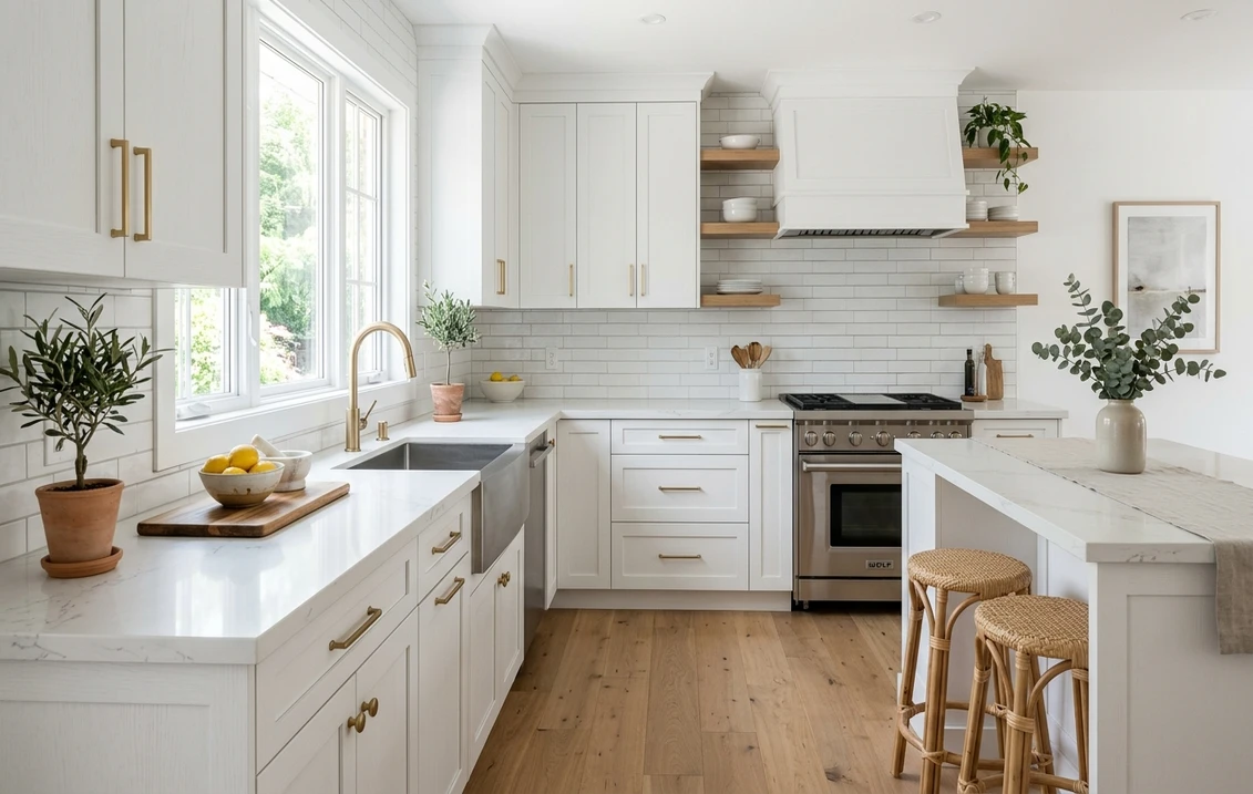
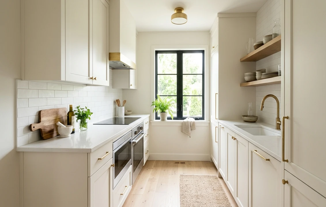
- Sherwin-Williams Alabaster (SW 7008), LRV 82. The most-painted soft white in the country and the color shown in the photo above. A warm off-white with a faint yellow-beige base that feels creamy and inviting without darkening the room. Pairs beautifully with white-oak floors and brass. The all-rounder if you want warmth and brightness in one can.
- Benjamin Moore White Dove (OC-17), LRV 85. A creamy, near-neutral off-white that holds its identity across lighting, slightly more neutral than Alabaster. The "set and forget" choice when you cannot test in the actual room.
- Behr Swiss Coffee (palette code 12), LRV around 85. A warm, soft cream white sold at The Home Depot, with a creamy base that warms a room while still reflecting plenty of light (slightly more than Alabaster). A good budget pick for a rental galley where you want a soft, inviting white.
Soft tints that add color but keep the room airy (LRV 60 to 74)
- Sherwin-Williams Sea Salt (SW 6204), LRV 63. A pale gray-green-blue that shifts with the light, often called a "color chameleon." It brings a spa-like calm while staying light enough not to close the room in. Best on cabinets with white walls.
- Benjamin Moore Palladian Blue (HC-144), LRV 61. A classic soft aqua with a green-blue base that reflects daylight beautifully and makes a tight kitchen feel fresh and cottage-like. Pair with crisp white trim to keep the edges sharp.
- Sherwin-Williams Repose Gray (SW 7015), LRV 58. A warm "greige" that reads as a soft neutral, not a cold gray. At LRV 58 it is low for an all-over color, so reserve it for rooms with good light or use it on cabinets under a brighter wall. See our gray kitchen cabinets guide for the full playbook.
Anchors for a lower run when you still want depth (LRV under 35)
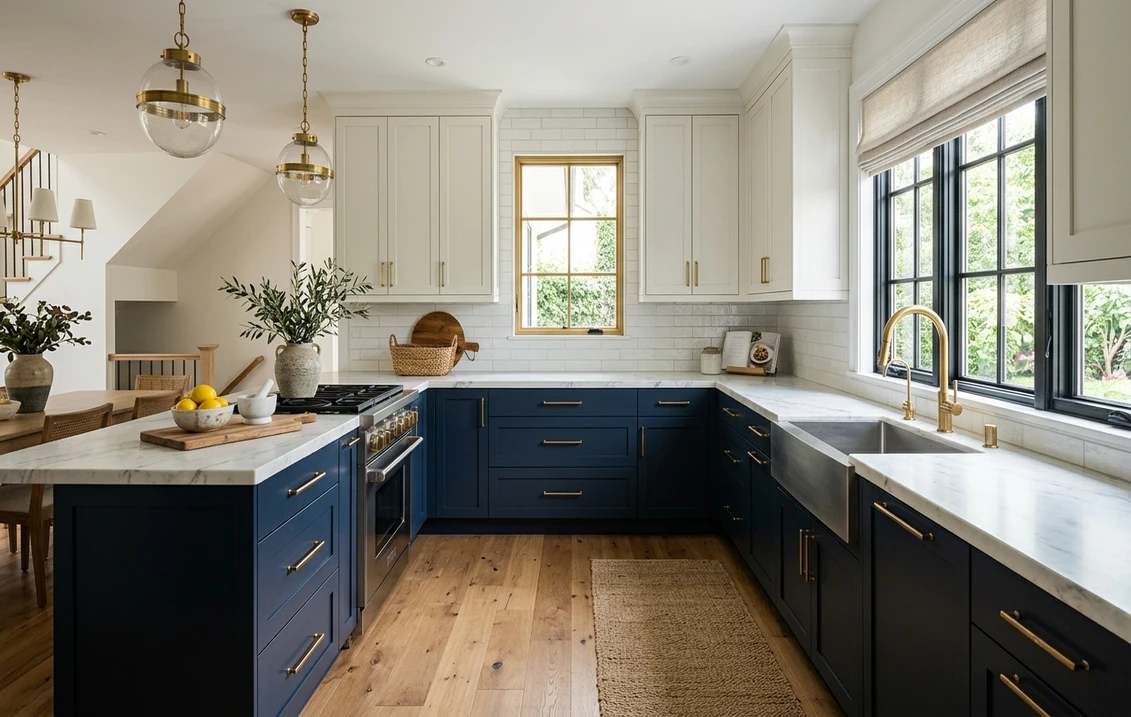
- Benjamin Moore Hale Navy (HC-154), LRV 7. A deep, slightly muted navy. Use it only on lower cabinets or an island with white walls and uppers above; that two-tone split adds richness without shrinking the room. Our blue kitchen cabinets guide covers navy pairings in depth.
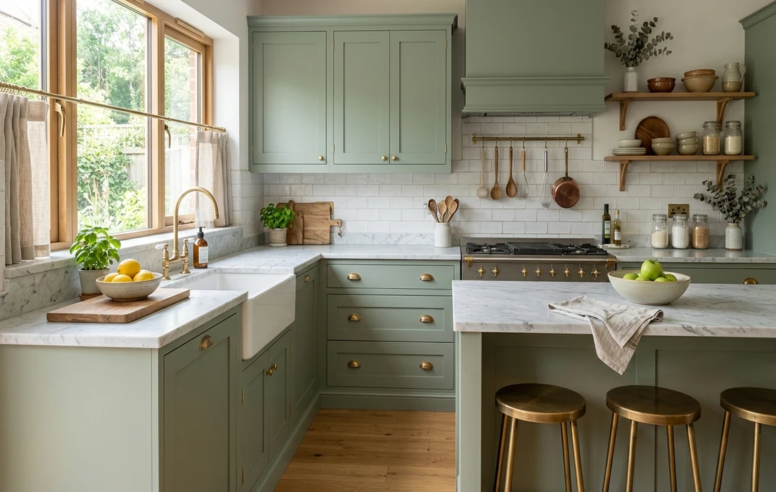
- Sherwin-Williams Evergreen Fog (SW 9130), LRV 30. A soft gray-green and Sherwin-Williams' 2022 Color of the Year. At LRV 30 it is a true mid-tone, so keep it to lower cabinets or a single accent wall, balanced by a bright white above.
- Sherwin-Williams Naval (SW 6244), LRV 4. A rich, saturated navy, bolder than Hale Navy. Stunning on a lower run with brass and a white-oak or marble counter, but strictly a lower-cabinet or island color, never the walls.
Free AI visualizer. Test light walls with dark lower cabinets on your real photo before you commit to a deep color.
Quick reference: the 12 colors at a glance
| Color | Code | LRV | Undertone | Best use in a small kitchen |
|---|---|---|---|---|
| Chantilly Lace | BM OC-65 | 90 | Clean neutral | All-over, max brightness |
| Simply White | BM OC-117 | 90 | Warm yellow | All-over, warm and bright |
| White Dove | BM OC-17 | 85 | Soft cream | All-over, fail-safe |
| Pure White | SW 7005 | 84 | Faint warm | Walls or trim, versatile |
| Alabaster | SW 7008 | 82 | Warm yellow-beige | All-over, cozy and bright |
| Swiss Coffee | Behr 12 | ~85 | Creamy | All-over, budget cozy |
| Sea Salt | SW 6204 | 63 | Gray-green-blue | Cabinets or walls, spa calm |
| Palladian Blue | BM HC-144 | 61 | Soft aqua | Walls, cottage fresh |
| Repose Gray | SW 7015 | 58 | Warm greige | Good-light rooms or cabinets |
| Evergreen Fog | SW 9130 | 30 | Gray-green | Lower cabinets or accent |
| Hale Navy | BM HC-154 | 7 | Muted navy | Lower cabinets or island only |
| Naval | SW 6244 | 4 | Deep navy | Lower cabinets or island only |
Try it on your house
No photo? Try a sample
Sources: Sherwin-Williams, Benjamin Moore, and Behr published technical data sheets and color pages 2026; LRV values rounded to whole numbers. Behr Swiss Coffee LRV is approximate and varies slightly by data source.
How light direction changes these colors
A small kitchen usually has one window, so its orientation matters more than in a big room: there is no second light source to balance an undertone shift.
- North-facing (cool, no direct sun): Whites drift gray and cool, so lean warm: Alabaster, White Dove, Simply White, or Swiss Coffee. Avoid the coolest whites and gray-greens, which can read dingy.
- South-facing (warm, bright): The most freedom. Even tints like Sea Salt and Palladian Blue stay light; warm whites can edge yellow at midday, so Pure White balances it.
- East and west-facing: Neutral off-whites like White Dove read clean most of the day. West light turns golden at sunset, flattering creams and warming grays like Repose Gray.
Artificial light is the other half. Choose 2700K to 3000K "soft white" LED bulbs to keep warm colors true; a cold 4000K bulb makes creams look gray. Then there is sheen. Satin or semi-gloss on the cabinets throws back more light than a flat wall ever will, and in a dark galley that is brightness you get for nothing.
Trim, counters, and hardware that make small kitchens look bigger
Cabinet color gets you halfway, no further. What expands the room is everything around it, and a handful of pairing rules carry most of that load:
- Keep trim within 3 to 5 LRV points of the walls, and match the upper cabinets to the wall. High contrast chops a small room into pieces; a near-monochrome scheme makes the boxes recede and reads larger.
- Run the backsplash and counter light. Pale tile, white quartz, or light marble bounces light up onto the cabinets. Busy, dark surfaces shrink the room and lower the visual ceiling.
- Use warm metal accents sparingly. Brushed brass or matte black hardware reads as a small jewel without adding visual weight, the effect the soft-white kitchen in the photo above uses.
If you are leaning all-white, our white kitchen cabinets guide compares the top white shades side by side, and if you have honey or golden-oak cabinets you would rather keep, our white kitchens with oak guide shows which whites flatter natural wood instead of fighting it.
How to test a small kitchen color before you buy a gallon
A 2-inch fan-deck chip lies to you. It reads roughly 20 to 35 percent lighter than the same color rolled on a wall, and it cannot show how the color shifts under your one window. In a small kitchen, where a wrong color is impossible to ignore, test properly:
- Paint a 12-inch swatch on at least two walls (one near the window, one away), or use a peel-and-stick sample.
- Look at it three times a day: morning, midday, and at night under your normal bulbs. That undertone shift is the whole reason chips fail.
- Hold it next to your real counter and backsplash, not against a white wall, so you judge it in context.
Want to skip the wall altogether, at least for the first cut? Use a digital visualizer. Upload one photo of your kitchen, drop each color onto your real cabinets and walls, and see it before a single sample pot leaves the store. It will not replace a final physical swatch, but it can take you from 12 candidates to 2 in minutes. For the repaint budget around your choice, see our interior house painting cost guide; if you are torn between brands, our Sherwin-Williams vs Benjamin Moore comparison covers how the two lines' whites differ; and for inspiration beyond the kitchen, our best interior paint colors of 2026 rounds up the year's most-requested shades.
Skip the sample pots. Upload your real kitchen photo and compare every color above on your own walls in 30 seconds.
Frequently asked questions
What is the best paint color to make a small kitchen look bigger?
A bright off-white with an LRV in the 80s does the most to expand a small kitchen because it reflects the most light. Benjamin Moore White Dove (OC-17, LRV 85), Sherwin-Williams Pure White (SW 7005, LRV 84), and Sherwin-Williams Alabaster (SW 7008, LRV 82) are the safest space-boosting picks. For the biggest effect, paint the walls, trim, and upper cabinets the same light color so there is no contrast line to break up the room.
Can I use a dark color in a small kitchen?
Yes, but only on a lower run of cabinets or an island, never on all four walls. A deep navy like Benjamin Moore Hale Navy (HC-154, LRV 7) or Sherwin-Williams Naval (SW 6244, LRV 4), or a gray-green like Evergreen Fog (SW 9130, LRV 30), looks rich on lower cabinets when the walls and upper cabinets stay a bright white above. That two-tone split adds depth without darkening or shrinking the room.
What LRV should I look for in a small kitchen?
Aim for LRV 70 or higher for an all-over wall and cabinet color in a compact kitchen. The 55 to 70 range works on cabinets or walls if you have a decent window. Below 50 will visually shrink the space and should be reserved for a lower-cabinet accent paired with a much lighter color above. LRV is printed on every manufacturer's technical data sheet for each color.
Should the walls and cabinets be the same color in a small kitchen?
Often yes. A monochromatic light scheme, where the walls, trim, and cabinets are the same shade or two colors within about 3 LRV points, removes the visual seams that tell the eye how small the room is, so the kitchen reads larger. If you want contrast, keep it to one element such as a darker island or lower run, and keep the rest of the room light and continuous.
Upload your kitchen photo and preview all 12 space-boosting colors on your actual walls and cabinets before buying a sample.
Disclaimer: Sherwin-Williams, Benjamin Moore, and Behr, and the color names and codes referenced above, are trademarks of their respective owners. FacadeColorizer is an independent paint visualization service and is not affiliated with, endorsed by, or sponsored by Sherwin-Williams, Benjamin Moore, or Behr. LRV values are taken from the manufacturers' published technical data sheets and color pages and are rounded to whole numbers; reproduction on screens approximates the manufacturer's chip, so always confirm with a physical sample under your own light before purchase. Sources: Sherwin-Williams, Benjamin Moore, and Behr 2026 technical data sheets and color pages; The Spruce paint color references; designer LRV field guidance.
Trademarks mentioned (Sherwin-Williams, Benjamin Moore, Behr, Caparol, Brillux, Sto, Alpina, Valspar, PPG, Glidden, Dulux, Crown Trade, Sandtex, Farrow & Ball, Johnstone's, Leyland) are property of their respective owners. FacadeColorizer is independent and not affiliated with any of them. Nominative fair use under Lanham Act §1125.