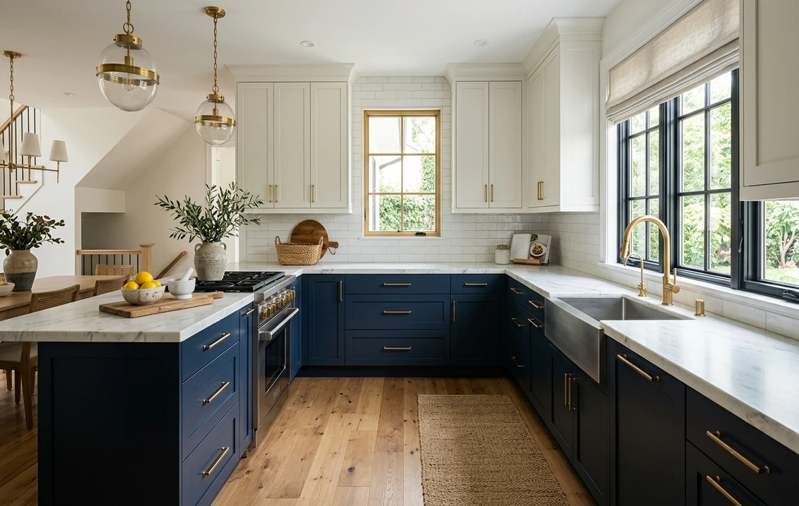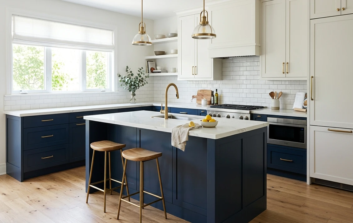
You want a bold color in the kitchen that still looks right in ten years. Two-tone cabinets are how almost every designer solves that. Put a deep, characterful color on the island or lower run and a calm warm white up top, and the room reads custom and grounded without committing the whole space to a trend. It is the look in the photo above: warm white uppers, a navy island, brass, white quartz.
The catch is that "two-tone" is a structure, not a color scheme. It either feels intentional or like you ran out of paint, and the difference is value contrast and matched undertones. Below are 12 combinations that work, each with real Sherwin-Williams and Benjamin Moore codes, published LRV (Light Reflectance Value) numbers, and a note on placement. This page sits under our complete guide to kitchen cabinet colors.
Upload one photo of your kitchen and preview these pairings on your actual cabinets in 30 seconds, free.
Try it on your house
No photo? Try a sample
The three rules that make two-tone work
First the structure. Three rules separate a deliberate two-tone kitchen from an accidental one.
- Light on top, dark on the bottom. Light uppers keep the room open; a deeper base or island grounds it and hides the scuffs lower cabinets collect. The reverse works only in a tall, bright kitchen, since it visually lowers the ceiling.
- Commit to real contrast. Aim for a value gap of 30 LRV points or more. A warm white at LRV 84 over a navy at LRV 4 reads crisp; two mid-tones four points apart just look like a mistake. For subtle, use one color in two sheens.
- Match the temperature, vary the value. Keep both colors warm or both cool. Undertone clashes (a yellow-cream white next to a violet-gray blue) are the most common reason a scheme feels off. Our interior paint color families guide covers reading undertone.
Here are the 12, grouped by the deeper partner since that is the choice that sets the mood.
Navy and deep blue pairings
Navy is the most-photographed two-tone partner: it reads timeless rather than trendy and carries brass and white stone like nothing else. Put it on the island or lower run.
1. White Dove uppers + Naval island
Benjamin Moore White Dove (OC-17, LRV 85) over Sherwin-Williams Naval (SW 6244, LRV 4). The safe, magazine-standard navy kitchen. White Dove is the best-selling off-white in the country, a creamy neutral with a soft yellow-beige base; Naval is a warm, slightly green-based navy that never goes purple. The 81-point gap reads crisp with brass pulls and white quartz. See our blue kitchen cabinet paint colors guide.
2. Alabaster uppers + Hale Navy lowers
Sherwin-Williams Alabaster (SW 7008, LRV 82) over Benjamin Moore Hale Navy (HC-154). Hale Navy reads softer and a touch grayer than Naval, the more relaxed, lived-in choice, and it pairs naturally with Alabaster's warm, creamy white because both lean warm. This is navy without the brand-new gloss feel: transitional rather than fully modern.
3. Pure White uppers + Newburyport Blue island
Sherwin-Williams Pure White (SW 7005, LRV 84) over Benjamin Moore Newburyport Blue (HC-155). Newburyport carries a faint violet that gives it depth and a dressier feel than a true navy. Because it leans cool, it wants a cleaner white, and Pure White (barely warm, versatile) is the ideal partner. Reserve it for an island in good light, where the violet can show.
Green pairings
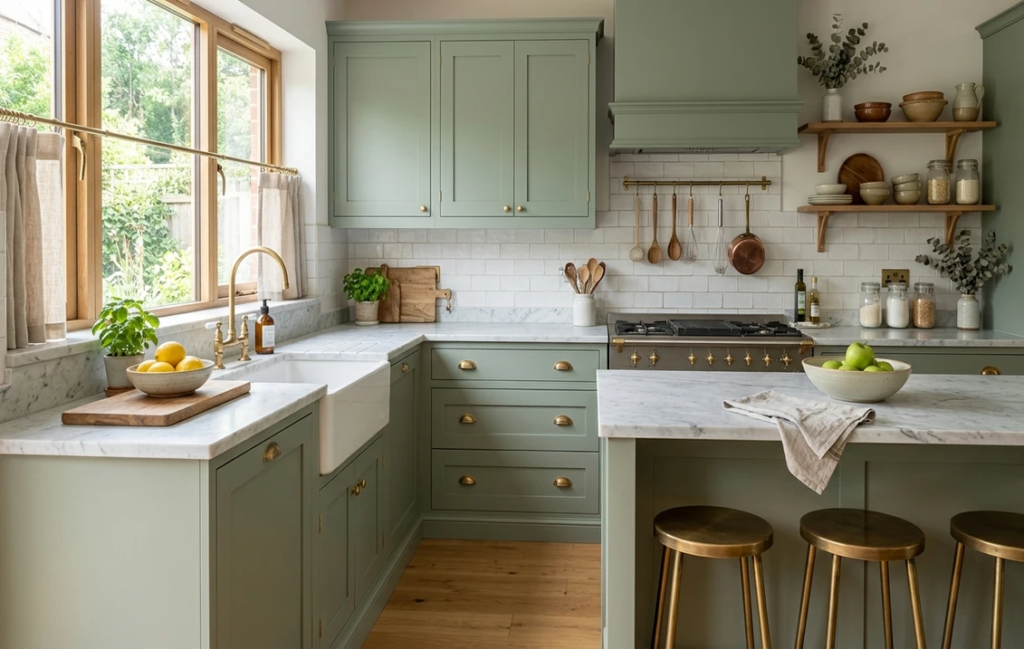
Muted green is the fastest-growing cabinet category in 2026, a natural partner sitting between a neutral and a statement.
4. Greek Villa uppers + Evergreen Fog island
Sherwin-Williams Greek Villa (SW 7551, LRV 84) over Sherwin-Williams Evergreen Fog (SW 9130, LRV 30). Evergreen Fog, a soft gray-green sage, was a Sherwin-Williams Color of the Year and remains the most requested kitchen green. At LRV 30 it stays fresh rather than heavy, so it works on an island or a full lower run. Greek Villa is a warm white with a peachy-yellow base that flatters it: the gentlest, most broadly liked pairing on the list.
5. White Dove uppers + Pewter Green lowers
Benjamin Moore White Dove (OC-17, LRV 85) over Sherwin-Williams Pewter Green (SW 6208, LRV 12). Pewter Green is a deep, smoky green that reads as a sophisticated near-neutral in low light and clearly green in sun. The 73-point gap with White Dove keeps it crisp. Choose this for green with real drama rather than a soft sage, with brass and warm wood so it does not feel cold.
6. Accessible Beige uppers + Evergreen Fog island
Sherwin-Williams Accessible Beige (SW 7036, LRV 58) over Evergreen Fog (SW 9130, LRV 30). Trade the white upper for a warm greige and the whole thing softens. Accessible Beige has a soft tan base. Set against sage green, the gentler 28-point contrast reads calm and earthy, almost European, and it suits a smaller or more traditional kitchen.
Free AI visualizer. See the exact pairing on your own cabinets before you buy a single sample pot.
Black and charcoal pairings
Black and near-black are the bold cousins: high-end and graphic, best on an island or single lower run, and good at hiding fingerprints in a matte finish. Save them for kitchens with strong natural light, where they read intentional rather than heavy.
7. Chantilly Lace uppers + Tricorn Black island
Benjamin Moore Chantilly Lace (OC-65, LRV 90) over Sherwin-Williams Tricorn Black (SW 6258, LRV 3). Maximum contrast, the most graphic pairing here. Chantilly Lace is a crisp near-pure white with no yellow; Tricorn Black is a true neutral black with no brown or blue. Neither color leans warm or cool, so nothing muddies the edge between them. Sharp and architectural.
8. Snowbound uppers + Iron Ore lowers
Sherwin-Williams Snowbound (SW 7004, LRV 83) over Sherwin-Williams Iron Ore (SW 7069, LRV 6). Iron Ore is a soft black, charcoal with a faint warmth, less stark than a true black and easier to live with. Paired with Snowbound, a clean white with a barely-there cool gray base, it stays high-contrast but soft at the edges: the forgiving alternative to a pure black island.
9. Repose Gray uppers + Chelsea Gray island
Sherwin-Williams Repose Gray (SW 7015, LRV 58) over Benjamin Moore Chelsea Gray (HC-168, LRV 23). Want contrast without committing to a color? Go all gray. Repose Gray is a warm-leaning greige, Chelsea Gray a deep mid-charcoal, both in the same family, and the whole thing stays calm. The 35-point gap feels deliberate, and it is a low-risk resale choice. See our gray cabinet guide.
All-neutral and wood pairings
You do not need a saturated color to go two-tone. Some of the most enduring kitchens pair two neutrals, or painted cabinets with natural wood as the second tone.
10. White Dove uppers + Agreeable Gray lowers
Benjamin Moore White Dove (OC-17, LRV 85) over Sherwin-Williams Agreeable Gray (SW 7029, LRV 60). This is the quietest pairing on the list. It also happens to be one of the easiest to resell, because almost no buyer reacts to it. Agreeable Gray is the most popular greige in the country, a warm gray that reads neither cold nor beige. The subtle 25-point contrast makes this a "barely two-tone" look: gentle dimension, no statement.
11. Warm white uppers + natural white oak base
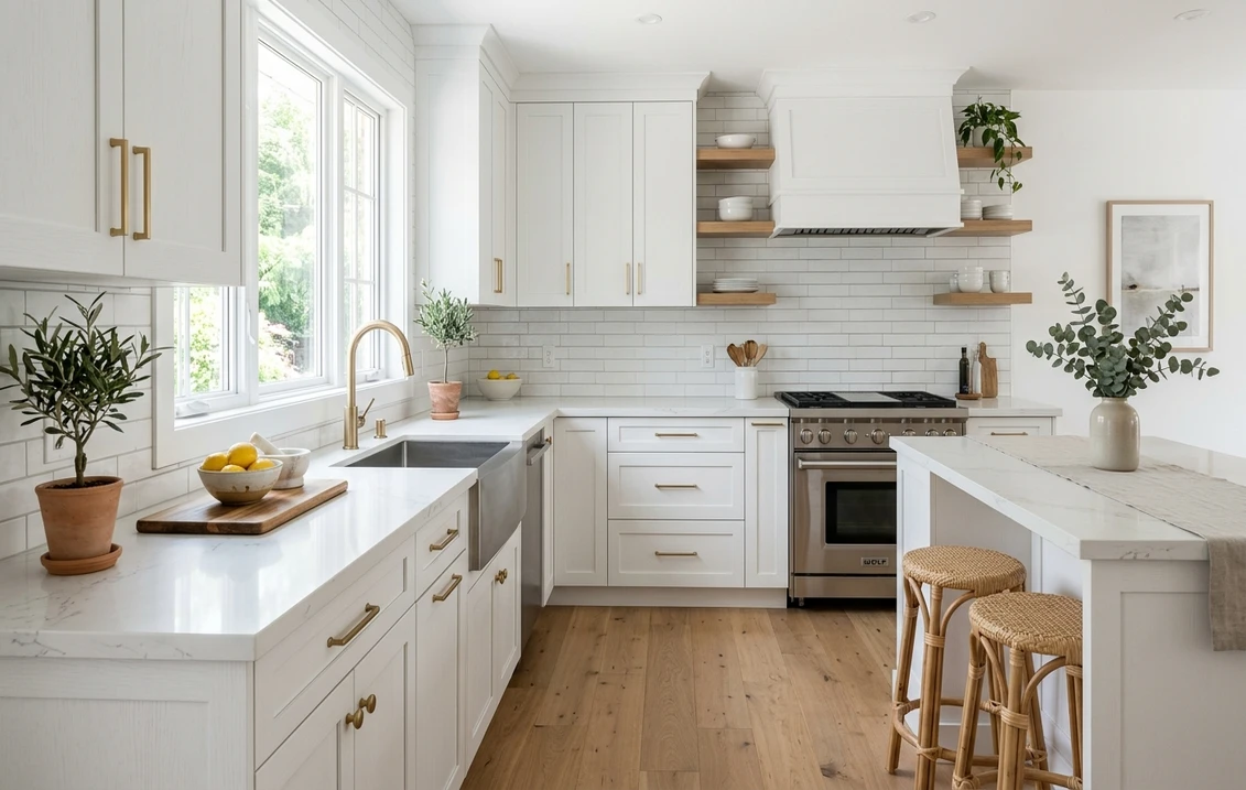
Sherwin-Williams Alabaster (SW 7008, LRV 82) or White Dove on the uppers, with a natural white-oak lower run or island left unpainted. Wood is the second tone, and white oak's cool greige-tan grain is driving the 2026 revival. Keep the white warm so it flatters the wood. Our white kitchen with oak cabinets guide covers which whites flatter which oak.
12. Pure White uppers + Accessible Beige island
Sherwin-Williams Pure White (SW 7005, LRV 84) over Accessible Beige (SW 7036, LRV 58). A warm, light, sun-washed pairing with no bold color at all. The crisp white above and warm greige island below give a layered, custom feel that suits a transitional or coastal kitchen, the lowest-commitment way to get the look and genuinely hard to get wrong. More on the white side in our white kitchen cabinet paint colors guide.
Placement, finish, and brand notes
The island is the lowest-risk spot for a bold color, a self-contained block that is easy to repaint later, which is why black and charcoal belong there first. Keep wall color in the same temperature family as the cabinets so the room reads cohesive, the logic our 2026 best interior paint colors guide applies room by room.
On both colors, use satin or semi-gloss: both resist grease and moisture and wipe clean, while flat and eggshell hold stains. Use a cabinet-grade enamel that cures to a hard film, and degrease, sand, and prime first; on a darker base color that prep is non-negotiable, because every missed spot shows.
You can mix Sherwin-Williams and Benjamin Moore in one kitchen (several pairings above do), since the final color comes from the tinted can, not the label. Our Sherwin-Williams vs Benjamin Moore comparison covers how their whites and durability stack up. Budget for labor too: a two-tone repaint costs more than one color because of the extra masking, which our interior painting cost guide details.
How to test a two-tone scheme before you commit
Most two-tone schemes that disappoint were judged off a fan-deck chip. That little chip reads far lighter than a rolled door, and it can never show you how two colors play off each other across a room. Paint a large peel-and-stick sample of each, hold them in their actual positions (white at eye level, the deeper color at island and base height), and check morning, midday, and evening light, since the contrast shifts through the day. The faster, no-paint option is a digital visualizer that applies both colors to a photo of your real kitchen.
Preview white uppers with a navy, sage, or charcoal base on your own photo, free.
Frequently asked questions
What is the most popular two-tone kitchen cabinet combination?
Warm white uppers with a navy island or lower run, typically Benjamin Moore White Dove (OC-17, LRV 85) or Sherwin-Williams Alabaster (SW 7008, LRV 82) over Sherwin-Williams Naval (SW 6244, LRV 4) or Benjamin Moore Hale Navy (HC-154). White uppers plus a sage island, led by Evergreen Fog (SW 9130, LRV 30), is the fastest-growing alternative in 2026.
Should the darker color go on top or bottom?
Bottom, as the default. Light uppers keep the eye up and the room open, while the deeper color on the lower run or island grounds the space and hides the scuffs lower cabinets collect. Dark uppers with a light base can work in a tall, bright kitchen, but it visually lowers the ceiling and is much less forgiving.
Is two-tone good or bad for resale?
Good, when the deeper color is broadly liked. A warm white with navy, sage, or a warm greige reads timeless and appeals to a wide buyer pool. Black, charcoal, and very saturated colors are more polarizing, so if resale is near term, keep those to an island rather than a full lower run. White Dove over Agreeable Gray (SW 7029) is among the safest, most neutral choices.
Can I mix Sherwin-Williams and Benjamin Moore on the same cabinets?
Yes. The final color comes from the tinted can you buy, not the brand on the label, so a Sherwin-Williams white with a Benjamin Moore navy is completely fine. To stay in one line for easier reordering and touch-ups, both carry a close match for every color here. What matters is that both colors share a temperature family and have real value contrast.
See white uppers with navy, sage, charcoal, or oak on your actual cabinets before you buy any paint.
Disclaimer: Sherwin-Williams color names and codes (Naval SW 6244, Alabaster SW 7008, Pure White SW 7005, Greek Villa SW 7551, Snowbound SW 7004, Evergreen Fog SW 9130, Pewter Green SW 6208, Tricorn Black SW 6258, Iron Ore SW 7069, Repose Gray SW 7015, Agreeable Gray SW 7029, Accessible Beige SW 7036) are trademarks of The Sherwin-Williams Company. Benjamin Moore color names and codes (White Dove OC-17, Chantilly Lace OC-65, Hale Navy HC-154, Newburyport Blue HC-155, Chelsea Gray HC-168) are trademarks of Benjamin Moore and Co. FacadeColorizer is an independent paint visualization service and is not affiliated with, endorsed by, or sponsored by Sherwin-Williams, Benjamin Moore, or Behr. Color reproduction on screens approximates the manufacturer's chip; always confirm with a manufacturer sample before purchase. Sources: Sherwin-Williams and Benjamin Moore technical data sheets 2026 (color codes and LRV values), The Spruce kitchen color reporting, and designer placement conventions.
Trademarks mentioned (Sherwin-Williams, Benjamin Moore, Behr, Caparol, Brillux, Sto, Alpina, Valspar, PPG, Glidden, Dulux, Crown Trade, Sandtex, Farrow & Ball, Johnstone's, Leyland) are property of their respective owners. FacadeColorizer is independent and not affiliated with any of them. Nominative fair use under Lanham Act §1125.